


One brief.
Every skill.
Only the good ones get in.
We run every design skill for AI coding tools on the same landing page and dashboard brief, then publish only the ones that score 3 out of 5 or higher. You skip the rest.
Browse skills- Reviewed
- 77
- Tested on the brief
- 47
- Cut below 3/5
- 9
- Published
- 38
5.3 hours of Claude time and about $74 in API usage so far, spent so you don't have to. What it costs
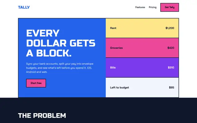
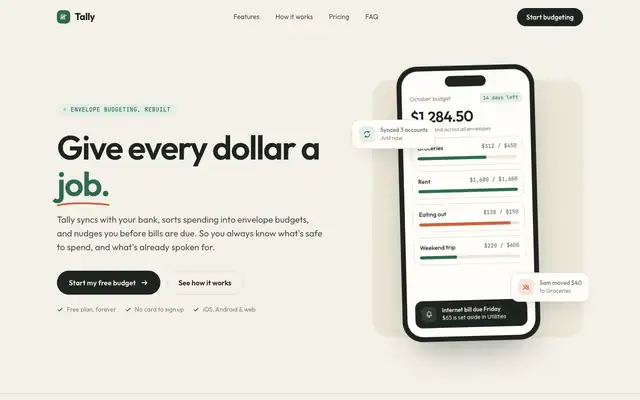
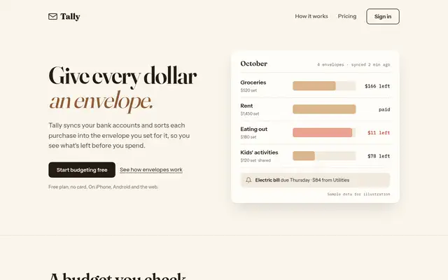
The same Tally landing page brief goes to the AI, once per skill. Each skill builds both pages from the brief: about 7 min and $1.57 of Claude time per skill. We score every build. 3/5 or higher gets published; the rest are cut.
Liquid Glass Design (ECC)
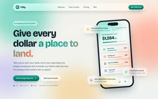
Liquid Glass Design builds Tally out of frosted glass panels floating over soft mint, peach and periwinkle light, set in Bricolage Grotesque and DM Sans. The dashboard keeps the glass in Manrope and stays readable. Pick it if you want a friendly, Apple-flavored product that looks nothing like the cream-and-serif default.
updated 2d ago
Impeccable
Impeccable drops the cream-and-serif default for a loud navy, orange and primary-color landing page set in heavy Archivo, then builds a calmer pine-and-lime dashboard. Pick it if you want a product page with real energy that still holds up on a dense screen.
updated 1d ago
Hallmark
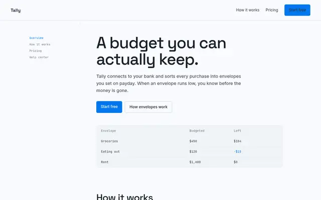
Hallmark turns Tally into a cheerful yellow-and-pastel brand in Plus Jakarta Sans with big ghost numerals, and the dashboard matches it. The most consistent result in the set, but it took about 12 minutes per brief.
updated 2mo ago
Huashu Design
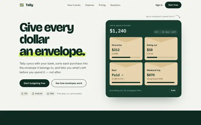
Huashu swaps Fraunces for Bricolage Grotesque and puts a lime highlighter on a deep forest green. It keeps envelopes as real kraft cards and carries the look into a tidy dashboard. A safe, distinct choice for consumer finance.
updated 4d ago
nothing-design-skill
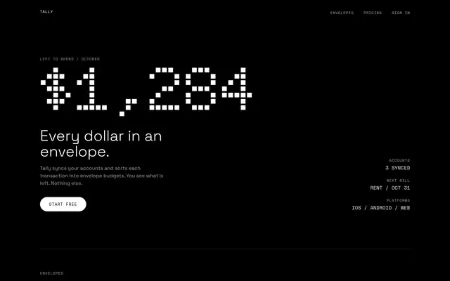
With the skill loading properly, Nothing turns both pages into an OLED-black instrument panel with Doto dot-matrix numerals, segmented bars and one red. This time the dashboard works end to end. Small grey labels on black are the weak spot.
updated 7mo ago
claude-design-system-prompt
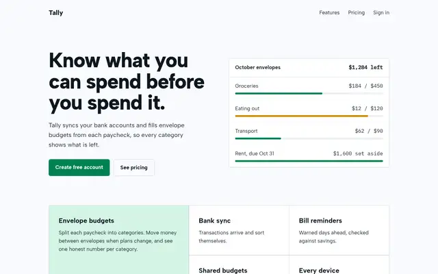
This system prompt moves Tally to a cool grey-and-ink look with Bricolage Grotesque, Geist and a lime marker, and the dashboard is clean and well organized. One contrast bug on the closing CTA keeps it from a higher score.
updated 3mo ago
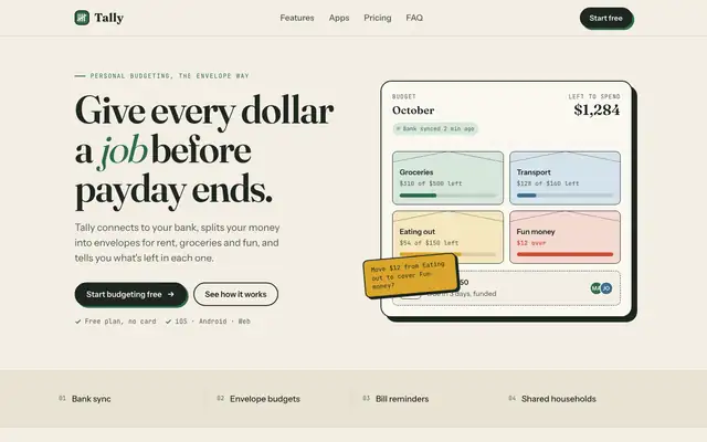
ECC Frontend Design Direction
ECC keeps a Fraunces and cream landing page but adds mono labels and a tilted sticky note. The IBM Plex dashboard is more useful than the baseline's, with a sync alert, search and person filters.
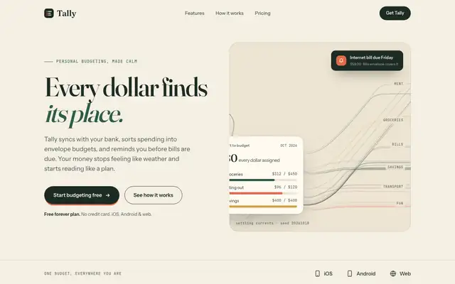
Algorithmic Art (Anthropic)
Algorithmic Art paints a seeded generative flow field across the hero, and even prints the seed, on cream with deep green, Fraunces and Instrument Sans. That art makes the landing page memorable, but the dashboard is close to the default. Pick it for a landing hero that nobody else has.
updated 8d ago
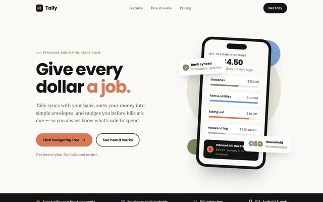
Brand Guidelines (Anthropic)
Brand Guidelines dresses Tally in Anthropic's own brand: near-black, warm off-white, orange, blue and olive, with Poppins headings over Lora body text. It's clean and consistent on both pages, but it's another company's look, and a 'Bank synced' card covers the hero balance. Pick it only if you want that Anthropic style.
updated 8d ago
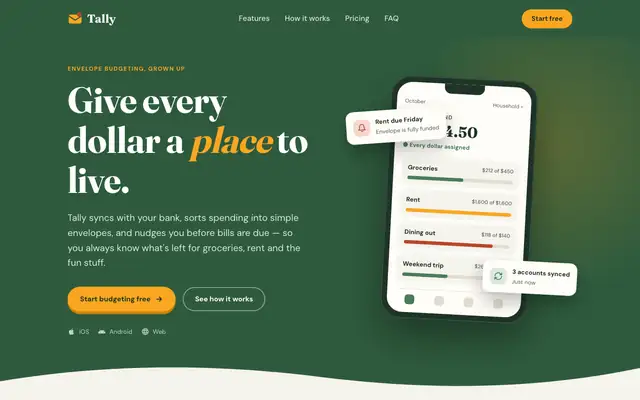
Theme Factory (Anthropic)
Theme Factory picked a forest-and-marigold theme for the landing page, in Fraunces and DM Sans, and a separate forest-and-olive one in Source Serif 4 and Figtree for the dashboard. Both are tidy, but they stay in the cream-and-green family of the default. A floating 'Rent due Friday' card covers the hero balance. Pick it for quick, warm theming.
updated 8d ago
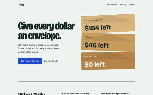
frontend-design (Anthropic)
Anthropic's frontend-design gives Tally a mint-and-pastel landing page and a navy-and-manila ledger dashboard, both clearly new. The mobile landing page is wider than the phone, which caps the score.
updated 8d ago
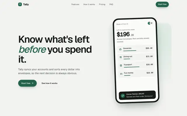
design-taste-frontend v2 experimental (Taste Skill)
The old v2 taste skill swaps the serif for Geist on a pale grey-green canvas, with a deep green accent and an interactive budget slider in the hero. Both pages are clean and competent, with only slight distance from the baseline. Pick it if you like Taste Skill's style and want the older single-file version.
updated today
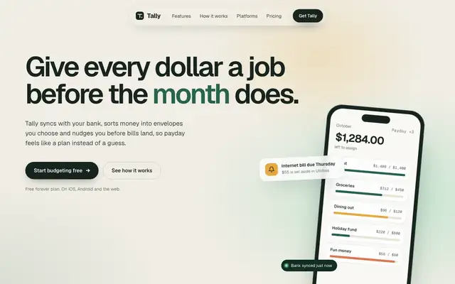
GPT Taste (Taste Skill)
GPT Taste builds a soft, polished Tally in Geist on warm paper, with mint and amber gradients, a dark green band and a huge 'tally' wordmark in the footer. The dashboard is a clean moss-green layout. Pick it for a well-finished startup page, though the green comes straight from the default.
updated today
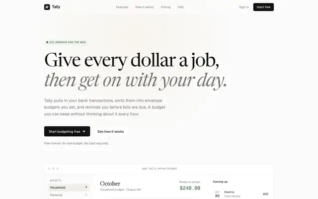
Minimalist UI (Taste Skill)
Minimalist UI goes almost monochrome: off-white, near-black type and Geist, with Newsreader italics for emphasis and soft Notion-like color tags. It's calm and editorial, a clear step away from the baseline, but the mobile dashboard scrolls sideways. Pick it for quiet products that let the content lead.
updated today
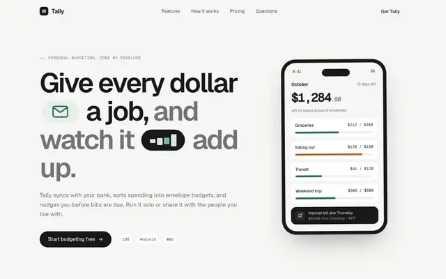
Stitch Design Taste (Taste Skill)
Taste Skill's copy of the Stitch taste skill gives almost the same page as the Google Labs version: Geist on warm off-white, a deep green accent, crisp cards and a quiet dashboard. Pick it if you want clean, modern SaaS pages; pick either this or Stitch's original, not both.
updated today
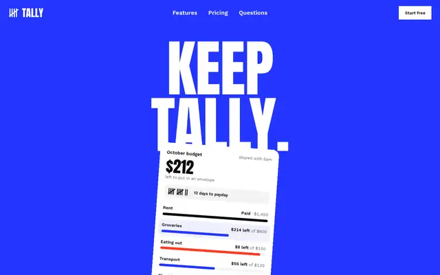
Taste Skill (design-taste-frontend)
Taste makes the boldest landing page in the set, a white Swiss poster with giant Anton type, electric blue and red. The dashboard looks like a different skill made it, and it scrolls sideways on a phone.
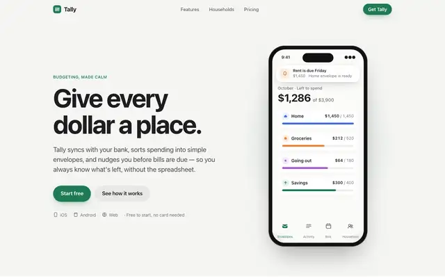
Apple Design (Emil Kowalski)
Emil Kowalski's Apple design skill goes for the iOS feel: the system font, an off-white canvas, a green accent and a drag-to-move-money demo that behaves like a native control. The dashboard switches to Inter with Apple's system colors. Pick it if motion and touch feel matter more than a bold look.
updated 6d ago
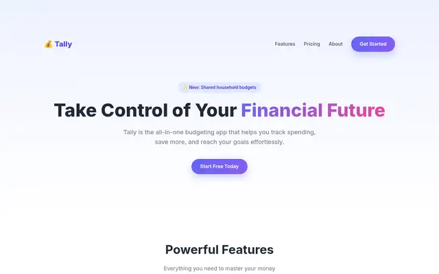
emilkowalski/skills
Emil's design-eng skill keeps a cream-and-forest landing page in Instrument Serif with a tilted phone, and builds a clean near-white Geist dashboard. The landing page repeats the baseline's hero overlap.
updated 6d ago
Garden Web Design Engineer
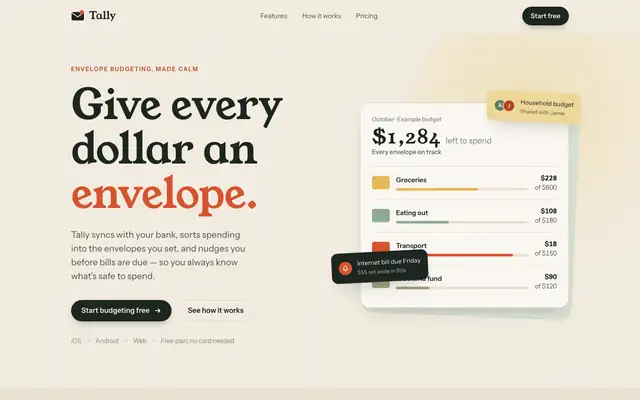
Garden's web-design-engineer trades Fraunces for Young Serif and adds an orange-red accent with sage. It's a warm variation on the default, and it repeats the default's habit of a hero card covering the mockup.
shadcn/ui (Stitch Skills)
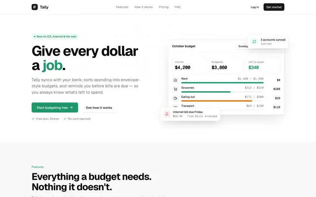
The shadcn/ui skill builds a neat, neutral shadcn-style Tally in Geist: white cards, zinc greys and one green brand color. It's tidy and consistent, but generic, and the mobile dashboard scrolls sideways. Pick it if you're building on shadcn and want that house style done right.
updated 2mo ago
Taste Design (Stitch Skills)
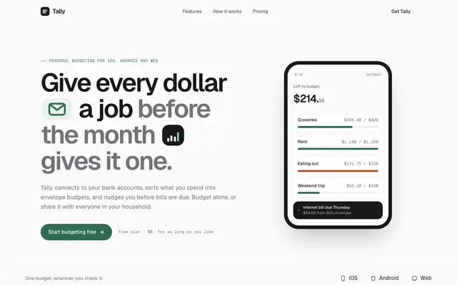
Stitch's taste skill swaps the cream-and-serif default for Geist on a near-white canvas, with a deep green accent and small icon chips set right into the headline. The dashboard is calm and consistent with the landing. Pick it if you want clean, current SaaS polish and don't need a strong personality.
updated 2mo ago
Background Grid WebGL (Meng To)
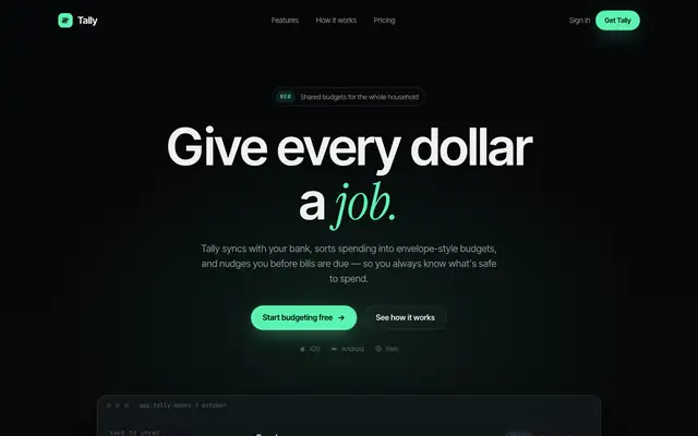
Background Grid WebGL puts a perspective grid fading into the dark behind the hero, with mint accents and Instrument Serif headlines over Inter Tight. The dashboard keeps the dark look in Manrope. The mobile dashboard scrolls sideways. Pick it for a tech launch page with atmosphere.
updated today
Bright Green Tech System (Meng To)
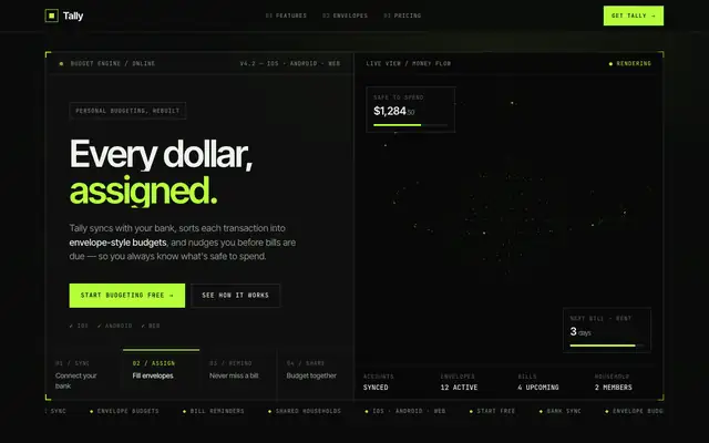
Bright Green Tech System is the furthest from the default in this batch: a near-black HUD with hard-framed panels, JetBrains Mono labels and a lime glow, plus a WebGL visual in the hero. It reads like a dev tool more than a budgeting app, and the mobile dashboard scrolls sideways. Pick it if your product is technical and you want it to look it.
updated today
Glass Dark UI (Meng To)
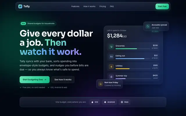
Glass Dark UI turns Tally into a dark navy product with frosted panels and gradient borders, lit by green, blue and violet accents. Text stays readable on both pages. Pick it if you want a polished dark interface, but expect it to look like plenty of other dark SaaS sites.
updated today
No AI Design Slop (Meng To)
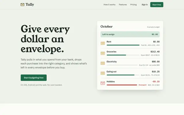
No AI Design Slop moves off the default with sage paper, Young Serif headlines, Schibsted Grotesk and manila-envelope cards that suit a budgeting app. The dashboard switches to Newsreader and Public Sans but keeps the sage and green. Pick it if you want warmth with more character than most of this batch.
updated today
Skeuomorphic UI (Meng To)
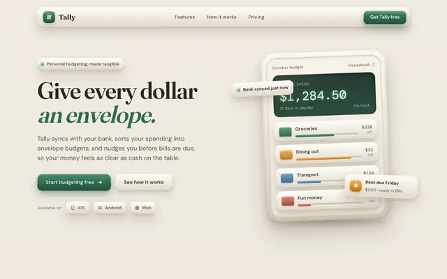
Skeuomorphic UI gives Tally tactile beige surfaces, embossed buttons and stacked shadows, in Fraunces and DM Sans, with a Manrope dashboard. It's a real texture change from the baseline, but the green and the serif stay, and the mobile dashboard scrolls sideways. Pick it for a playful, physical feel.
updated today
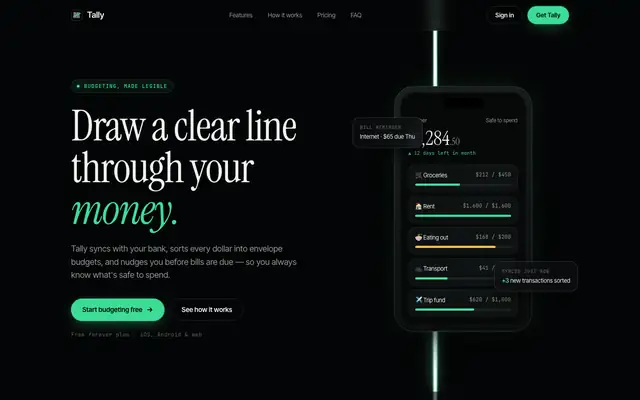
WebGL Laser (Meng To)
WebGL Laser runs a white-hot vertical beam with a mint halo down a near-black page, with Instrument Serif headlines over Inter Tight. It's striking on desktop, but on a phone the beam crosses the hero text, and the mobile dashboard scrolls sideways. Pick it for a launch page hero, not for the app itself.
updated today
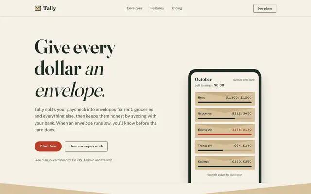
Antislop UI
Antislop UI keeps the baseline's paper and serif but cleans it up: no overlapping hero cards, a working "assign $2,000" slider demo, honest placeholder copy and a dashboard that leads with what to do about the $640. Better made, still close to the default look.
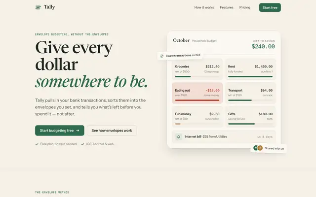
Interface Design
Interface Design gives the default a ledger-and-pencil feel with Newsreader and IBM Plex Mono, and adds envelope icons to the dashboard. It's careful work, but you'd still take it for the baseline at a glance.
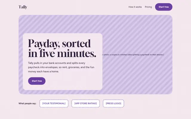
baoyu-design
Baoyu keeps the baseline's cream-and-green palette in oklch with Instrument Serif and a kraft envelope illustration. It's a nicer-detailed version of the default rather than a new direction.
updated 24d ago
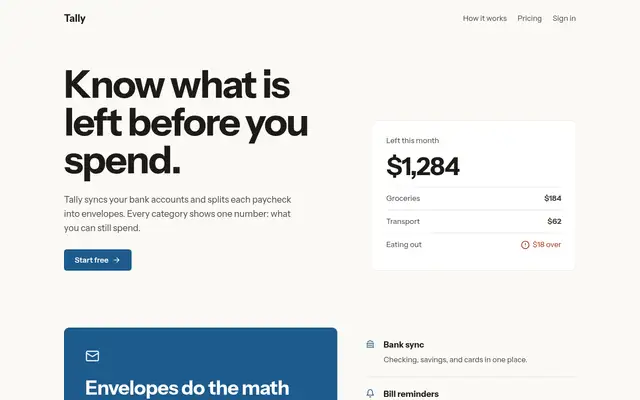
ux-ui-agent-skills
Once loaded, UX/UI Agent Skills pulls three of its skills (design-screen, design-doctrine, data-dashboard) and produces a careful, well-reasoned version of the default: Newsreader serif, ink green and ochre, and a dashboard that explains pace and what is unassigned. Solid work, though it still reads as the familiar cream-and-green look.
updated 7d ago
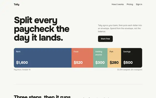
oil-ui
Loaded at last, oil-ui spent longest of the five (7.5 min on the landing page) sketching three hero ideas and built a polished kitchen-table envelope page: fanned envelopes that fill as you scroll and pricing drawn as envelopes. The craft is good, but the colors and type are the default's, and the mobile dashboard scrolls sideways.
updated 1d ago
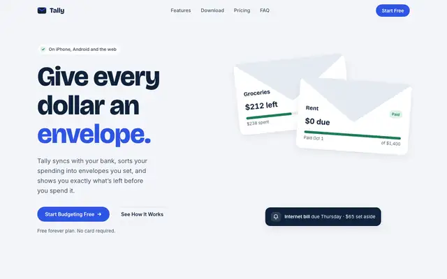
apple-design-skill
This Apple design skill moves Tally to a cool palette: blue-white paper, navy type and a cobalt accent, with folded-envelope illustrations in the hero. The dashboard is a tidy Inter layout with JetBrains Mono figures. Pick it if you want a clean, Apple-adjacent product that nobody will call off-brand.
updated 2d ago
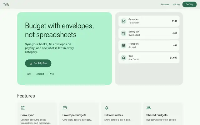
material-3-skill
Material 3 applies a full tonal M3 system in Roboto Flex, and the dashboard is dense and solid. On the landing page, icon names print as text and a hero card still covers the balance.
updated 3mo ago
styleseed
StyleSeed gives Tally a warm blush canvas, Plus Jakarta Sans and a deep green primary, with a full token set behind it. It's clean, with slight distance from the baseline, and the dashboard in Manrope matches. It was the longest run in the batch. Pick it if you want a design-system workflow more than a bold look.
updated 3d ago
Refactoring UI Skills
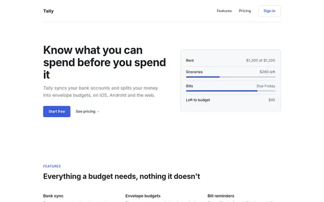
Refactoring UI turns Tally into a clean, generic Tailwind-style SaaS: Plus Jakarta Sans, a grey scale and emerald, then Inter and slate with teal on the dashboard. Tidy, but anonymous, and the hero card still covers the balance.
updated 6mo ago
mobile-app-ui-design
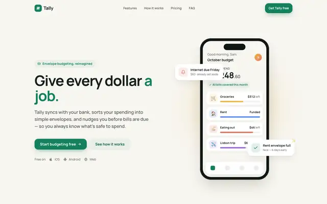
The mobile app UI skill gives Tally an app-first look: Manrope on off-white, a green accent with sun, clay and sky category colors, and big rounded cards. Both pages work well on a phone, and the dashboard in Plus Jakarta Sans matches. Pick it if mobile is where your users live.
updated 4mo ago
UI Craft: Dense Dashboard
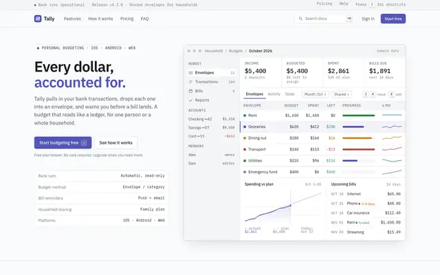
UI Craft builds the best dense dashboard in the set: Linear-style IBM Plex on cool grey, with filters, a line chart and a who-spent-what view, all above the fold. The mobile dashboard scrolls sideways, which caps the score.
New results every week.
Follow the RSS feed for every newly tested skill, or send us one to run through the brief.