


Liquid Glass Design (ECC)
4/5 out of 5. Read the verdictApple's iOS 26 Liquid Glass look (frosted panels, blur and reflection) as a skill, from the Everything Claude Code repo.
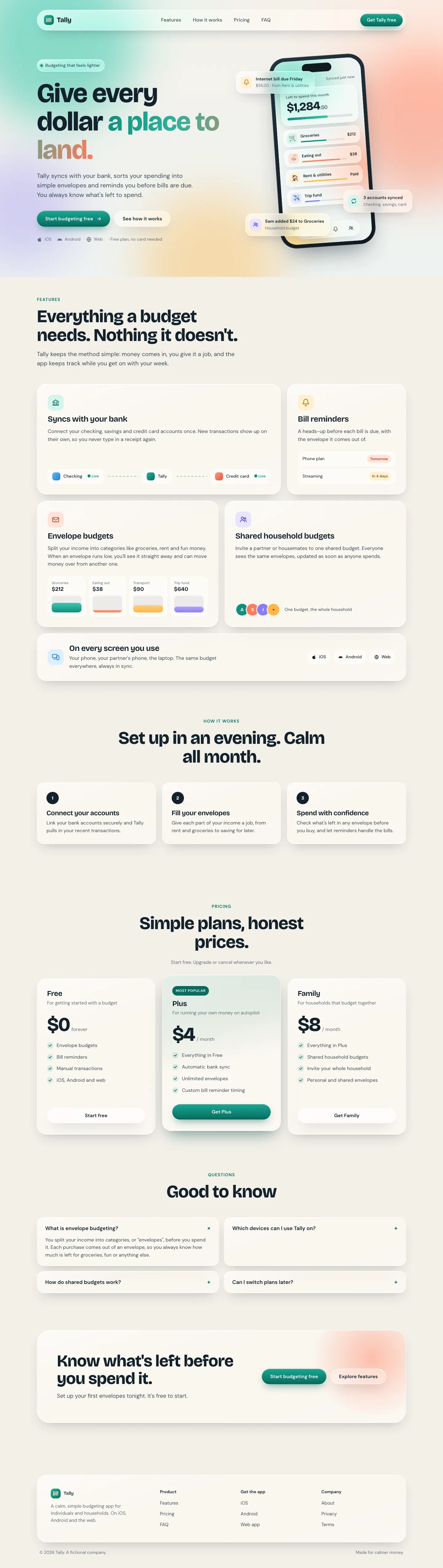
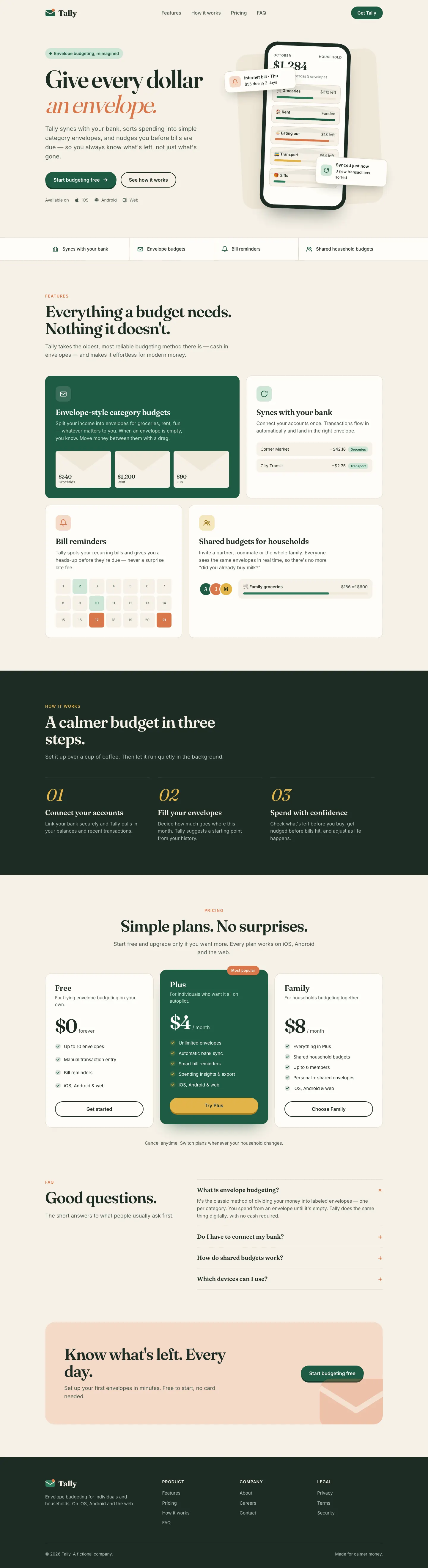
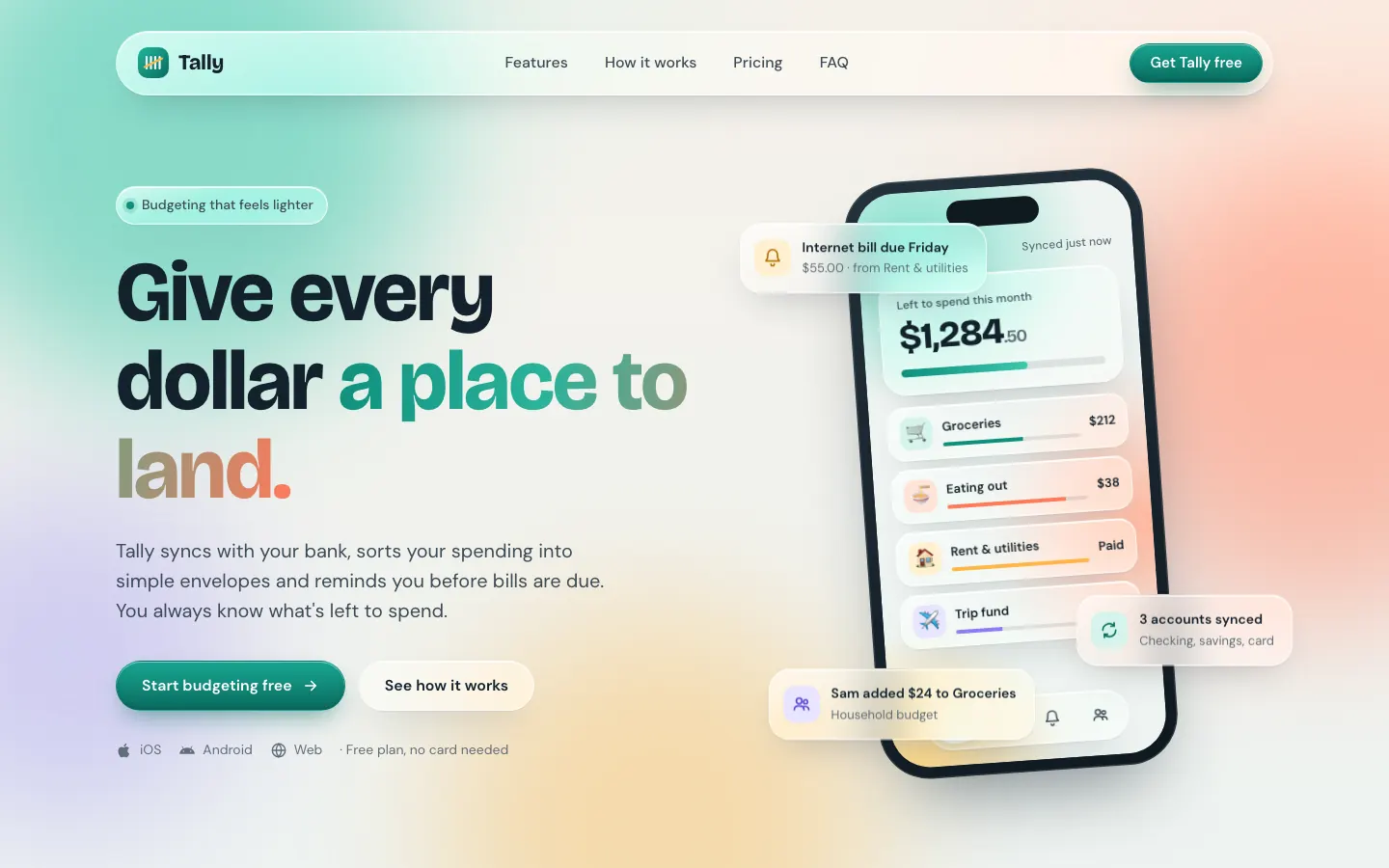
First screen only. Switch to side by side to read the full pages.
Scroll either page; the other follows.Full Liquid Glass Design (ECC) pageFull baseline
Every skill gets the same Tally brief, alone in a clean project. How we test
Our verdict
4/5 out of 5
Passed the cut
Liquid Glass Design builds Tally out of frosted glass panels floating over soft mint, peach and periwinkle light, set in Bricolage Grotesque and DM Sans. The dashboard keeps the glass in Manrope and stays readable. Pick it if you want a friendly, Apple-flavored product that looks nothing like the cream-and-serif default.
Compare with claude-design-system-promptPick it for
- consumer fintech apps
- iOS companion sites
- friendly SaaS dashboards
- wellness and lifestyle products
- app launch pages
Skip it for
- dense data and admin tools
- sober enterprise or legal brands
- long-form editorial sites
Typography
- Bricolage Grotesquelanding
- DM Sanslanding
- Manropedashboard
Colors
Observations
- dashboard desktop: the payee column in the transactions table wraps onto two lines
- the landing (teal, coral, amber) and the dashboard (blue-led) shift the accent color between pages
- the skill is written for SwiftUI; on the web the glass is CSS blur, so it leans on backdrop-filter support
Install
1 Run in your terminal
npx degit affaan-m/ECC/skills/liquid-glass-design#main .claude/skills/liquid-glass-design2 Or paste a prompt into Claude Code, Codex, Cursor or Gemini
It tells your tool to install this from its source repository.
This install is for Claude Code only; for other agents use Copy prompt or copy the skill folder.
Copies just this skill's folder into your project's .claude/skills.
Check the source for the latest instructions.
We tested the liquid-glass-design skill from this repo.
Details
- Type
- Skill
- GitHub stars
- 282,976 (Stars are for the whole affaan-m/ECC repository.)
- Updated
- 2d ago
- License
- MIT
- Best for
- Visual directionMobile
Test runOpus 5.5Claude Code 2.1.302Oct 18, 2026generated in 6 minabout $1.43 at API pricescommit 76aaa77
Similar
Same brief, other skills
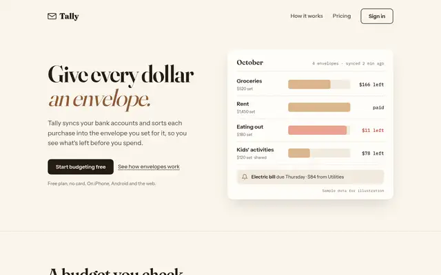
Impeccable
Impeccable drops the cream-and-serif default for a loud navy, orange and primary-color landing page set in heavy Archivo, then builds a calmer pine-and-lime dashboard. Pick it if you want a product page with real energy that still holds up on a dense screen.
updated 1d ago
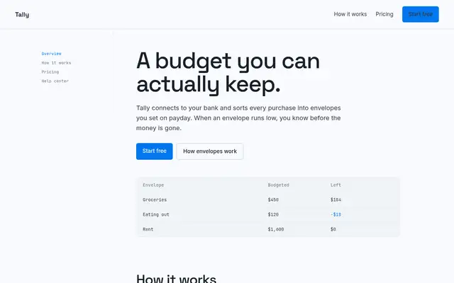
Hallmark
Hallmark turns Tally into a cheerful yellow-and-pastel brand in Plus Jakarta Sans with big ghost numerals, and the dashboard matches it. The most consistent result in the set, but it took about 12 minutes per brief.
updated 2mo ago
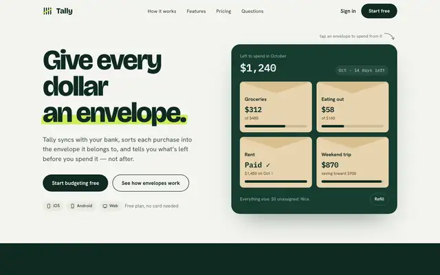
Huashu Design
Huashu swaps Fraunces for Bricolage Grotesque and puts a lime highlighter on a deep forest green. It keeps envelopes as real kraft cards and carries the look into a tidy dashboard. A safe, distinct choice for consumer finance.
updated 4d ago
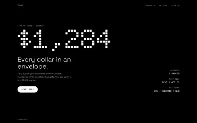
nothing-design-skill
With the skill loading properly, Nothing turns both pages into an OLED-black instrument panel with Doto dot-matrix numerals, segmented bars and one red. This time the dashboard works end to end. Small grey labels on black are the weak spot.
updated 7mo ago
Also for these tasks
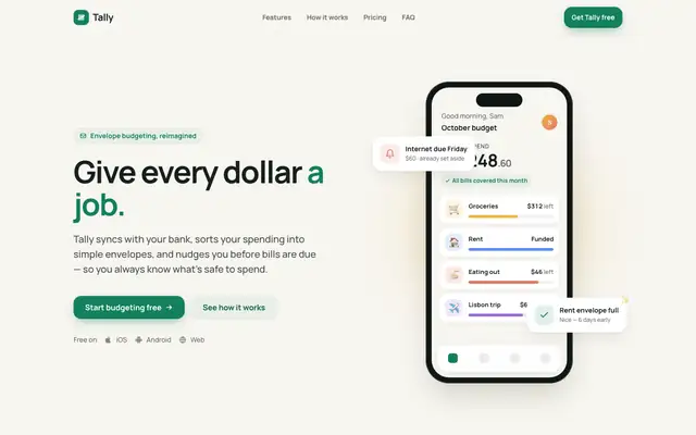
mobile-app-ui-design
The mobile app UI skill gives Tally an app-first look: Manrope on off-white, a green accent with sun, clay and sky category colors, and big rounded cards. Both pages work well on a phone, and the dashboard in Plus Jakarta Sans matches. Pick it if mobile is where your users live.
updated 4mo ago
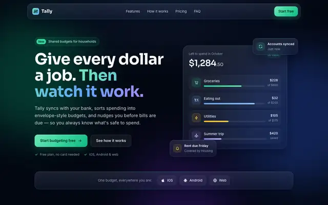
Glass Dark UI (Meng To)
Glass Dark UI turns Tally into a dark navy product with frosted panels and gradient borders, lit by green, blue and violet accents. Text stays readable on both pages. Pick it if you want a polished dark interface, but expect it to look like plenty of other dark SaaS sites.
updated today
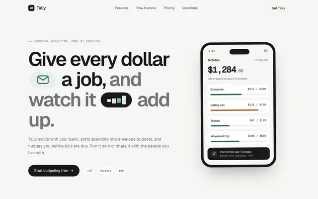
Stitch Design Taste (Taste Skill)
Taste Skill's copy of the Stitch taste skill gives almost the same page as the Google Labs version: Geist on warm off-white, a deep green accent, crisp cards and a quiet dashboard. Pick it if you want clean, modern SaaS pages; pick either this or Stitch's original, not both.
updated today
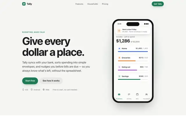
Apple Design (Emil Kowalski)
Emil Kowalski's Apple design skill goes for the iOS feel: the system font, an off-white canvas, a green accent and a drag-to-move-money demo that behaves like a native control. The dashboard switches to Inter with Apple's system colors. Pick it if motion and touch feel matter more than a bold look.
updated 6d ago