 Skills for Design
One brief, 17 skills.
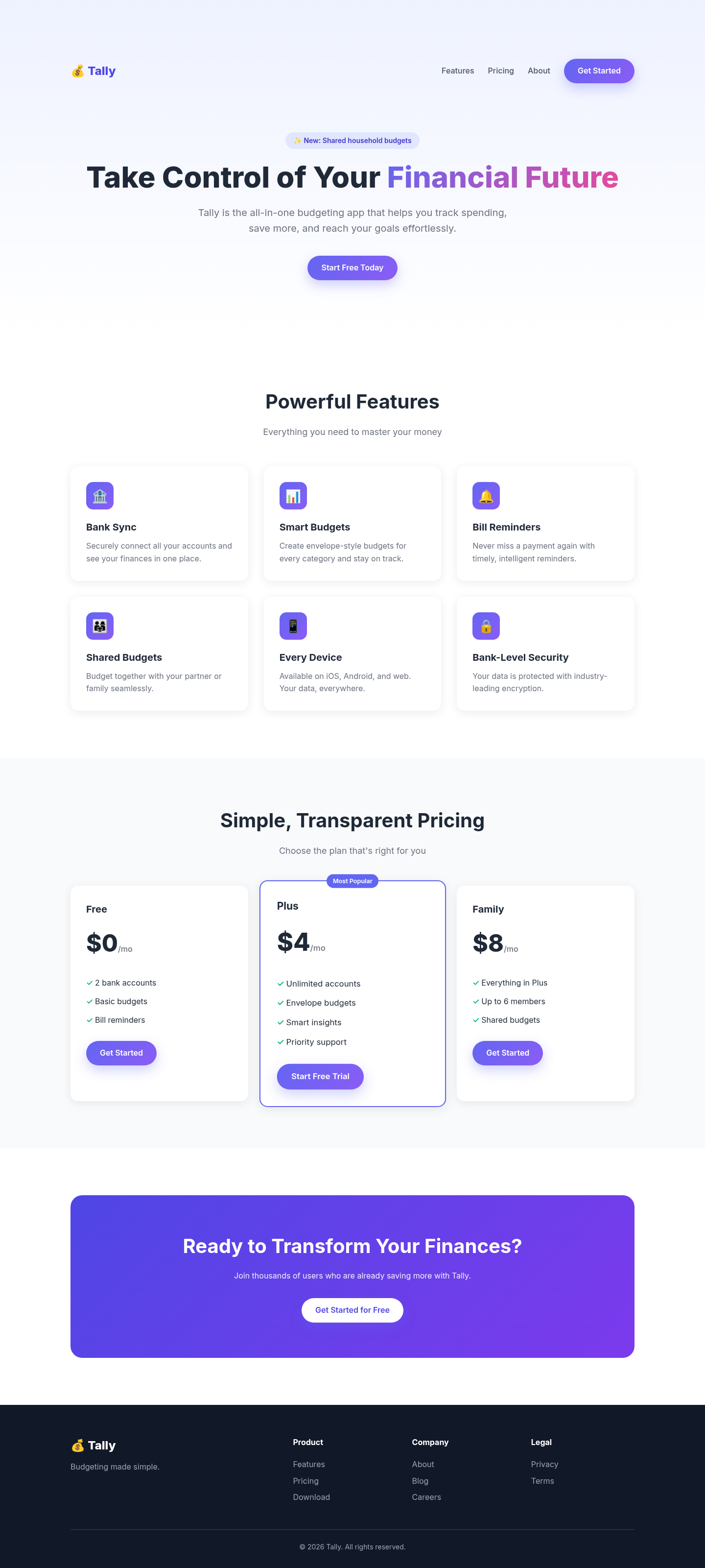
We ran every card below on the same Tally budgeting-app landing page. The before shot is that page with no skill. Scores are editorial. GitHub stars do not change the rank.
Tested listings

frontend-design (Anthropic)
The biggest jump in the set: the generic purple SaaS template became a page built around one idea (a stack of kraft envelopes), with characterful type, a plain feature list and a comparison table instead of card grids. Its anti-default checklist visibly removed every gradient, emoji and 'Most Popular' tell from the baseline.

Impeccable
Threw out the gradient-and-emoji template for a warm paper 'ledger' world: the hero is a working envelope budget (labelled as sample data), features become one lead argument plus a ruled row, and pricing leads with a dark Plus plan. Distinctive and honest with copy. We followed its written rules but not its full workflow (launcher, question round, reviewer subagent), so a real run could differ.

Hallmark
Turned the centered hero-plus-cards template into a document-style page with a side rail, a real envelope ledger and hairline rules, using its Cobalt theme tokens. Clean and credible, though the result is quieter and less memorable than the strongest entries.

nothing-design-skill
Produces a strongly recognisable result: OLED black, a dot-matrix hero number, mono caps labels and a single red over-budget dot. Faithful and striking, but the style is fixed, so every page made with it will look like a Nothing product regardless of brand.

ux-ui-agent-skills
Its banned-defaults list fixed the baseline's tells directly: no emoji, one lead feature instead of an equal grid, a lead pricing plan, off-black on warm white and a big display headline. Solid and tasteful; we could not run the kit's own scripted gates because only the skill folder was available.

claude-design-system-prompt
The aesthetic-direction and slop-check skills produced a calm, coherent fintech page: a real product panel in the hero, a bento feature block with one lead cell, and borders instead of shadows. It also renders a visible design-system summary, as the skill requires, which some will see as clutter.

oil-ui
Its 'one protagonist per screen' rule gave the page a memorable hero: a full-width paycheck bar split into colour-coded envelopes, with the palette taken from it. The rest is restrained to the point of sparseness, and we skipped its usual three-direction user check.

web-designer
Its mandatory six-line brief (direction, mood, palette, type, layout, signature) pushed the page into a warm editorial ledger: Fraunces on paper, one tomato accent, hand-drawn tally marks as the signature and alternating paper/ink sections. One of the most distinctive results in the set. The weak spot is its full-viewport section habit, which leaves big empty bands on a short page.

UI UX Pro Max
We ran its own design-system generator on the brief. It picked a 'Vibrant & Block-based' style, blue/purple/pink and Russo One with Chakra Petch, a pairing it tags for gaming and esports, and a testimonials-led layout we had no real quotes for. Following it gave a bold, accessible block layout with SVG icons and visible focus states, but the look doesn't fit a calm budgeting app. Good rules and checklists; the auto-picked direction needs a designer's veto.

MengTo Skills (GSAP + web design)
Its landing-page skill restructured the page into a conversion argument: outcome headline, risk-reversal line, problem/fix band, benefits, three steps, a six-question FAQ and a repeated final CTA. The GSAP skill only adds a hero entrance that a screenshot can't show. Clearer than the baseline, but visually still a generic SaaS template.

baoyu-design
Following its landing-page rules gave the page a clear single CTA, objection-led sections and honest placeholders for photos and testimonials instead of invented proof. Structurally better than the baseline, but without real photography the screenshot is dominated by striped image slots.

material-3-skill
Applied faithfully, it yields a correct-looking Material 3 page: tonal surfaces, pill buttons, MD3 type scale and Material Symbols. That is an improvement in consistency over the baseline, but it reads as an Android app shell rather than a distinctive marketing page.

rampstackco/claude-skills
Its landing-page-copy and design-standards skills mostly improved the words and structure: an outcome headline, a problem section, a 3-step mechanism, an objection FAQ and a repeated single CTA. Visually it stays conventional, with a dark hero band and plain card pricing.

Refactoring UI Skills
This one audits rather than generates, so we ran /refactor-ui's checklist over the baseline and applied its priority fixes: no gradients, one hue plus a grey scale, a real button hierarchy, no emoji tiles, and a shadow only on the lead plan. The page is noticeably calmer and more professional, but the layout is still the same SaaS template. Best used as a cleanup pass, not for creative direction.

emilkowalski/skills
We applied its main emil-design-eng skill to the baseline. The page picked up specific transitions, a strong custom ease-out, press feedback, hover gated to real pointers, staggered entrances, and a soft ring instead of a hard border. The advice is good. Almost all of it is motion and interaction, so the static page looks nearly identical. It polishes a page rather than designing one.

web-design (xiaopu-ai)
Its 'Warm Professional' style seed (white, blue #2563EB, Plus Jakarta Sans, 12px radius, soft shadows) produced a tidier, less gimmicky page, but structurally it is still hero, four equal cards and three pricing cards. The difference from the unguided baseline is mostly polish, not direction.

design-for-ai
We tested the prototype skill on the brief by itself. With no DESIGN.md it falls back to a greyscale wireframe with placeholder labels, which it does exactly as documented: semantic HTML, 44px targets, and a reduced-motion rule. It is useful for structure. You get no visual design until you run its token workflow first, so this score only reflects what you get out of the box.
Same brief, side by side
- frontend-design (Anthropic) vs Hallmark 5/5 · 4/5 · Visual direction, Landing pages
- frontend-design (Anthropic) vs Impeccable 5/5 · 4/5 · Visual direction, Landing pages
- frontend-design (Anthropic) vs oil-ui 5/5 · 4/5 · Visual direction, Landing pages
- frontend-design (Anthropic) vs web-designer 5/5 · 4/5 · Landing pages, Visual direction
- claude-design-system-prompt vs frontend-design (Anthropic) 4/5 · 5/5 · Visual direction
- frontend-design (Anthropic) vs nothing-design-skill 5/5 · 4/5 · Visual direction
- baoyu-design vs frontend-design (Anthropic) 3/5 · 5/5 · Visual direction, Landing pages
- Hallmark vs Impeccable 4/5 · 4/5 · Visual direction, Landing pages
- Hallmark vs oil-ui 4/5 · 4/5 · Visual direction, Landing pages
- Hallmark vs web-designer 4/5 · 4/5 · Landing pages, Visual direction
- Impeccable vs oil-ui 4/5 · 4/5 · Visual direction, Landing pages
- Impeccable vs web-designer 4/5 · 4/5 · Landing pages, Visual direction
A longer set of pairs that share a task tag is in the sitemap.
The weekly letter covers new tests. The signup is a placeholder and does not send.