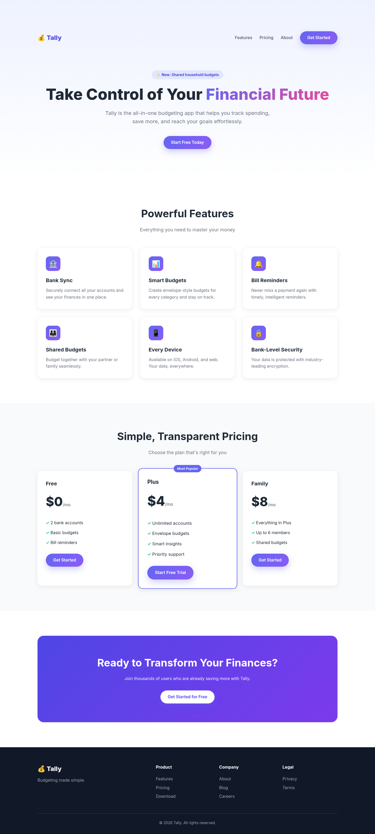
Both after shots are the Tally budgeting-app landing page, made by applying each skill's published instructions. Shared tags: Visual direction, Landing pages.
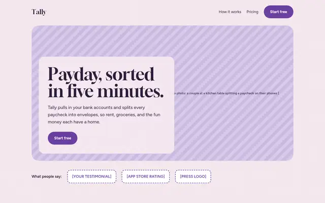
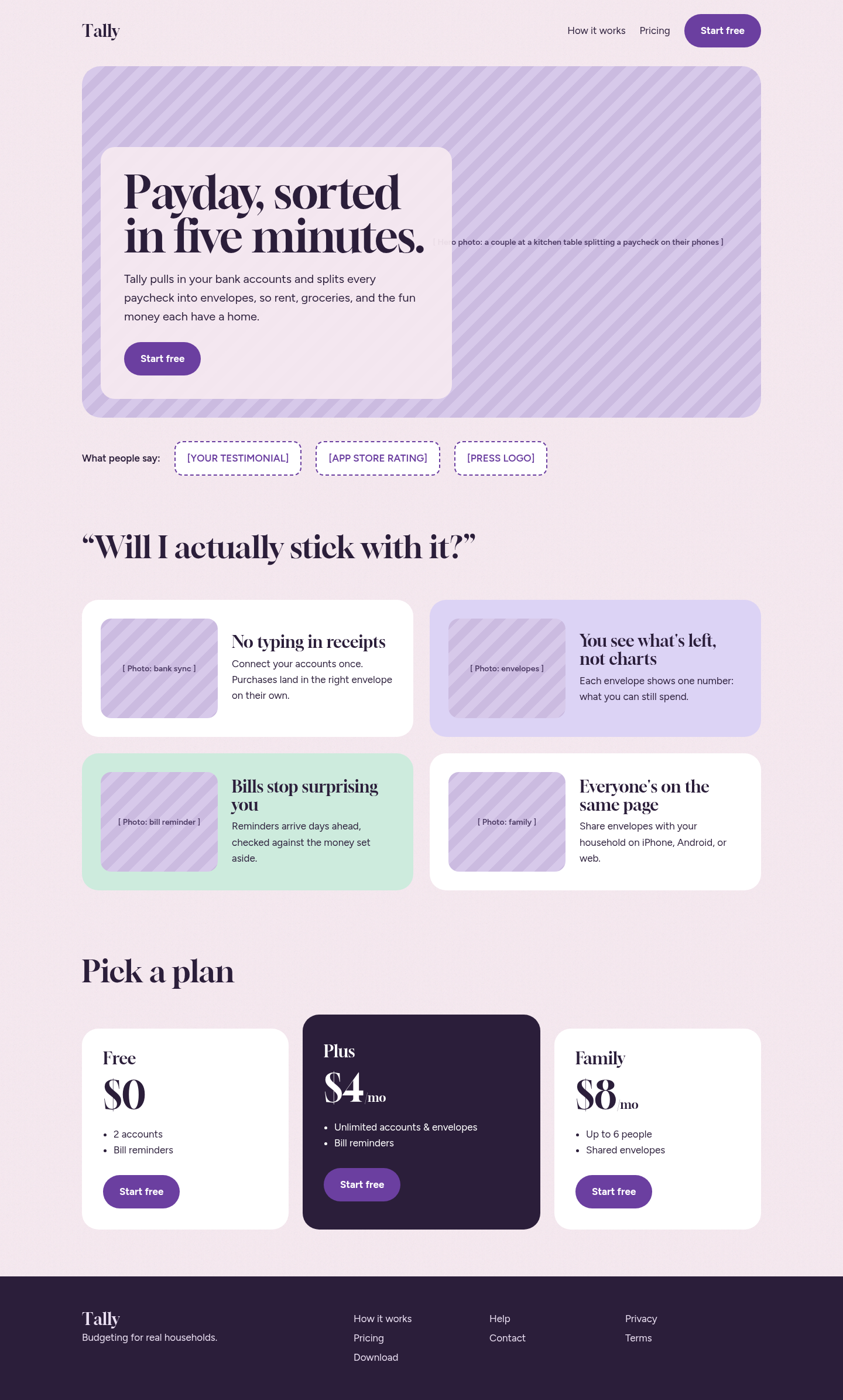
Following its landing-page rules gave the page a clear single CTA, objection-led sections and honest placeholders for photos and testimonials instead of invented proof. Structurally better than the baseline, but without real photography the screenshot is dominated by striped image slots.
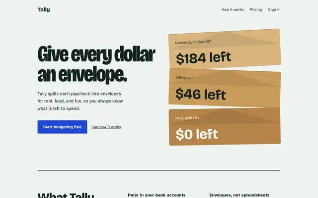
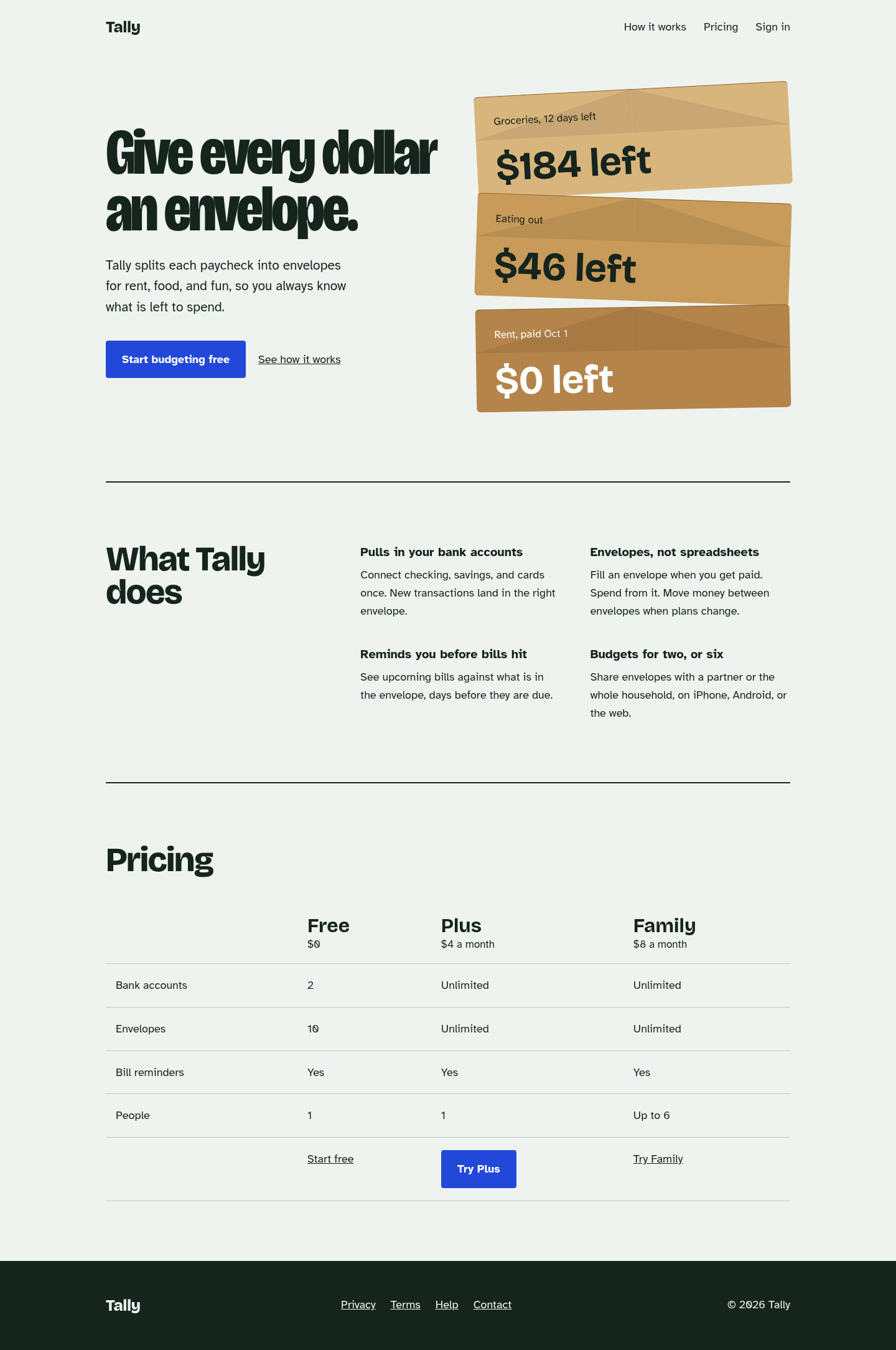
The biggest jump in the set: the generic purple SaaS template became a page built around one idea (a stack of kraft envelopes), with characterful type, a plain feature list and a comparison table instead of card grids. Its anti-default checklist visibly removed every gradient, emoji and 'Most Popular' tell from the baseline.
 Skills for Design