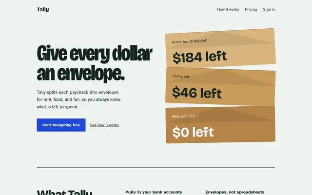
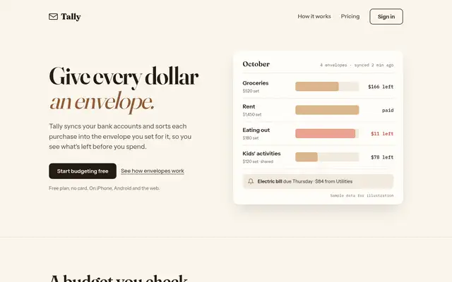
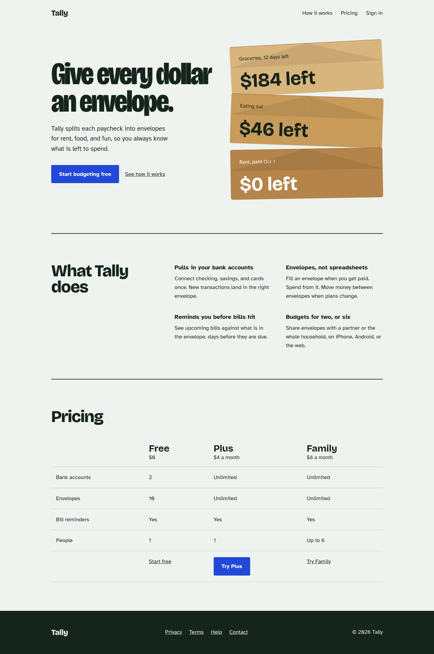
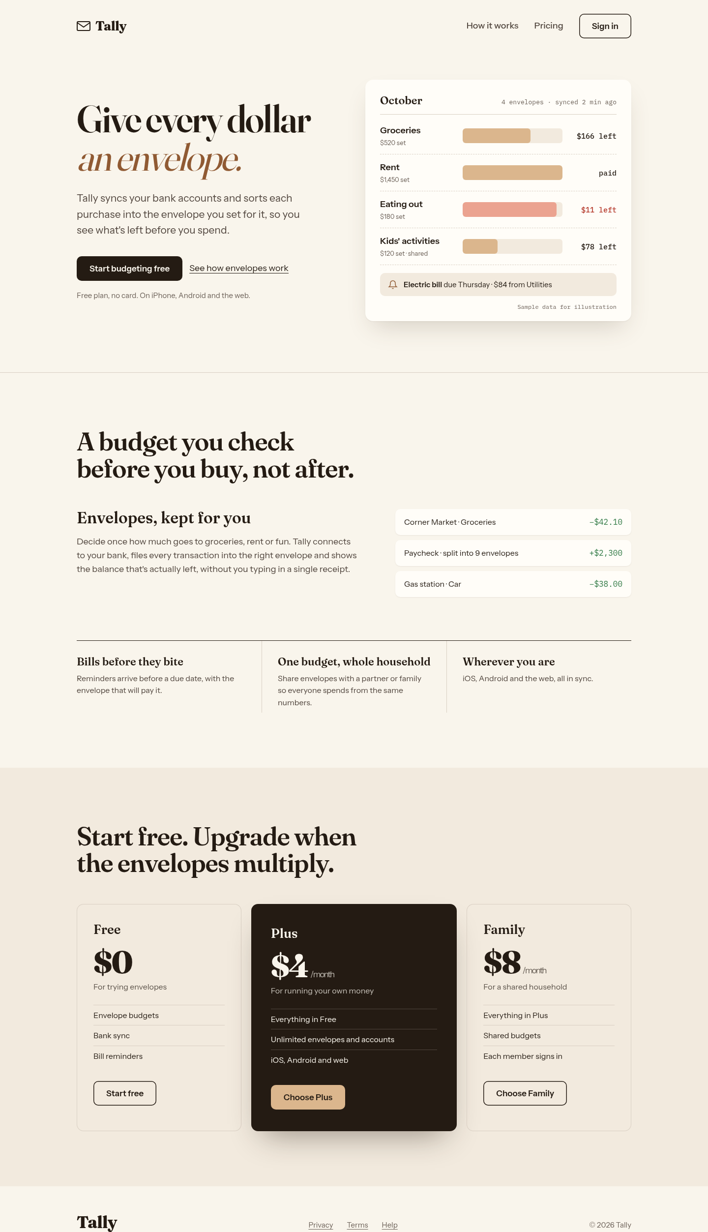
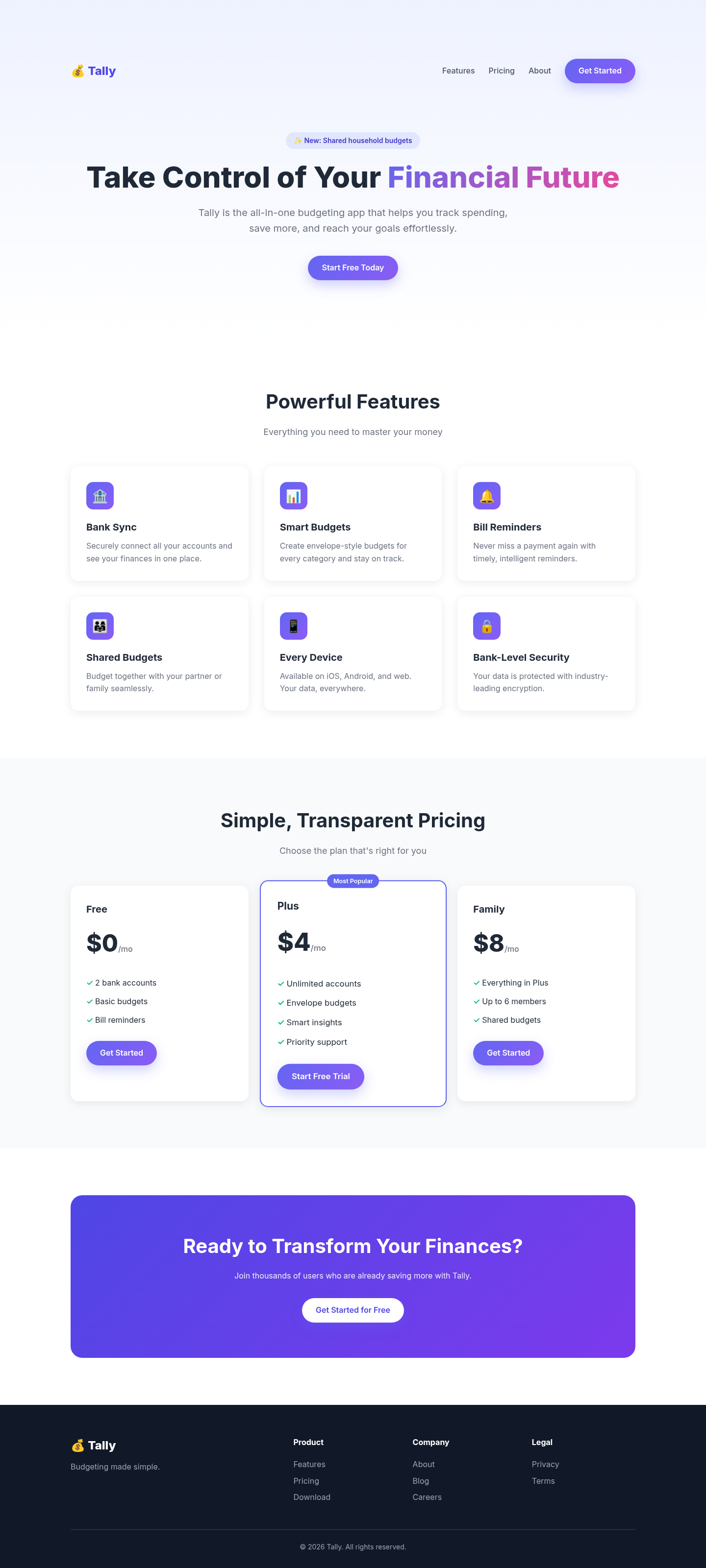
Both after shots are the Tally budgeting-app landing page, made by applying each skill's published instructions. Shared tags: Visual direction, Landing pages.
The biggest jump in the set: the generic purple SaaS template became a page built around one idea (a stack of kraft envelopes), with characterful type, a plain feature list and a comparison table instead of card grids. Its anti-default checklist visibly removed every gradient, emoji and 'Most Popular' tell from the baseline.
Threw out the gradient-and-emoji template for a warm paper 'ledger' world: the hero is a working envelope budget (labelled as sample data), features become one lead argument plus a ruled row, and pricing leads with a dark Plus plan. Distinctive and honest with copy. We followed its written rules but not its full workflow (launcher, question round, reviewer subagent), so a real run could differ.
 Skills for Design