


Apple Design (Emil Kowalski)
3/5 out of 5. Read the verdictApple's approach to interface design and fluid, physical motion, translated for the web.

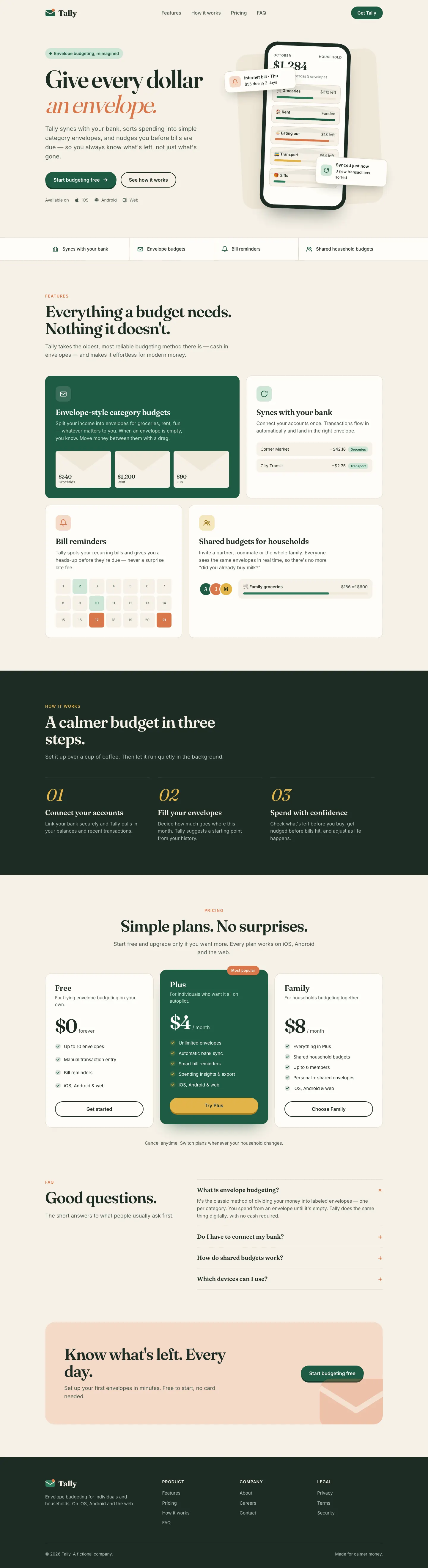
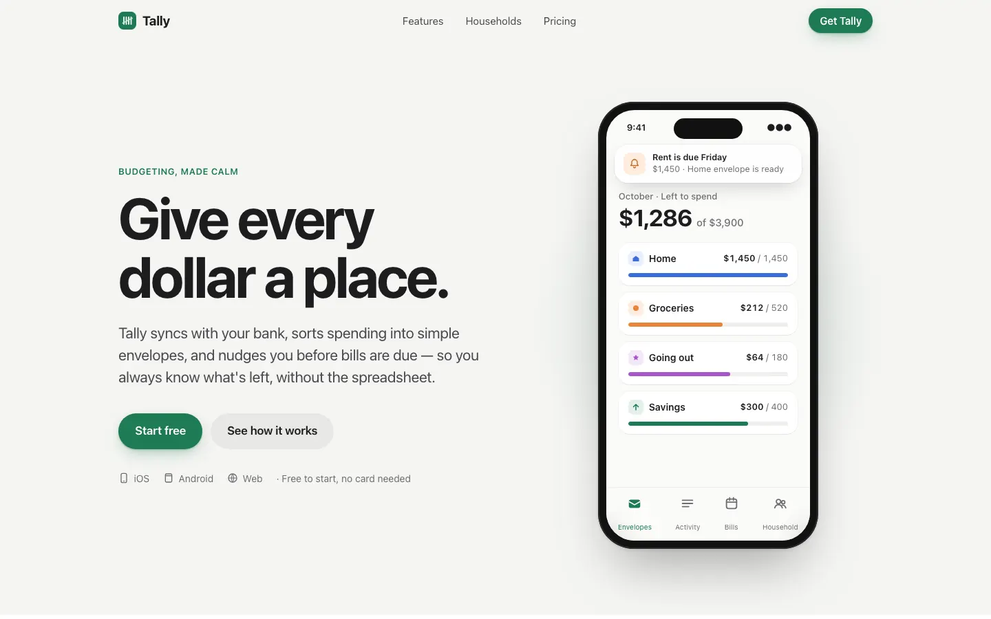
First screen only. Switch to side by side to read the full pages.
Scroll either page; the other follows.Full Apple Design (Emil Kowalski) pageFull baseline
Every skill gets the same Tally brief, alone in a clean project. How we test
Our verdict
3/5 out of 5
Passed the cut
Emil Kowalski's Apple design skill goes for the iOS feel: the system font, an off-white canvas, a green accent and a drag-to-move-money demo that behaves like a native control. The dashboard switches to Inter with Apple's system colors. Pick it if motion and touch feel matter more than a bold look.
Pick it for
- app marketing pages
- iOS companion sites
- interaction-heavy demos
- consumer apps
Skip it for
- bold brands
- editorial sites
- dense admin tools
Colors
Observations
- the dashboard switches to Inter and looks generic next to the landing page
- only slight distance from the baseline layout
Install
1 Run in your terminal
npx degit emilkowalski/skills/skills/apple-design#main .claude/skills/apple-design2 Or paste a prompt into Claude Code, Codex, Cursor or Gemini
It tells your tool to install this from its source repository.
This install is for Claude Code only; for other agents use Copy prompt or copy the skill folder.
Copies just this skill's folder into your project's .claude/skills.
Check the source for the latest instructions.
We tested the apple-design skill from this repo.
Details
- Type
- Skill
- GitHub stars
- 47,231 (Stars are for the whole emilkowalski/skills repository.)
- Updated
- 6d ago
- License
- MIT
- Best for
- Visual directionMotion and video
Test runOpus 5.5Claude Code 2.1.302Oct 18, 2026generated in 6 minabout $1.41 at API pricescommit 2d22863
Similar
Same brief, other skills
GPT Taste (Taste Skill)
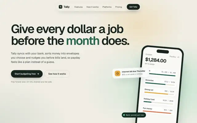
GPT Taste builds a soft, polished Tally in Geist on warm paper, with mint and amber gradients, a dark green band and a huge 'tally' wordmark in the footer. The dashboard is a clean moss-green layout. Pick it for a well-finished startup page, though the green comes straight from the default.
updated today
emilkowalski/skills
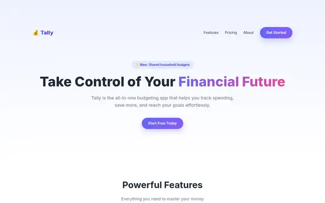
Emil's design-eng skill keeps a cream-and-forest landing page in Instrument Serif with a tilted phone, and builds a clean near-white Geist dashboard. The landing page repeats the baseline's hero overlap.
updated 6d ago
Liquid Glass Design (ECC)
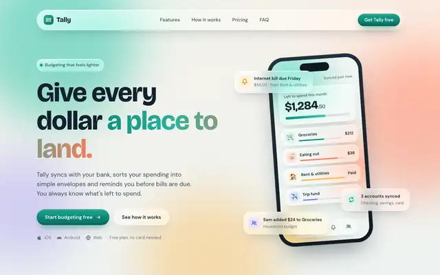
Liquid Glass Design builds Tally out of frosted glass panels floating over soft mint, peach and periwinkle light, set in Bricolage Grotesque and DM Sans. The dashboard keeps the glass in Manrope and stays readable. Pick it if you want a friendly, Apple-flavored product that looks nothing like the cream-and-serif default.
updated 2d ago
Impeccable
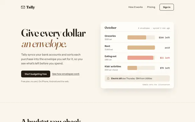
Impeccable drops the cream-and-serif default for a loud navy, orange and primary-color landing page set in heavy Archivo, then builds a calmer pine-and-lime dashboard. Pick it if you want a product page with real energy that still holds up on a dense screen.
updated 1d ago
Also for these tasks
ECC Frontend Design Direction
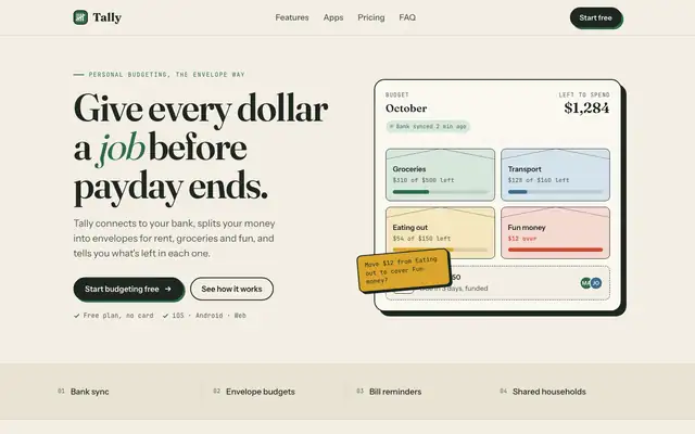
ECC keeps a Fraunces and cream landing page but adds mono labels and a tilted sticky note. The IBM Plex dashboard is more useful than the baseline's, with a sync alert, search and person filters.
Algorithmic Art (Anthropic)
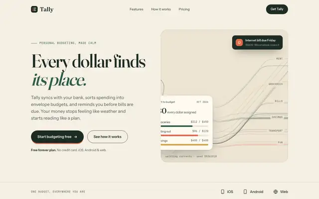
Algorithmic Art paints a seeded generative flow field across the hero, and even prints the seed, on cream with deep green, Fraunces and Instrument Sans. That art makes the landing page memorable, but the dashboard is close to the default. Pick it for a landing hero that nobody else has.
updated 8d ago
Brand Guidelines (Anthropic)
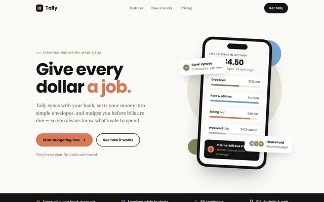
Brand Guidelines dresses Tally in Anthropic's own brand: near-black, warm off-white, orange, blue and olive, with Poppins headings over Lora body text. It's clean and consistent on both pages, but it's another company's look, and a 'Bank synced' card covers the hero balance. Pick it only if you want that Anthropic style.
updated 8d ago
Theme Factory (Anthropic)
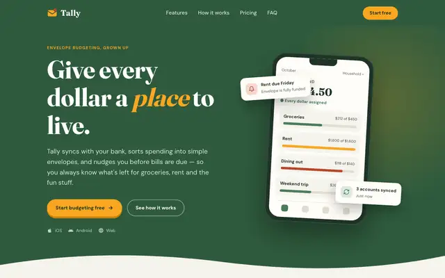
Theme Factory picked a forest-and-marigold theme for the landing page, in Fraunces and DM Sans, and a separate forest-and-olive one in Source Serif 4 and Figtree for the dashboard. Both are tidy, but they stay in the cream-and-green family of the default. A floating 'Rent due Friday' card covers the hero balance. Pick it for quick, warm theming.
updated 8d ago