


Garden Web Design Engineer
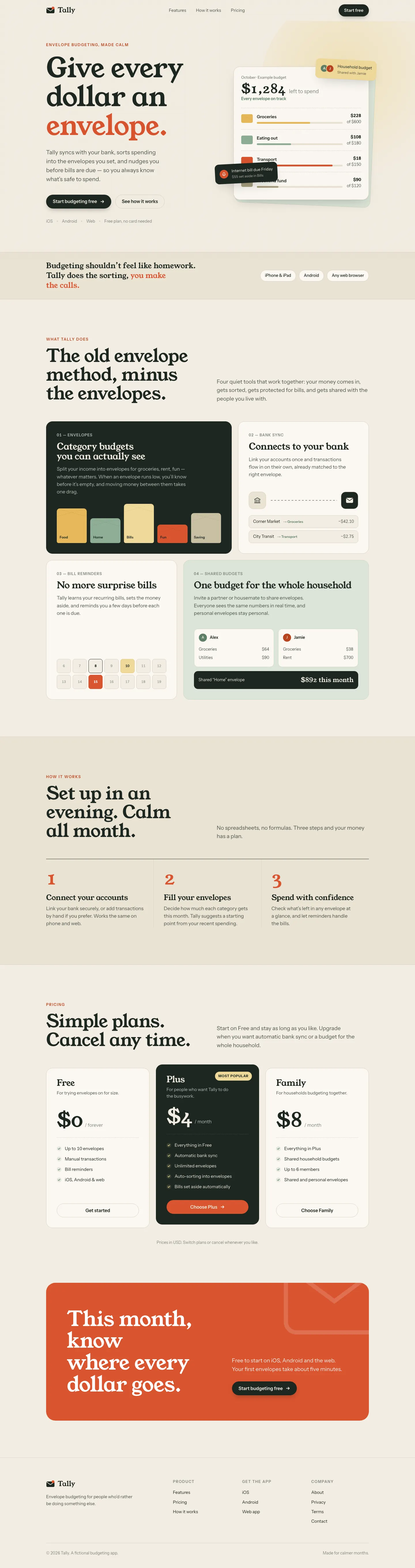
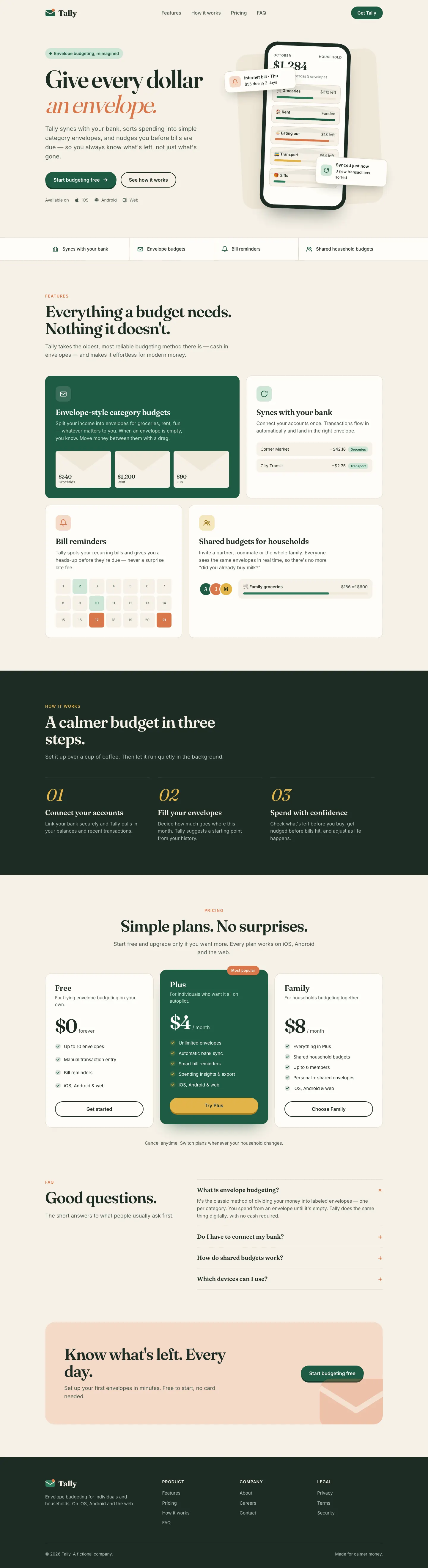
3/5 out of 5. Read the verdictGarden's web-design-engineer trades Fraunces for Young Serif and adds an orange-red accent with sage.
First screen only. Switch to side by side to read the full pages.
Scroll either page; the other follows.Full Garden Web Design Engineer pageFull baseline
Every skill gets the same Tally brief, alone in a clean project. How we test
Our verdict
3/5 out of 5
Passed the cut
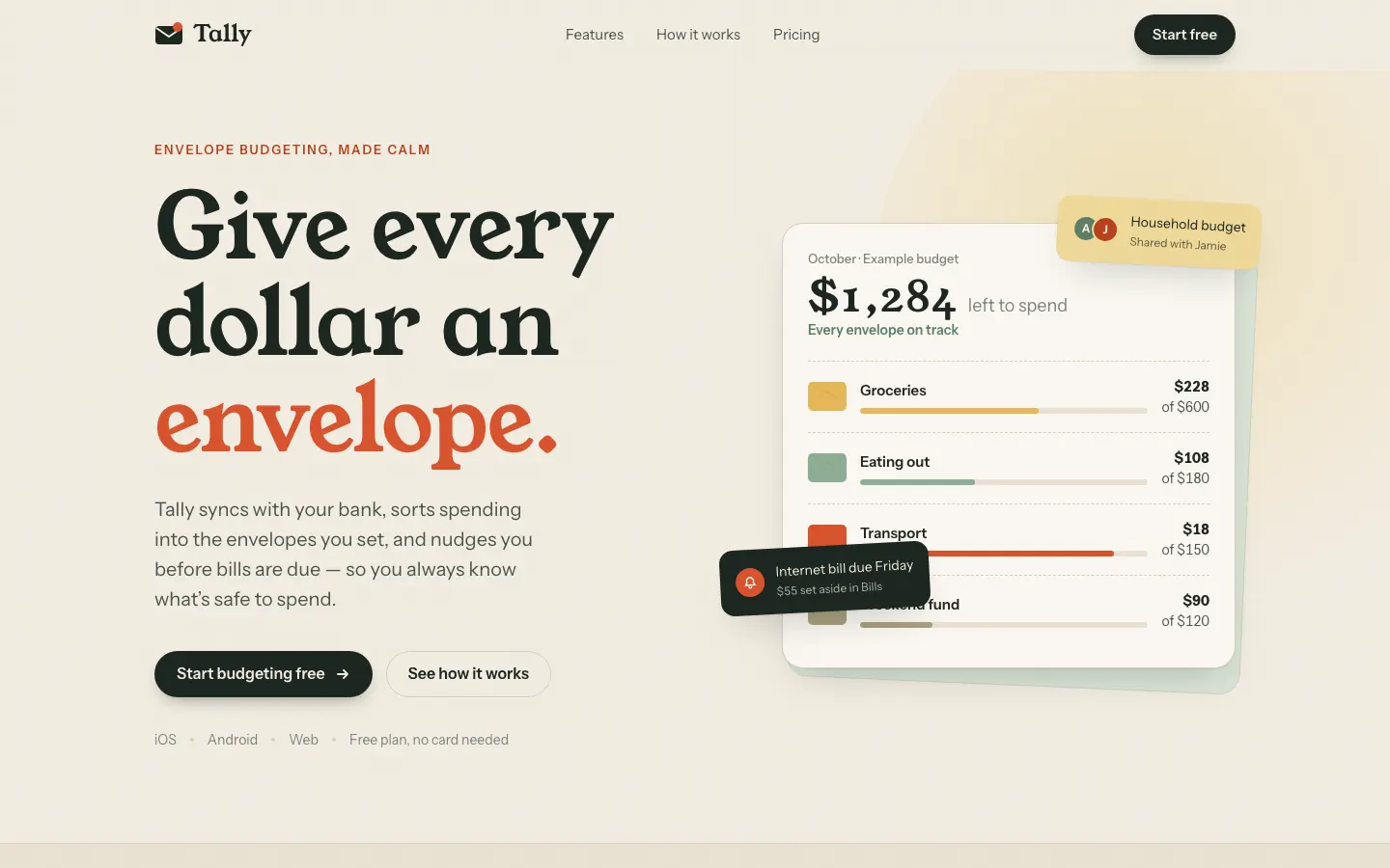
Garden's web-design-engineer trades Fraunces for Young Serif and adds an orange-red accent with sage. It's a warm variation on the default, and it repeats the default's habit of a hero card covering the mockup.
Compare with HallmarkPick it for
- personal finance
- food and lifestyle brands
- small consumer SaaS
Skip it for
- dense pro dashboards
- dev tools
- bold or dark brands
Typography
- Young Serif
- Instrument Sans
- Instrument Serifdashboard
- Hanken Groteskdashboard
Colors
Observations
- landing hero: the dark "Internet bill due Friday" card covers the Weekend fund row
- landing mobile: the CTA buttons wrap to three lines
Install
1 Run in your terminal
npx degit ConardLi/garden-skills/skills/web-design-engineer#main .claude/skills/web-design-engineer2 Or paste a prompt into Claude Code, Codex, Cursor or Gemini
It tells your tool to install this from its source repository.
This install is for Claude Code only; for other agents use Copy prompt or copy the skill folder.
Taken from the project README. Check the source for the latest instructions.
Details
- Type
- Skill
- GitHub stars
- 12,948
- Updated
- Unknown
- License
- Not listed
- Best for
- Visual directionLanding pages
Test runOpus 5.5Claude Code 2.1.302Oct 17, 2026generated in 5 minabout $1.24 at API pricescommit 7a6d5a7
Similar
Same brief, other skills
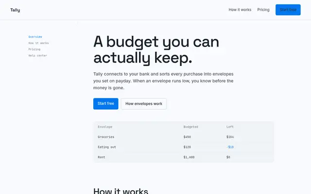
Impeccable
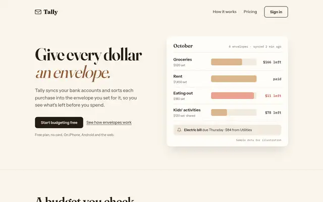
Impeccable drops the cream-and-serif default for a loud navy, orange and primary-color landing page set in heavy Archivo, then builds a calmer pine-and-lime dashboard. Pick it if you want a product page with real energy that still holds up on a dense screen.
updated 1d ago
Hallmark
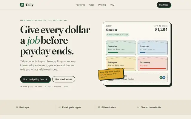
Hallmark turns Tally into a cheerful yellow-and-pastel brand in Plus Jakarta Sans with big ghost numerals, and the dashboard matches it. The most consistent result in the set, but it took about 12 minutes per brief.
updated 2mo ago
ECC Frontend Design Direction
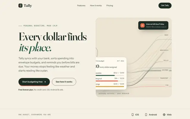
ECC keeps a Fraunces and cream landing page but adds mono labels and a tilted sticky note. The IBM Plex dashboard is more useful than the baseline's, with a sync alert, search and person filters.
Algorithmic Art (Anthropic)
Algorithmic Art paints a seeded generative flow field across the hero, and even prints the seed, on cream with deep green, Fraunces and Instrument Sans. That art makes the landing page memorable, but the dashboard is close to the default. Pick it for a landing hero that nobody else has.
updated 8d ago
Also for these tasks
Antislop UI
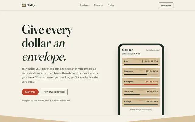
Antislop UI keeps the baseline's paper and serif but cleans it up: no overlapping hero cards, a working "assign $2,000" slider demo, honest placeholder copy and a dashboard that leads with what to do about the $640. Better made, still close to the default look.
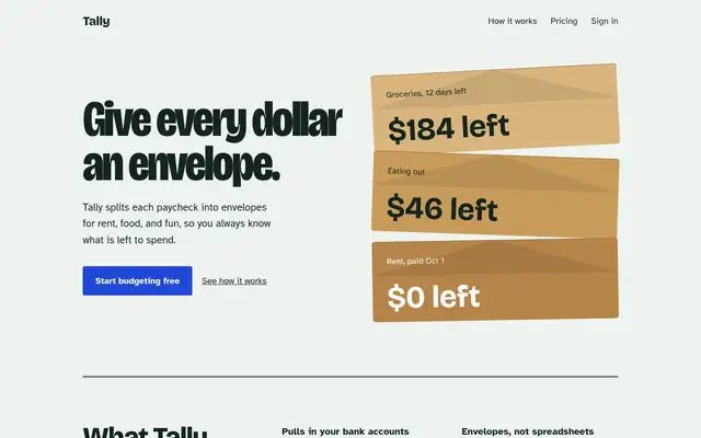
frontend-design (Anthropic)
Anthropic's frontend-design gives Tally a mint-and-pastel landing page and a navy-and-manila ledger dashboard, both clearly new. The mobile landing page is wider than the phone, which caps the score.
updated 8d ago
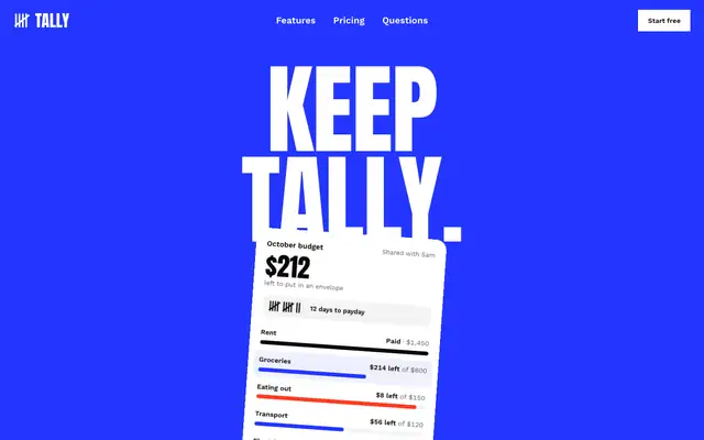
Taste Skill (design-taste-frontend)
Taste makes the boldest landing page in the set, a white Swiss poster with giant Anton type, electric blue and red. The dashboard looks like a different skill made it, and it scrolls sideways on a phone.
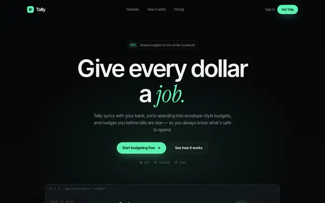
Background Grid WebGL (Meng To)
Background Grid WebGL puts a perspective grid fading into the dark behind the hero, with mint accents and Instrument Serif headlines over Inter Tight. The dashboard keeps the dark look in Manrope. The mobile dashboard scrolls sideways. Pick it for a tech launch page with atmosphere.
updated today