


shadcn/ui (Stitch Skills)
3/5 out of 5. Read the verdictGuidance for building with shadcn/ui components: discovery, installation and customization.
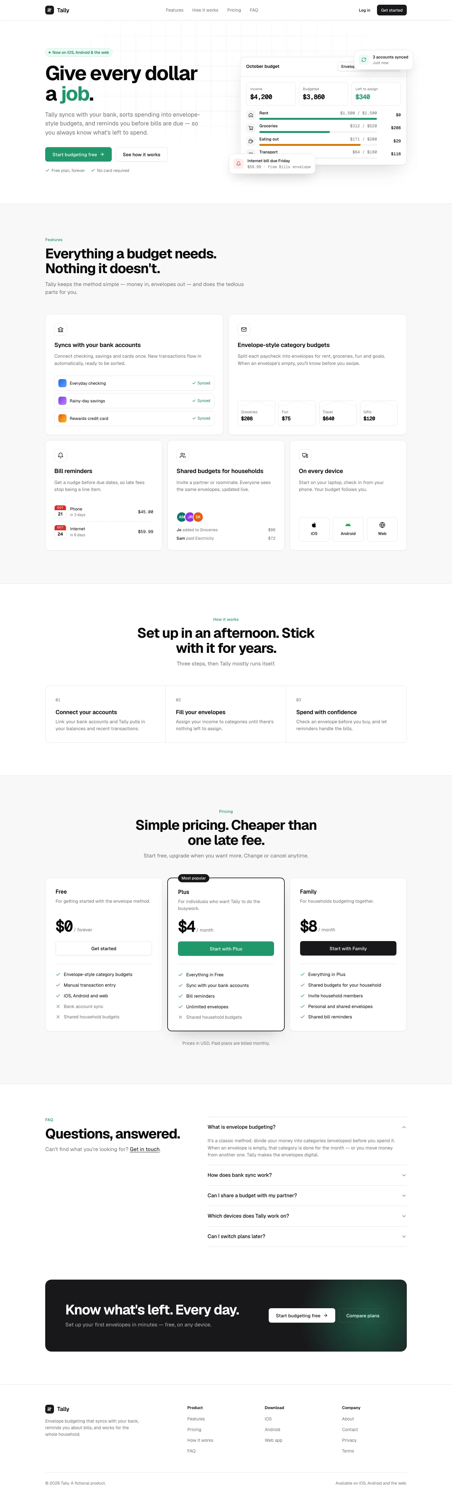
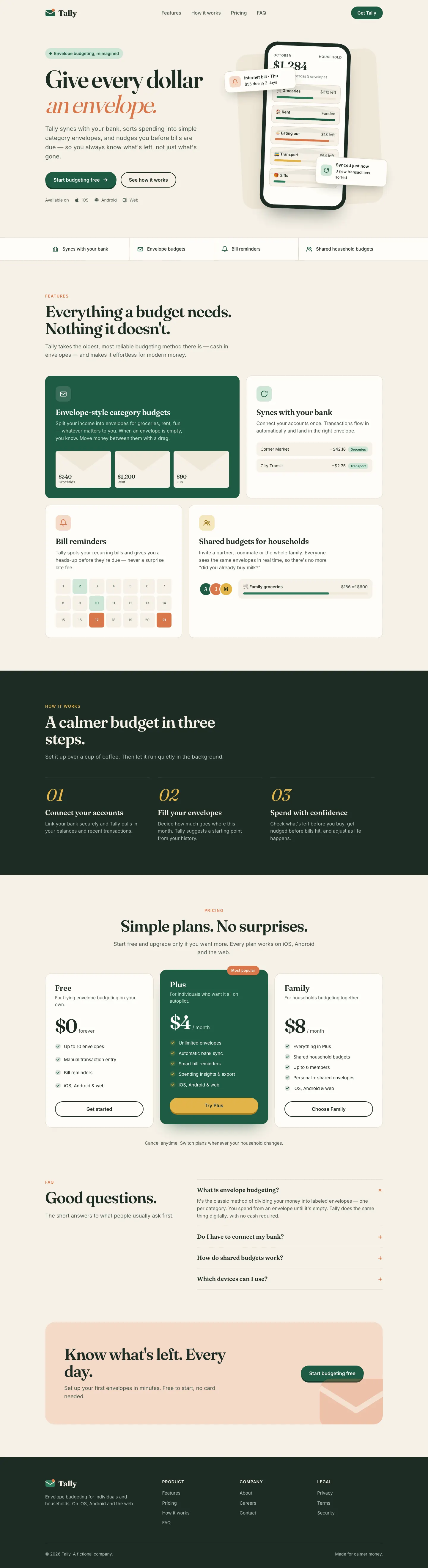
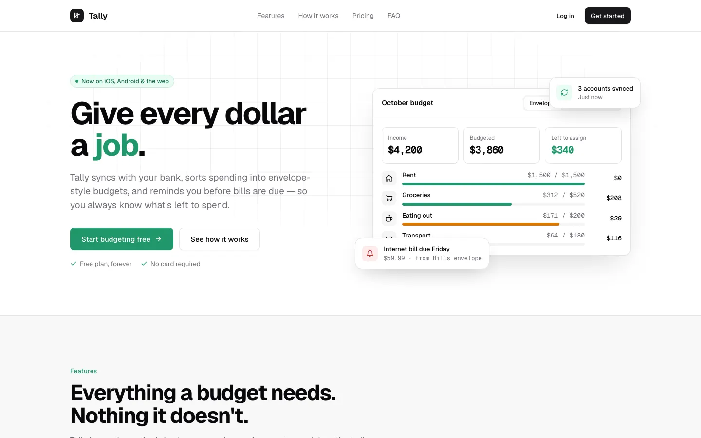
First screen only. Switch to side by side to read the full pages.
Scroll either page; the other follows.Full shadcn/ui (Stitch Skills) pageFull baseline
Every skill gets the same Tally brief, alone in a clean project. How we test
Our verdict
3/5 out of 5
Passed the cut
The shadcn/ui skill builds a neat, neutral shadcn-style Tally in Geist: white cards, zinc greys and one green brand color. It's tidy and consistent, but generic, and the mobile dashboard scrolls sideways. Pick it if you're building on shadcn and want that house style done right.
Pick it for
- React and shadcn projects
- internal tools
- SaaS dashboards
- admin panels
Skip it for
- brand-led marketing
- distinct visual identity
- editorial sites
Typography
Colors
Observations
- dashboard mobile: 628 px wide on a 390 px screen, so it scrolls sideways
- looks like the shadcn defaults with a brand color
Install
1 Run in your terminal
npx degit google-labs-code/stitch-skills/plugins/stitch-build/skills/shadcn-ui#main .claude/skills/shadcn-ui2 Or paste a prompt into Claude Code, Codex, Cursor or Gemini
It tells your tool to install this from its source repository.
This install is for Claude Code only; for other agents use Copy prompt or copy the skill folder.
Copies just this skill's folder into your project's .claude/skills.
Check the source for the latest instructions.
We tested the shadcn-ui skill from this repo.
Details
- Type
- Skill
- GitHub stars
- 8,542 (Stars are for the whole google-labs-code/stitch-skills repository.)
- Updated
- 2mo ago
- License
- Apache-2.0
- Best for
- Design systemsDashboards
Test runOpus 5.5Claude Code 2.1.302Oct 18, 2026generated in 6 minabout $1.28 at API pricescommit 0337446
Similar
Same brief, other skills
claude-design-system-prompt
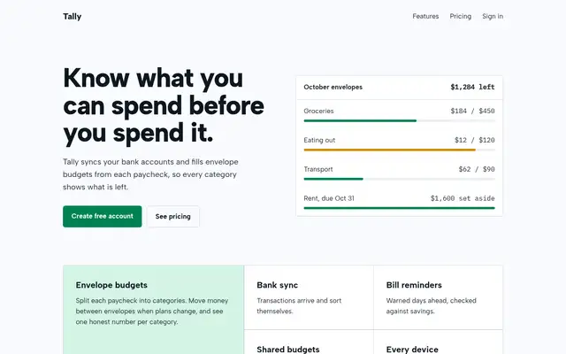
This system prompt moves Tally to a cool grey-and-ink look with Bricolage Grotesque, Geist and a lime marker, and the dashboard is clean and well organized. One contrast bug on the closing CTA keeps it from a higher score.
updated 3mo ago
Theme Factory (Anthropic)
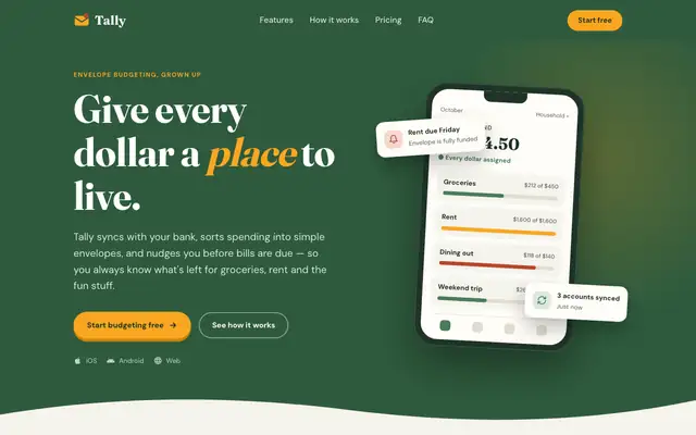
Theme Factory picked a forest-and-marigold theme for the landing page, in Fraunces and DM Sans, and a separate forest-and-olive one in Source Serif 4 and Figtree for the dashboard. Both are tidy, but they stay in the cream-and-green family of the default. A floating 'Rent due Friday' card covers the hero balance. Pick it for quick, warm theming.
updated 8d ago
Stitch Design Taste (Taste Skill)
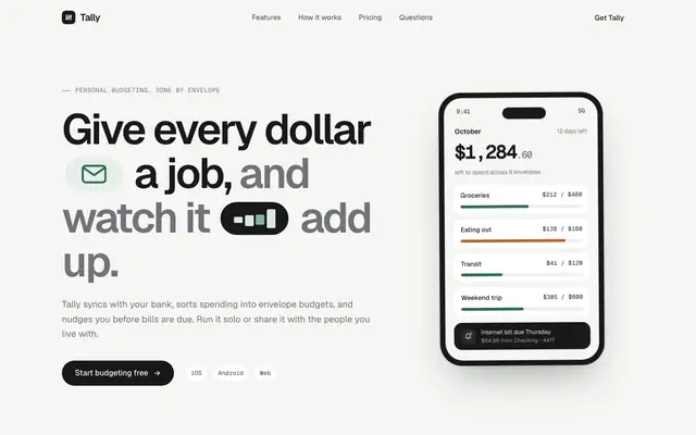
Taste Skill's copy of the Stitch taste skill gives almost the same page as the Google Labs version: Geist on warm off-white, a deep green accent, crisp cards and a quiet dashboard. Pick it if you want clean, modern SaaS pages; pick either this or Stitch's original, not both.
updated today
Taste Design (Stitch Skills)
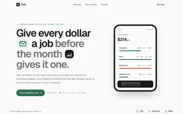
Stitch's taste skill swaps the cream-and-serif default for Geist on a near-white canvas, with a deep green accent and small icon chips set right into the headline. The dashboard is calm and consistent with the landing. Pick it if you want clean, current SaaS polish and don't need a strong personality.
updated 2mo ago
Also for these tasks
ux-ui-agent-skills
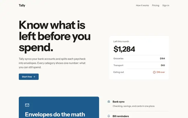
Once loaded, UX/UI Agent Skills pulls three of its skills (design-screen, design-doctrine, data-dashboard) and produces a careful, well-reasoned version of the default: Newsreader serif, ink green and ochre, and a dashboard that explains pace and what is unassigned. Solid work, though it still reads as the familiar cream-and-green look.
updated 7d ago
material-3-skill
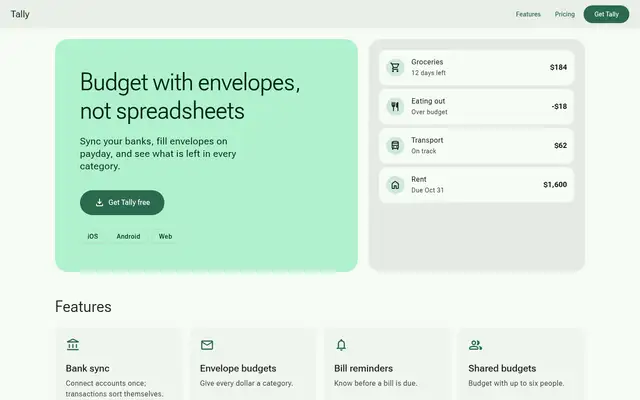
Material 3 applies a full tonal M3 system in Roboto Flex, and the dashboard is dense and solid. On the landing page, icon names print as text and a hero card still covers the balance.
updated 3mo ago
Glass Dark UI (Meng To)
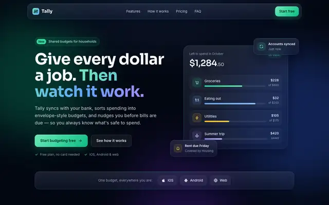
Glass Dark UI turns Tally into a dark navy product with frosted panels and gradient borders, lit by green, blue and violet accents. Text stays readable on both pages. Pick it if you want a polished dark interface, but expect it to look like plenty of other dark SaaS sites.
updated today
styleseed
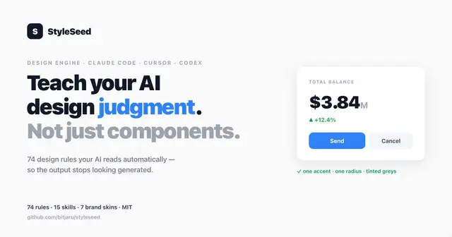
StyleSeed gives Tally a warm blush canvas, Plus Jakarta Sans and a deep green primary, with a full token set behind it. It's clean, with slight distance from the baseline, and the dashboard in Manrope matches. It was the longest run in the batch. Pick it if you want a design-system workflow more than a bold look.
updated 3d ago