

- Listed skills
- 51
- Best score
- 4/5
About
Meng To is a designer and educator in Singapore. Founded Design+Code, which teaches designers to code and developers to design, and has since built the AI products Aura and DreamCut.
Is this you? Claim your listings for a followed link to your site.
All 51 skillsby score
3D Metal Material (Meng To)
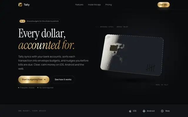
3D Metal Material gives Tally a dark studio look: Instrument Serif headlines with brass accents and a slowly tilting brushed-steel card in the hero, drawn live with WebGL. The dashboard puts the $640 on a machined steel plate and uses steel, brass and copper finishes on the bars and buttons. It feels premium and is consistent across both pages. Pick it when you want one rich 3D centerpiece on a dark product page.
updated today
Agency Grid Layout Minimal (Meng To)
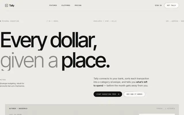
Agency Grid Layout Minimal turns Tally into a Swiss-style studio page: grey paper, huge light Inter Tight headlines with a darker second line, hairline rules and JetBrains Mono labels. The dashboard is the same: a giant "$640 left to budget", thin progress lines and one black bar in the chart. Pick it if you want a calm, typographic product page that looks designed rather than templated.
updated today
Book Serif Index (Meng To)
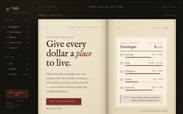
Book Serif Index lays Tally out as an open ledger: aged paper pages inside a dark leather frame, IM Fell English and EB Garamond on the landing, Cormorant Garamond and Newsreader on the dashboard, with mono chapter numbers and an oxblood accent. The dashboard reads like a page of accounts, drop cap included. It is the most committed idea in this batch. Pick it for products that want warmth, history or craft.
updated today
Documentary Brutalist Agency (Meng To)
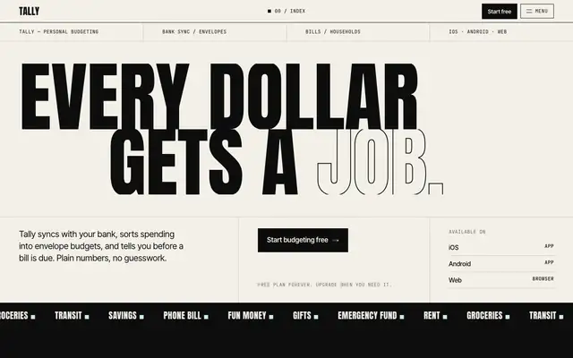
Documentary Brutalist Agency shouts in the best way: "EVERY DOLLAR GETS A JOB" in giant Anton capitals, hard black and paper chapters, numbered sections and mono captions. The dashboard keeps it, with a huge $640, black rule-framed panels and a mint bills card. Pick it if you want a poster-loud brand and can live with a budgeting app that feels like a culture magazine.
updated today
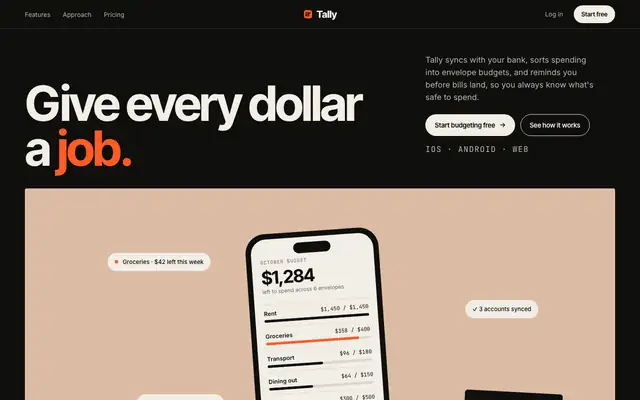
Editorial Portfolio Chapters (Meng To)
Editorial Portfolio Chapters tells the Tally story in color-blocked chapters: clay, sage, mist and ochre panels on a black page, Inter Tight headlines and a hot orange signal color. The dashboard carries the same muted chapter colors into the envelope bars and ends on a big orange call to action. Pick it if you want a confident, art-directed product that still reads cleanly.
updated today
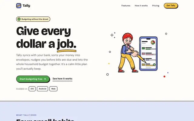
Illustration: Outlined Cartoon (Meng To)
The Outlined Cartoon skill draws its own SVG people and objects, with thick black outlines and flat yellow, periwinkle, red and green fills, and builds the whole page around them: chunky Bricolage Grotesque, hard offset shadows and sticker-like cards. The dashboard keeps the cartoon, down to a little character in the summary card. Pick it if you want a friendly, playful product that looks hand-made.
updated today
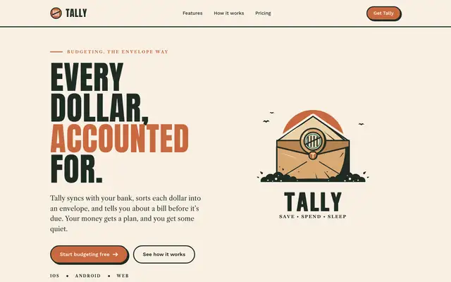
Illustration: Vintage Emblem (Meng To)
The Vintage Emblem skill gives Tally a heritage badge, a sealed envelope inside a stamped emblem, and builds a print-shop brand around it: Anton capitals, Libre Caslon text, cream stock, deep forest ink and terracotta. The dashboard wears the same badge and colors, with Oswald headings. Pick it for brands that want craft, trust and a little nostalgia.
updated today
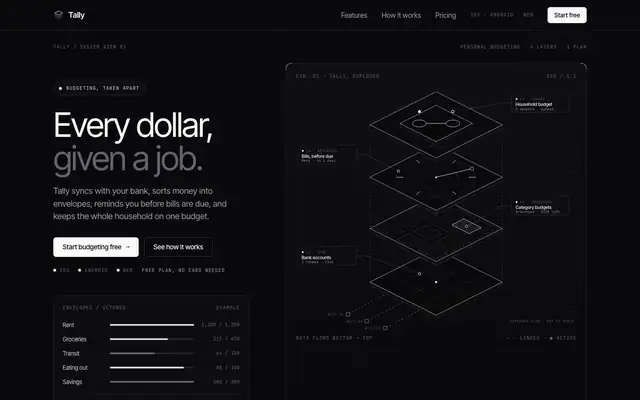
Technical Wireframe Info Layout (Meng To)
Technical Wireframe Info Layout draws Tally as an engineering diagram: exploded isometric wireframes, thin connector lines, JetBrains Mono labels and pure grey-on-black panels with no accent color at all. The dashboard stacks the envelopes as wireframe discs with callouts. Pick it if your product is technical and you want it to look precise and expensive.
updated today
3D Paper Material (Meng To)
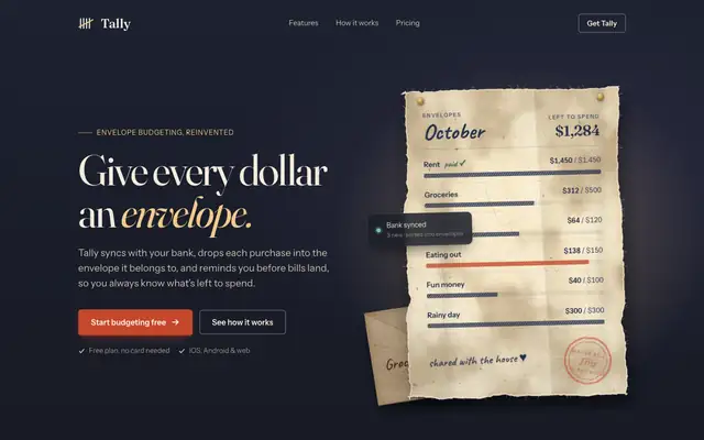
3D Paper Material turns Tally into paper on a wall: a dark, warmly lit hero with a torn washi budget sheet, cotton-rag feature slips held by washi tape, kraft envelopes and vermilion stamps. The dashboard is a paper desk with ledger-paper charts. The craft feel is real, but it is drawn with CSS and SVG rather than 3D, and both mobile pages scroll sideways. Pick it for warm, handmade brands.
updated today
3D Sky Rays (Meng To)
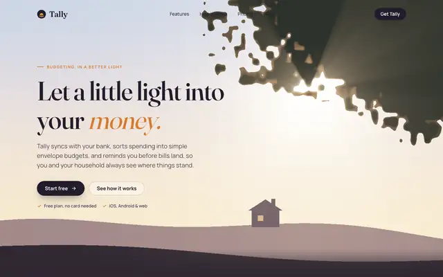
3D Sky Rays gives Tally a golden-hour hero: a live WebGL scene with sunlight through a tree canopy over a rooftop and hills, then a cream and dusk page with Fraunces and Manrope. The dashboard puts the October summary in a sunlit banner with rays through leaves. The hero is lovely, though the rest of each page is a warm cream look close to the default. Pick it for a calm, cinematic hero.
updated today
3D Underwater God Rays (Meng To)
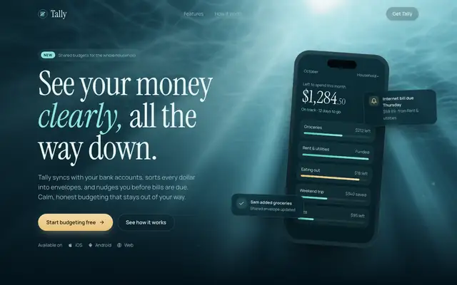
3D Underwater God Rays sets Tally in deep water: teal-black colors, Instrument Serif headlines, sand-colored buttons and a live WebGL hero with light shafts drifting down. The dashboard has translucent panels over the same moving light, with aqua for progress and coral for the over-budget envelope. It is atmospheric and consistent, but the mobile dashboard scrolls sideways. Pick it for calm, premium dark brands.
updated today

3D Wood Lighting Scorecard (Meng To)
3D Wood Lighting Scorecard gives Tally a warm still life: a dark walnut desk lit by one window in the hero, with a phone and paper envelopes casting soft shadows, then cream sections with Fraunces and amber. The dashboard is paper and walnut with an amber current month. It is warm and clean, but it is CSS rather than 3D, and on the dashboard the agent said it did not use the skill. Pick it for cozy, warm brands.
updated today
Framed Tech Dark Border Gradient (Meng To)
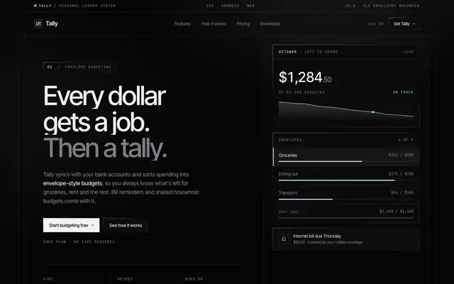
Framed Tech gives Tally a near-black page inside one framed shell: thin edge rails, corner markers, 1px gradient borders and uppercase mono labels, with a sparse mint accent. The dashboard uses the same framed shell, mint for money left and coral for overspending. It is clean and precise, but both mobile pages scroll sideways. Note that the landing and dashboard come from two different test days. Pick it for developer and infra products.
updated today
High Contrast Skeuomorphic Clean (Meng To)
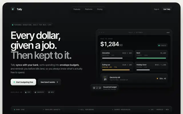
High Contrast Skeuomorphic gives Tally a dark charcoal app shell on a warm light-grey page, with molded panels, thin edge highlights, recessed wells and one mint-green signal color. The dashboard uses the same molded shell with a lime accent and coral for overspending. It is clean and tactile on both pages. Pick it for premium, hardware-like product pages.
updated today
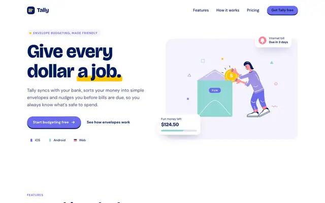
Illustration: Flat (Meng To)
Illustration: Flat gives Tally a cut-paper look: white and pale lavender, navy text, and a hero of a woman dropping a coin into a "FUN" envelope, with small flat drawings on each feature. The dashboard uses the same lavender, indigo, yellow, coral and mint for the envelopes. It is friendly and clean. Pick it when you want custom spot illustrations without hiring an illustrator.
updated today
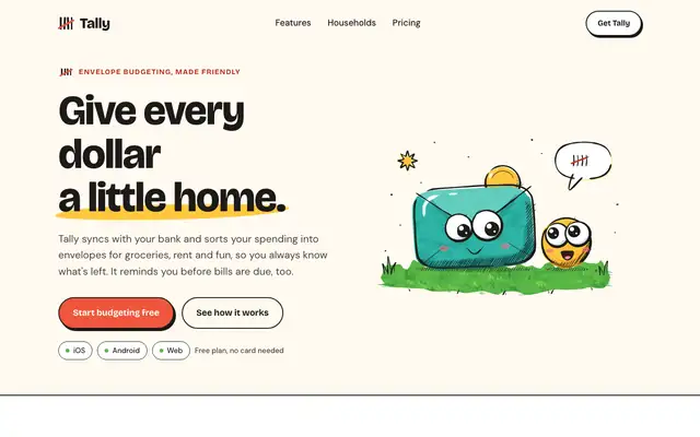
Illustration: Ink Sketch (Meng To)
Illustration: Ink Sketch gives Tally hand-inked mascots: a googly-eyed envelope with a coin buddy, a ringing alarm clock and two critters sharing a budget, with chunky Bricolage Grotesque and ink-outlined sticker buttons on warm paper. The dashboard has an envelope critter waving on grass. It is charming, but the mobile dashboard scrolls sideways and the inline drawings make the pages heavy. Pick it for playful brands.
updated today
Blue Cloudy Clean Modern (Meng To)
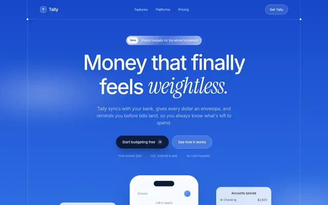
Blue Cloudy Clean Modern sets Tally in a bright blue sky: soft cloud gradients, white frosted cards, Inter with Instrument Serif italics for the accents. The dashboard keeps the whole sky behind glass panels. It is far from the default and very calm. Pick it for products that want to feel light and reassuring.
updated today

Blue Laser Clean Glass Layout (Meng To)
Blue Laser Clean Glass Layout puts Tally on near-black with a thin blue light beam, frosted glass panels and Inter Tight with mono labels. The dashboard is the stronger page: clear cards, blue bars and readable tables. The mobile dashboard scrolls sideways. Pick it for technical or premium dark products.
updated today
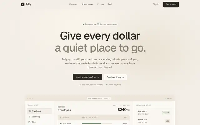
Clean Minimal Beige Light Mode (Meng To)
Clean Minimal Beige Light Mode keeps Tally soft and quiet: warm beige shells, Geist on the landing and Inter Tight on the dashboard, a muted sage accent and one dark panel for emphasis. It is closer to the default than most, but the sans type and calm grid set it apart. Pick it for understated products that want to feel calm.
updated today
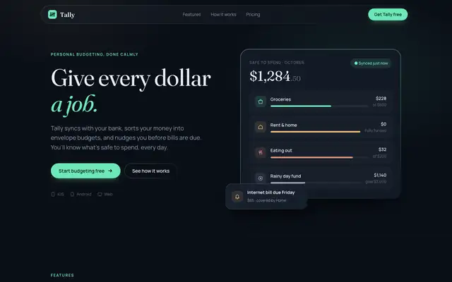
CSS Border Gradient (Meng To)
CSS Border Gradient takes Tally dark: deep navy panels with faint mint-edged gradient borders, Fraunces headlines over Manrope on the landing and Inter on the dashboard, with mint, amber and coral accents. The dashboard is clean and colorful without getting loud. Pick it if you want a polished dark product with a soft glow.
updated today
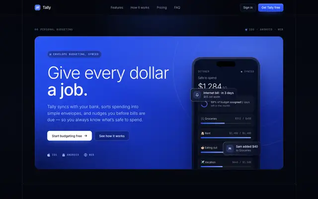
Dark Blue Contrasting Clean (Meng To)
Dark Blue Contrasting Clean gives Tally a deep navy page with bright cobalt gradient blocks, crisp frames, Inter and lots of JetBrains Mono labels. The dashboard leads with a cobalt summary card and stays clear and readable. Pick it for confident, technical-feeling products.
updated today
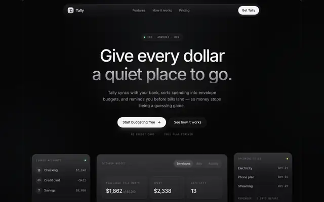
Dark Glass Clean Layout (Meng To)
Dark Glass Clean Layout is the neutral version of dark mode: near-black zinc surfaces, frosted cards, Inter with mono labels and almost no color beyond a pale green. It looks expensive and quiet, but both pages scroll sideways on a phone. Pick it for premium, understated products.
updated today
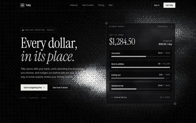
Dither Background (Meng To)
Dither Background turns Tally black and white with a grainy, pixel-dithered glow behind the hero and the closing panel, Instrument Serif italics over Inter Tight, and Geist on the dashboard. The dashboard keeps it monochrome, with one orange warning. Pick it for products that want a moody, print-like dark look.
updated today

Dither Laser Dark Mode (Meng To)
Dither Laser Dark Mode lights a near-black Tally with a warm amber laser line and soft dither texture, set in Inter Tight with mono labels. The dashboard switches the accent to green, which loses some of the landing's character. Pick it for dark technical products with one strong accent.
updated today
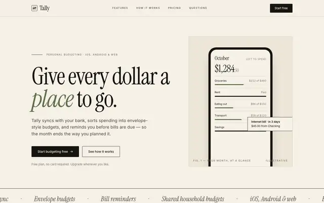
Editorial Service Booking (Meng To)
Editorial Service Booking gives Tally a quiet magazine look: warm paper, large Instrument Serif headlines with italics, Inter text, black chapters and a muted olive and rust accent. It sits close to the default's cream and serif, but the editorial layout and the black bands make it clearly its own. Pick it for calm, premium service brands.
updated today
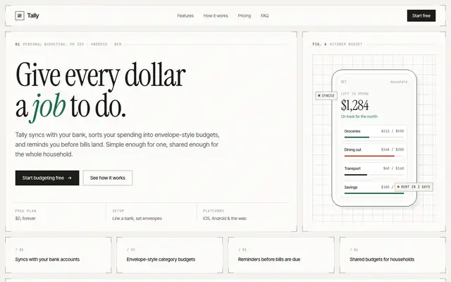
Framed Grid Layout (Meng To)
Framed Grid Layout puts every part of Tally inside thin ruled frames with corner brackets, on a pale off-white page, with Instrument Serif italics, Inter Tight and lots of mono labels. The dashboard is neat and technical, with a deep green accent and a rust warning color. Pick it if you like an architectural, blueprint-tidy look.
updated today
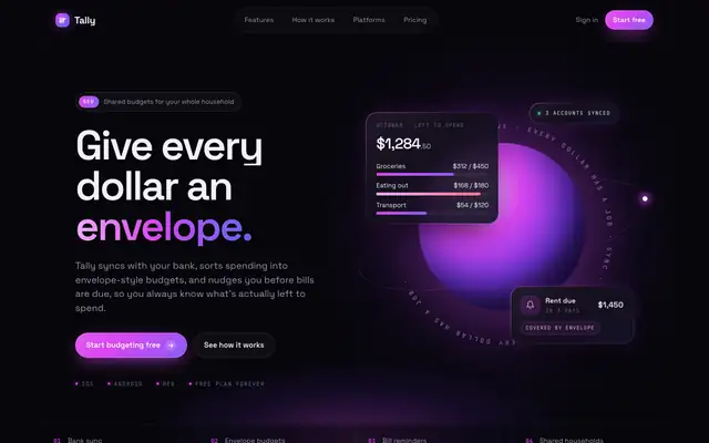
Funky Purple Container Tech (Meng To)
Funky Purple Container Tech goes full neon: a near-black page, a glowing purple orb in the hero, fuchsia and violet accents, Space Grotesk and lots of JetBrains Mono. The dashboard keeps the orb and the purple bars. It is fun and far from the default, but both pages scroll sideways on a phone. Pick it for playful tech or crypto products.
updated today
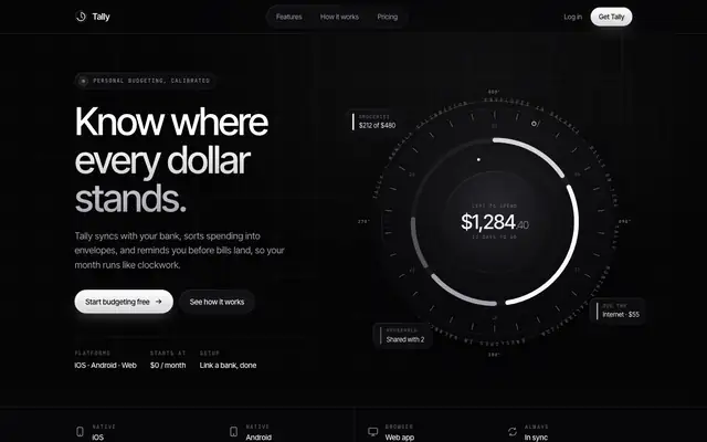
Glass Dark Mode Clock (Meng To)
Glass Dark Mode Clock builds Tally around an instrument dial: a big circular gauge in the hero and again on the dashboard, frosted black glass, Inter Tight and mono labels, no accent color. The dashboard's dial showing $3,182 spent is the best single idea here. The landing scrolls sideways a little on a phone. Pick it for premium dark products that like a watch-face feel.
updated today
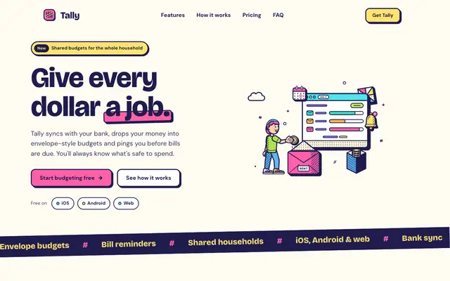
Illustration: Bold Pop (Meng To)
The Bold Pop skill draws pop-art scenes in navy outline with hot pink, lemon and lime fills, and builds a loud, cheerful Tally around them: Bricolage Grotesque, thick navy borders and hard offset shadows. The dashboard keeps every bit of it. The landing scrolls sideways a little on a phone. Pick it for playful consumer brands that want to be noticed.
updated today
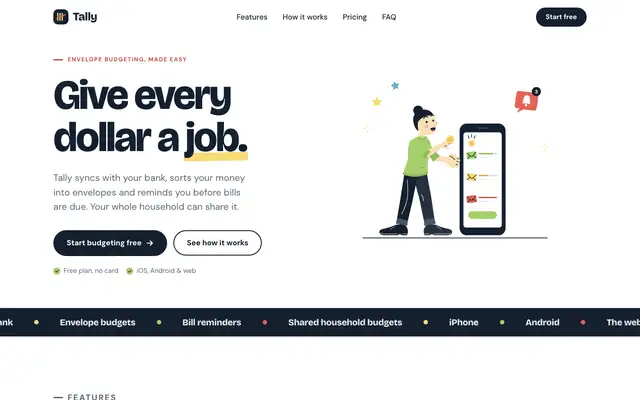
Illustration: Flat With Black (Meng To)
The Flat With Black skill draws tall, flat-vector people in denim, yellow and black, and pairs them with a clean white Tally in Bricolage Grotesque and DM Sans, yellow highlights and a navy footer. The dashboard keeps the illustrations and the yellow accents, but scrolls sideways on a phone. Pick it for friendly, modern product sites.
updated today
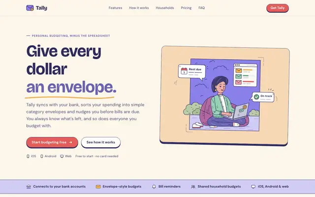
Illustration: Framed Panel (Meng To)
The Framed Panel skill draws cosy cartoon scenes inside framed cards, in navy line with lavender, peach and coral, and wraps Tally in a soft lavender-and-cream page with Bricolage Grotesque. The dashboard places a scene in the summary card and keeps the palette. Pick it for gentle, friendly consumer products.
updated today
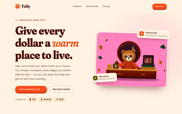
Illustration: Grainy Gouache (Meng To)
The Grainy Gouache skill paints a little bear at a desk in grainy, riso-like SVG and builds a warm Tally around it: pink, vermilion and sand on cream, Fraunces headlines and deep maroon panels. The dashboard keeps the bear and the warm palette. The mobile dashboard scrolls sideways slightly. Pick it for cosy, characterful consumer brands.
updated today
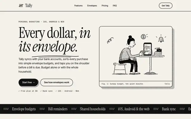
Illustration: Halftone Line (Meng To)
The Halftone Line skill draws black line art with halftone dot shading and keeps Tally strictly two-color: black ink on warm paper, Instrument Serif headlines, mono captions and heavy rules. The dashboard follows with Newsreader and IBM Plex. It reads like a printed zine. Pick it for editorial or craft brands that like ink on paper.
updated today
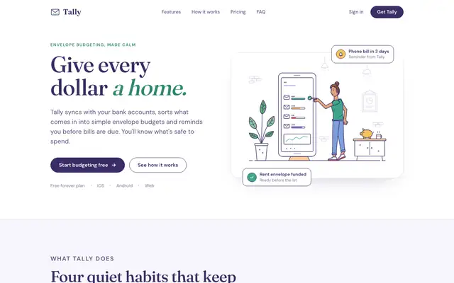
Illustration: Line Interior (Meng To)
The Line Interior skill draws airy room scenes in thin purple line, and gives Tally a light, calm page to match: white and pale lavender, Fraunces headlines, DM Sans text, teal, coral and mustard accents. The dashboard keeps a scene in the summary card. Pick it for calm, friendly products that want a little warmth.
updated today
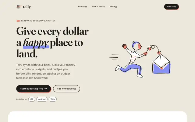
Illustration: One Line (Meng To)
The One Line skill draws cheerful figures in a single continuous line with coral and periwinkle shapes, on a warm paper Tally with Fraunces headlines and a scribbled underline. The dashboard switches to Bricolage Grotesque and keeps the figures. It shares the default's paper and serif, but the drawings give it its own voice. Pick it for warm, upbeat consumer brands.
updated today
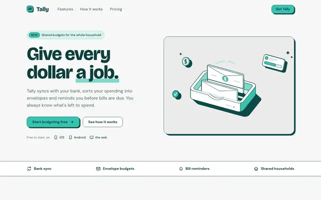
Illustration: Teal Spot (Meng To)
The Teal Spot skill draws a single hero object, a wallet with coins, in deep teal outline and mint fills, and builds a clean teal-and-white Tally with Bricolage Grotesque and hard teal shadows. The dashboard reuses the object and the palette. The mobile dashboard scrolls sideways. Pick it for clear, friendly fintech.
updated today
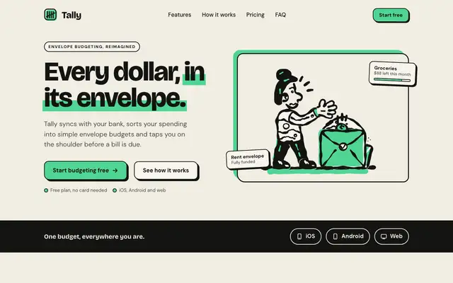
Illustration: Two-Colour Brush (Meng To)
The Two-Colour Brush skill draws marker-style scenes in black ink and bright mint, and keeps all of Tally to those two colors on warm paper, with Bricolage Grotesque headlines and mint underlines. The dashboard keeps the character in the summary card. Pick it for friendly products that want a bold, hand-drawn look on a tight palette.
updated today
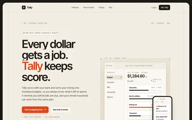
Light Mode Paper Technical (Meng To)
Light Mode Paper Technical frames a warm paper Tally inside a dark border, with Inter Tight, many JetBrains Mono labels, bracketed panels and one red-orange accent. The dashboard is neat and technical, like a well-made instrument panel in daylight. Pick it if you want a technical product that still feels warm.
updated today
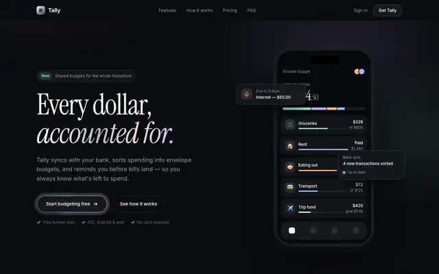
Liquid Metal Border (Meng To)
Liquid Metal Border gives Tally a dark, quiet look with shimmering metallic edges on key cards, Instrument Serif italics over Inter and soft pastel accents. The dashboard is clean dark mode in Inter Tight with mono labels. The skill is written for a React package, so in our single HTML file the metal is a CSS stand-in. Pick it for premium dark products.
updated today
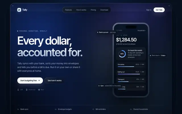
Mesh Gradient Dark Blue Clean (Meng To)
Mesh Gradient Dark Blue Clean sets Tally on a deep navy mesh gradient, with frosted shells, Inter Tight and mono labels, and pale blue highlights. The dashboard is clean and readable, with a glowing summary card and soft blue bars. Pick it for premium tech or fintech products.
updated today
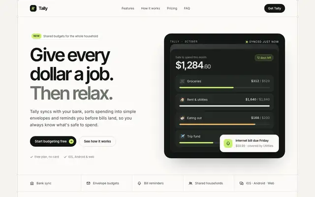
Nested Container Clean Agency (Meng To)
Nested Container Clean Agency builds Tally from rounded boxes inside boxes: an off-white shell with inset near-black panels, Inter Tight headlines and a bright lime accent. The dashboard is crisp, with a dark summary block and lime highlights. The mobile dashboard scrolls sideways slightly. Pick it for modern SaaS and agency sites.
updated today
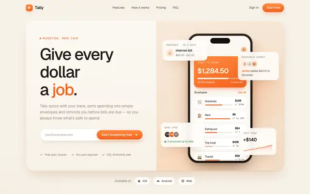
Orange Clean Paper SaaS (Meng To)
Orange Clean Paper SaaS gives Tally a warm, soft SaaS page: paper-toned neutrals, Geist type, rounded cards with soft shadows and a bright orange accent. The dashboard is friendly and clear, with orange bars and a glowing summary card. Pick it for approachable SaaS that wants warmth without a serif.
updated today
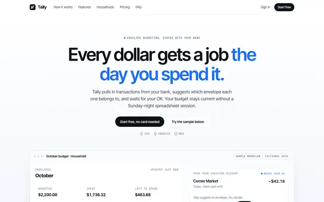
Product Proof SaaS (Meng To)
Product Proof SaaS puts the product first: a white page with a large, readable app screen right under the headline, Inter Tight, mono labels and a single blue accent. The dashboard is clean Geist with blue bars and a clear overspend alert. It is focused and credible, if plain, and the mobile dashboard scrolls sideways. Pick it for SaaS pages that need to show the product working.
updated today
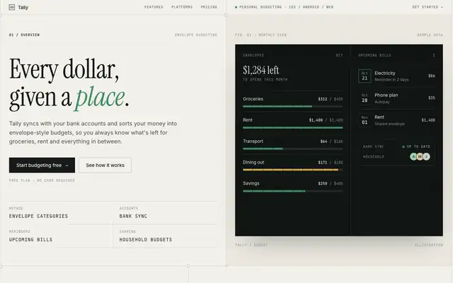
Split Layout Technical (Meng To)
Split Layout Technical pairs light paper columns with dark canvas panels side by side, set in Instrument Serif italics, Inter and mono metadata. The dashboard is a sharp two-panel layout with an amber accent and a dark chart panel. Both mobile pages run a few pixels too wide. Pick it for technical products with an editorial streak.
updated today
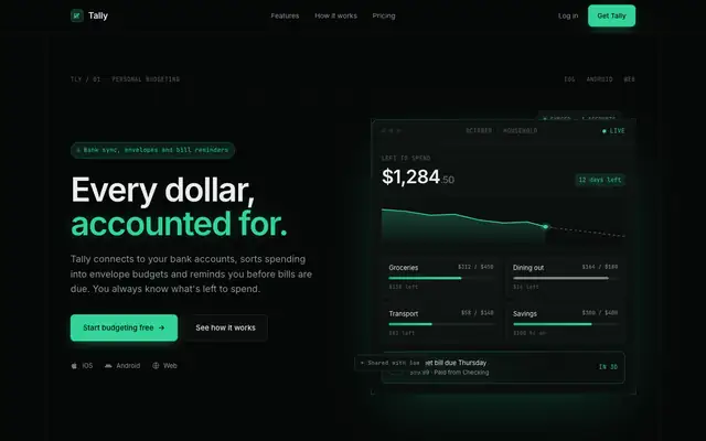
Tech Green Dark Mode Modern (Meng To)
Tech Green Dark Mode Modern gives Tally a matte-black developer-tool look with emerald accents, Inter and heavy use of JetBrains Mono. The dashboard is the stronger page, with clear framed cards, emerald bars and a red overspend tag. Pick it for technical products; it is a familiar style, done cleanly.
updated today

Background Grid WebGL (Meng To)
Background Grid WebGL puts a perspective grid fading into the dark behind the hero, with mint accents and Instrument Serif headlines over Inter Tight. The dashboard keeps the dark look in Manrope. The mobile dashboard scrolls sideways. Pick it for a tech launch page with atmosphere.
updated today
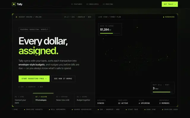
Bright Green Tech System (Meng To)
Bright Green Tech System is the furthest from the default in this batch: a near-black HUD with hard-framed panels, JetBrains Mono labels and a lime glow, plus a WebGL visual in the hero. It reads like a dev tool more than a budgeting app, and the mobile dashboard scrolls sideways. Pick it if your product is technical and you want it to look it.
updated today
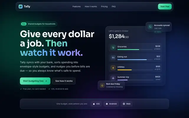
Glass Dark UI (Meng To)
Glass Dark UI turns Tally into a dark navy product with frosted panels and gradient borders, lit by green, blue and violet accents. Text stays readable on both pages. Pick it if you want a polished dark interface, but expect it to look like plenty of other dark SaaS sites.
updated today
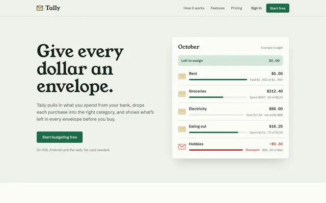
No AI Design Slop (Meng To)
No AI Design Slop moves off the default with sage paper, Young Serif headlines, Schibsted Grotesk and manila-envelope cards that suit a budgeting app. The dashboard switches to Newsreader and Public Sans but keeps the sage and green. Pick it if you want warmth with more character than most of this batch.
updated today
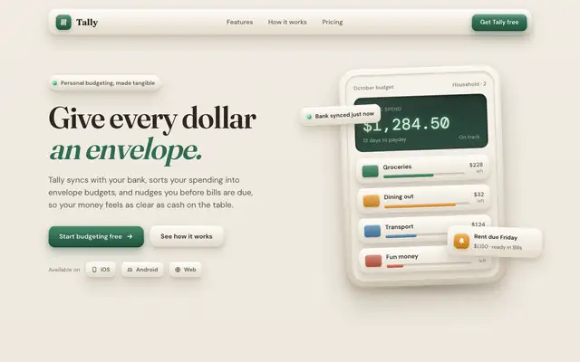
Skeuomorphic UI (Meng To)
Skeuomorphic UI gives Tally tactile beige surfaces, embossed buttons and stacked shadows, in Fraunces and DM Sans, with a Manrope dashboard. It's a real texture change from the baseline, but the green and the serif stay, and the mobile dashboard scrolls sideways. Pick it for a playful, physical feel.
updated today
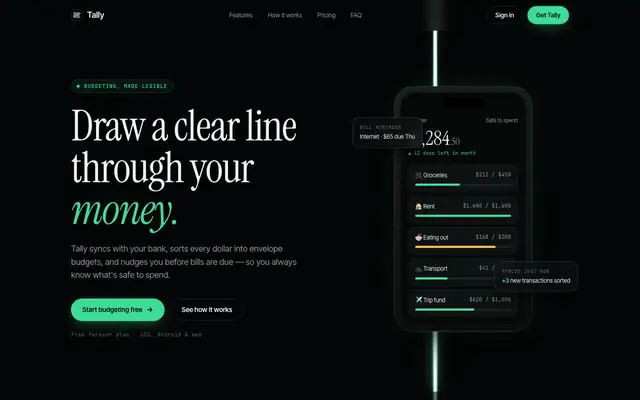
WebGL Laser (Meng To)
WebGL Laser runs a white-hot vertical beam with a mint halo down a near-black page, with Instrument Serif headlines over Inter Tight. It's striking on desktop, but on a phone the beam crosses the hero text, and the mobile dashboard scrolls sideways. Pick it for a launch page hero, not for the app itself.
updated today