


Agency Grid Layout Minimal (Meng To)
4/5 out of 5. Read the verdictA minimal agency design system: a strict editorial grid, oversized type, quiet uppercase labels and restrained image blocks.
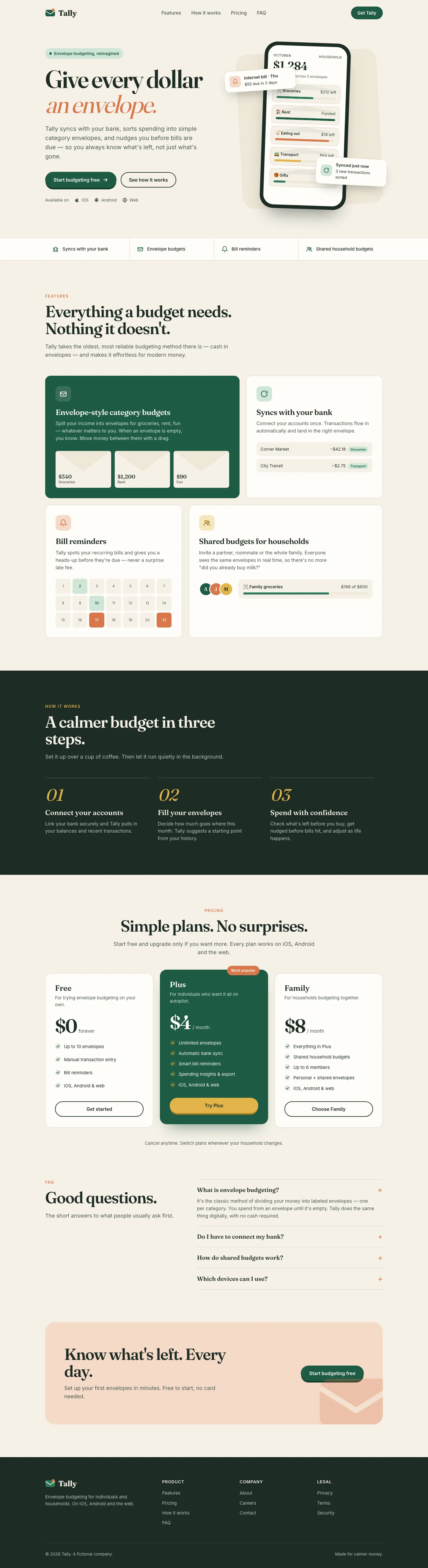
First screen only. Switch to side by side to read the full pages.
Scroll either page; the other follows.Full Agency Grid Layout Minimal (Meng To) pageFull baseline
Every skill gets the same Tally brief, alone in a clean project. How we test
Our verdict
4/5 out of 5
Passed the cut
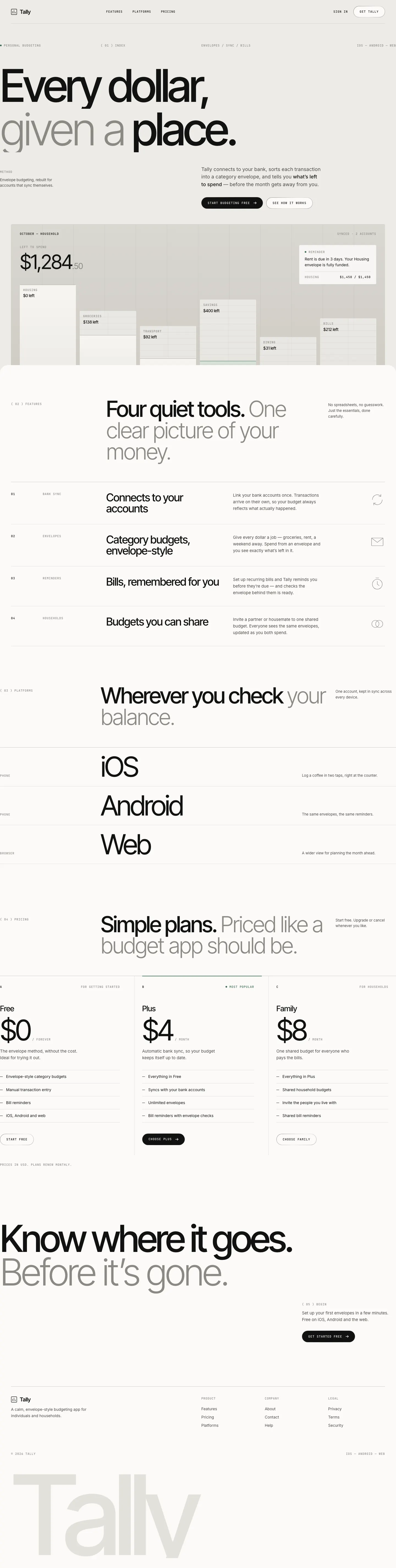
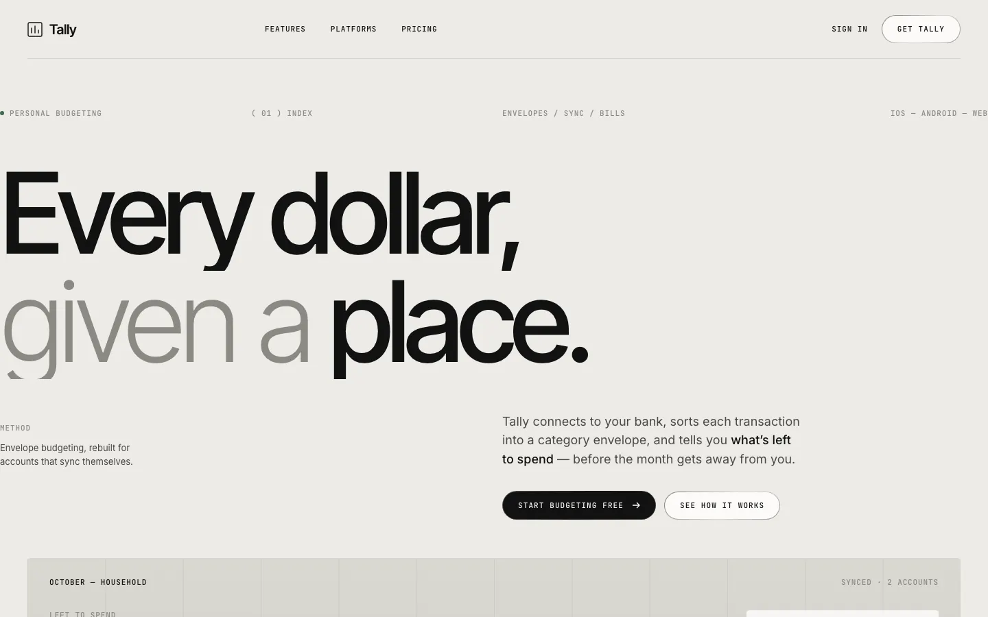
Agency Grid Layout Minimal turns Tally into a Swiss-style studio page: grey paper, huge light Inter Tight headlines with a darker second line, hairline rules and JetBrains Mono labels. The dashboard is the same: a giant "$640 left to budget", thin progress lines and one black bar in the chart. Pick it if you want a calm, typographic product page that looks designed rather than templated.
Compare with claude-design-system-promptPick it for
- agency and studio sites
- portfolio and case-study pages
- minimal SaaS landing pages
- finance and analytics dashboards
Skip it for
- playful consumer brands
- image-heavy marketing pages
- dark-mode products
Typography
Colors
Observations
- landing: the light grey type on grey paper is low contrast in places
- landing: the hero product shot is a pale wireframe that says little at a glance
Install
1 Run in your terminal
npx degit MengTo/Skills/agent-skills/web-design/agency-grid-layout-minimal#main .claude/skills/agency-grid-layout-minimal2 Or paste a prompt into Claude Code, Codex, Cursor or Gemini
It tells your tool to install this from its source repository.
This install is for Claude Code only; for other agents use Copy prompt or copy the skill folder.
Copies just this skill's folder into your project's .claude/skills.
Check the source for the latest instructions.
We tested the agency-grid-layout-minimal skill from this repo.
Details
- Type
- Skill
- GitHub stars
- 6,824 (Stars are for the whole MengTo/Skills repository.)
- Updated
- today
- License
- MIT
- Best for
- Visual direction
Test runOpus 5.5Claude Code 2.1.302Oct 18, 2026generated in 5 minabout $1.06 at API pricescommit 83a47fe
Similar
Same brief, other skills
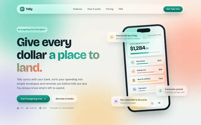
Liquid Glass Design (ECC)
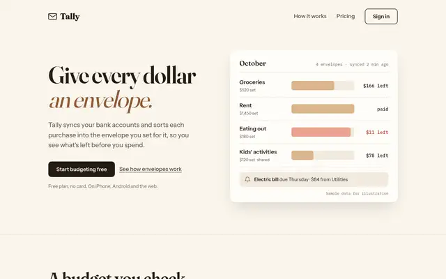
Liquid Glass Design builds Tally out of frosted glass panels floating over soft mint, peach and periwinkle light, set in Bricolage Grotesque and DM Sans. The dashboard keeps the glass in Manrope and stays readable. Pick it if you want a friendly, Apple-flavored product that looks nothing like the cream-and-serif default.
updated 2d ago
Impeccable
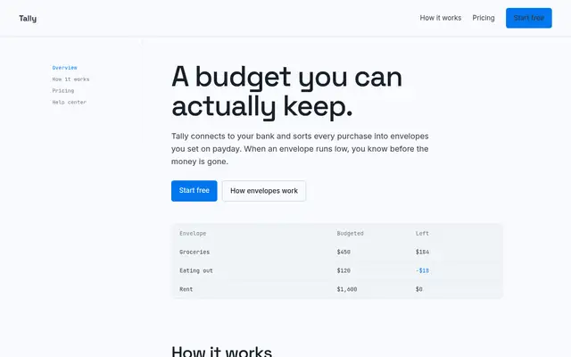
Impeccable drops the cream-and-serif default for a loud navy, orange and primary-color landing page set in heavy Archivo, then builds a calmer pine-and-lime dashboard. Pick it if you want a product page with real energy that still holds up on a dense screen.
updated 1d ago
Hallmark
Hallmark turns Tally into a cheerful yellow-and-pastel brand in Plus Jakarta Sans with big ghost numerals, and the dashboard matches it. The most consistent result in the set, but it took about 12 minutes per brief.
updated 2mo ago
Huashu Design
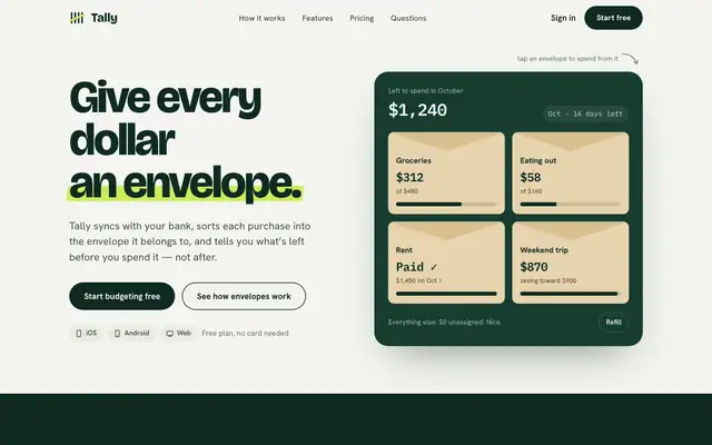
Huashu swaps Fraunces for Bricolage Grotesque and puts a lime highlighter on a deep forest green. It keeps envelopes as real kraft cards and carries the look into a tidy dashboard. A safe, distinct choice for consumer finance.
updated 4d ago
Also for these tasks
Bright Green Tech System (Meng To)
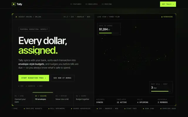
Bright Green Tech System is the furthest from the default in this batch: a near-black HUD with hard-framed panels, JetBrains Mono labels and a lime glow, plus a WebGL visual in the hero. It reads like a dev tool more than a budgeting app, and the mobile dashboard scrolls sideways. Pick it if your product is technical and you want it to look it.
updated today
Book Serif Index (Meng To)
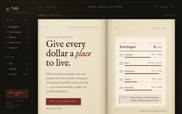
Book Serif Index lays Tally out as an open ledger: aged paper pages inside a dark leather frame, IM Fell English and EB Garamond on the landing, Cormorant Garamond and Newsreader on the dashboard, with mono chapter numbers and an oxblood accent. The dashboard reads like a page of accounts, drop cap included. It is the most committed idea in this batch. Pick it for products that want warmth, history or craft.
updated today
Split Layout Technical (Meng To)
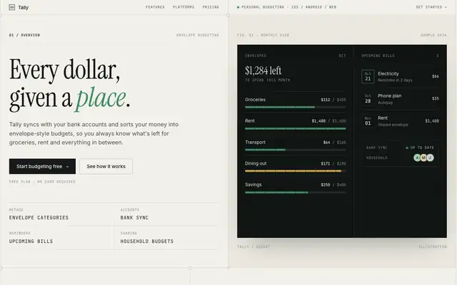
Split Layout Technical pairs light paper columns with dark canvas panels side by side, set in Instrument Serif italics, Inter and mono metadata. The dashboard is a sharp two-panel layout with an amber accent and a dark chart panel. Both mobile pages run a few pixels too wide. Pick it for technical products with an editorial streak.
updated today
Clean Minimal Beige Light Mode (Meng To)
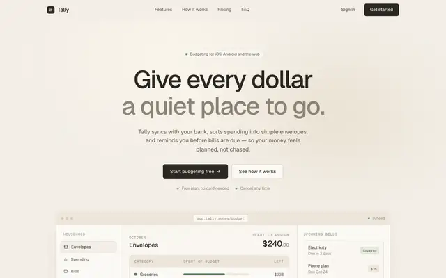
Clean Minimal Beige Light Mode keeps Tally soft and quiet: warm beige shells, Geist on the landing and Inter Tight on the dashboard, a muted sage accent and one dark panel for emphasis. It is closer to the default than most, but the sans type and calm grid set it apart. Pick it for understated products that want to feel calm.
updated today