
No Slop UI
3/5 out of 5. Read the verdictLight slate and white, one teal accent, Inter throughout and plain 1px borders. For SaaS products and internal tools.
Made by 
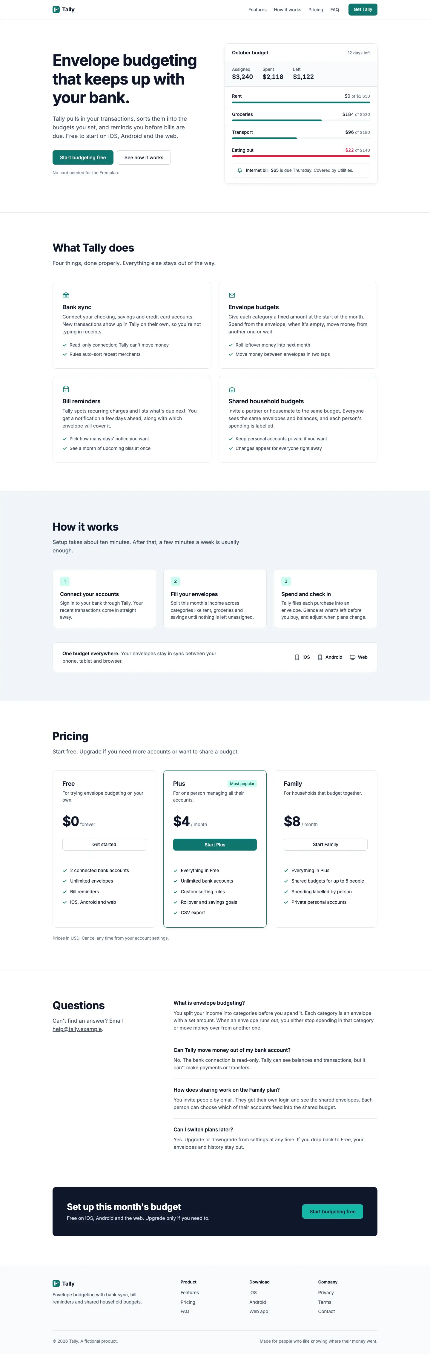
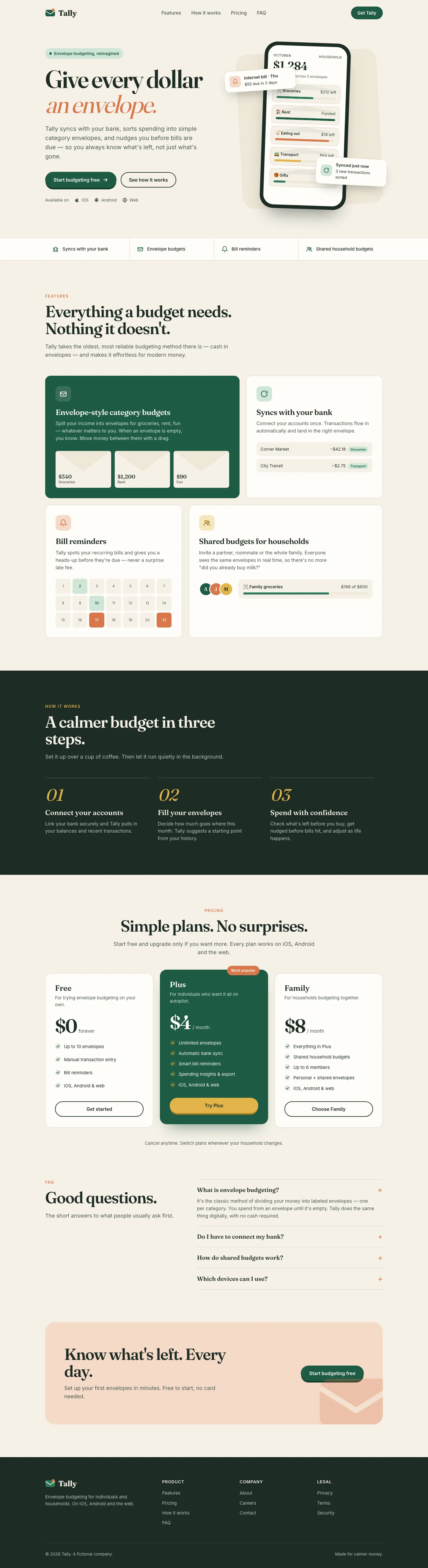
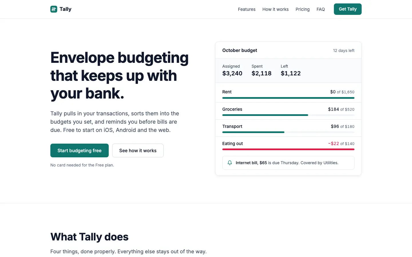
First screen only. Switch to side by side to read the full pages.
Scroll either page; the other follows.
Every skill gets the same Tally brief, alone in a clean project. How we test
Our verdict
3/5 out of 5
Passed the cut
No Slop UI gives Tally a restrained, Linear-style product: Inter only, light slate #f1f5f9 and white, one teal #0f766e accent, 1px borders and small radii, with an HTML budget card instead of a phone in the hero. The dashboard matches, with a single income bar, rose only for the over-budget envelope and clean tables, and both pages work well on a phone. It is clean and far from the default, but generic: it could be any SaaS product. Pick it when you want a plain, honest interface with no decoration.
Compare with Sheleg DesignPick it for
- saas products
- internal tools
- clean dashboards
Skip it for
- brands that need personality
- consumer marketing pages
Typography
Colors
Observations
- tidy but generic, could be any SaaS site
- the landing page has little visual interest below the hero
Install
1 Run in your terminal
npx degit LeoStehlik/no-slop-ui#master .claude/skills/no-slop-ui2 Or paste a prompt into Claude Code, Codex, Cursor or Gemini
It tells your tool to install this from its source repository.
This install is for Claude Code only; for other agents use Copy prompt or copy the skill folder.
Copies just this skill's folder into your project's .claude/skills.
Check the source for the latest instructions.
We installed the no-slop-ui folder from this repo.
Details
Made by
Building practical AI tooling for agentic coding, memory, evals, and proof-driven workflows.
- GitHub @LeoStehlik (opens in a new tab)
- skeptikaltechie.com (opens in a new tab)
- X @skeptikaltechie (opens in a new tab)
Is this you? Claim it
- Type
- Skill
- GitHub stars
- 10*
- Updated
- 2mo ago
- License
- MIT
- Best for
- Visual direction
Test runOpus 5.5Claude Code 2.1.303Oct 20, 2026generated in 4 minabout $1.00 at API pricescommit 3c8f9e5
* Stars are for the whole LeoStehlik/no-slop-ui repository.
Made this skill?Put your score on your README, and claim this page for a link to your site. 
1. Put your score on your README
[](https://skillsfordesign.com/s/no-slop-ui/) The badge links here. If a retest changes the score, it updates by itself.
2. Claim this page
Get a free backlink to your site.
- A followed link, not nofollow. From the page about your skill, on a site about design skills, to your portfolio, product or studio. Search engines count it.
- Your name on the page. Credited as the maker, right under the description, where every visitor sees it.
- Free. Usually live within a few days.
How it will look
Thanks, we have it.
We'll check the repo and email you when your name is on the listing.
Similar
Same brief, other skills
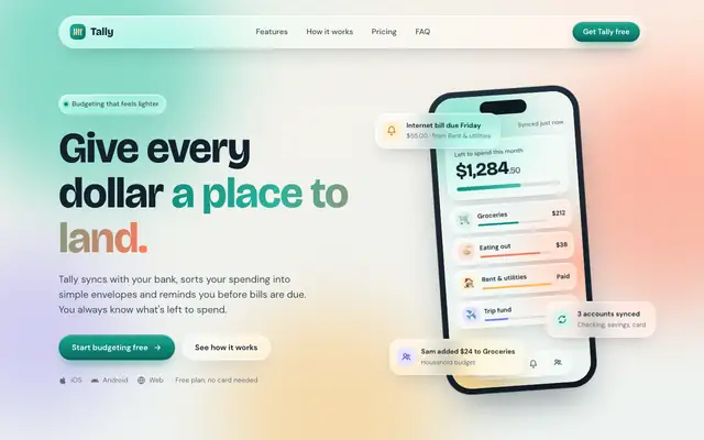
Liquid Glass Design (ECC)
Liquid Glass Design builds Tally out of frosted glass panels floating over soft mint, peach and periwinkle light, set in Bricolage Grotesque and DM Sans. The dashboard keeps the glass in Manrope and stays readable. Pick it if you want a friendly, Apple-flavored product that looks nothing like the cream-and-serif default.
updated 2d ago
Popular Web Designs (Hermes Agent)
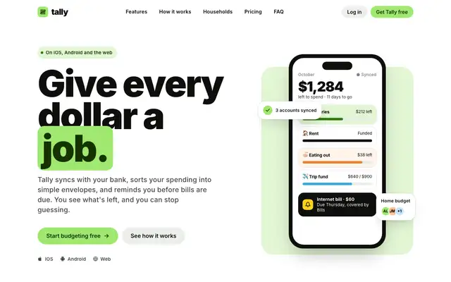
Popular Web Designs gives Tally the Wise treatment: very heavy black Inter headlines, a lime highlight box around 'job.', pill buttons, big rounded cards and a black pricing band with a lime Plus plan. The dashboard follows through with a black 'left to budget' card in huge lime numerals, lime envelope bars and a lime October bar. It is far from the default and holds together on both pages and on a phone, though the tight headline leading lets lines collide and a sync chip covers the Groceries label in the hero. Pick it when you want a bright, confident consumer fintech look and are happy to start from a known brand's style.
updated today
Impeccable
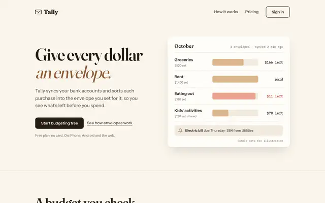
Impeccable drops the cream-and-serif default for a loud navy, orange and primary-color landing page set in heavy Archivo, then builds a calmer pine-and-lime dashboard. Pick it if you want a product page with real energy that still holds up on a dense screen.
updated 1d ago
Hallmark
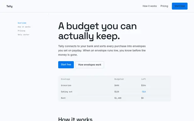
Hallmark turns Tally into a cheerful yellow-and-pastel brand in Plus Jakarta Sans with big ghost numerals, and the dashboard matches it. The most consistent result in the set, but it took about 12 minutes per brief.
updated 2mo ago
Also good for these
Premium (Awesome Design Skills)
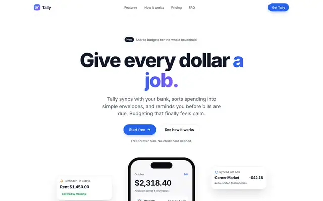
Premium gives Tally the clean, bright SaaS treatment: white and light grey surfaces, Inter throughout, a bright blue accent and a dark closing panel. The dashboard is tidy and well spaced, with a donut gauge and blue bars. Nothing is wrong with it, but it looks like many fintech sites. Pick it if you want safe, polished and current.
updated 4mo ago
UI Principles (brijr)
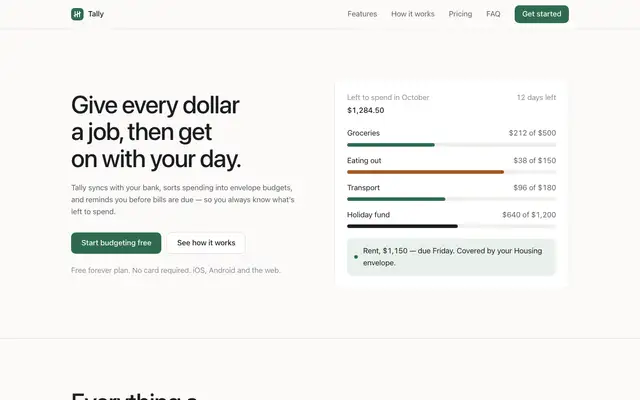
UI Principles gives Tally a restrained, neutral product look: near-white backgrounds, the system sans on the landing and Inter on the dashboard, two type sizes and one muted green used only for buttons, healthy bars and October in the chart. The hero is a plain budget card instead of a phone, and the dashboard is a clean grid of rules with black envelope bars and red only for Dining out. It is tidy, readable and works on a phone, but it is generic, with little that says Tally. Pick it to calm down a busy interface rather than to set a brand.
updated 6d ago
Sheleg Design
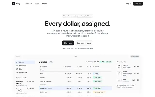
Sheleg Design gives Tally a quiet white landing page with a short centered Inter headline over a framed budget table with mono figures and status chips, then a light dashboard with hairline borders, one blue #2f6feb and pace markers on each envelope bar. Both pages are consistent, readable and work on a phone, and the dashboard is one of the more useful ones. It is well made but looks like many modern SaaS tools. Pick it for admin screens and internal tools that need to be clear rather than branded.
updated today
Clean Minimal Beige Light Mode (Meng To)
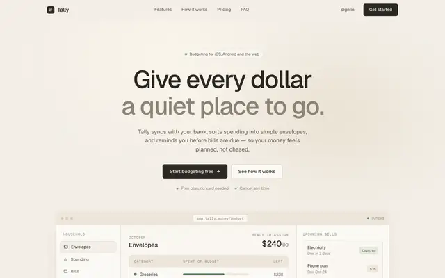
Clean Minimal Beige Light Mode keeps Tally soft and quiet: warm beige shells, Geist on the landing and Inter Tight on the dashboard, a muted sage accent and one dark panel for emphasis. It is closer to the default than most, but the sans type and calm grid set it apart. Pick it for understated products that want to feel calm.
updated today