



Pac-Man (Awesome Design Skills)
4/5 out of 5. Read the verdictRetro arcade design with pixel fonts, dotted borders, playful high-contrast colors and 8-bit game style. From bergside's Awesome Design Skills.
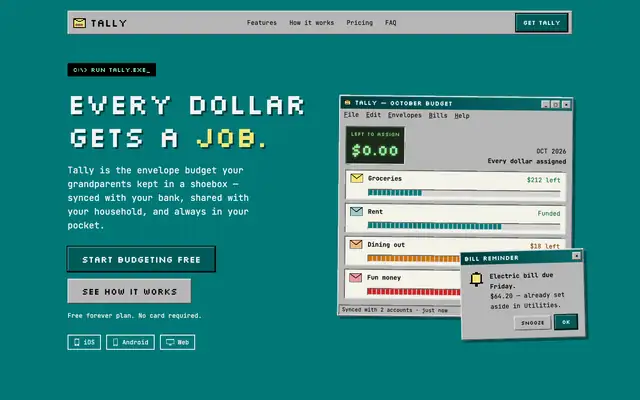
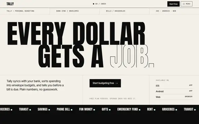
First screen only. Switch to side by side to read the full pages.
Scroll either page; the other follows.Full Pac-Man (Awesome Design Skills) pageFull baseline
Every skill gets the same Tally brief, alone in a clean project. How we test
Our verdict
4/5 out of 5
Passed the cut
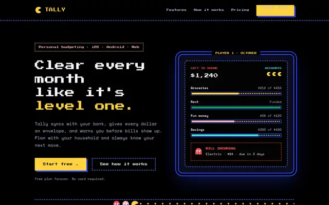
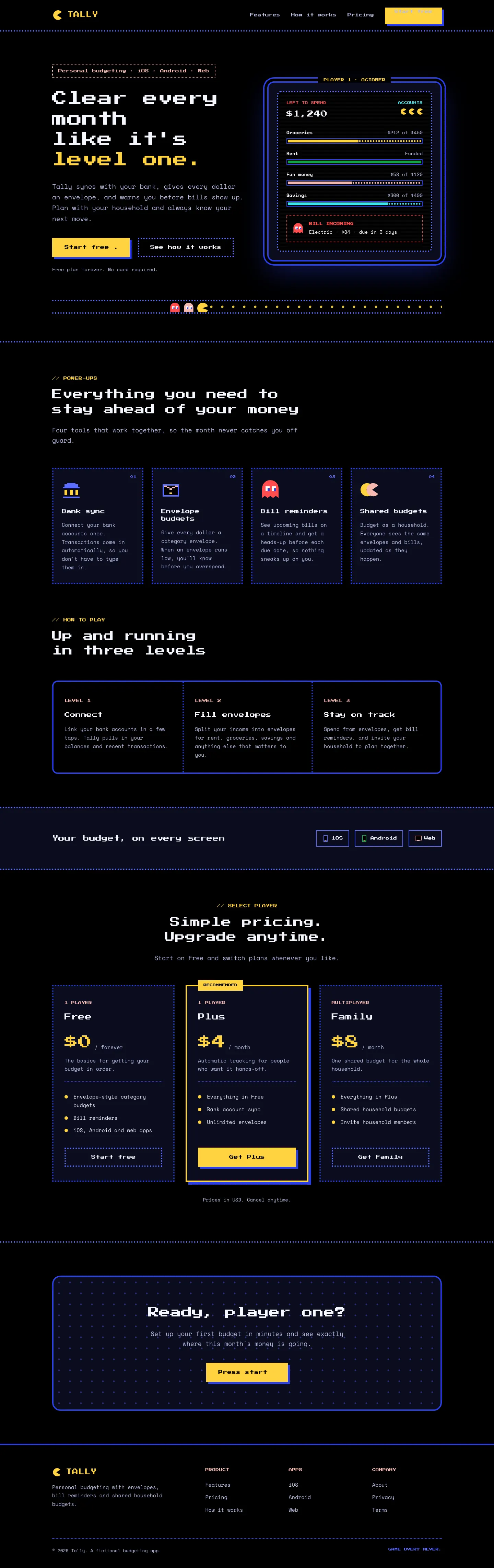
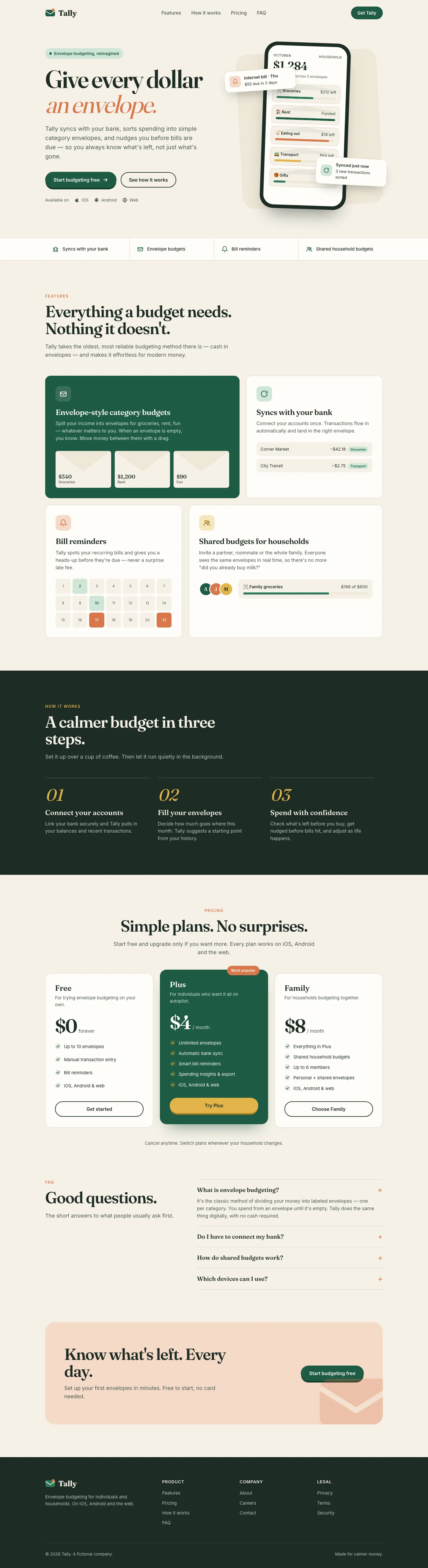
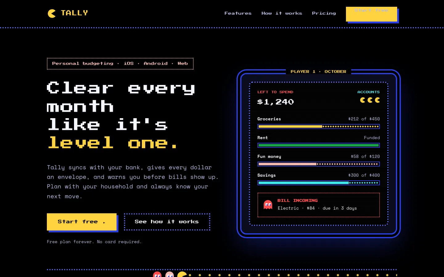
Pac-Man turns Tally into an arcade cabinet: black screens, blue dotted maze borders, Press Start 2P headings and power-pellet yellow buttons. The hero is an arcade screen with envelope budgets as pellet bars, and on the dashboard a little Pac-Man chomps along each envelope while the over-budget one gets ghost styling. The theme is committed and still readable. Pick it for playful or gaming-adjacent brands.
Compare with Bold (Awesome Design Skills)Pick it for
- gaming and hobby products
- playful consumer apps
- hackathon and side projects
- event or campaign pages
Skip it for
- serious finance or B2B products
- accessibility-first products
- long reading pages
Typography
Colors
Observations
- pixel headings get hard to read at small sizes
- monospace body text makes the landing feel dense in places
Install
1 Run in your terminal
npx degit bergside/awesome-design-skills/skills/pacman#main .claude/skills/pacman2 Or paste a prompt into Claude Code, Codex, Cursor or Gemini
It tells your tool to install this from its source repository.
This install is for Claude Code only; for other agents use Copy prompt or copy the skill folder.
Copies just this skill's folder into your project's .claude/skills.
Check the source for the latest instructions.
We tested the pacman skill from this repo.
Details
- Type
- Skill
- GitHub stars
- 3,255*
- Updated
- 4mo ago
- License
- MIT
- Best for
- Visual direction
Test runOpus 5.5Claude Code 2.1.303Oct 19, 2026generated in 5 minabout $1.04 at API pricescommit f631a09
* Stars are for the whole bergside/awesome-design-skills repository.
Made this skill?Put your score on your README, and claim this page for a link to your site. 
1. Put your score on your README
[](https://skillsfordesign.com/s/awesome-design-skills-pacman/) The badge links here. If a retest changes the score, it updates by itself.
2. Claim this page
Get a free backlink to your site.
- A followed link, not nofollow. From the page about your skill, on a site about design skills, to your portfolio, product or studio. Search engines count it.
- Your name on the page. Credited as the maker, right under the description, where every visitor sees it.
- Free. Live within a few days.
How it will look
Thanks, we have it.
We'll check the repo and email you when your name is on the listing.
Similar
Same brief, other skills
Liquid Glass Design (ECC)
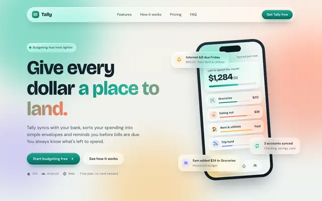
Liquid Glass Design builds Tally out of frosted glass panels floating over soft mint, peach and periwinkle light, set in Bricolage Grotesque and DM Sans. The dashboard keeps the glass in Manrope and stays readable. Pick it if you want a friendly, Apple-flavored product that looks nothing like the cream-and-serif default.
updated 2d ago
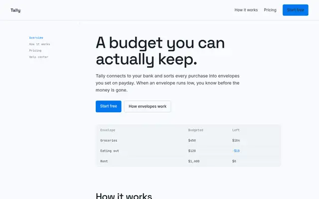
Impeccable
Impeccable drops the cream-and-serif default for a loud navy, orange and primary-color landing page set in heavy Archivo, then builds a calmer pine-and-lime dashboard. Pick it if you want a product page with real energy that still holds up on a dense screen.
updated 1d ago
Hallmark
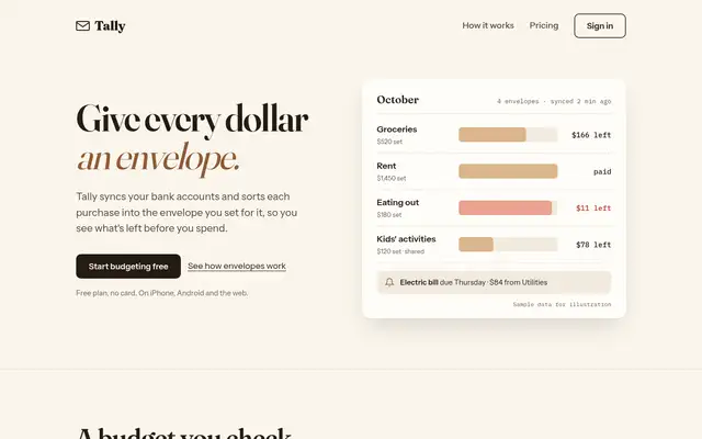
Hallmark turns Tally into a cheerful yellow-and-pastel brand in Plus Jakarta Sans with big ghost numerals, and the dashboard matches it. The most consistent result in the set, but it took about 12 minutes per brief.
updated 2mo ago
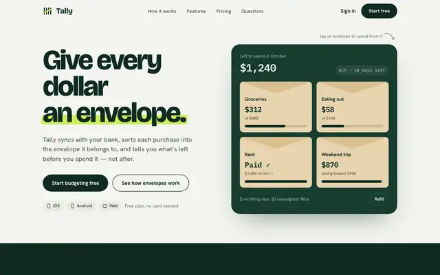
Huashu Design
Huashu swaps Fraunces for Bricolage Grotesque and puts a lime highlighter on a deep forest green. It keeps envelopes as real kraft cards and carries the look into a tidy dashboard. A safe, distinct choice for consumer finance.
updated 4d ago
Also for these tasks
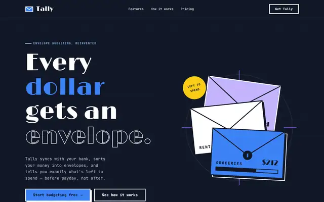
Artistic (Awesome Design Skills)
Artistic sets Tally as an Art Deco poster: Limelight display type, JetBrains Mono body text, navy and white sections and solid blue and violet blocks with hard offset shadows. The dashboard keeps the dark sidebar, thick outlines and big colored summary blocks. It has a real point of view, but the mobile dashboard scrolls sideways. Pick it for expressive, poster-like brands.
updated 4mo ago
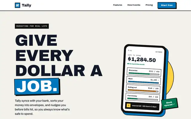
Bold (Awesome Design Skills)
Bold gives Tally a poster: huge uppercase Archivo Black headlines, thick black borders with hard offset shadows, a blue-and-yellow accent pair and a tilted phone in the hero. The dashboard keeps the same voice with a black sidebar, a big black "spent so far" card and striped red for the over-budget envelope. Both pages read clearly and work on a phone. Pick it when you want a product page that shouts.
updated 4mo ago
Brand Guidelines (Anthropic)
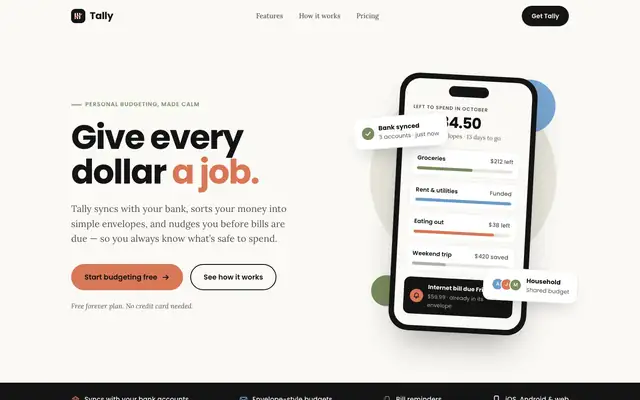
Brand Guidelines dresses Tally in Anthropic's own brand: near-black, warm off-white, orange, blue and olive, with Poppins headings over Lora body text. It's clean and consistent on both pages, but it's another company's look, and a 'Bank synced' card covers the hero balance. Pick it only if you want that Anthropic style.
updated 8d ago
Neobrutalism (Awesome Design Skills)
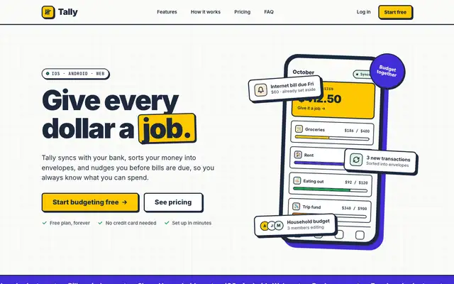
Neobrutalism puts Tally on warm off-white with thick navy borders, hard offset shadows and flat yellow and violet blocks. The landing has a CSS phone with sticker-like envelope cards; the dashboard uses a dotted background, yellow highlights on the date and summary cards, and a clean transactions table. It is bold but still easy to read on both pages. Pick it for playful products that want a confident, graphic look.
updated 4mo ago