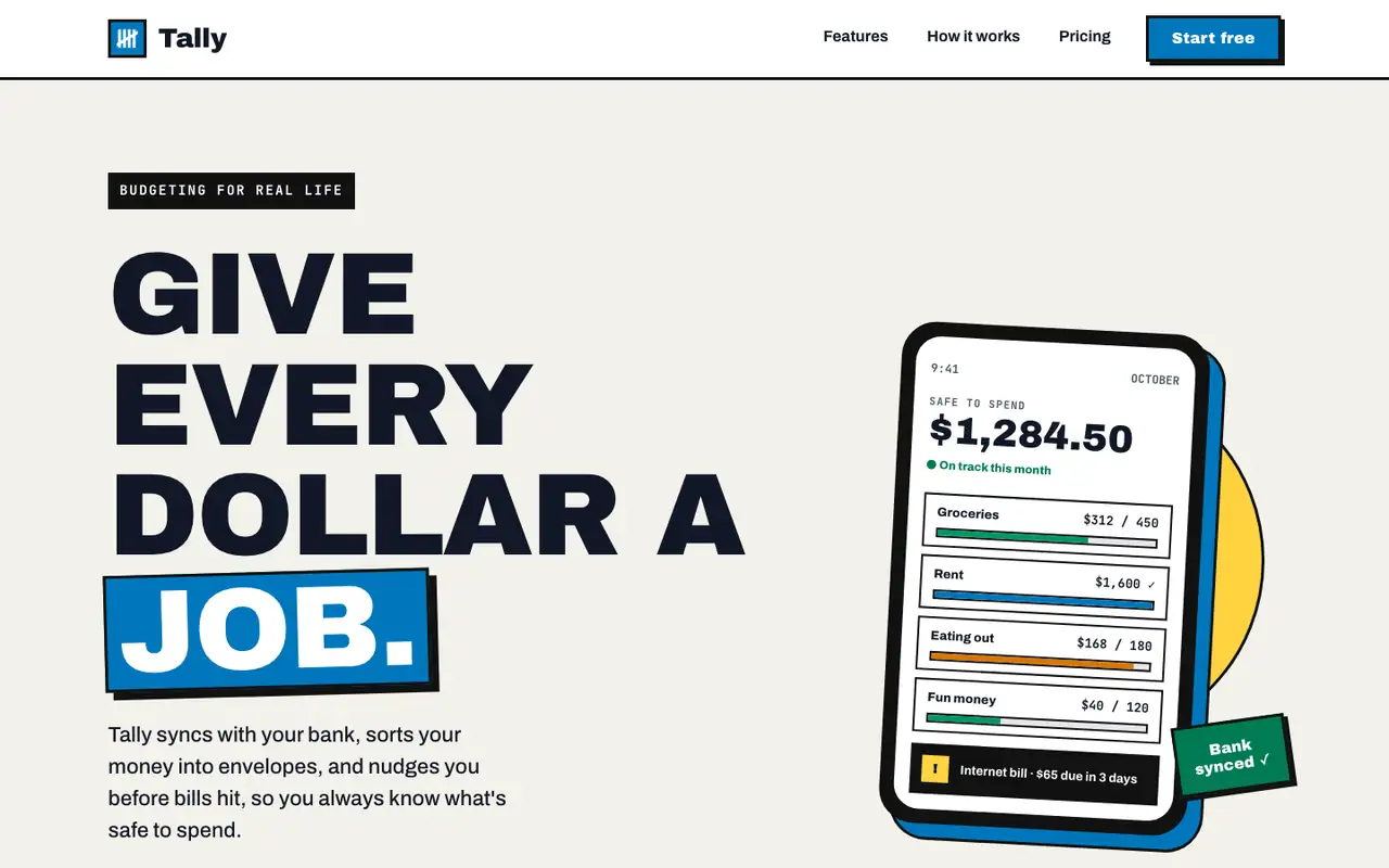
Bold gives Tally a poster: huge uppercase Archivo Black headlines, thick black borders with hard offset shadows, a blue-and-yellow accent pair and a tilted phone in the hero. The dashboard keeps the same voice with a black sidebar, a big black "spent so far" card and striped red for the over-budget envelope. Both pages read clearly and work on a phone. Pick it when you want a product page that shouts.
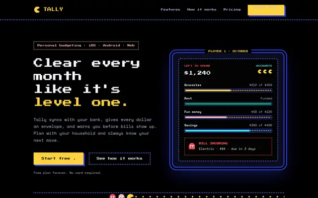
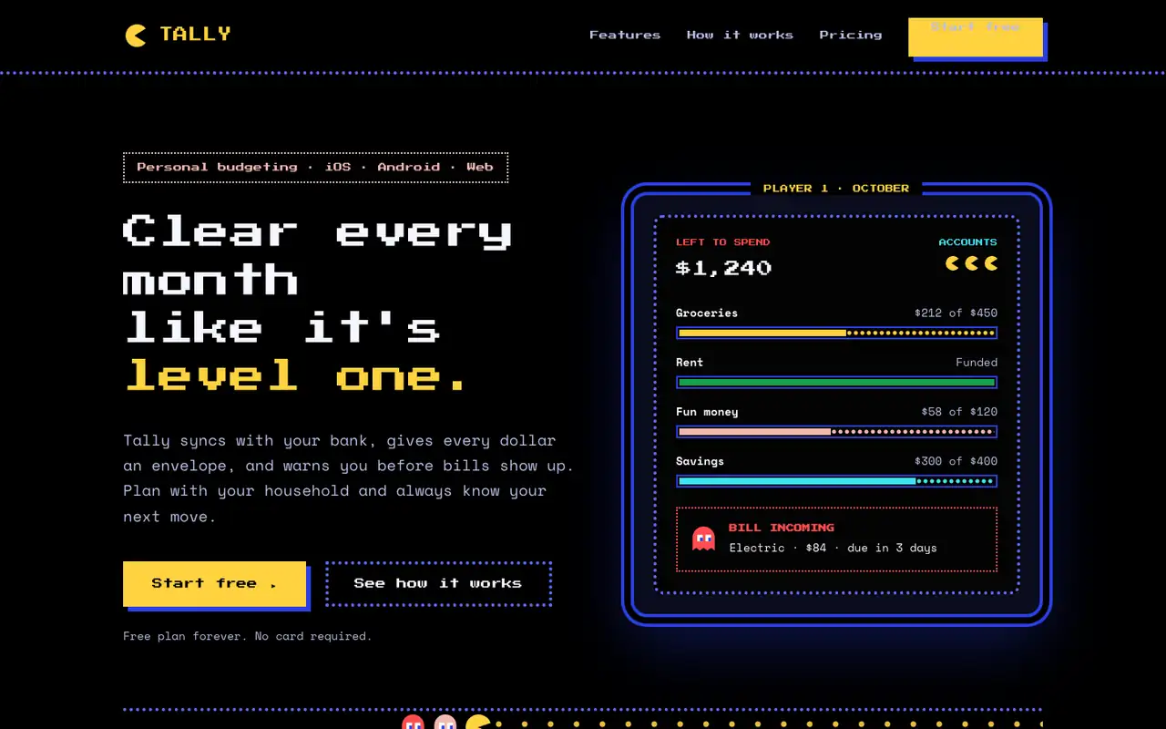
Pac-Man turns Tally into an arcade cabinet: black screens, blue dotted maze borders, Press Start 2P headings and power-pellet yellow buttons. The hero is an arcade screen with envelope budgets as pellet bars, and on the dashboard a little Pac-Man chomps along each envelope while the over-budget one gets ghost styling. The theme is committed and still readable. Pick it for playful or gaming-adjacent brands.
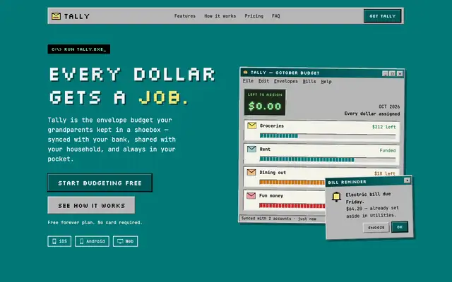
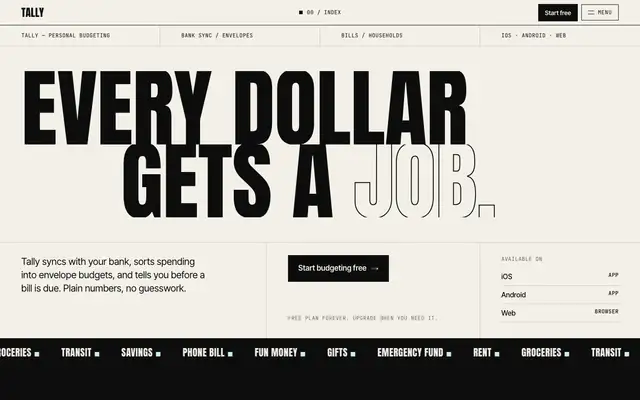
Side by side
Field
Bold (Awesome Design Skills)
Pac-Man (Awesome Design Skills)
Fonts
Archivo Black
Archivo
JetBrains Mono
Press Start 2P
Space Mono
Colors
#111111 near-black
#ffffff white
#0077bc blue
#ffd23f yellow
#f3f1ea paper
#dc2626 red
#000000 black
#2a3fe5 maze blue
#ffd23f pellet yellow
#f4b9b0 ghost pink
#ff4d4d ghost red
#5eead4 cyan (dashboard)
Good fit for
consumer apps with a loud brand
launch and campaign pages
SaaS landing pages
product dashboards that need personality
gaming and hobby products
playful consumer apps
hackathon and side projects
event or campaign pages
Not great for
quiet enterprise tools
luxury or editorial brands
dense data tables
serious finance or B2B products
accessibility-first products
long reading pages
Flaws we saw
landing: the hero headline is so large that the value line and buttons sit low on a laptop screen
dashboard: heavy borders on every card make the page feel busy in long lists
pixel headings get hard to read at small sizes
monospace body text makes the landing feel dense in places