
UI Design Aesthetics (Claude Cortex)
3/5 out of 5. Read the verdictRuled cream paper, heavy and thin-italic Fraunces, Plex Mono, forest green, vermilion and a mustard note. For warm consumer apps.
Made by 
First screen only. Switch to side by side to read the full pages.
Scroll either page; the other follows.
Every skill gets the same Tally brief, alone in a clean project. How we test
Our verdict
3/5 out of 5
Passed the cut
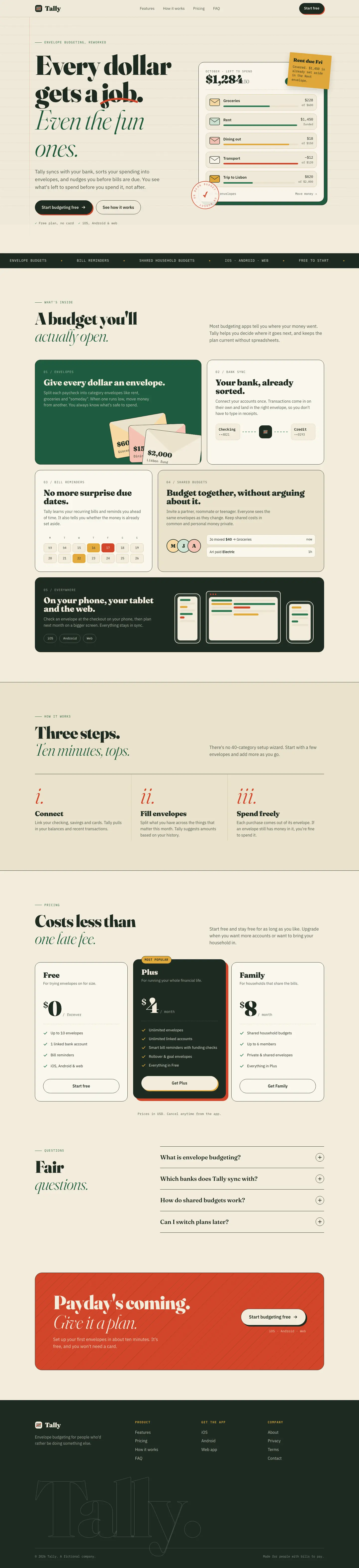
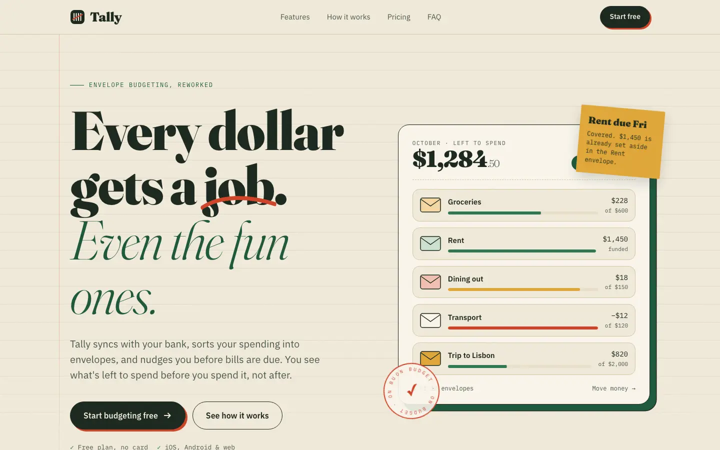
UI Design Aesthetics gives Tally a ruled-notebook landing page: cream lined paper, Fraunces set very heavy beside a thin italic, IBM Plex Mono labels, a mustard sticky note, an "on budget" stamp and vermilion hard shadows on the buttons. The dashboard keeps the ruled paper, heavy Fraunces figures and a hatched green "left to budget" card. It has far more character than the default, but it sits on the same cream, Fraunces and forest-green base, and the sticky note and stamp cover parts of the hero card. Pick it for warm consumer brands that want personality on a familiar base.
Compare with Quiet Luxury (Design Taste by Mustafa)Pick it for
- warm consumer brands
- personal finance apps
- pages with handmade details
Skip it for
- a clear break from the default look
- dark or technical products
Typography
Colors
Observations
- built on the default cream, Fraunces and forest-green palette
- the sticky note and stamp cover parts of the hero card
Install
1 Run in your terminal
npx degit nickcrew/claude-cortex/skills/ui-design-aesthetics#main .claude/skills/ui-design-aesthetics2 Or paste a prompt into Claude Code, Codex, Cursor or Gemini
It tells your tool to install this from its source repository.
This install is for Claude Code only; for other agents use Copy prompt or copy the skill folder.
Copies just this skill's folder into your project's .claude/skills.
Check the source for the latest instructions.
We installed the ui-design-aesthetics folder from this repo.
Details
Made by
Platform engineer and security tooling builder. I design production infrastructure, build open-source security platforms, and ship engineering tools
Is this you? Claim it
- Type
- Skill
- GitHub stars
- 58*
- Updated
- 4mo ago
- License
- MIT
- Best for
- Visual direction
Test runOpus 5.5Claude Code 2.1.303Oct 20, 2026generated in 6 minabout $1.33 at API pricescommit bb47af7
* Stars are for the whole nickcrew/claude-cortex repository.
Made this skill?Put your score on your README, and claim this page for a link to your site. 
1. Put your score on your README
[](https://skillsfordesign.com/s/cortex-ui-design-aesthetics/) The badge links here. If a retest changes the score, it updates by itself.
2. Claim this page
Get a free backlink to your site.
- A followed link, not nofollow. From the page about your skill, on a site about design skills, to your portfolio, product or studio. Search engines count it.
- Your name on the page. Credited as the maker, right under the description, where every visitor sees it.
- Free. Usually live within a few days.
How it will look
Thanks, we have it.
We'll check the repo and email you when your name is on the listing.
Similar
Same brief, other skills
Liquid Glass Design (ECC)
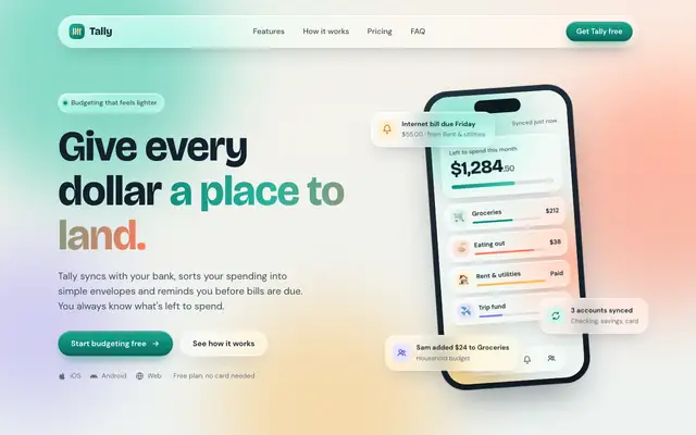
Liquid Glass Design builds Tally out of frosted glass panels floating over soft mint, peach and periwinkle light, set in Bricolage Grotesque and DM Sans. The dashboard keeps the glass in Manrope and stays readable. Pick it if you want a friendly, Apple-flavored product that looks nothing like the cream-and-serif default.
updated 2d ago
Popular Web Designs (Hermes Agent)
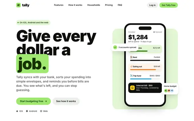
Popular Web Designs gives Tally the Wise treatment: very heavy black Inter headlines, a lime highlight box around 'job.', pill buttons, big rounded cards and a black pricing band with a lime Plus plan. The dashboard follows through with a black 'left to budget' card in huge lime numerals, lime envelope bars and a lime October bar. It is far from the default and holds together on both pages and on a phone, though the tight headline leading lets lines collide and a sync chip covers the Groceries label in the hero. Pick it when you want a bright, confident consumer fintech look and are happy to start from a known brand's style.
updated today
Impeccable
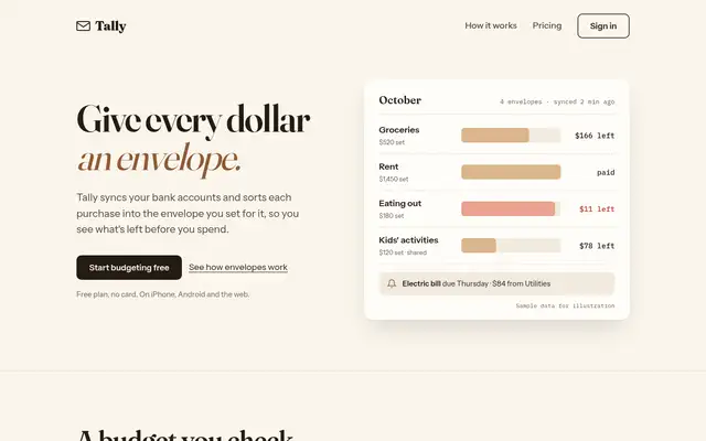
Impeccable drops the cream-and-serif default for a loud navy, orange and primary-color landing page set in heavy Archivo, then builds a calmer pine-and-lime dashboard. Pick it if you want a product page with real energy that still holds up on a dense screen.
updated 1d ago
Hallmark
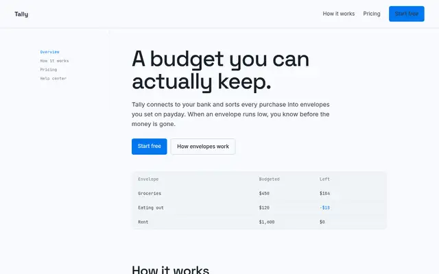
Hallmark turns Tally into a cheerful yellow-and-pastel brand in Plus Jakarta Sans with big ghost numerals, and the dashboard matches it. The most consistent result in the set, but it took about 12 minutes per brief.
updated 2mo ago
Also good for these
ECC Frontend Design Direction
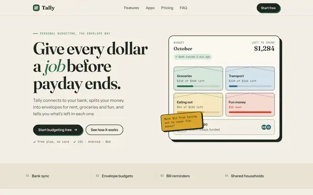
ECC keeps a Fraunces and cream landing page but adds mono labels and a tilted sticky note. The IBM Plex dashboard is more useful than the baseline's, with a sync alert, search and person filters.
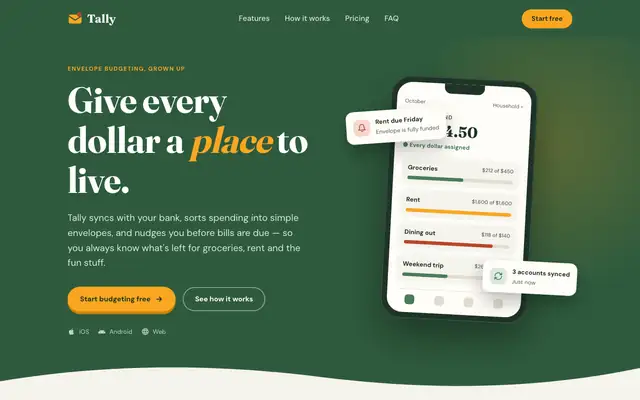
Theme Factory (Anthropic)
Theme Factory picked a forest-and-marigold theme for the landing page, in Fraunces and DM Sans, and a separate forest-and-olive one in Source Serif 4 and Figtree for the dashboard. Both are tidy, but they stay in the cream-and-green family of the default. A floating 'Rent due Friday' card covers the hero balance. Pick it for quick, warm theming.
updated 8d ago
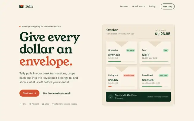
Waza UI
Waza UI gives Tally warm cream paper, chunky Young Serif headlines in bottle green and vermilion, a hero panel of envelope tiles instead of a phone, numbered ledger rows for features and a vermilion envelope-flap call to action. The dashboard switches to Bricolage Grotesque on cream with a dark green accent and terracotta for overspending, and it looks much like the default. The landing has its own voice, but the palette stays in the cream-and-green family, the chart label for October is clipped and the phone dashboard scrolls sideways. Pick it for warm consumer brands that want a little more stamp and character than the default.
updated today
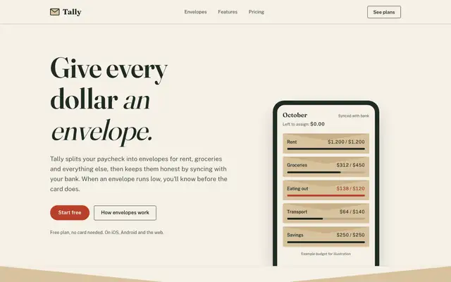
Antislop UI
Antislop UI keeps the baseline's paper and serif but cleans it up: no overlapping hero cards, a working "assign $2,000" slider demo, honest placeholder copy and a dashboard that leads with what to do about the $640. Better made, still close to the default look.