Design type · Design Skills Arena
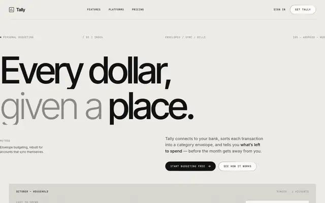
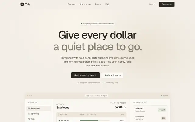
A Print Romantic.
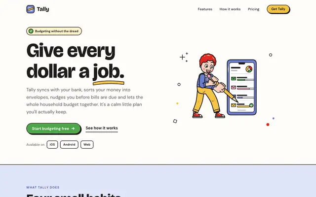
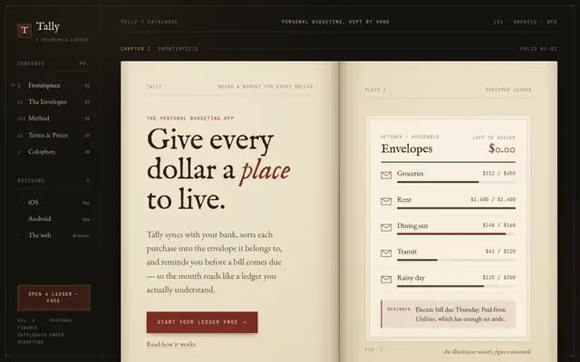
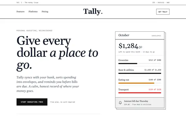
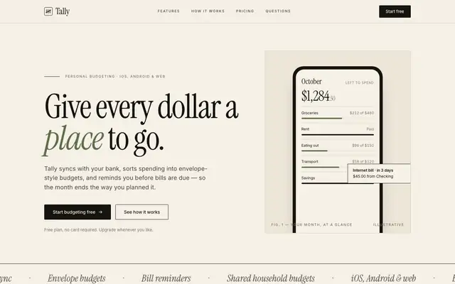
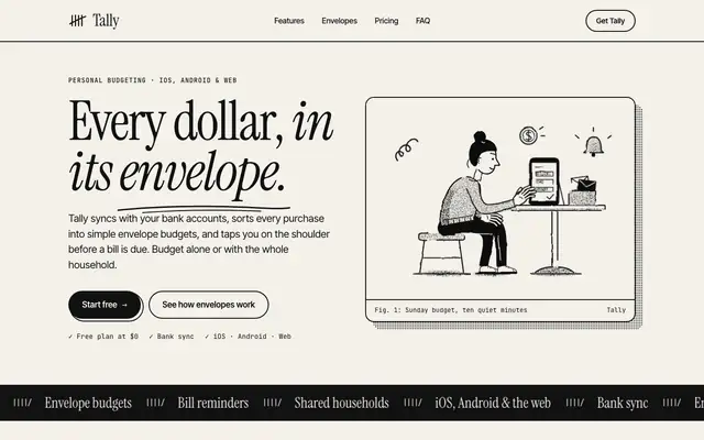
Cream paper, serif headlines, nothing shouting.
What are you? Start voting
10 blind votes between real AI design skills reveal your type. A few seconds each.
What it means
You trust the page. Serif headlines, warm paper and wide margins borrow from books and magazines, where type did all the work long before screens. It reads as calm and considered, the opposite of a dashboard shouting at you.
- Type
- A serif for headlines, with italics doing the emphasis.
- Colour
- Cream, ink and one muted accent, like rust or forest green.
- Layout
- A clear reading column, wide margins, rules between sections.
- Details
- Small caps, numbered sections, footnote-style labels.
Where it works
Editorial sites, personal finance, anything that asks for trust and slow reading.
Watch out for
It turns twee fast. Too many flourishes and the page reads like a wedding invite. Keep the contrast high enough to read.
Skills that design this way
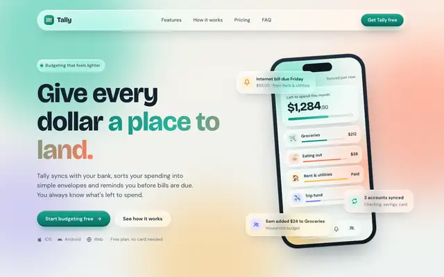
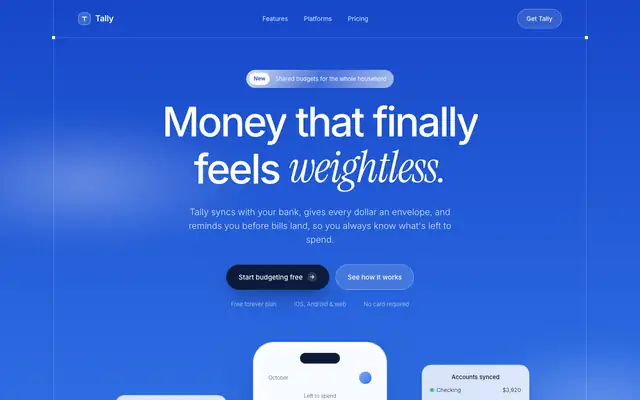
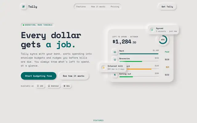
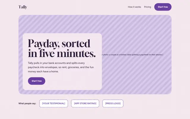
Tested on the same brief, best scored first. Install one and your pages lean Print Romantic.
All seven design types
How types work- Print RomanticThis page Cream paper, serif headlines, nothing shouting.
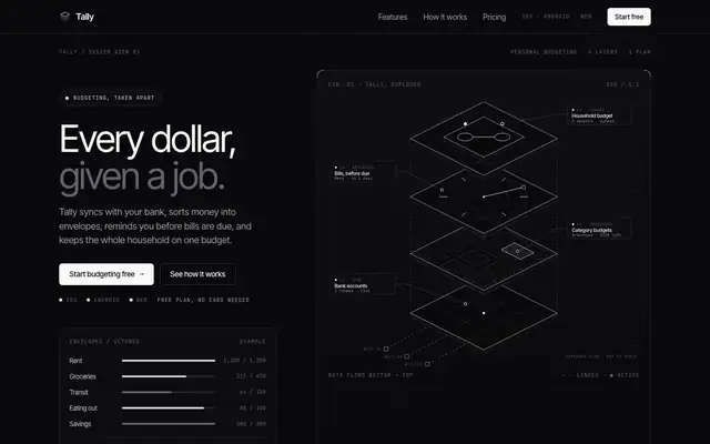
- Night Shift Dark screens, glowing accents, work that looks best at 2am.
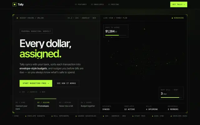
- Engineer Monospace, grids and labels. If it isn’t aligned, it isn’t done.
- Minimalist White space, one accent, and the confidence to leave things out.
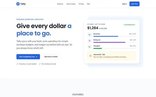
- Daydreamer Pastel gradients, frosted glass and rounded everything. Software that feels like a nice day.
- Maximalist Loud color, big type, more is more.
- Brutalist Black, white and heavy type. Hard edges, no apologies.