
Interface Craft
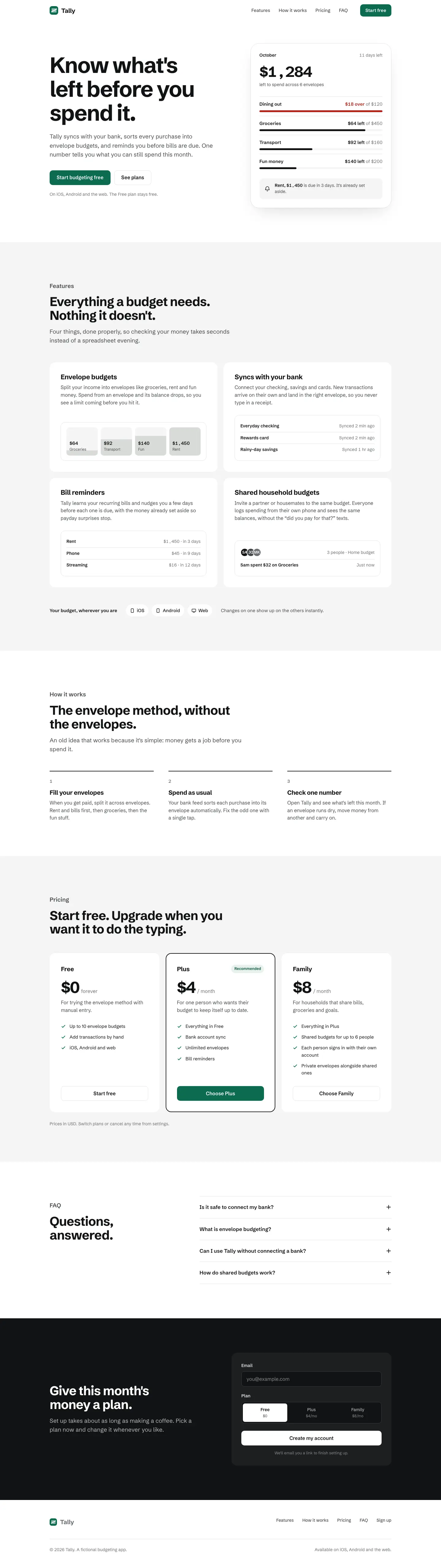
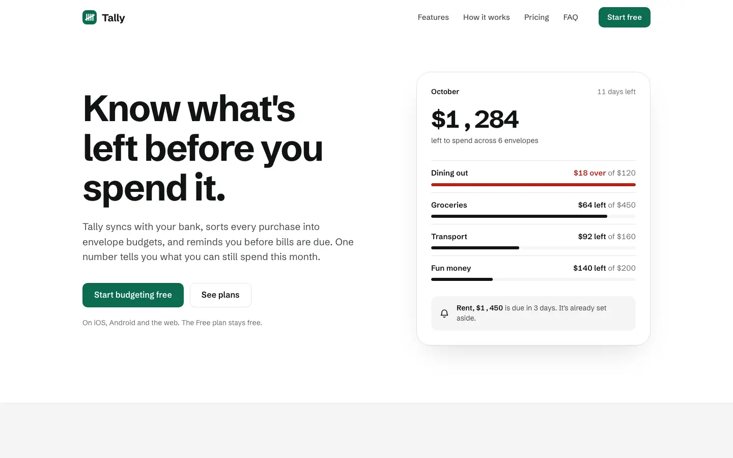
3/5 out of 5. Read the verdictMostly grayscale white and light gray, Schibsted Grotesk and Geist, one accent and red only for over budget. For SaaS tools.
Made by 
First screen only. Switch to side by side to read the full pages.
Scroll either page; the other follows.
Every skill gets the same Tally brief, alone in a clean project. How we test
Our verdict
3/5 out of 5
Passed the cut
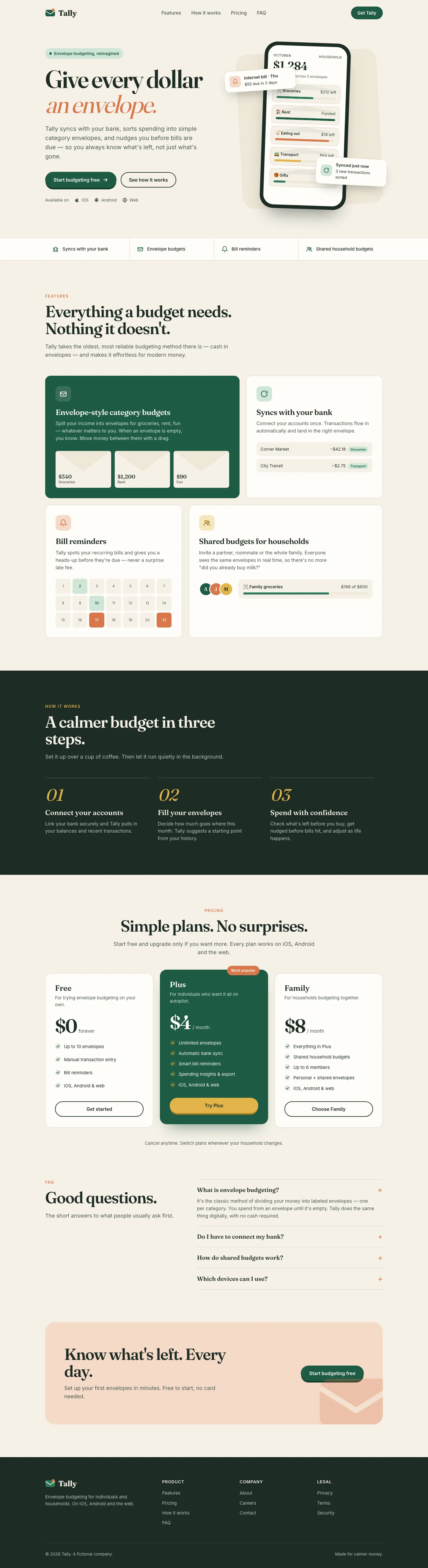
Interface Craft gives Tally a restrained, mostly grayscale look: Schibsted Grotesk on white and light gray, an evergreen button, and a hero card where one '$1,284 left' figure leads and red marks only the over-budget envelope. The Geist dashboard sorts envelopes worst-first, wires every control and switches to a single blue accent. It is clean and well thought through but generic, the two pages use different accents, the hero money prints as '$1 , 284', and the phone dashboard scrolls sideways. Pick it for product teams who care more about clear hierarchy and working controls than about brand.
Compare with Design Taste Frontend v2, experimental (Taste Skill)Pick it for
- SaaS dashboards
- internal and admin tools
- product teams building real flows
Skip it for
- brands that want a strong visual identity
- editorial or playful products
- marketing-heavy launches
Typography
- Schibsted Grotesk
- Geistdashboard
Colors
Observations
- the phone dashboard scrolls sideways
- landing: money figures print with spaces around the comma ('$1 , 284')
- the landing uses evergreen and the dashboard blue
Install
1 Run in your terminal
npx degit deanayoung3-droid/interface-craft#main .claude/skills/interface-craft2 Or paste a prompt into Claude Code, Codex, Cursor or Gemini
It tells your tool to install this from its source repository.
This install is for Claude Code only; for other agents use Copy prompt or copy the skill folder.
Copies just this skill's folder into your project's .claude/skills.
Check the source for the latest instructions.
We installed the interface-craft folder from this repo.
Details
Made by
If you stay in your lane theres less traffic.
Is this you? Claim it
- Type
- Skill
- GitHub stars
- 1*
- Updated
- 33d ago
- License
- MIT
- Best for
- Visual directionDashboards
Test runOpus 5.5Claude Code 2.1.303Oct 20, 2026generated in 7 minabout $1.65 at API pricescommit d80ec1d
* Stars are for the whole deanayoung3-droid/interface-craft repository.
Made this skill?Put your score on your README, and claim this page for a link to your site. 
1. Put your score on your README
[](https://skillsfordesign.com/s/interface-craft/) The badge links here. If a retest changes the score, it updates by itself.
2. Claim this page
Get a free backlink to your site.
- A followed link, not nofollow. From the page about your skill, on a site about design skills, to your portfolio, product or studio. Search engines count it.
- Your name on the page. Credited as the maker, right under the description, where every visitor sees it.
- Free. Usually live within a few days.
How it will look
Thanks, we have it.
We'll check the repo and email you when your name is on the listing.
Similar
Same brief, other skills
Blue Laser Clean Glass Layout (Meng To)
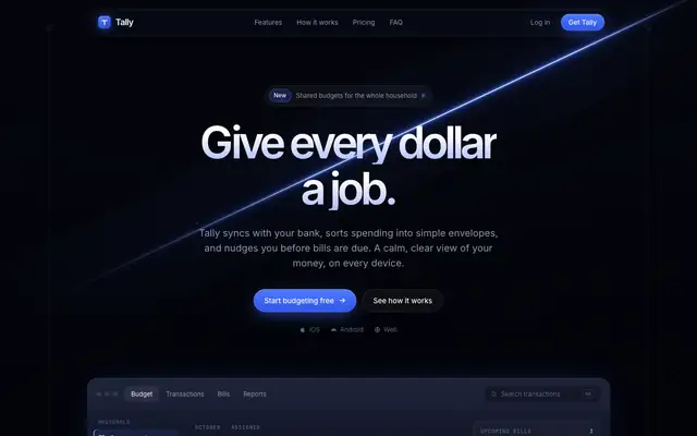
Blue Laser Clean Glass Layout puts Tally on near-black with a thin blue light beam, frosted glass panels and Inter Tight with mono labels. The dashboard is the stronger page: clear cards, blue bars and readable tables. The mobile dashboard scrolls sideways. Pick it for technical or premium dark products.
updated today
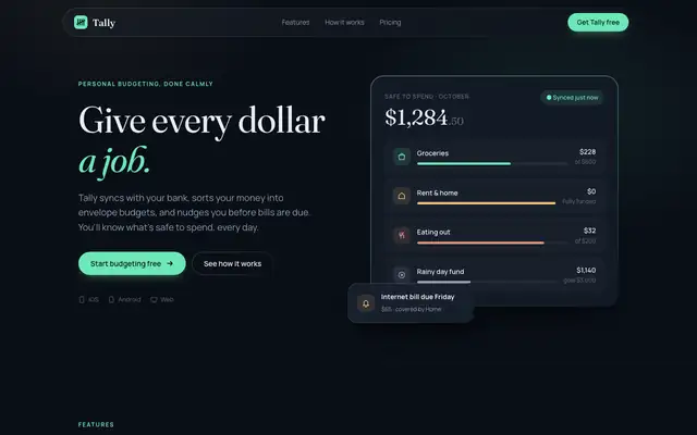
CSS Border Gradient (Meng To)
CSS Border Gradient takes Tally dark: deep navy panels with faint mint-edged gradient borders, Fraunces headlines over Manrope on the landing and Inter on the dashboard, with mint, amber and coral accents. The dashboard is clean and colorful without getting loud. Pick it if you want a polished dark product with a soft glow.
updated today
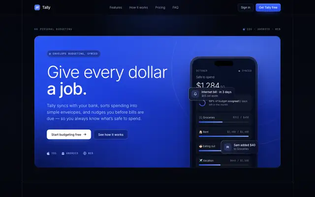
Dark Blue Contrasting Clean (Meng To)
Dark Blue Contrasting Clean gives Tally a deep navy page with bright cobalt gradient blocks, crisp frames, Inter and lots of JetBrains Mono labels. The dashboard leads with a cobalt summary card and stays clear and readable. Pick it for confident, technical-feeling products.
updated today
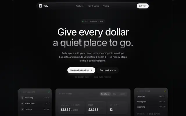
Dark Glass Clean Layout (Meng To)
Dark Glass Clean Layout is the neutral version of dark mode: near-black zinc surfaces, frosted cards, Inter with mono labels and almost no color beyond a pale green. It looks expensive and quiet, but both pages scroll sideways on a phone. Pick it for premium, understated products.
updated today
Also good for these
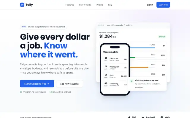
Corporate (Awesome Design Skills)
Corporate gives Tally a clean enterprise look: a 12-column grid, Poppins headings over Open Sans, blue as the main color and violet accents. The dashboard has a white sidebar, summary cards and a tidy envelope grid. It is safe and orderly, but the mobile dashboard scrolls sideways. Pick it for B2B products that want to look established.
updated 4mo ago
shadcn (Awesome Design Skills)
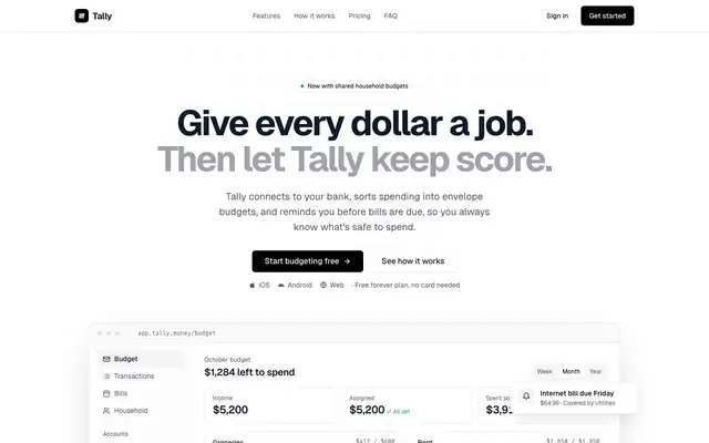
shadcn gives Tally the familiar shadcn/ui look: Geist type, thin zinc borders, black buttons, Fira Code numbers and a solid black Plus card. The dashboard has a sidebar with the household switcher and color only for status. It is clean and correct, but it is what many AI-built apps already look like. Pick it if you build on shadcn/ui and want pages that match.
updated 4mo ago
Glass Dark Mode Clock (Meng To)
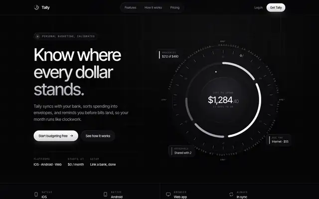
Glass Dark Mode Clock builds Tally around an instrument dial: a big circular gauge in the hero and again on the dashboard, frosted black glass, Inter Tight and mono labels, no accent color. The dashboard's dial showing $3,182 spent is the best single idea here. The landing scrolls sideways a little on a phone. Pick it for premium dark products that like a watch-face feel.
updated today
Sheleg Design
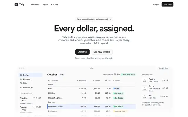
Sheleg Design gives Tally a quiet white landing page with a short centered Inter headline over a framed budget table with mono figures and status chips, then a light dashboard with hairline borders, one blue #2f6feb and pace markers on each envelope bar. Both pages are consistent, readable and work on a phone, and the dashboard is one of the more useful ones. It is well made but looks like many modern SaaS tools. Pick it for admin screens and internal tools that need to be clear rather than branded.
updated today