Interface Craft vs Design Taste Frontend v2, experimental
Standalone skill · Taste Skill
Tied at 3/5 on the same brief. Pick by fit: the rows below show where each one is stronger.
Both built the Tally landing page in the same Claude Code test, and both design the Minimalist way: white space, one accent, and the confidence to leave things out. Both are best for: visual direction.
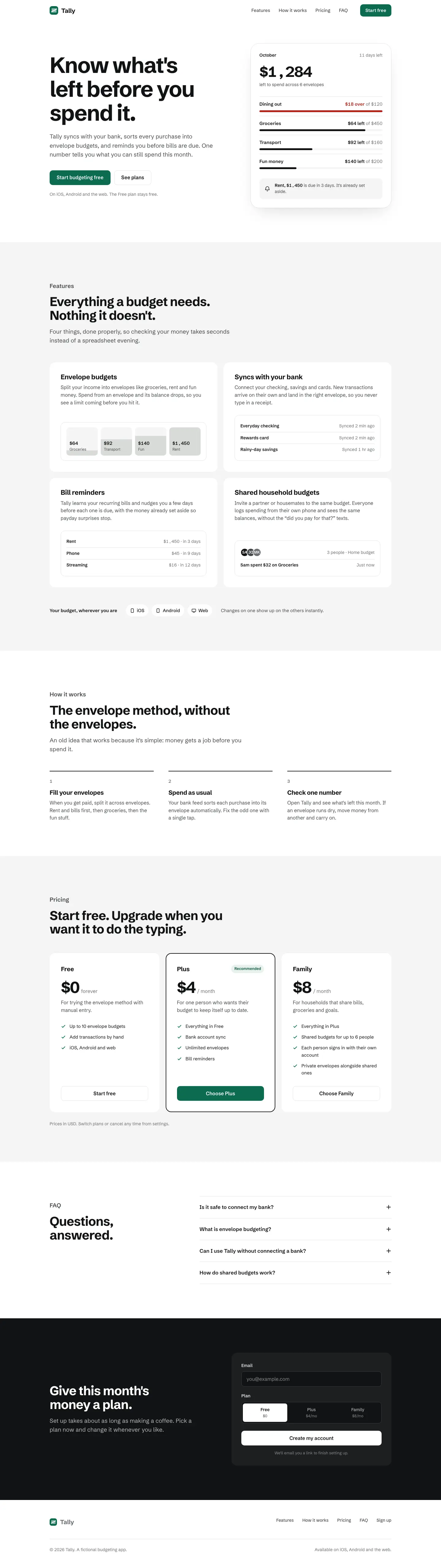
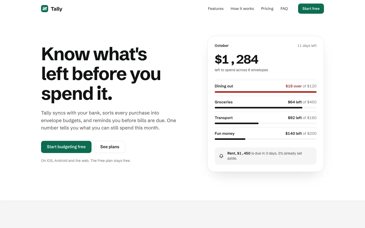
Interface Craft gives Tally a restrained, mostly grayscale look: Schibsted Grotesk on white and light gray, an evergreen button, and a hero card where one '$1,284 left' figure leads and red marks only the over-budget envelope. The Geist dashboard sorts envelopes worst-first, wires every control and switches to a single blue accent. It is clean and well thought through but generic, the two pages use different accents, the hero money prints as '$1 , 284', and the phone dashboard scrolls sideways. Pick it for product teams who care more about clear hierarchy and working controls than about brand.
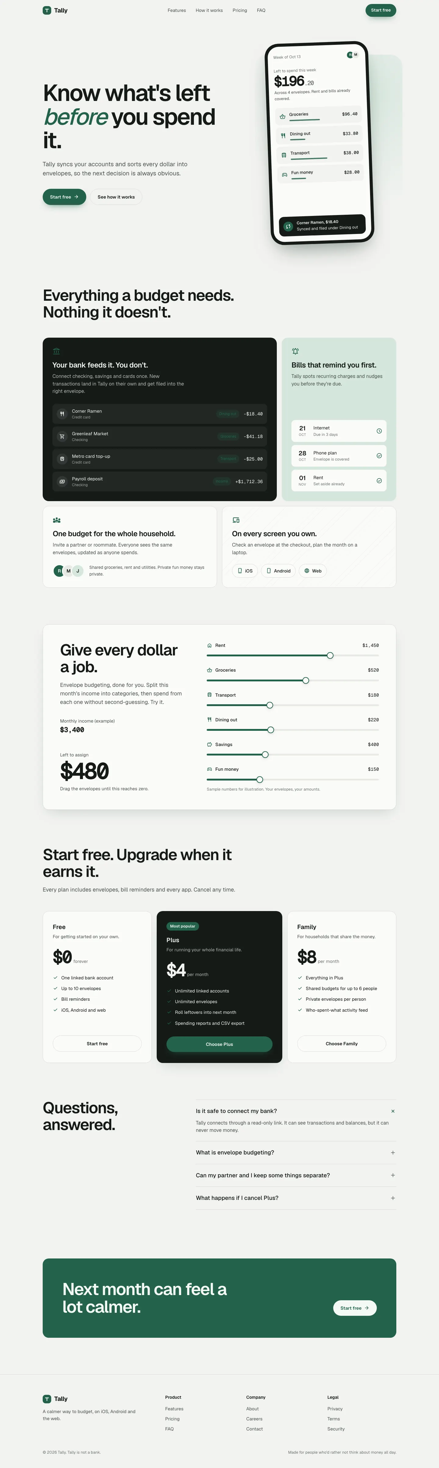
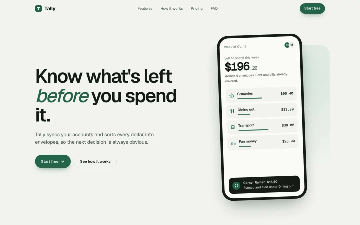
The old v2 taste skill swaps the serif for Geist on a pale grey-green canvas, with a deep green accent and an interactive budget slider in the hero. Both pages are clean and competent, with only slight distance from the baseline. Pick it if you like Taste Skill's style and want the older single-file version.