Tied at 3/5 on the same brief. Pick by fit: the rows below show where each one is stronger.
Both built the Tally landing page in the same Claude Code test, and both design the Print Romantic way: cream paper, serif headlines, nothing shouting. Both are best for: visual direction.
Motion Web3/5
Frontend Design3/5
Motion WebFrontend Design
First screen only. Switch to side by side to read the full pages.
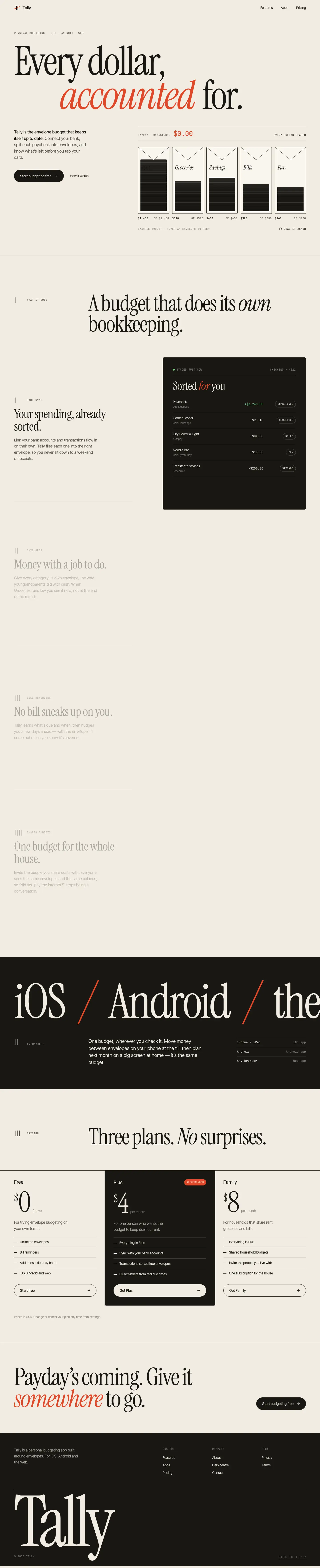
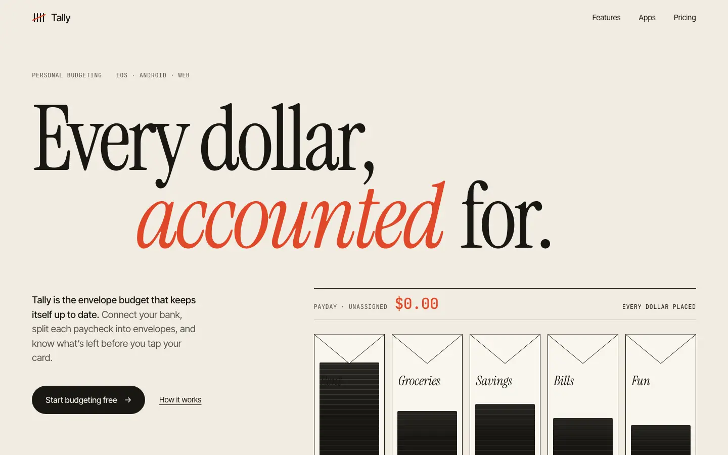
Motion Web gives Tally an editorial landing page: paper #f1ece1, a huge Instrument Serif headline with 'accounted' in vermilion italic, JetBrains Mono labels, line-drawn envelopes that fill with a sample paycheck, and a big 'iOS / Android' type band. The dashboard does not follow; it falls back to a green sidebar, Fraunces numbers and cream cards close to the default. Pick it for a motion-led landing page, and plan to restyle the app screens.
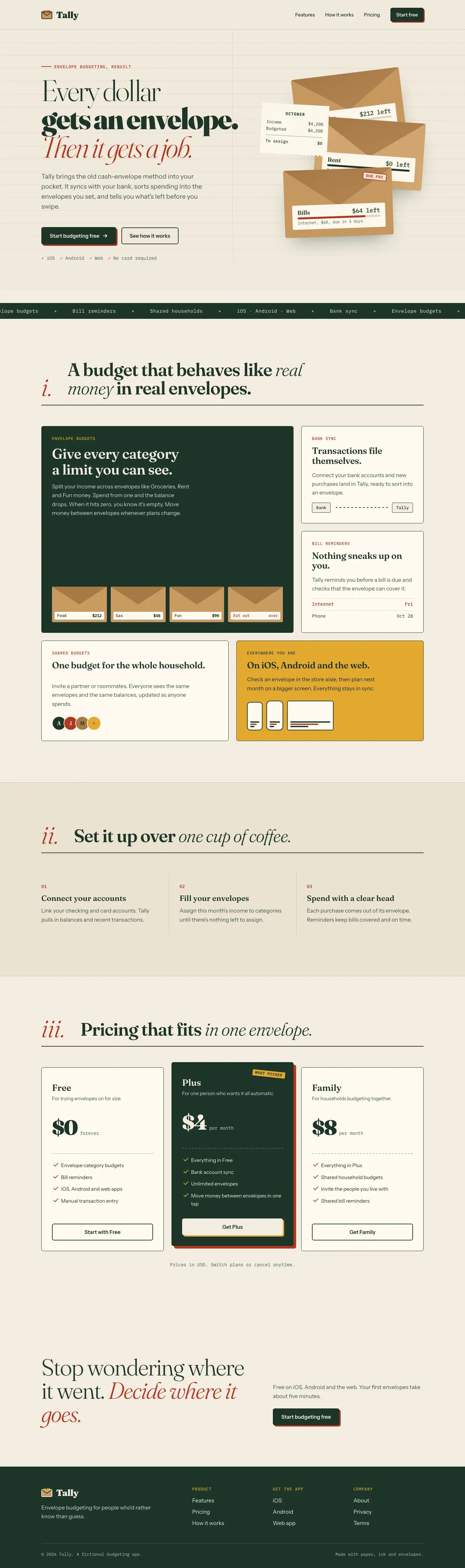
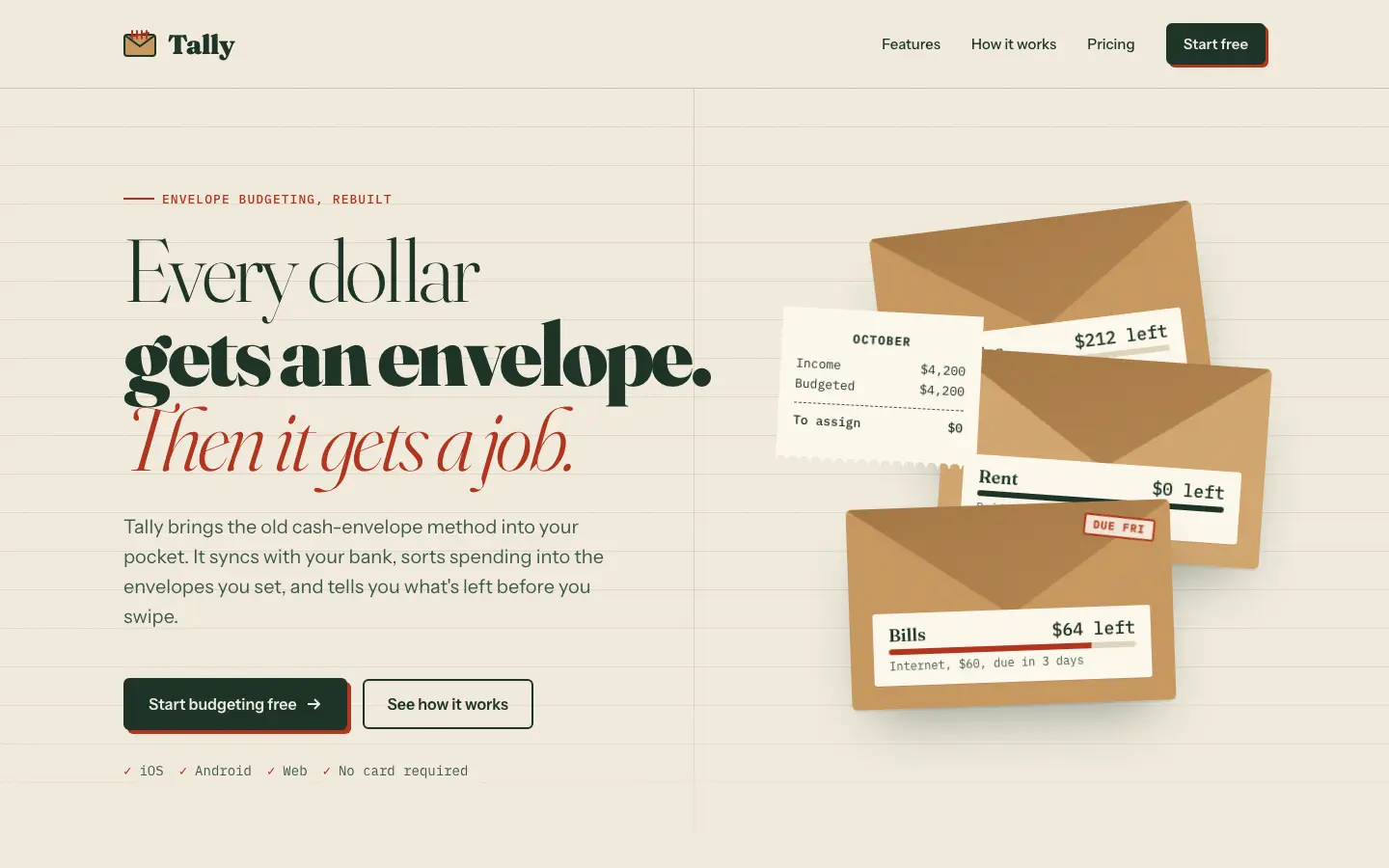
OpenCode Power Pack's Frontend Design gives Tally a cash-envelope ledger: ruled cream paper, a headline mixing light, black and red italic Fraunces, stacked kraft envelopes with a receipt, IBM Plex Mono figures and buttons with red offset shadows. The dashboard follows with a tall Instrument Serif 'October 2026', DM Mono numbers on ruled paper and a dark bottle-green sidebar. It is committed and consistent, but the cream, serif and forest green palette stays close to the default family. Pick it for a warm finance brand that wants more character than the default.
Side by side
Field
Motion Web
Frontend Design (OpenCode Power Pack)
Fonts
Instrument Serif
Inter Tight
JetBrains Mono
Fraunces
Fraunces
Instrument Serif
IBM Plex Mono
DM Mono
Colors
#f1ece1 paper
#191814 ink
#e0482a vermilion
#f8f5ee light paper
#1d4b3c forest green
#f3ede0 ruled paper
#1d3528 ink green
#b3361f stamp red
#c99a62 kraft
#e2a92f mustard
#17251d bottle green
Pick it for
motion-led landing pages
editorial product launches
portfolios
personal finance apps
warm, crafted brands
editorial product pages
Skip it for
dashboards and app screens
dense data pages
dark or technical products
brands avoiding cream and green
Observations
the dashboard drifts back to the default cream, serif and green look
a dark fill hides the first envelope label in the hero
feature blocks sit faded until scrolled into view
the palette stays in the default cream, serif and green family