
Frontend Design UI/UX (ULPI)
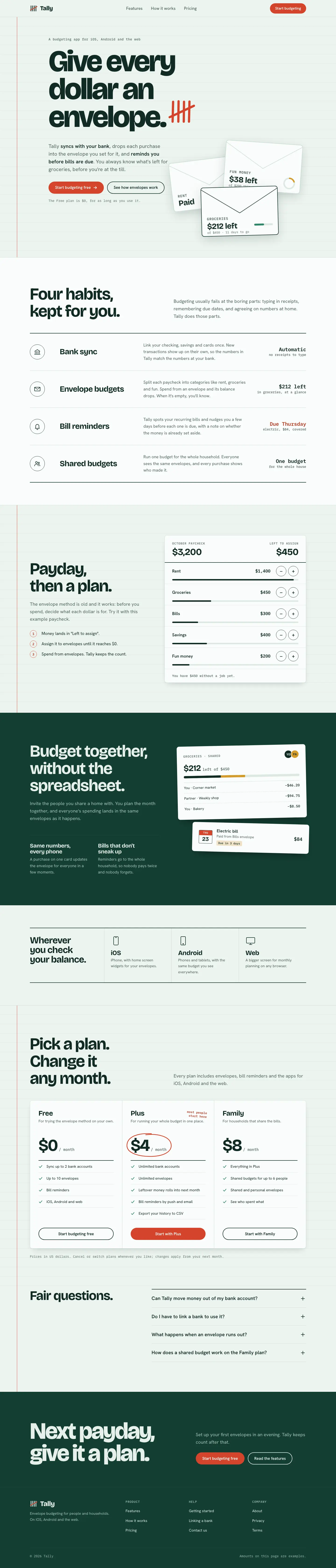
4/5 out of 5. Read the verdictRuled mint ledger paper, tight Bricolage Grotesque, mono notes and a red-pen tally mark. For finance and utility apps.
Made by 
First screen only. Switch to side by side to read the full pages.
Scroll either page; the other follows.
Every skill gets the same Tally brief, alone in a clean project. How we test
Our verdict
4/5 out of 5
Passed the cut
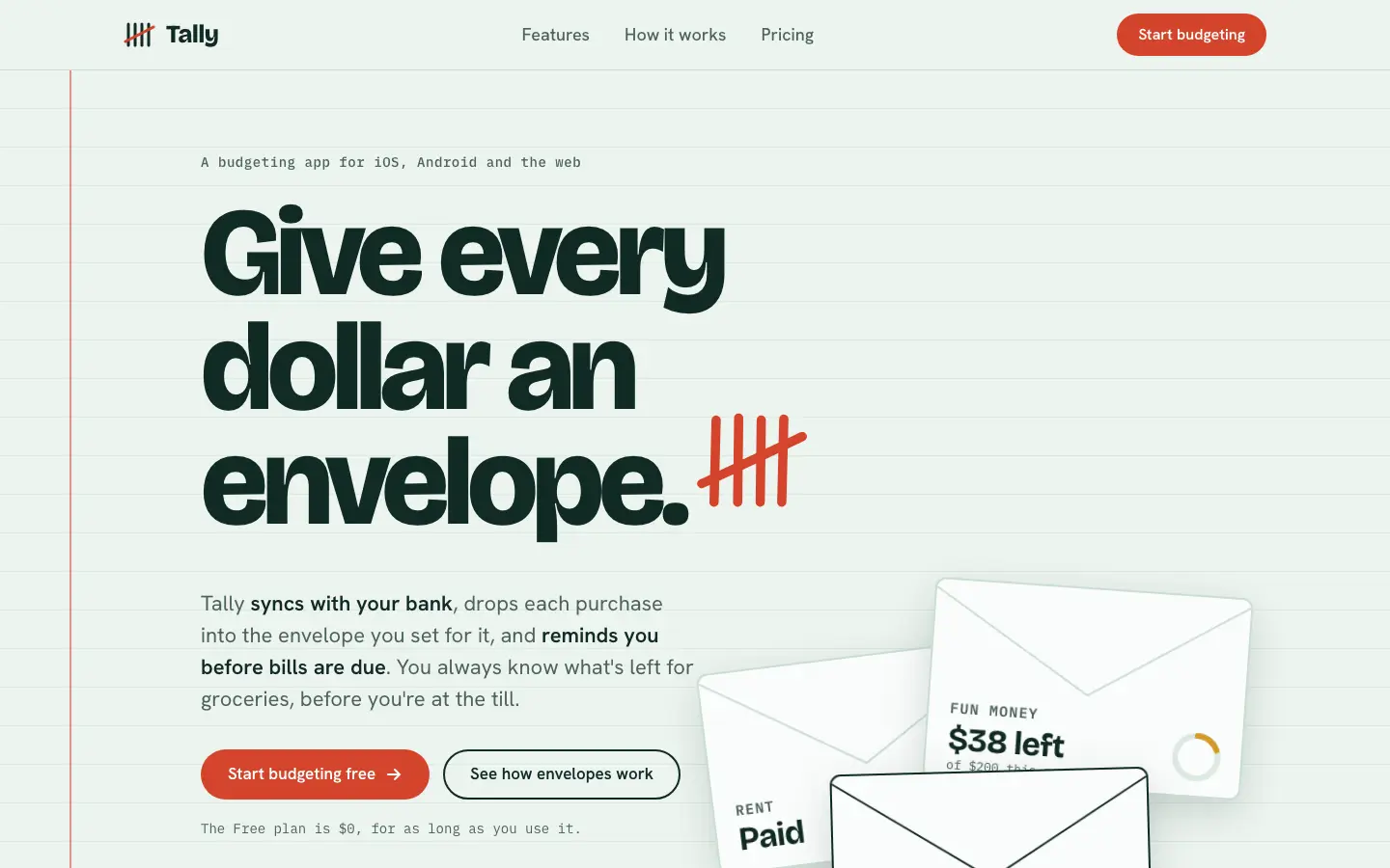
Frontend Design UI/UX puts Tally on a ruled account-book page: pale mint paper with a red margin line, very tight Bricolage Grotesque headlines, Hanken Grotesk and IBM Plex Mono notes, a red-pen tally mark beside the headline and paper envelopes in the hero. The dashboard keeps the ledger with a near-black green sidebar, thin rules instead of cards, a huge $640 and tick-mark envelope bars that turn red past the limit marker. It is a committed idea carried across both pages, far from the default, and both work on a phone. The hero envelopes sit low and are cut by the fold at desktop width. Pick it for finance or utility apps that want a plain, crafted ledger feel.
Compare with Framed Tech Dark Border Gradient (Meng To)Pick it for
- finance and budgeting apps
- productivity tools
- dense data screens
Skip it for
- luxury or fashion brands
- playful consumer apps
Colors
Observations
- the hero envelopes are cut off by the fold at desktop width
Install
1 Run in your terminal
npx degit ulpi-io/skills/frontend-design-ui-ux#main .claude/skills/frontend-design-ui-ux2 Or paste a prompt into Claude Code, Codex, Cursor or Gemini
It tells your tool to install this from its source repository.
This install is for Claude Code only; for other agents use Copy prompt or copy the skill folder.
Copies just this skill's folder into your project's .claude/skills.
Check the source for the latest instructions.
We installed the frontend-design-ui-ux folder from this repo.
Details
Made by
ULPIOrg
Is this you? Claim it
- Type
- Skill
- GitHub stars
- 5*
- Updated
- 2mo ago
- License
- Not listed
- Best for
- Visual directionDesign systems
Test runOpus 5.5Claude Code 2.1.303Oct 20, 2026generated in 9 minabout $1.95 at API pricescommit b3e5e33
* Stars are for the whole ulpi-io/skills repository.
Made this skill?Put your score on your README, and claim this page for a link to your site. 
1. Put your score on your README
[](https://skillsfordesign.com/s/ulpi-frontend-design-ui-ux/) The badge links here. If a retest changes the score, it updates by itself.
2. Claim this page
Get a free backlink to your site.
- A followed link, not nofollow. From the page about your skill, on a site about design skills, to your portfolio, product or studio. Search engines count it.
- Your name on the page. Credited as the maker, right under the description, where every visitor sees it.
- Free. Usually live within a few days.
How it will look
Thanks, we have it.
We'll check the repo and email you when your name is on the listing.
Similar
Same brief, other skills
Claude Design System Prompt
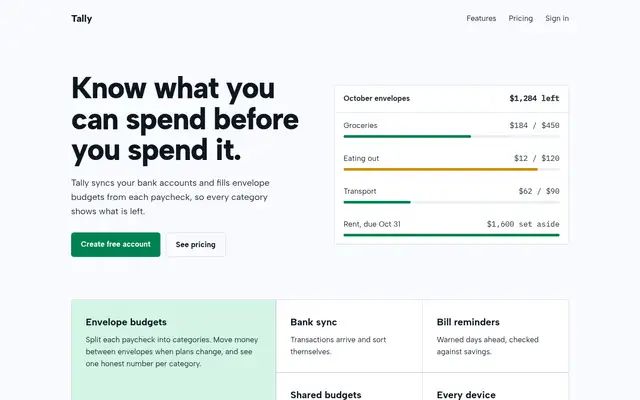
This system prompt moves Tally to a cool grey-and-ink look with Bricolage Grotesque, Geist and a lime marker, and the dashboard is clean and well organized. One contrast bug on the closing CTA keeps it from a higher score.
updated 3mo ago
Theme Factory (Anthropic)
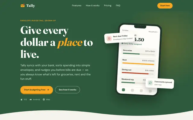
Theme Factory picked a forest-and-marigold theme for the landing page, in Fraunces and DM Sans, and a separate forest-and-olive one in Source Serif 4 and Figtree for the dashboard. Both are tidy, but they stay in the cream-and-green family of the default. A floating 'Rent due Friday' card covers the hero balance. Pick it for quick, warm theming.
updated 8d ago
Stitch Design Taste (Taste Skill)
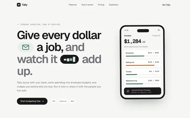
Taste Skill's copy of the Stitch taste skill gives almost the same page as the Google Labs version: Geist on warm off-white, a deep green accent, crisp cards and a quiet dashboard. Pick it if you want clean, modern SaaS pages; pick either this or Stitch's original, not both.
updated today
Taste Design (Stitch Skills)
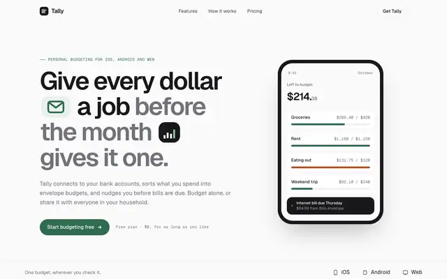
Stitch's taste skill swaps the cream-and-serif default for Geist on a near-white canvas, with a deep green accent and small icon chips set right into the headline. The dashboard is calm and consistent with the landing. Pick it if you want clean, current SaaS polish and don't need a strong personality.
updated 2mo ago
Also good for these
Frontend Design (OpenDesign)
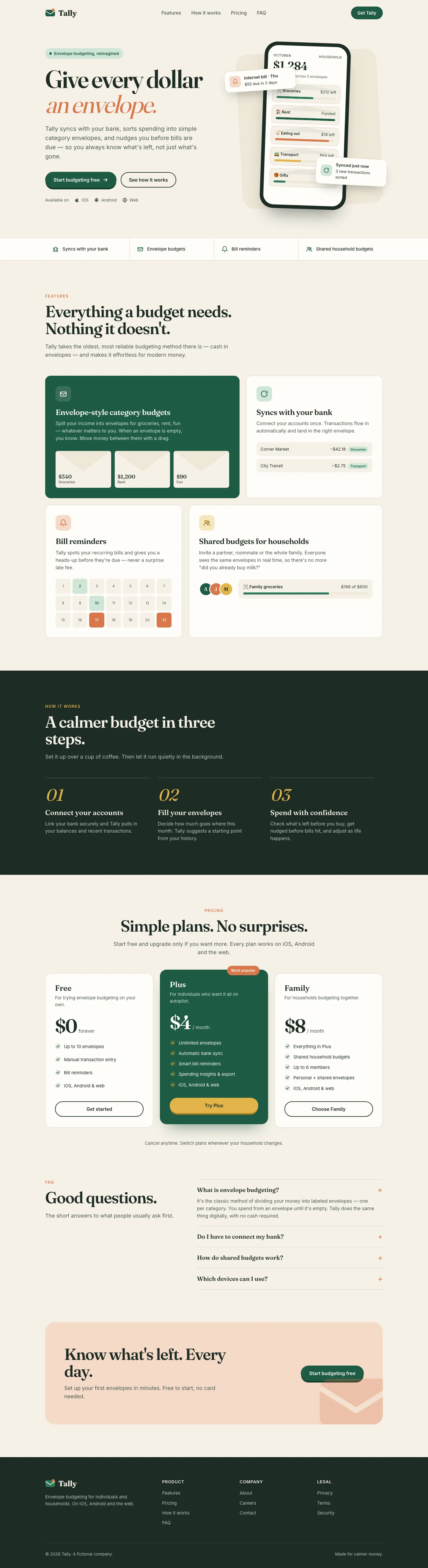
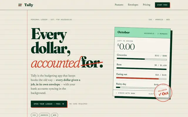
OpenDesign's Frontend Design turns Tally into an accountant's ledger: ruled cream paper with a red margin line, black-weight Fraunces with a struck-through 'for.', a tilted ledger card with a mint header and a red 'Balanced Oct' stamp, Newsreader body text and IBM Plex Mono labels. The dashboard keeps the idea with a sentence-style summary, hatched chart bars and calendar-tile bills. It is the most committed take in this group, but the cream, serif and forest green base stays near the default, and the stamp covers the card's footer text. Pick it for a finance product that wants a clear, crafted concept.
updated 4mo ago
Frontend Design (OpenCode Power Pack)
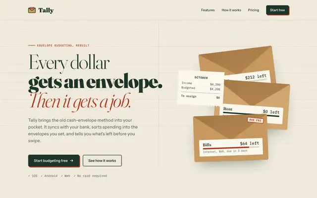
OpenCode Power Pack's Frontend Design gives Tally a cash-envelope ledger: ruled cream paper, a headline mixing light, black and red italic Fraunces, stacked kraft envelopes with a receipt, IBM Plex Mono figures and buttons with red offset shadows. The dashboard follows with a tall Instrument Serif 'October 2026', DM Mono numbers on ruled paper and a dark bottle-green sidebar. It is committed and consistent, but the cream, serif and forest green palette stays close to the default family. Pick it for a warm finance brand that wants more character than the default.
updated today
ECC Frontend Design Direction
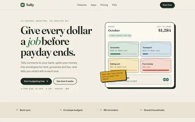
ECC keeps a Fraunces and cream landing page but adds mono labels and a tilted sticky note. The IBM Plex dashboard is more useful than the baseline's, with a sync alert, search and person filters.
Frontend Design Deslop
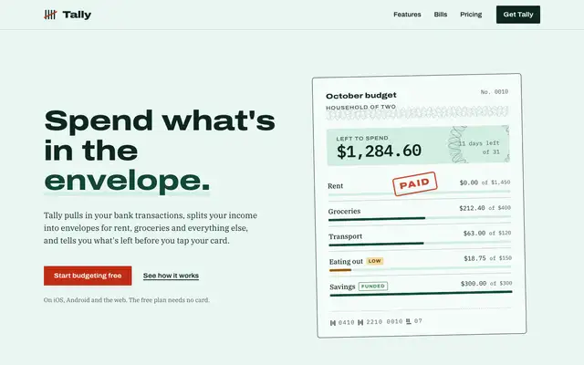
Frontend Design Deslop gives Tally a printed cheque: banknote green on pale mint, wide Archivo headlines over IBM Plex Serif text, a guilloche-patterned budget slip with a red PAID stamp, a bill timeline on a green band and pricing as tear-off cheques. The dashboard is an account book with an ink-green sidebar, mono figures and the month set out as a sum, but its Fraunces headings and green cards drift back toward the default. The landing page also scrolls sideways on a phone, where the nav runs out of room. Pick it for fintech or banking products that want a paper-money motif.
updated 16d ago