



Refactoring UI (s0xDk)
3/5 out of 5. Read the verdictDesigns and improves interfaces with concrete Refactoring UI rules: spacing, type, color and shadow scales, and hierarchy through weight and color.
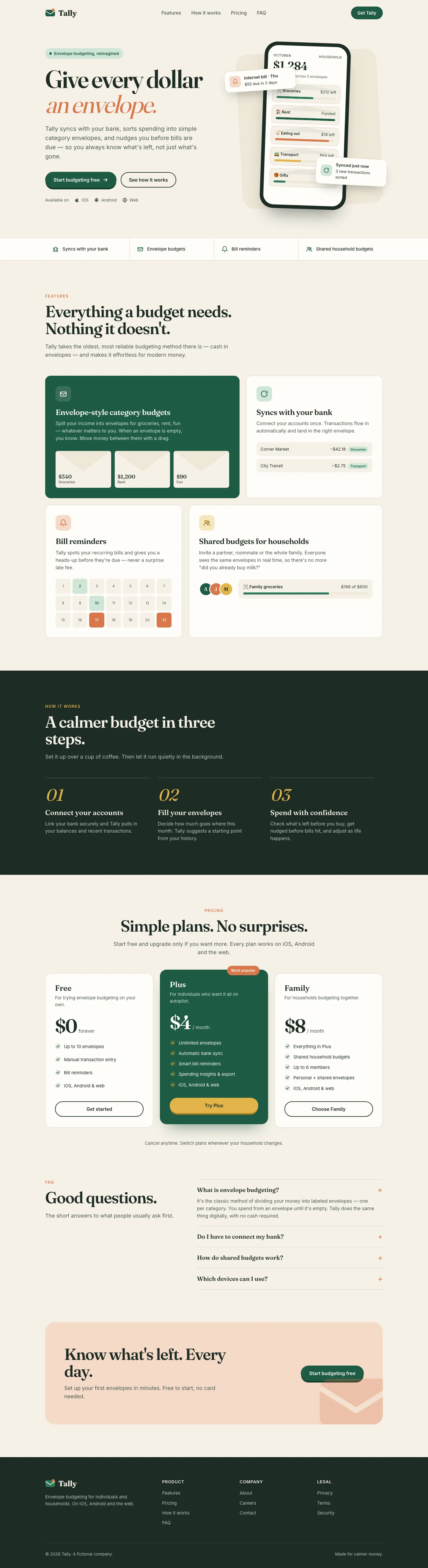
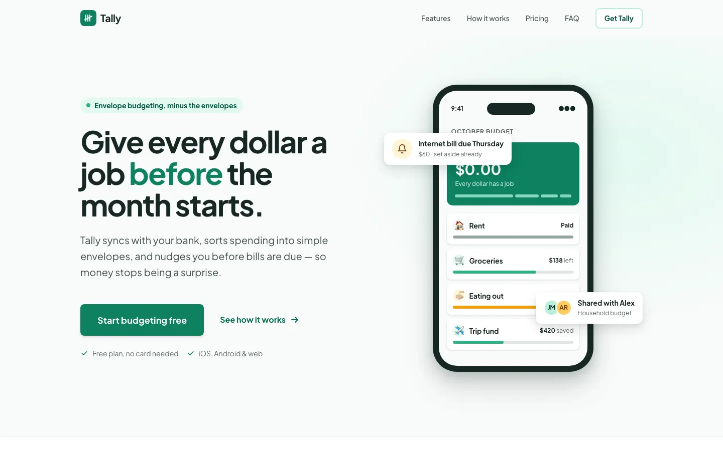
First screen only. Switch to side by side to read the full pages.
Scroll either page; the other follows.Full Refactoring UI (s0xDk) pageFull baseline
Every skill gets the same Tally brief, alone in a clean project. How we test
Our verdict
3/5 out of 5
Passed the cut
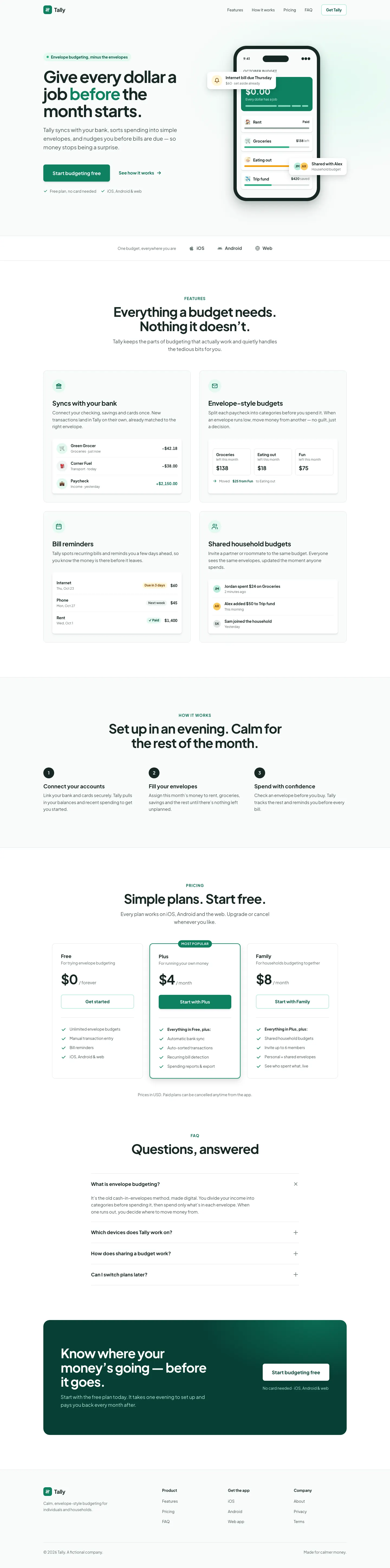
Refactoring UI gave Tally a careful, systematic look: Plus Jakarta Sans, an evergreen palette with green-tinted greys and proper spacing, type and shadow scales on the landing, and an indigo app on cool grey for the dashboard. Color is used for meaning, and over-budget states get an icon and a tag as well. It is clean and well built, though the two pages use different palettes. Pick it to tighten an interface rather than to set a brand.
Pick it for
- cleaning up existing UIs
- SaaS dashboards
- design-system scales
- developer-built products
Skip it for
- brands that want a strong visual identity
- editorial sites
- playful products
Typography
- Plus Jakarta Sanslanding
- Interdashboard
Colors
Observations
- the landing is evergreen and the dashboard indigo, so the two pages do not feel like one product
Install
1 Run in your terminal
npx degit s0xDk/refactoring-ui-skill#main .claude/skills/refactoring-ui2 Or paste a prompt into Claude Code, Codex, Cursor or Gemini
It tells your tool to install this from its source repository.
This install is for Claude Code only; for other agents use Copy prompt or copy the skill folder.
Copies just this skill's folder into your project's .claude/skills.
Check the source for the latest instructions.
We tested the refactoring-ui skill from this repo.
Details
- Type
- Skill
- GitHub stars
- 651*
- Updated
- 2mo ago
- License
- NOASSERTION
- Best for
- Design systemsAudit
Test runOpus 5.5Claude Code 2.1.303Oct 19, 2026generated in 7 minabout $1.60 at API pricescommit 4887214
* Stars are for the whole s0xDk/refactoring-ui-skill repository.
Made this skill?Put your score on your README, and claim this page for a link to your site. 
1. Put your score on your README
[](https://skillsfordesign.com/s/refactoring-ui/) The badge links here. If a retest changes the score, it updates by itself.
2. Claim this page
Get a free backlink to your site.
- A followed link, not nofollow. From the page about your skill, on a site about design skills, to your portfolio, product or studio. Search engines count it.
- Your name on the page. Credited as the maker, right under the description, where every visitor sees it.
- Free. Live within a few days.
How it will look
Thanks, we have it.
We'll check the repo and email you when your name is on the listing.
Similar
Same brief, other skills
ux-ui-agent-skills
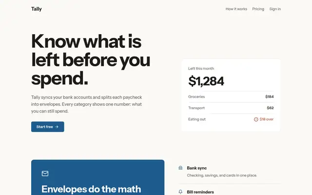
Once loaded, UX/UI Agent Skills pulls three of its skills (design-screen, design-doctrine, data-dashboard) and produces a careful, well-reasoned version of the default: Newsreader serif, ink green and ochre, and a dashboard that explains pace and what is unassigned. Solid work, though it still reads as the familiar cream-and-green look.
updated 7d ago
claude-design-system-prompt
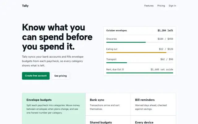
This system prompt moves Tally to a cool grey-and-ink look with Bricolage Grotesque, Geist and a lime marker, and the dashboard is clean and well organized. One contrast bug on the closing CTA keeps it from a higher score.
updated 3mo ago
hue
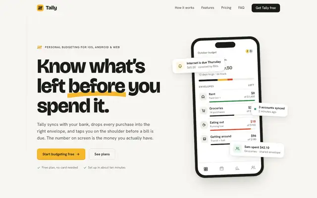
hue is built to turn a brand into a new design-language skill. With our one-file brief it skipped those extra files and used its rules for picking colors and fonts, and the result is a clear brand: a pocket-ledger look with warm off-white paper, near-black ink, one marigold highlight and chunky Bricolage Grotesque over Hanken Grotesk. The landing and the dashboard match closely, and neither looks like the cream-and-serif default. Pick it if you want a skill that settles a brand before it designs.
updated 4mo ago
Theme Factory (Anthropic)
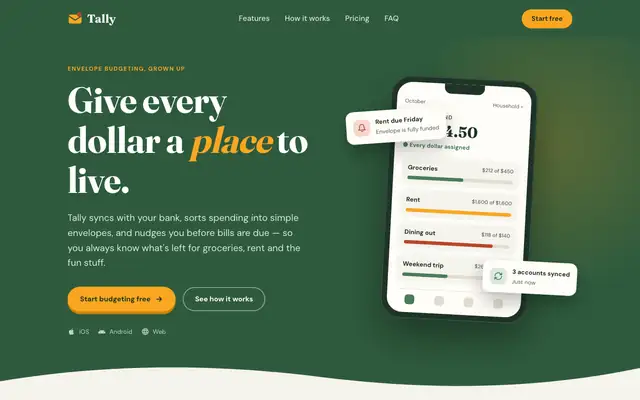
Theme Factory picked a forest-and-marigold theme for the landing page, in Fraunces and DM Sans, and a separate forest-and-olive one in Source Serif 4 and Figtree for the dashboard. Both are tidy, but they stay in the cream-and-green family of the default. A floating 'Rent due Friday' card covers the hero balance. Pick it for quick, warm theming.
updated 8d ago
Also for these tasks
Taste Design (Stitch Skills)
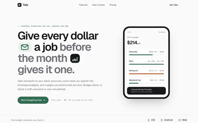
Stitch's taste skill swaps the cream-and-serif default for Geist on a near-white canvas, with a deep green accent and small icon chips set right into the headline. The dashboard is calm and consistent with the landing. Pick it if you want clean, current SaaS polish and don't need a strong personality.
updated 2mo ago
Codex (Awesome Design Skills)
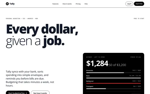
Codex makes Tally stark black and white: oversized heavy Open Sans headlines, pill buttons, thin black rules and inverted black bands, with no shadows or gradients. The dashboard uses big light numbers and black as the only fill, with red and green only for status. It is clean and confident. Pick it for developer tools or brands that want a strict monochrome look.
updated 4mo ago
Minimal (Awesome Design Skills)
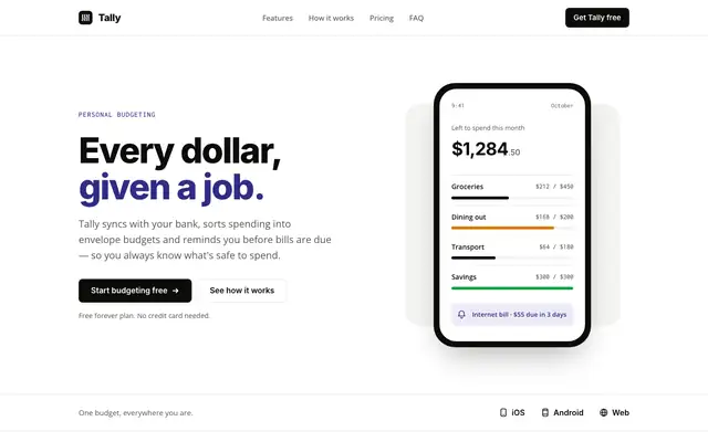
Minimal gives Tally lots of white space, a near-black and indigo palette on warm off-white, and big Inter headlines over Open Sans. The dashboard is mostly black and white, with indigo for the $640 and red for the over-budget envelope. It is calm and clean, but the mobile dashboard scrolls sideways. Pick it for products that want quiet, simple pages.
updated 4mo ago
Paper (Awesome Design Skills)
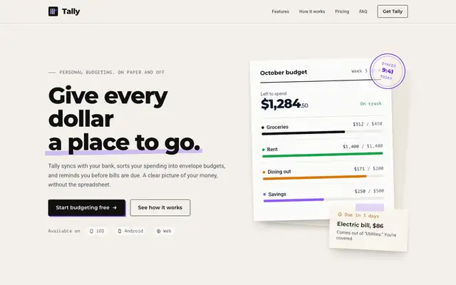
Paper gives Tally a ledger feel: warm grainy off-white, black Montserrat headlines, Roboto body text, PT Mono labels and violet as the only accent. The landing hero is a budget sheet with a "synced" stamp and a taped-on note. It is tidy and has a small idea, but it stays close to a plain light page, and the mobile dashboard scrolls sideways. Pick it for calm, print-flavored products.
updated 4mo ago