

Skill author
Ghulam Mustafa
I'm just here for the vibes, man
- Listed skills
- 11
- Best score
- 4/5
About
Ghulam Mustafa is a product designer in the United Kingdom. Known for Design Resources for Developers, a curated list of design and UI resources, and the Inclusive Design Checklist.
Is this you? Claim your listings for a followed link to your site.
All 11 skillsby score
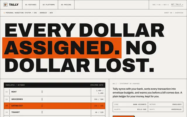
Brutalist Industrial (Design Taste by Mustafa)
Brutalist Industrial gives Tally a declassified blueprint: huge uppercase Archivo headlines, IBM Plex Mono labels, 1px black rules around every cell, warm paper and safety orange as the only accent. The landing indexes features as F.01 to F.04, fills the Plus pricing column in orange and ends on a giant TALLY wordmark; the dashboard keeps the same voice with an OCTOBER 2026 headline, black and orange summary blocks and a ruled envelope table. A few labels collide, such as the chart's average tag and a clipped rent figure, and the hero envelope bars on the landing render empty. Pick it for products that want to look like an instrument or a technical document.
updated 2mo ago
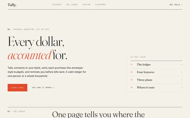
Editorial Minimal (Design Taste by Mustafa)
Editorial Minimal gives Tally a printed broadsheet: light Fraunces headlines with one italic vermilion word, IBM Plex Mono section numbers, hairline rules and an "In this issue" index beside the hero. The dashboard keeps the voice in Newsreader, opening with "You have $640 left to give a job" next to a ruled column of figures, and lists envelopes as a numbered table with one red over-budget bar. The background is cream like the default, but the green, the phone mockup and the cards are all gone, and both pages read well on a phone. Pick it for a calm, print-inspired product that lets type do the work.
updated 2mo ago
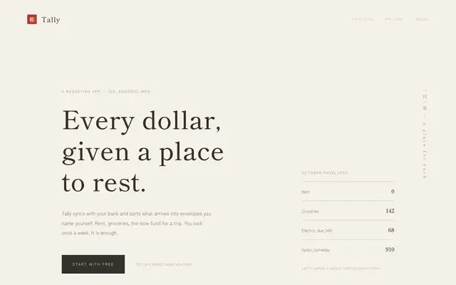
Japanese Minimal (Design Taste by Mustafa)
Japanese Minimal gives Tally a wabi-sabi ledger: Shippori Mincho headlines on rice paper, Zen Kaku Gothic New body text, a red hanko seal by the wordmark and a vertical line of text at the edge of the hero. Features and pricing are thin-ruled rows instead of cards, and the dashboard uses Roman-numeral navigation, three large figures with seal red only on the $640, and a quiet gray bar chart. It is the most restrained look in this batch and holds together on both pages and on a phone, though the small gray text is faint and the landing feels sparse. Pick it for studios, tea or wellness brands, or any product that wants stillness.
updated 2mo ago
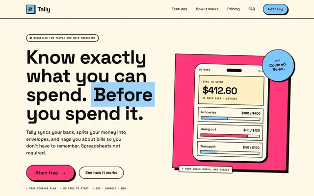
Neo-Brutalism (Design Taste by Mustafa)
Neo-Brutalism puts Tally in thick black outlines: Space Grotesk headlines with a sky-blue highlighted word, a tilted hot-pink panel holding the phone with a round "Rent covered" sticker, and pricing cards styled like packaging labels. The dashboard carries the same borders and hard offset shadows, with Space Mono stamp labels, a hot-pink "Left to budget" card with quick actions and a striped over-budget envelope. The copy is playful and everything stays readable, but the dashboard scrolls sideways on a phone. Pick it for consumer apps and brands that want personality.
updated 2mo ago
Playful Color (Design Taste by Mustafa)
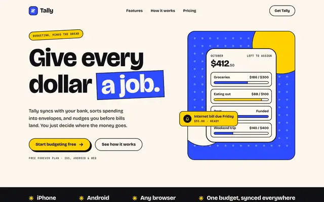
Playful Color gives Tally a poster: heavy Bricolage Grotesque headlines with "a job" on a tilted cobalt block, a dotted cobalt and yellow panel behind the app card, and sections that switch between full cobalt, black and yellow. The dashboard keeps it going with a black sidebar, a huge "October is on track" headline, a cobalt "$640 left" card with an "Assign it" sticker and a black-and-yellow striped bar for the over-budget envelope. Two colors are used with discipline and both pages hold up on a phone; a bill notice in the hero covers one envelope row. Pick it for consumer, education or event products that want energy.
updated 2mo ago
Retro Print (Design Taste by Mustafa)
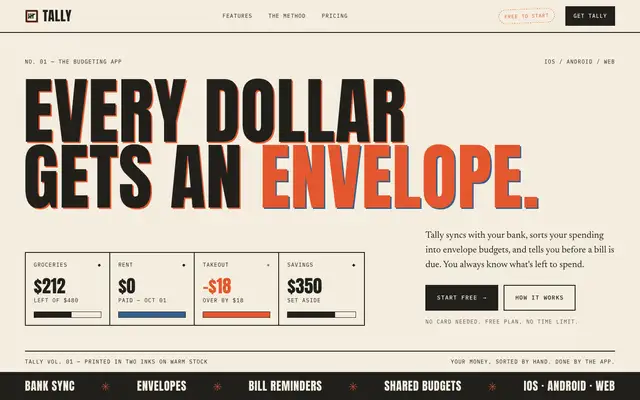
Retro Print prints Tally like a risograph poster: giant Anton capitals with a misregistered red and blue shadow, Newsreader for body text, IBM Plex Mono labels, a boxed row of envelope figures and a black marquee strip. Further down, a halftone panel draws the envelopes and pricing ends with a black Plus card and a red Family card. The dashboard keeps every idea, with a dotted "$640 left to budget" panel, numbered envelope rows, halftone chart bars and a dashed "over by $36" stamp. It is committed, readable and works on a phone. Pick it for food, music, event or agency brands with an analog voice.
updated 2mo ago
Cinematic Motion (Design Taste by Mustafa)
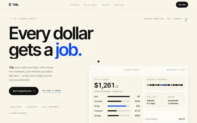
Cinematic Motion gives Tally warm studio paper, tight Inter Tight headlines, IBM Plex Mono scene labels like "00 Opening credits" and one electric blue #0F4BFD. The landing has a live hero dashboard, a drag carousel and dark sections that pin and scrub on scroll; the dashboard leads with "October has $640 to give a job." beside an ink sidebar, with black chart bars and blue only where attention is needed. The dashboard is the stronger page. On the landing, the pinned sections show as large empty dark blocks in a full-page view and a feature marquee runs off the edge, and the phone dashboard scrolls sideways. Pick it for launches and portfolios that want scroll storytelling.
updated 2mo ago
Corporate Trust (Design Taste by Mustafa)
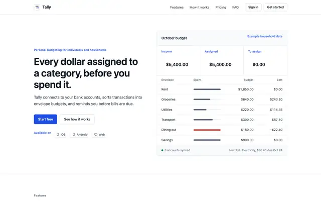
Corporate Trust gives Tally white surfaces, system type, thin gray rules and one deep blue #1F4FE0, with a bordered October budget table as the hero and a full comparison table for pricing. The dashboard matches: plain bordered panels, tabular figures, slate bars and red only for Dining out. It is restrained on purpose and well ordered, but it looks like any enterprise SaaS product, and on a phone the hero table is cut off at the right edge. Pick it when credibility matters more than personality.
updated 2mo ago
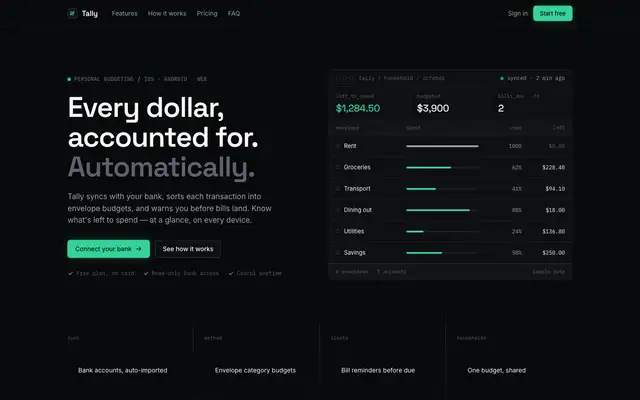
Dark Tech (Design Taste by Mustafa)
Dark Tech gives Tally a near-black instrument console: Space Grotesk headings, Inter text, IBM Plex Mono labels with keys like left_to_spend, hairline borders and one emerald #34D399. The landing hero is a terminal-style envelope table, and the dashboard matches with dark panels, an emerald October bar and white rather than red for the over-budget envelope. Both pages are consistent and carefully built, though small gray mono text on black is hard to read, the result looks like many developer tools, and the phone dashboard scrolls sideways. Pick it for developer, infrastructure or AI products.
updated 2mo ago
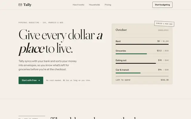
Design Taste (Mustafa)
Mustafa's Design Taste gives Tally a quiet paper ledger: light Fraunces headlines with italic emphasis, Instrument Sans text, IBM Plex Mono labels, hairline rules, square buttons and one ledger green on warm paper. The dashboard follows in Newsreader, with a large $640.00 figure, ruled envelope rows with pace ticks and a rust over-budget bar. It is more deliberate and editorial than the default, but its cream, serif and forest-green palette stays very close to it. Pick it for finance or editorial products that want a calm, print-like feel.
updated 2mo ago
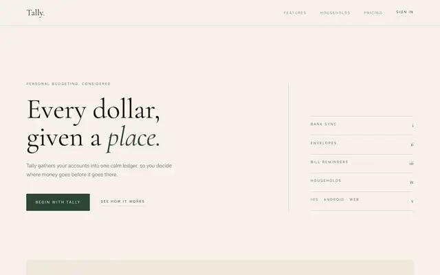
Quiet Luxury (Design Taste by Mustafa)
Quiet Luxury gives Tally a private-bank annual report: Cormorant Garamond headlines with one italic word, widely spaced small caps, an index column of features beside the hero and a ledger panel drawn in hairlines. The dashboard switches the accent from forest green to oxblood and lays envelopes, transactions and bills out as ruled lists instead of cards. It is calm and consistent, but the ivory, serif and green landing sits near the default, much of the gray text is faint, and the hero shows little of the product. Pick it for premium services that want restraint over color.
updated 2mo ago