

Organization
Bergside
We are a company building digital brands used by over 20 million users globally
- Listed skills
- 38
- Best score
- 4/5
About
Bergside is a software company in Romania. It makes TypeUI, a toolkit of design skills and prompts that help AI tools build better interfaces, and DESIGN.md generator plugins for Chrome, Figma, Framer and other design tools.
Is this you? Claim your listings for a followed link to your site.
All 38 skillsby score
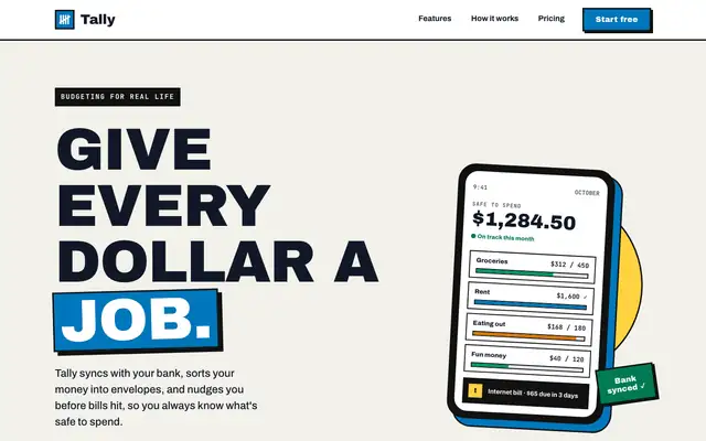
Bold (Awesome Design Skills)
Bold gives Tally a poster: huge uppercase Archivo Black headlines, thick black borders with hard offset shadows, a blue-and-yellow accent pair and a tilted phone in the hero. The dashboard keeps the same voice with a black sidebar, a big black "spent so far" card and striped red for the over-budget envelope. Both pages read clearly and work on a phone. Pick it when you want a product page that shouts.
updated 4mo ago
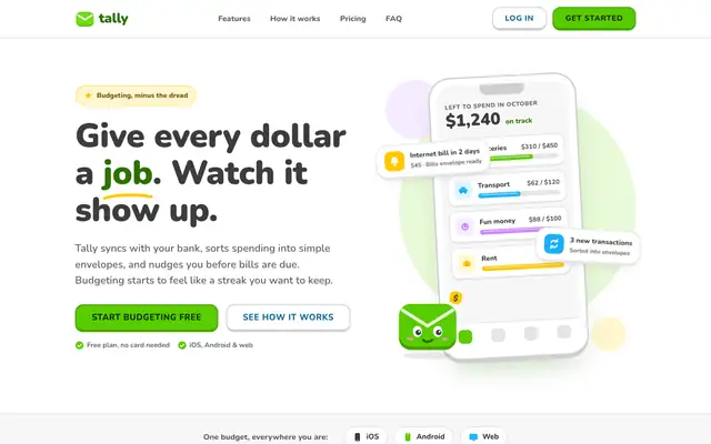
Lingo (Awesome Design Skills)
Lingo makes Tally look like a language-learning app: Nunito everywhere, bright green buttons with a chunky 3D bottom edge, rounded cards and a friendly envelope mascot. The dashboard has a smiling coin next to the "Left to budget" card and color-coded envelope icons. It is cheerful and very consistent across both pages. Pick it for friendly consumer products aimed at beginners.
updated 4mo ago
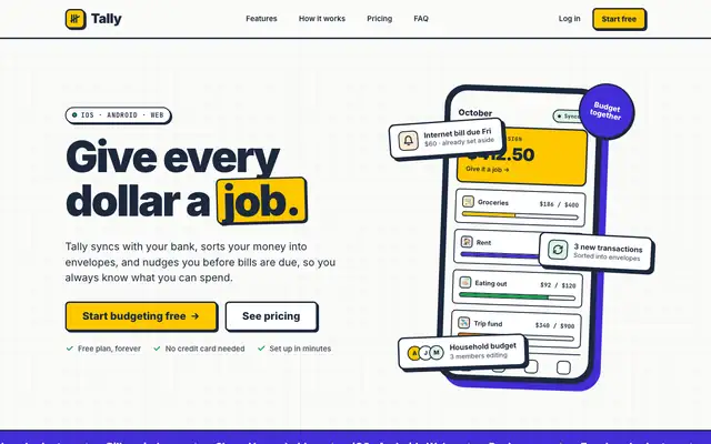
Neobrutalism (Awesome Design Skills)
Neobrutalism puts Tally on warm off-white with thick navy borders, hard offset shadows and flat yellow and violet blocks. The landing has a CSS phone with sticker-like envelope cards; the dashboard uses a dotted background, yellow highlights on the date and summary cards, and a clean transactions table. It is bold but still easy to read on both pages. Pick it for playful products that want a confident, graphic look.
updated 4mo ago
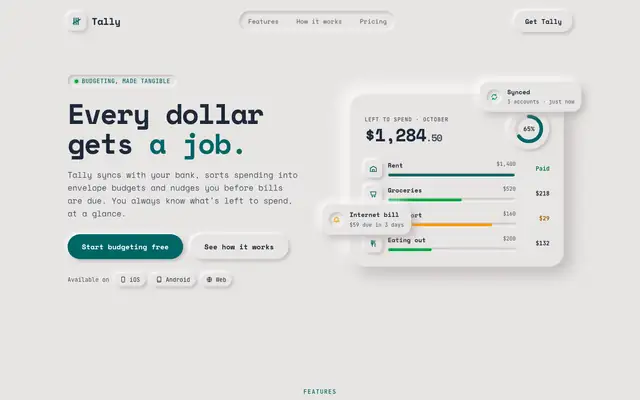
Neumorphism (Awesome Design Skills)
Neumorphism turns Tally into soft grey plastic: a warm stone surface, cards and buttons that look raised or pressed in, Space Mono type and one deep teal accent. The dashboard carries it through with pressed-in progress bars, a recessed chart and a ring gauge. It is one of the few runs where the style holds on every card without falling apart. Pick it for calm, tactile tools where readability is not the top concern.
updated 4mo ago
Pac-Man (Awesome Design Skills)
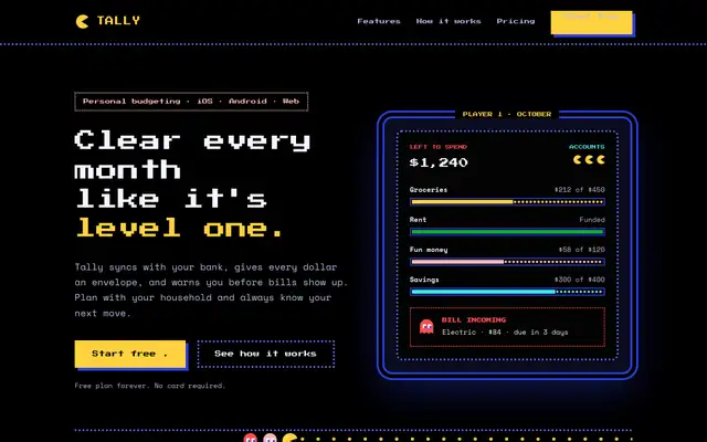
Pac-Man turns Tally into an arcade cabinet: black screens, blue dotted maze borders, Press Start 2P headings and power-pellet yellow buttons. The hero is an arcade screen with envelope budgets as pellet bars, and on the dashboard a little Pac-Man chomps along each envelope while the over-budget one gets ghost styling. The theme is committed and still readable. Pick it for playful or gaming-adjacent brands.
updated 4mo ago
Vintage (Awesome Design Skills)
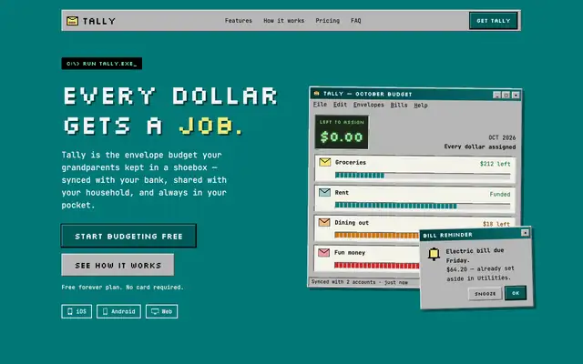
Vintage builds Tally as a Windows 95 desktop: a grainy teal background, beveled silver windows, Silkscreen pixel headings and JetBrains Mono text. Features, pricing and the FAQ each sit in their own window, and the dashboard adds a title bar, LCD-style readouts and segmented progress bars. It is the most fully committed theme in this batch, and it still works on a phone. Pick it for retro, playful or nostalgic brands.
updated 4mo ago
Ant (Awesome Design Skills)
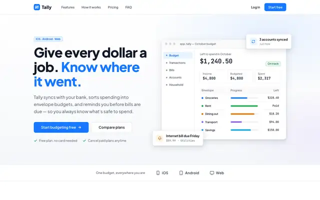
Ant gives Tally the look of Ant Design: white and cool grey, a #1677ff blue, Plus Jakarta Sans with JetBrains Mono figures, and compact bordered cards and tags. The landing hero is a realistic budget dashboard; the dashboard itself is dense and tidy. It is clean and clearly not the default, but it looks like many admin tools. Pick it for data-heavy B2B apps.
updated 4mo ago
Artistic (Awesome Design Skills)
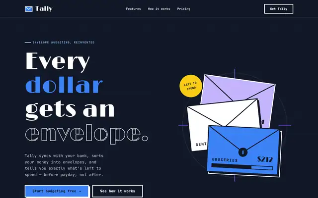
Artistic sets Tally as an Art Deco poster: Limelight display type, JetBrains Mono body text, navy and white sections and solid blue and violet blocks with hard offset shadows. The dashboard keeps the dark sidebar, thick outlines and big colored summary blocks. It has a real point of view, but the mobile dashboard scrolls sideways. Pick it for expressive, poster-like brands.
updated 4mo ago
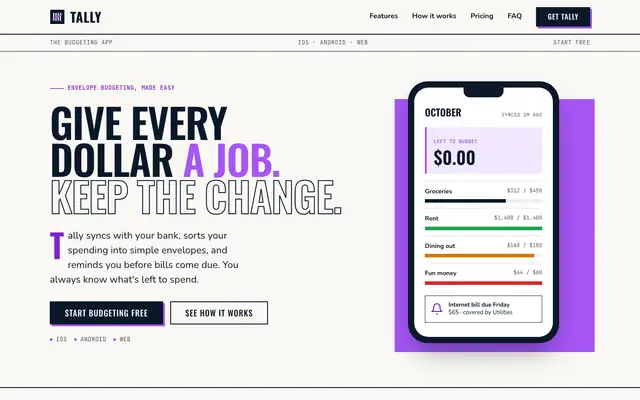
Basic (Awesome Design Skills)
Basic treats Tally like a magazine issue: a masthead with a dateline, numbered section openers, big condensed Oswald headlines, Nunito body text and thin rules, in navy and violet. The dashboard adds a "Vol. 26, No. 10" sidebar and large Oswald numbers split by column lines. The idea comes through, but the mobile dashboard scrolls sideways. Pick it for editorial or report-style products.
updated 4mo ago
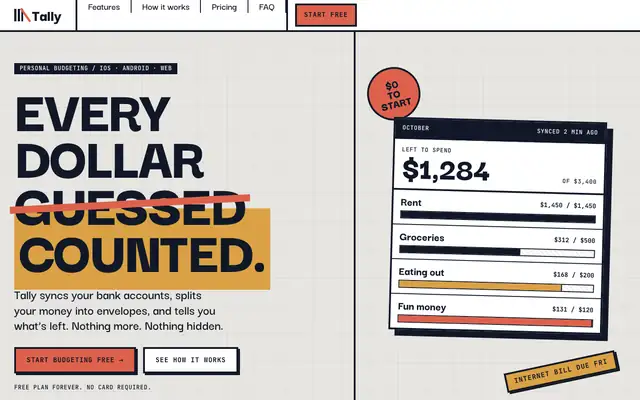
Brutalism (Awesome Design Skills)
Brutalism builds Tally from concrete: a speckled grey grid, 4px black rules, hard offset shadows and huge uppercase Darker Grotesque, with terracotta and ochre blocks. The landing hero is a crooked ledger of envelope budgets; the dashboard uses giant condensed numbers and solid color blocks. It has a strong point of view, but the mobile dashboard scrolls sideways badly. Pick it for bold, design-forward brands.
updated 4mo ago
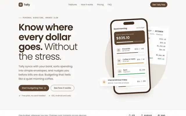
Cafe (Awesome Design Skills)
Cafe gives Tally espresso browns on cream, Poppins type and soft rounded cards. The landing has a phone next to a paper-receipt "monthly tally" and coffee-themed copy; the dashboard leads with a dark espresso summary card. It is warm and tidy, but the cream background and phone hero sit close to the default look, with brown in place of green. Pick it for cozy lifestyle or food brands.
updated 4mo ago
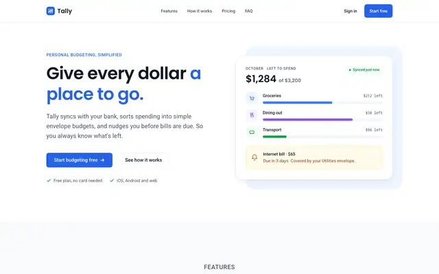
Clean (Awesome Design Skills)
Clean gives Tally a calm white and slate page with one blue accent, Poppins headings over Roboto, Inconsolata figures and an 8px spacing grid. The dashboard is just as plain: white cards, blue bars and color only where status matters. It is tidy and readable, though it looks like many SaaS templates. Pick it as a safe, neutral starting point.
updated 4mo ago
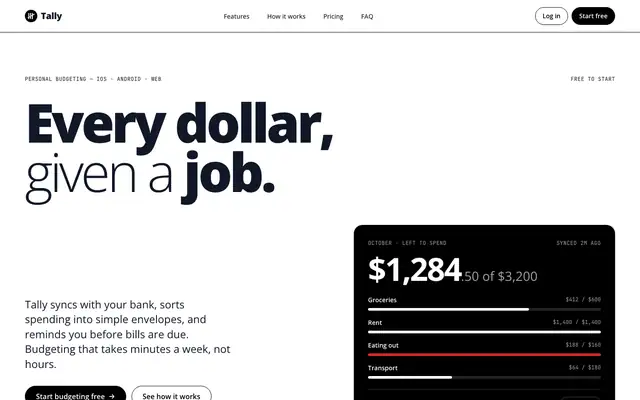
Codex (Awesome Design Skills)
Codex makes Tally stark black and white: oversized heavy Open Sans headlines, pill buttons, thin black rules and inverted black bands, with no shadows or gradients. The dashboard uses big light numbers and black as the only fill, with red and green only for status. It is clean and confident. Pick it for developer tools or brands that want a strict monochrome look.
updated 4mo ago
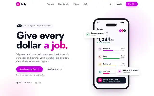
Contemporary (Awesome Design Skills)
Contemporary gives Tally a white page with magenta-to-pink gradient accents, Jost type and a bento grid of feature tiles. The dashboard leads with a gradient "$640 left to budget" card over light tiles. It is clean and current, and the magenta keeps it from looking like the default. Pick it for modern consumer or creator products.
updated 4mo ago
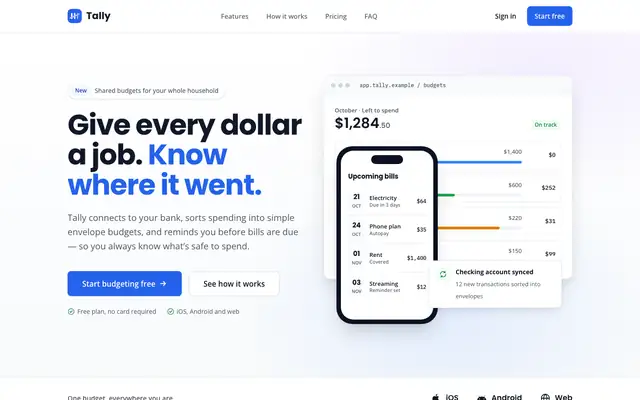
Corporate (Awesome Design Skills)
Corporate gives Tally a clean enterprise look: a 12-column grid, Poppins headings over Open Sans, blue as the main color and violet accents. The dashboard has a white sidebar, summary cards and a tidy envelope grid. It is safe and orderly, but the mobile dashboard scrolls sideways. Pick it for B2B products that want to look established.
updated 4mo ago
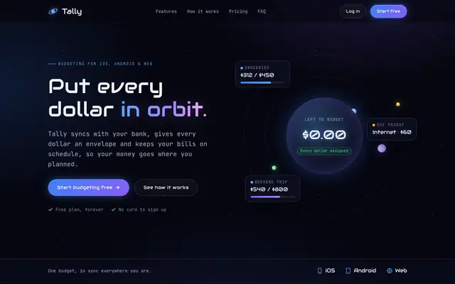
Cosmic (Awesome Design Skills)
Cosmic sets Tally in deep space: a starfield, blue-to-violet neon glows, Audiowide headings and JetBrains Mono text. The landing hero is an animated orbit with envelopes circling the monthly budget; the dashboard uses frosted-glass cards and an orbit-ring gauge. It is distinct and consistent, but the mobile landing scrolls sideways. Pick it for space, gaming or futuristic brands.
updated 4mo ago
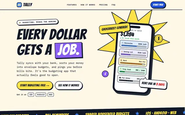
Creative (Awesome Design Skills)
Creative turns Tally into a comic book: Bangers headlines, IBM Plex Mono body text, thick black outlines with pop shadows, halftone dots, speech bubbles and highlighter yellow. The dashboard is a set of comic panels on cream halftone. It is one of the boldest looks here, but both mobile pages scroll sideways. Pick it for playful brands, and plan to fix the phone layout.
updated 4mo ago
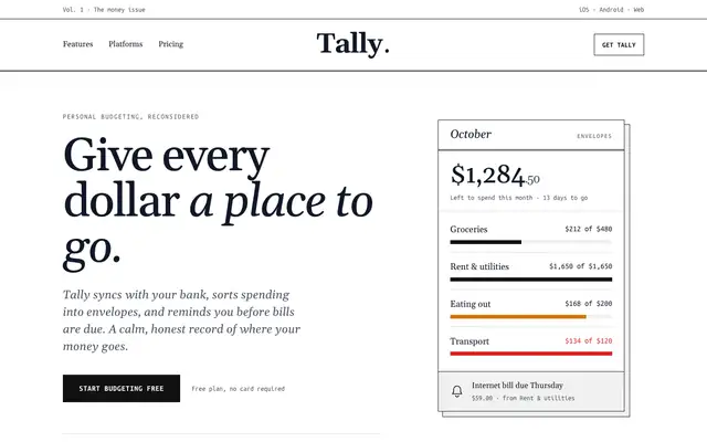
Editorial (Awesome Design Skills)
Editorial sets Tally as a black-and-white newspaper: a masthead, big Gelasio serif headlines with italics, Ubuntu Mono labels, thin rules, a drop cap and a pull quote. The dashboard reads like a monthly issue on warm off-white with double rules and red only on the over-budget envelope. It is elegant, but the mobile dashboard scrolls sideways. Pick it for content-led or editorial products.
updated 4mo ago

Enterprise (Awesome Design Skills)
Enterprise gives Tally a dark cloud-console look: near-black pages, IBM Plex Sans, glass-like panels on an 8pt grid and a brand blue for buttons. The dashboard is dense and readable, with green, amber and red only for status. It is clean and clearly not the default, though it looks like many dark admin consoles. Pick it for dark B2B dashboards.
updated 4mo ago
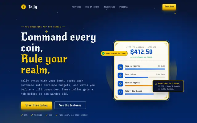
Fantasy (Awesome Design Skills)
Fantasy recasts Tally as a royal treasury: a starry navy hero, New Rocker display type, gold accents, envelopes as "coffers" and plans named Squire, Knight and Guild. The dashboard has a deep-blue sidebar with a gold crest and gold-cornered cards. The theme is fun and consistent, but the light dashboard is calmer than the landing. Pick it for gaming or playful brands.
updated 4mo ago
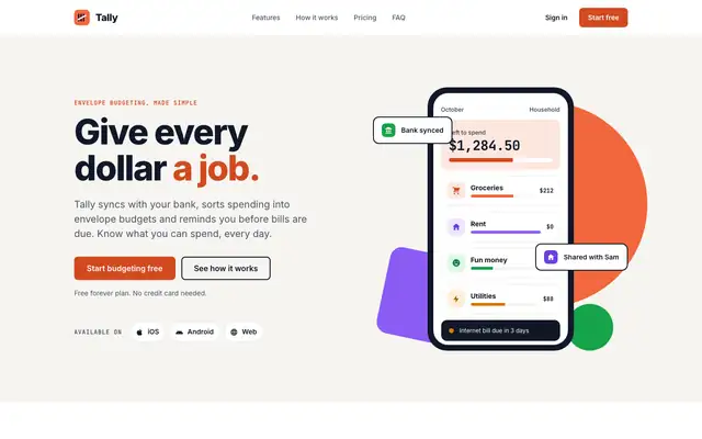
Flat (Awesome Design Skills)
Flat gives Tally solid color blocks with no shadows or gradients: Inter type, a bright tangerine, tinted feature cards and an orange "how it works" band. The dashboard uses a dark sidebar and one tangerine tile for "Left to budget", with a bright color per envelope. It is clean and cheerful. Pick it for friendly products that want a simple, flat look.
updated 4mo ago
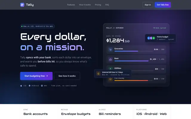
Futuristic (Awesome Design Skills)
Futuristic gives Tally dark navy sections with a faint grid and blue-to-violet glows, Audiowide headings and Roboto text, alternating with white sections. The dashboard is a light control panel with a dark nav rail and a gradient-ringed summary card. It is clean and distinct, though the light dashboard is tamer than the hero. Pick it for tech and AI products.
updated 4mo ago
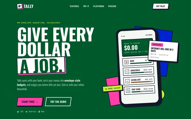
Immersive (Awesome Design Skills)
Immersive sets Tally on one deep-green canvas like a museum exhibit: white cards with thick black borders and hard shadows, cobalt and hot-pink blocks, condensed Oswald headlines and slanted arcade buttons. Features are "Exhibit 01-04" and pricing is "Pick your ticket". The dashboard keeps the same look. It is loud and distinct, but both mobile pages scroll sideways, the dashboard only a little. Pick it for playful, story-led brands.
updated 4mo ago
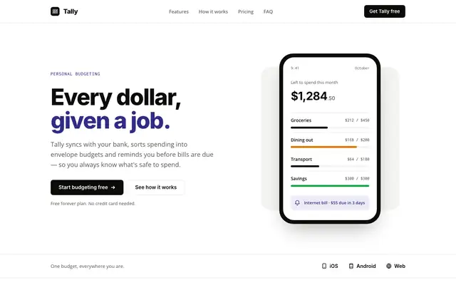
Minimal (Awesome Design Skills)
Minimal gives Tally lots of white space, a near-black and indigo palette on warm off-white, and big Inter headlines over Open Sans. The dashboard is mostly black and white, with indigo for the $640 and red for the over-budget envelope. It is calm and clean, but the mobile dashboard scrolls sideways. Pick it for products that want quiet, simple pages.
updated 4mo ago
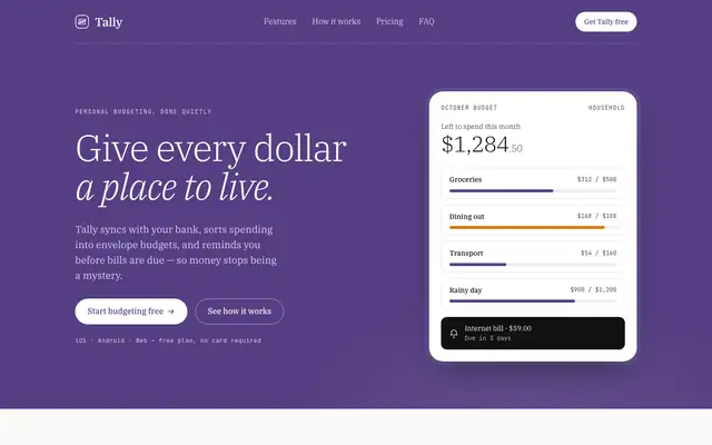
Modern (Awesome Design Skills)
Modern gives Tally a deep purple hero with large light IBM Plex Serif headlines, JetBrains Mono labels and thin dividing lines. The dashboard uses a purple sidebar with the household switcher and white cards. It is calm and polished, and the purple keeps it away from the default look. Pick it for editorial-leaning product pages.
updated 4mo ago
Mono (Awesome Design Skills)
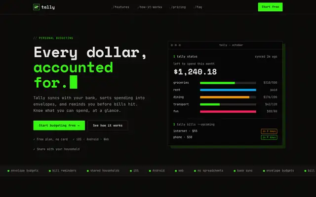
Mono turns Tally into a terminal: near-black pages, Space Mono and JetBrains Mono everywhere, and a bright #37f712 green accent. The landing hero is a CLI-style dashboard; the dashboard uses green only for the active nav, the $640 tile and money coming in. It is consistent and distinct, but the mobile dashboard scrolls sideways. Pick it for developer tools.
updated 4mo ago
Paper (Awesome Design Skills)
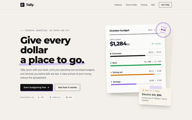
Paper gives Tally a ledger feel: warm grainy off-white, black Montserrat headlines, Roboto body text, PT Mono labels and violet as the only accent. The landing hero is a budget sheet with a "synced" stamp and a taped-on note. It is tidy and has a small idea, but it stays close to a plain light page, and the mobile dashboard scrolls sideways. Pick it for calm, print-flavored products.
updated 4mo ago
Power (Awesome Design Skills)
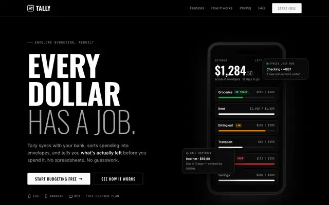
Power gives Tally a black, monochrome page with big uppercase Oswald headlines, thin grid lines and outlined display text. The dashboard is black and white too, with JetBrains Mono numbers and green, amber and red only for status. It is strong and consistent, but the mobile dashboard scrolls sideways. Pick it for premium dark brands.
updated 4mo ago
Pulse (Awesome Design Skills)
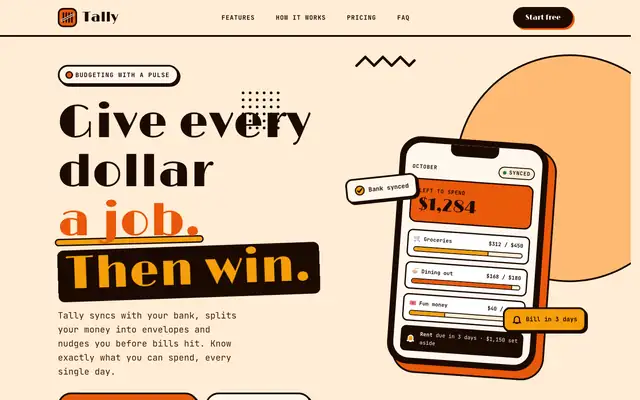
Pulse gives Tally a warm retro poster: cream and orange, 4px dark outlines with hard shadows, big Limelight headlines and circle, triangle and diamond shapes. The dashboard keeps the orange and amber blocks and springy hovers. It is bold and consistent, but the mobile landing scrolls sideways. Pick it for energetic consumer brands.
updated 4mo ago
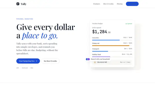
Refined (Awesome Design Skills)
Refined gives Tally a quiet editorial page: Playfair Display headlines, JetBrains Mono figures, white and warm off-white with thin lines and one deep blue accent. The dashboard uses Playfair for big numbers and keeps color to blue and red. It is clean and calm, though it is a familiar look. Pick it for understated premium products.
updated 4mo ago
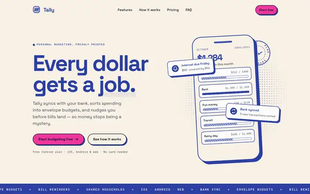
Riso (Awesome Design Skills)
Riso prints Tally in two inks: federal blue for headings and line art, fluorescent pink only on things you click, on warm grainy paper with halftone dots and offset print shadows. The dashboard keeps the same paper and two inks. It has a real point of view, but both mobile pages scroll sideways. Pick it for playful, print-loving brands.
updated 4mo ago
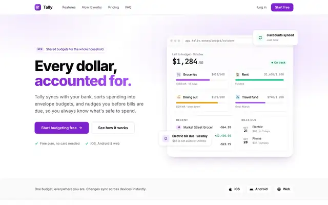
Roku (Awesome Design Skills)
Roku gives Tally a clean developer-tool look: white cards, Inter with JetBrains Mono figures, a frosted top bar and purple accents. The dashboard uses only a top bar for navigation, with the Dashboard tab underlined in purple. It is tidy and works well on a phone, but it is a familiar SaaS look. Pick it for developer-facing dashboards.
updated 4mo ago
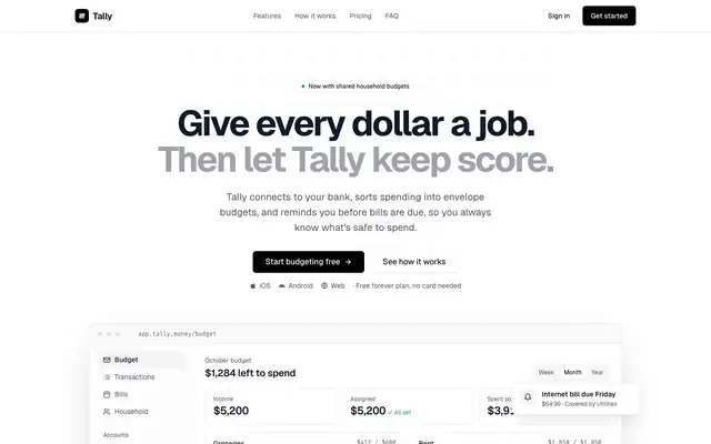
shadcn (Awesome Design Skills)
shadcn gives Tally the familiar shadcn/ui look: Geist type, thin zinc borders, black buttons, Fira Code numbers and a solid black Plus card. The dashboard has a sidebar with the household switcher and color only for status. It is clean and correct, but it is what many AI-built apps already look like. Pick it if you build on shadcn/ui and want pages that match.
updated 4mo ago
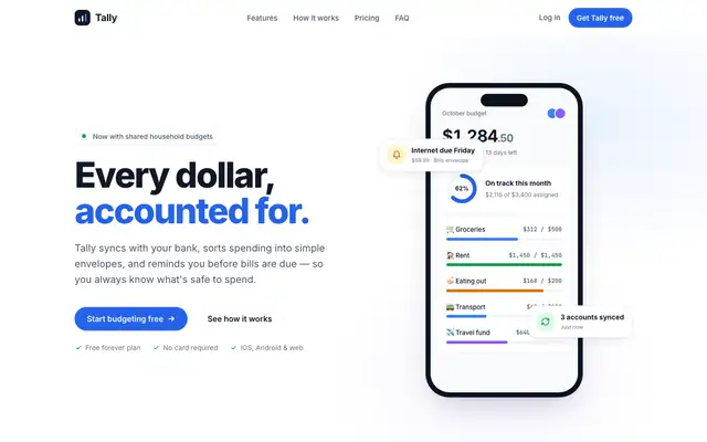
Sleek (Awesome Design Skills)
Sleek gives Tally a light, minimal page: Inter, a neutral palette with one blue accent and an 8px grid. The dashboard puts a dark "Left to budget" card at the top of pale slate cards. It is tidy and readable, but generic. Pick it as a clean neutral base.
updated 4mo ago
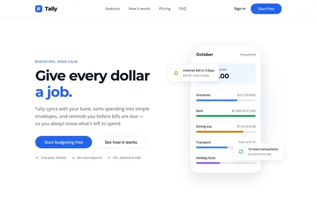
Spacious (Awesome Design Skills)
Spacious gives Tally a roomy white page on an 8pt grid with Montserrat headings, Open Sans text and a blue accent. The dashboard is calm white cards on pale grey with a dark "Left to budget" card. It is clean, but generic, and the mobile dashboard scrolls sideways. Pick it as a neutral base if you plan to add your own brand.
updated 4mo ago
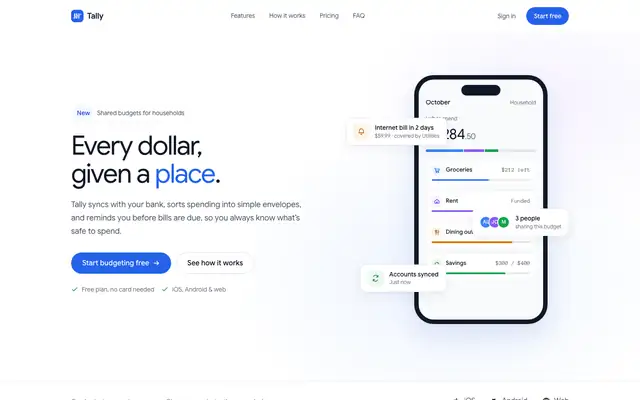
Square (Awesome Design Skills)
Square gives Tally lots of white space, light large Google Sans headings, Anonymous Pro figures and a blue accent with violet touches. The dashboard puts a dark "Left to budget" card first, with red and amber for status. It is polished but generic. Pick it as a clean, light base.
updated 4mo ago
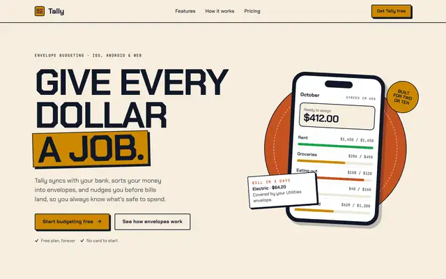
Impeccable (Awesome Design Skills)
This Impeccable is a different skill from pbakaus's Impeccable: a poster style with alternating cream and burnt-orange bands, big Chakra Petch capitals, JetBrains Mono details and an amber brand color. The dashboard uses an orange header and amber bars. It has a strong point of view, but the mobile dashboard scrolls sideways. Pick it for bold, warm brands.
updated 4mo ago
Premium (Awesome Design Skills)
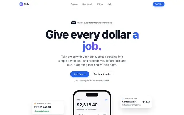
Premium gives Tally the clean, bright SaaS treatment: white and light grey surfaces, Inter throughout, a bright blue accent and a dark closing panel. The dashboard is tidy and well spaced, with a donut gauge and blue bars. Nothing is wrong with it, but it looks like many fintech sites. Pick it if you want safe, polished and current.
updated 4mo ago