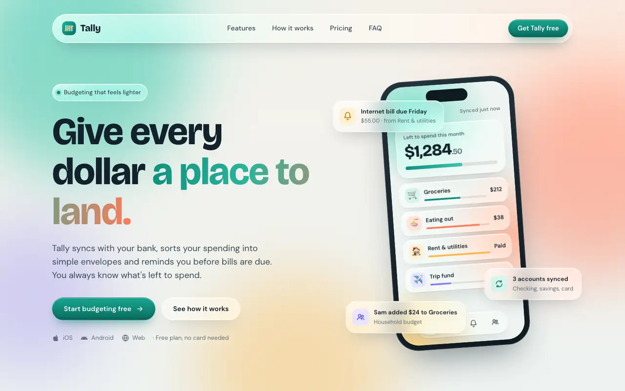
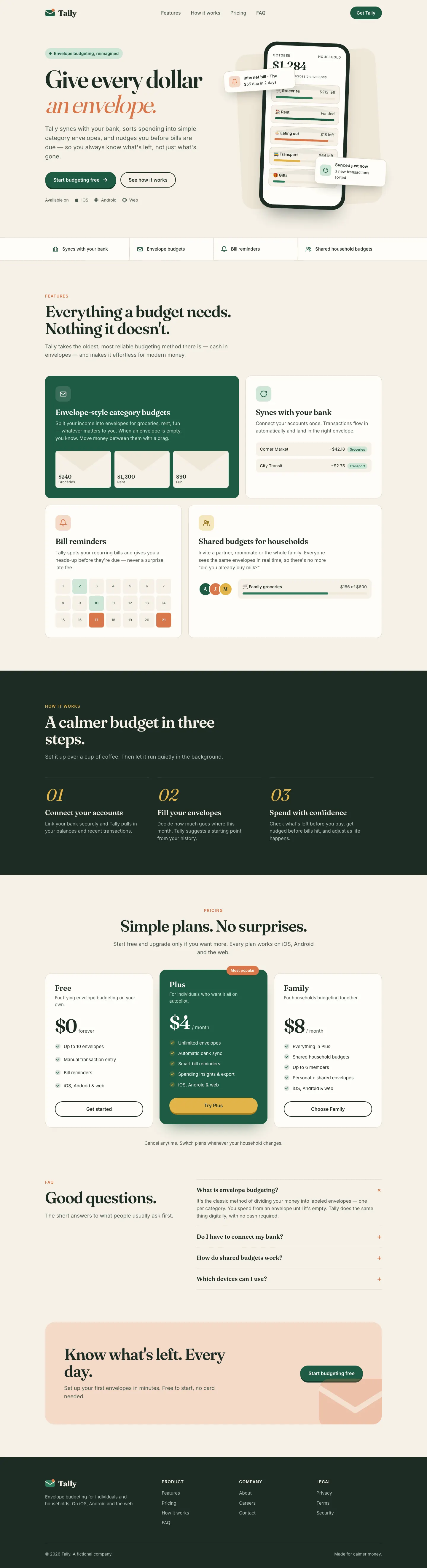
Liquid Glass Design builds Tally out of frosted glass panels floating over soft mint, peach and periwinkle light, set in Bricolage Grotesque and DM Sans. The dashboard keeps the glass in Manrope and stays readable. Pick it if you want a friendly, Apple-flavored product that looks nothing like the cream-and-serif default.
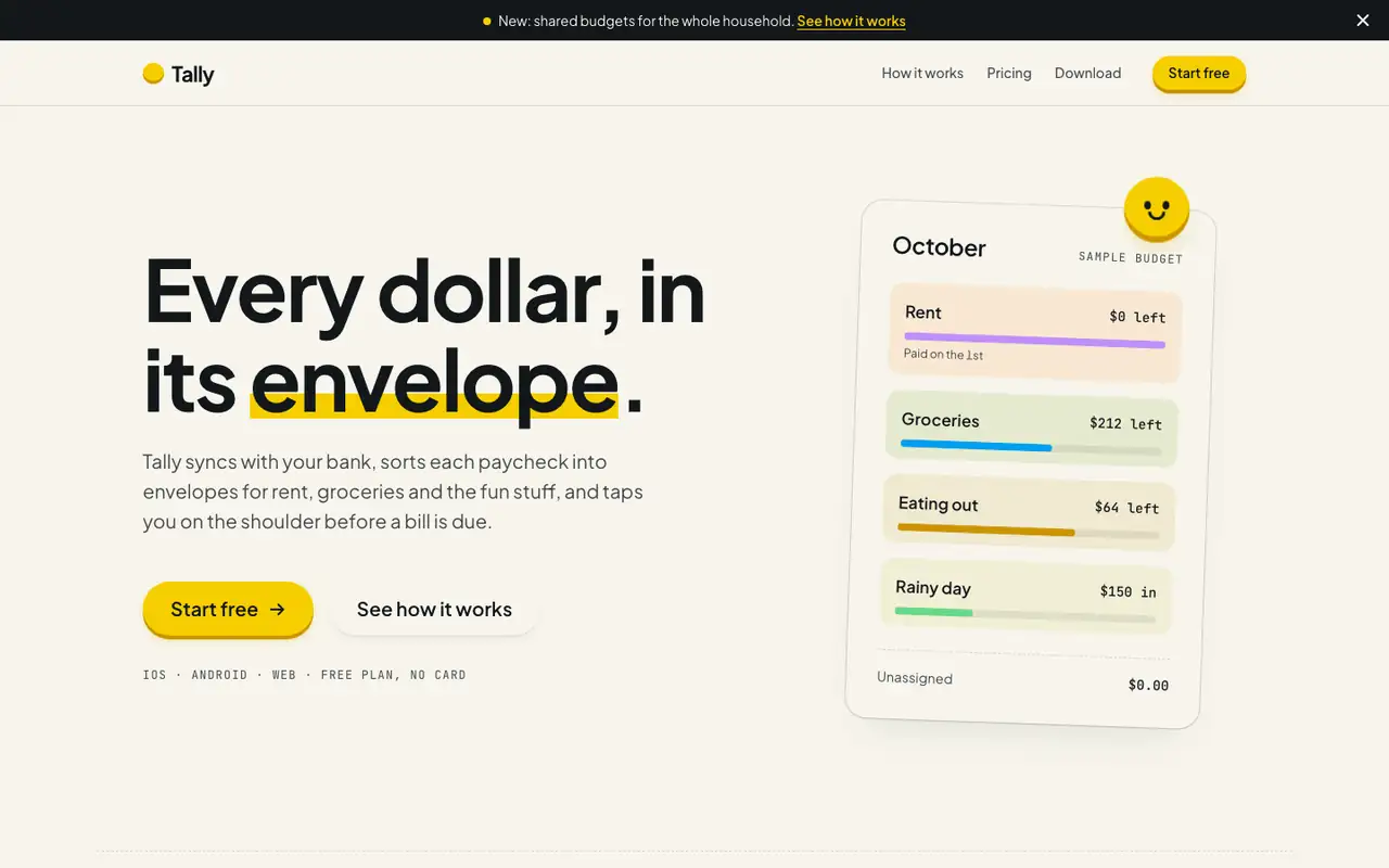
Hallmark turns Tally into a cheerful yellow-and-pastel brand in Plus Jakarta Sans with big ghost numerals, and the dashboard matches it. The most consistent result in the set, but it took about 12 minutes per brief.
Side by side
Field
Liquid Glass Design (ECC)
Hallmark
Fonts
Bricolage Grotesque (landing)
DM Sans (landing)
Manrope (dashboard)
Plus Jakarta Sans
JetBrains Mono
Colors
#13212c ink
#0f8f7e teal
#ff7a59 coral
#ffb547 amber
#8b7cf6 violet
#3f5bd9 blue (dashboard)
#e0435a red (dashboard)
paper oklch(97% 0.012 95)
yellow accent oklch(86% 0.18 95)
blue oklch(66% 0.18 235)
pink, mint and lavender step bands
ink oklch(20% 0.012 250)
Good fit for
consumer fintech apps
iOS companion sites
friendly SaaS dashboards
wellness and lifestyle products
app launch pages
consumer budgeting apps
family and household tools
onboarding-heavy mobile apps
friendly B2C SaaS
Not great for
dense data and admin tools
sober enterprise or legal brands
long-form editorial sites
serious banking or wealth
enterprise and pro tools
luxury brands
Flaws we saw
dashboard desktop: the payee column in the transactions table wraps onto two lines
the landing (teal, coral, amber) and the dashboard (blue-led) shift the accent color between pages
the skill is written for SwiftUI; on the web the glass is CSS blur, so it leans on backdrop-filter support
landing and dashboard: the mono labels run very small and get hard to read
each brief took about 12 minutes (742 s and 722 s), about five times the baseline's 143 s and 125 s