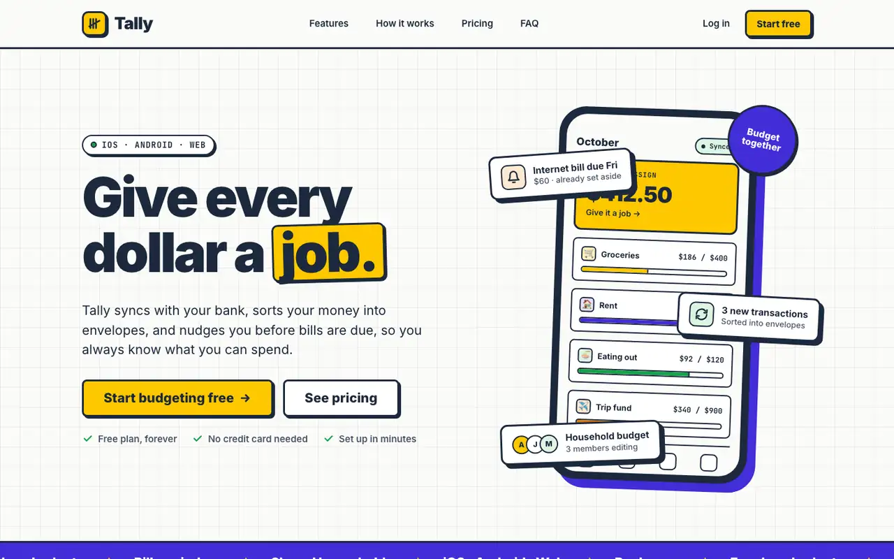
Neobrutalism puts Tally on warm off-white with thick navy borders, hard offset shadows and flat yellow and violet blocks. The landing has a CSS phone with sticker-like envelope cards; the dashboard uses a dotted background, yellow highlights on the date and summary cards, and a clean transactions table. It is bold but still easy to read on both pages. Pick it for playful products that want a confident, graphic look.
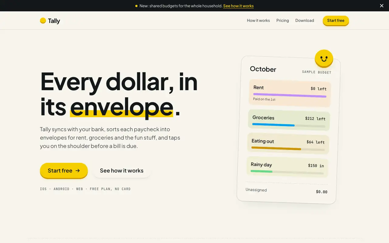
Hallmark turns Tally into a cheerful yellow-and-pastel brand in Plus Jakarta Sans with big ghost numerals, and the dashboard matches it. The most consistent result in the set, but it took about 12 minutes per brief.
Side by side
Field
Neobrutalism (Awesome Design Skills)
Hallmark
Fonts
Inter
JetBrains Mono
Plus Jakarta Sans
JetBrains Mono
Colors
#fbfbf9 off-white
#1c293c ink navy
#fdc800 yellow
#432dd7 violet
#ff8fb1 pink (dashboard)
#16a34a green
paper oklch(97% 0.012 95)
yellow accent oklch(86% 0.18 95)
blue oklch(66% 0.18 235)
pink, mint and lavender step bands
ink oklch(20% 0.012 250)
Good fit for
playful SaaS landing pages
consumer finance and productivity apps
product dashboards
startup marketing sites
consumer budgeting apps
family and household tools
onboarding-heavy mobile apps
friendly B2C SaaS
Not great for
conservative brands
luxury products
very dense admin tools
serious banking or wealth
enterprise and pro tools
luxury brands
Flaws we saw
dashboard: the pink and violet chart bars add colors that are not in the rest of the system
the run did not check the page in a browser, but our screenshots show no breakage
landing and dashboard: the mono labels run very small and get hard to read
each brief took about 12 minutes (742 s and 722 s), about five times the baseline's 143 s and 125 s