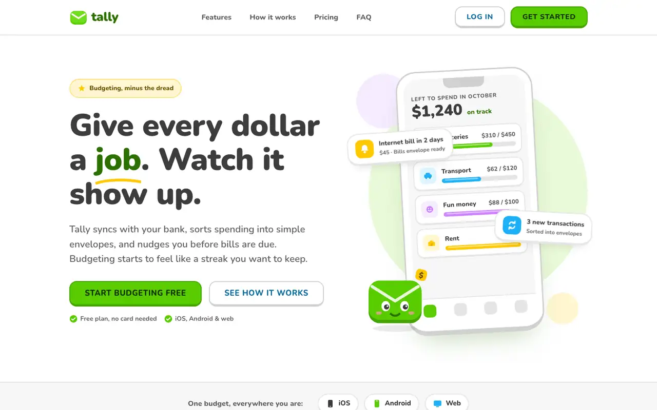
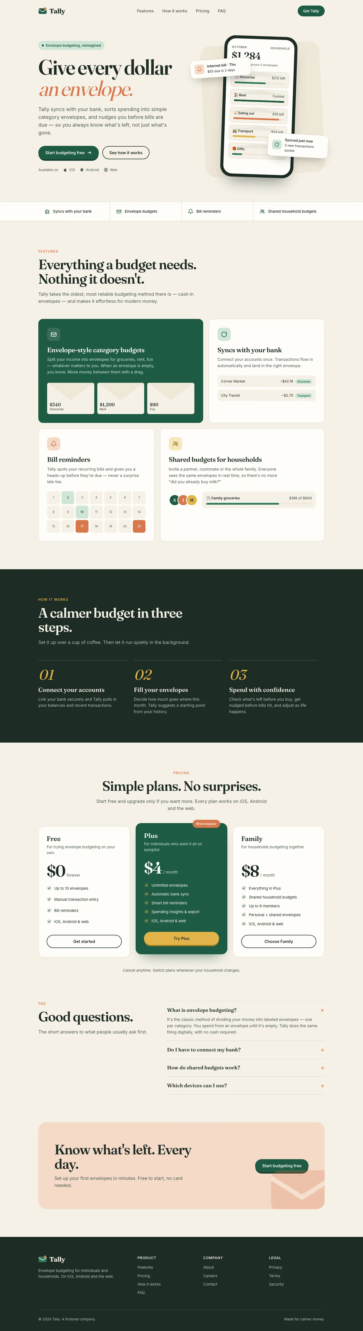
Lingo makes Tally look like a language-learning app: Nunito everywhere, bright green buttons with a chunky 3D bottom edge, rounded cards and a friendly envelope mascot. The dashboard has a smiling coin next to the "Left to budget" card and color-coded envelope icons. It is cheerful and very consistent across both pages. Pick it for friendly consumer products aimed at beginners.
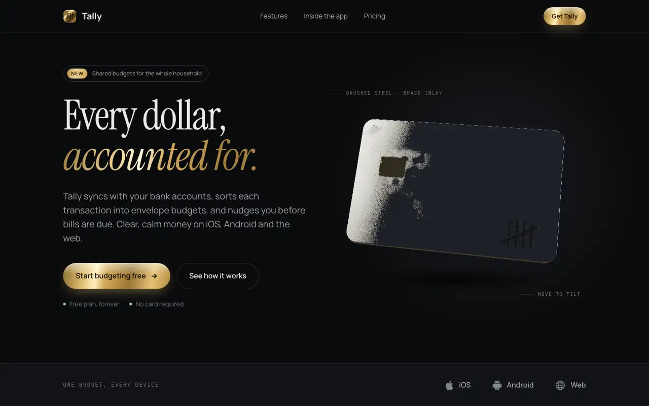
3D Metal Material gives Tally a dark studio look: Instrument Serif headlines with brass accents and a slowly tilting brushed-steel card in the hero, drawn live with WebGL. The dashboard puts the $640 on a machined steel plate and uses steel, brass and copper finishes on the bars and buttons. It feels premium and is consistent across both pages. Pick it when you want one rich 3D centerpiece on a dark product page.
Side by side
Field
Lingo (Awesome Design Skills)
3D Metal Material (Meng To)
Fonts
Nunito
JetBrains Mono (dashboard)
Instrument Serif (landing)
Manrope
JetBrains Mono (landing)
IBM Plex Mono (dashboard)
Colors
#58cc02 green
#46a302 deep green
#1cb0f6 sky blue
#ffc800 yellow
#ce82ff violet
#ff4b4b red
#3c3c3c charcoal
#0a0b0d graphite
#15181c panel
#e2bd6e brass
#c9ced2 steel
#e6a48d copper
#e7eaee text
#8fc7a4 sage
Good fit for
consumer apps for beginners
education and habit apps
onboarding flows
friendly product dashboards
mobile-first products
premium fintech and card products
dark product landing pages
hardware and luxury brands
hero visuals
Not great for
serious finance or B2B tools
luxury brands
data-heavy admin screens
light or playful brands
low-power devices
teams without WebGL experience
Flaws we saw
the mascot and bright green can feel childish for a money app
dashboard: the many colored chips and badges compete for attention
the WebGL card and plate add weight to the page and need a fallback
dashboard: the brass on graphite is subtle, so some labels are low contrast