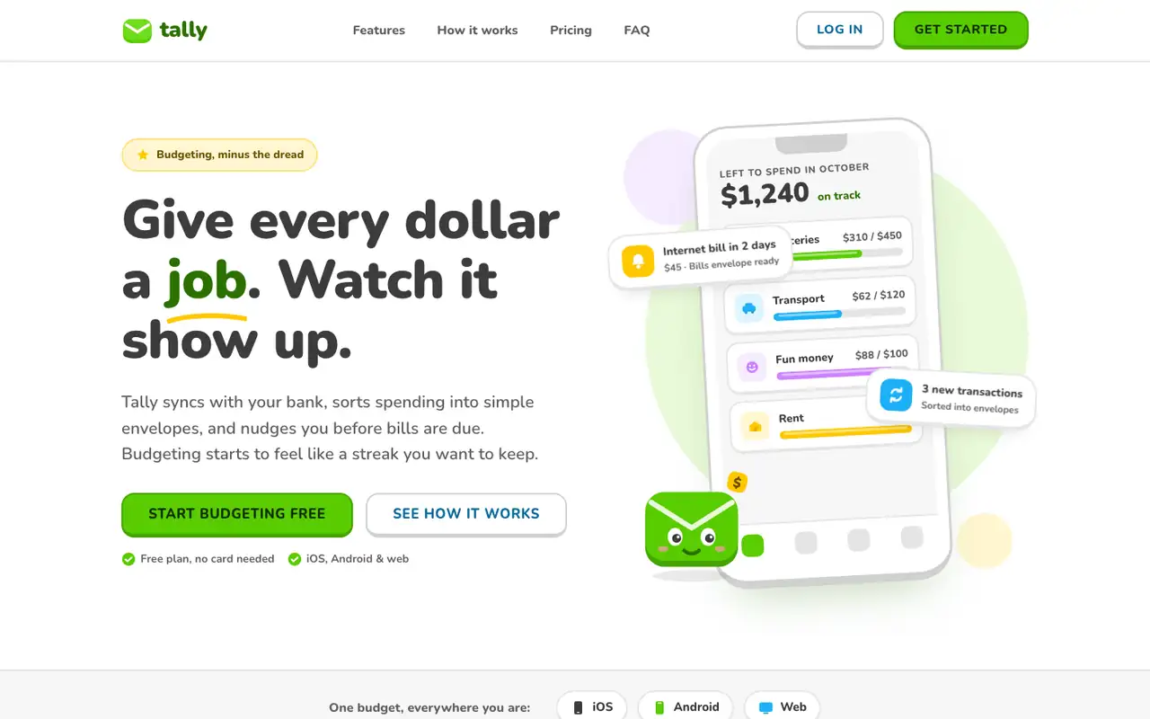
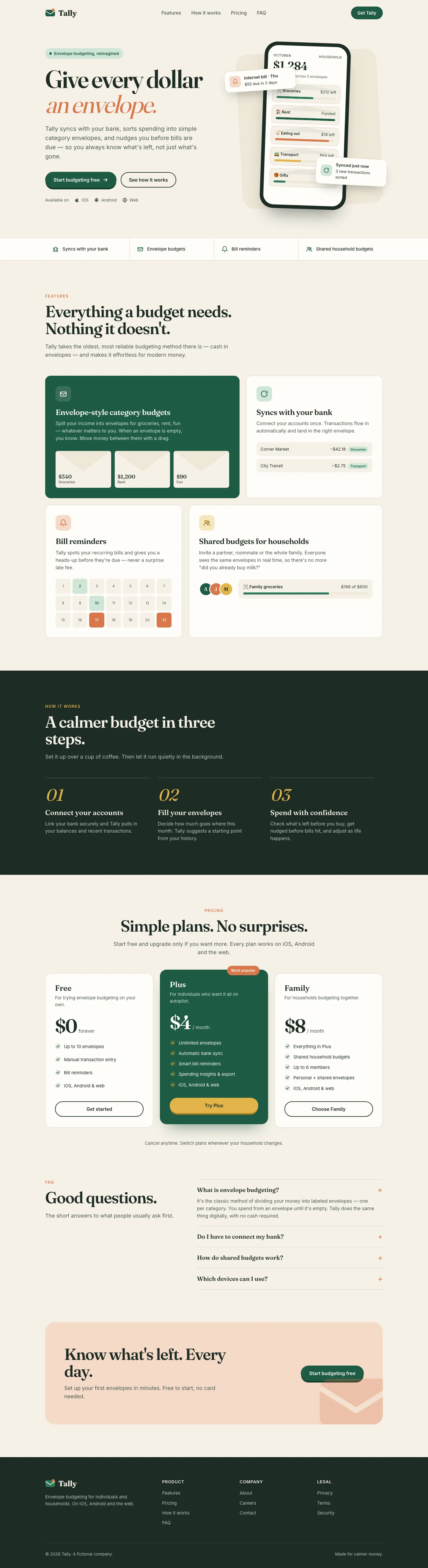
Lingo makes Tally look like a language-learning app: Nunito everywhere, bright green buttons with a chunky 3D bottom edge, rounded cards and a friendly envelope mascot. The dashboard has a smiling coin next to the "Left to budget" card and color-coded envelope icons. It is cheerful and very consistent across both pages. Pick it for friendly consumer products aimed at beginners.
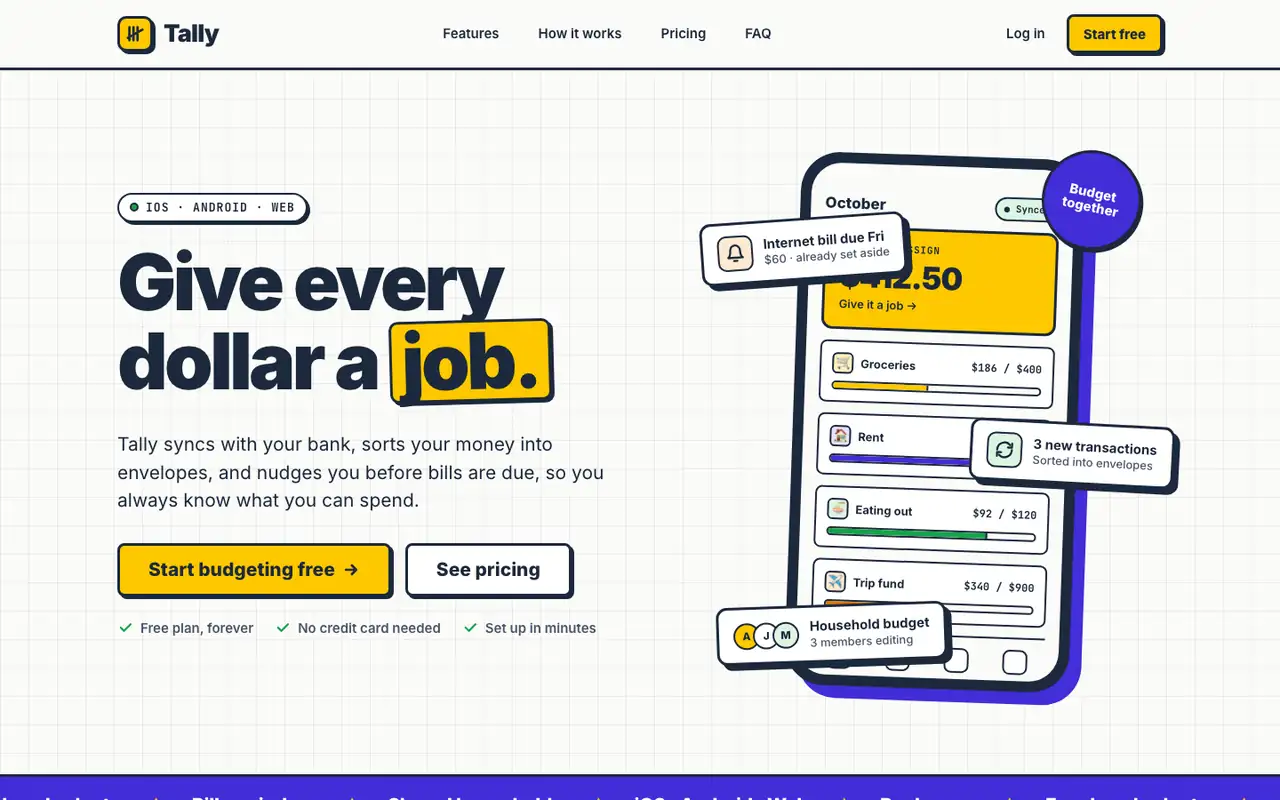
Neobrutalism puts Tally on warm off-white with thick navy borders, hard offset shadows and flat yellow and violet blocks. The landing has a CSS phone with sticker-like envelope cards; the dashboard uses a dotted background, yellow highlights on the date and summary cards, and a clean transactions table. It is bold but still easy to read on both pages. Pick it for playful products that want a confident, graphic look.
Side by side
Field
Lingo (Awesome Design Skills)
Neobrutalism (Awesome Design Skills)
Fonts
Nunito
JetBrains Mono (dashboard)
Inter
JetBrains Mono
Colors
#58cc02 green
#46a302 deep green
#1cb0f6 sky blue
#ffc800 yellow
#ce82ff violet
#ff4b4b red
#3c3c3c charcoal
#fbfbf9 off-white
#1c293c ink navy
#fdc800 yellow
#432dd7 violet
#ff8fb1 pink (dashboard)
#16a34a green
Good fit for
consumer apps for beginners
education and habit apps
onboarding flows
friendly product dashboards
mobile-first products
playful SaaS landing pages
consumer finance and productivity apps
product dashboards
startup marketing sites
Not great for
serious finance or B2B tools
luxury brands
data-heavy admin screens
conservative brands
luxury products
very dense admin tools
Flaws we saw
the mascot and bright green can feel childish for a money app
dashboard: the many colored chips and badges compete for attention
dashboard: the pink and violet chart bars add colors that are not in the rest of the system
the run did not check the page in a browser, but our screenshots show no breakage