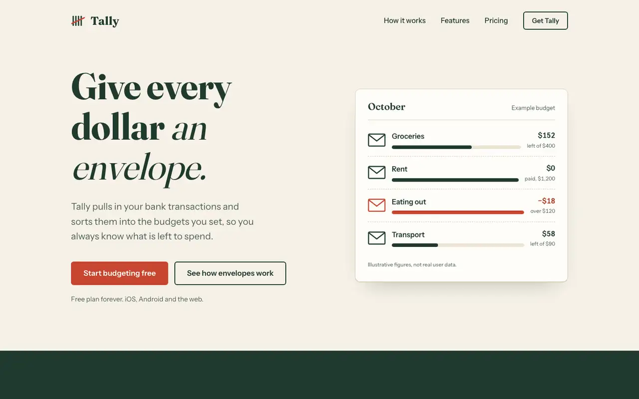
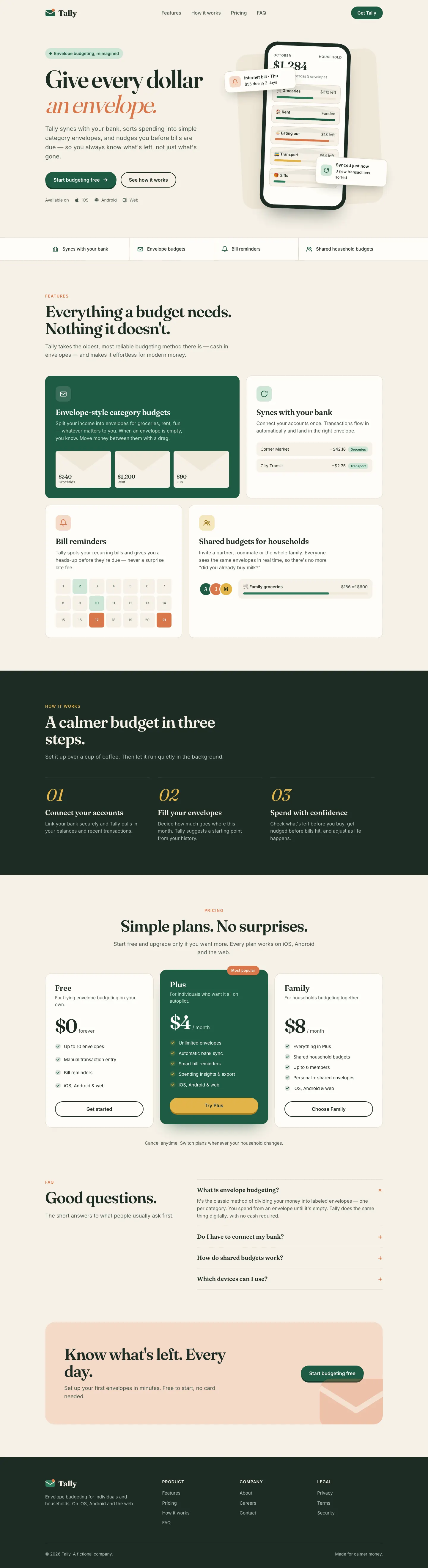
Antislop UI keeps the baseline's paper and serif but cleans it up: no overlapping hero cards, a working "assign $2,000" slider demo, honest placeholder copy and a dashboard that leads with what to do about the $640. Better made, still close to the default look.
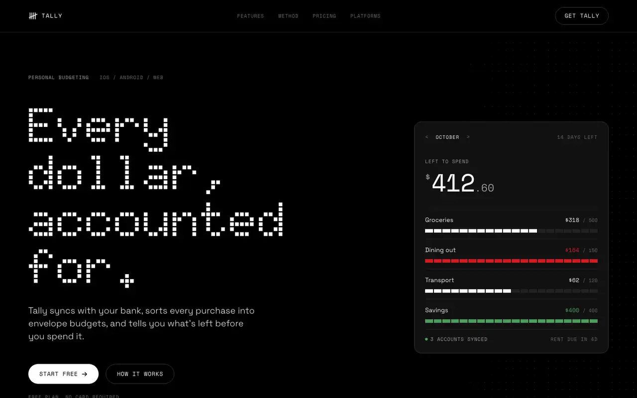
With the skill loading properly, Nothing turns both pages into an OLED-black instrument panel with Doto dot-matrix numerals, segmented bars and one red. This time the dashboard works end to end. Small grey labels on black are the weak spot.
Side by side
Field
Antislop UI
nothing-design-skill
Fonts
Fraunces
Instrument Sans
Public Sans (dashboard)
Doto
Space Grotesk
Space Mono
Colors
#F6F1E7 paper (same as baseline)
#1F3A2E ink green
#C8452F stamp red
dashboard #1F6B4F green
#A93F26 over budget
#000000 background
#111111 surface
#E8E8E8 text
#D71921 red
#4A9E5C success
Good fit for
personal finance
small consumer SaaS
early-stage products that need honest copy
hardware and gadget brands
dev tools
tech product launches
dark-first apps
Not great for
brands that need to look unlike other AI-made pages
dark-first apps
dense pro dashboards
warm consumer finance
accessibility-critical services
content-heavy sites
Flaws we saw
palette and headline match the baseline ("Give every dollar an envelope." on #F6F1E7 paper)
dashboard chart: the value labels above the first two bars crowd into each other
dashboard mobile: the tab row is cut at "Set" and needs a sideways swipe to reach Settings
dashboard chart: the month value labels are dim grey on grey bars and the y-axis labels sit behind the bars, so the chart is hard to read
small Space Mono labels in #666 and #999 on black are faint at 10 to 11 px on both briefs
landing desktop: sections leave wide empty black areas around short text
the look changed between runs (light landing last time, black this time), so expect some drift