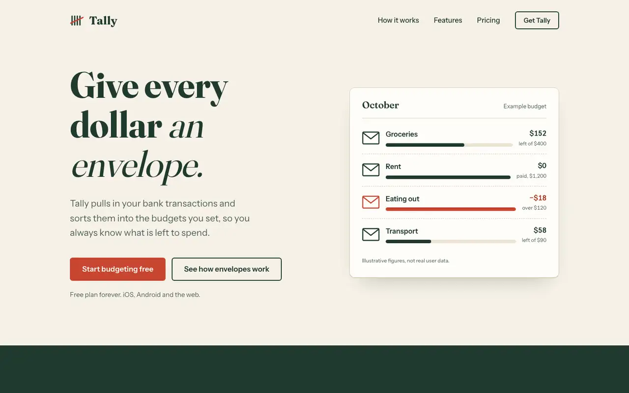
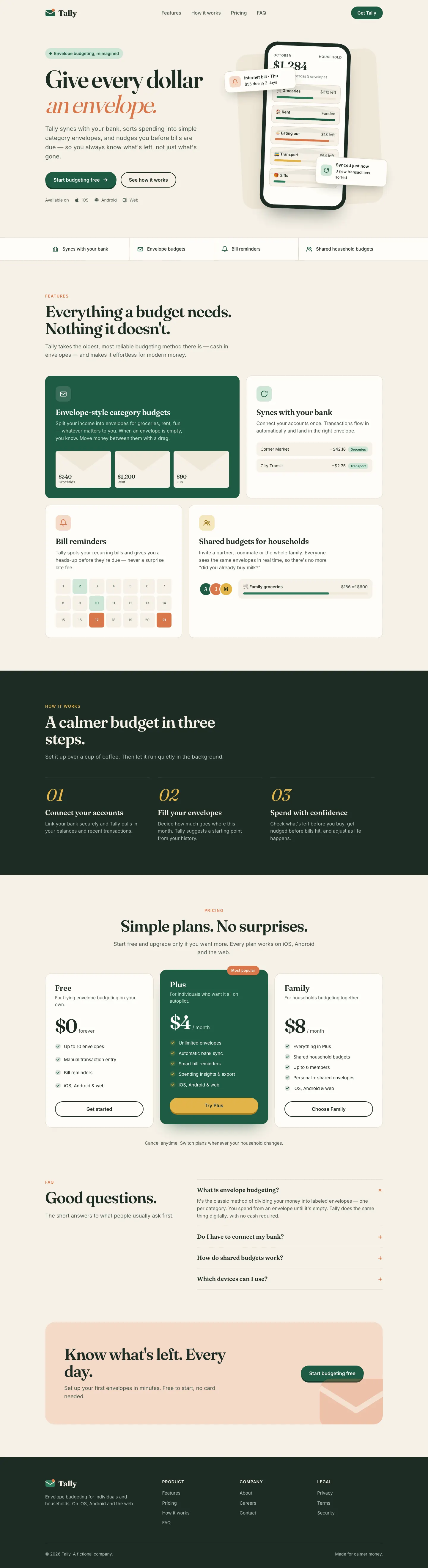
Antislop UI keeps the baseline's paper and serif but cleans it up: no overlapping hero cards, a working "assign $2,000" slider demo, honest placeholder copy and a dashboard that leads with what to do about the $640. Better made, still close to the default look.
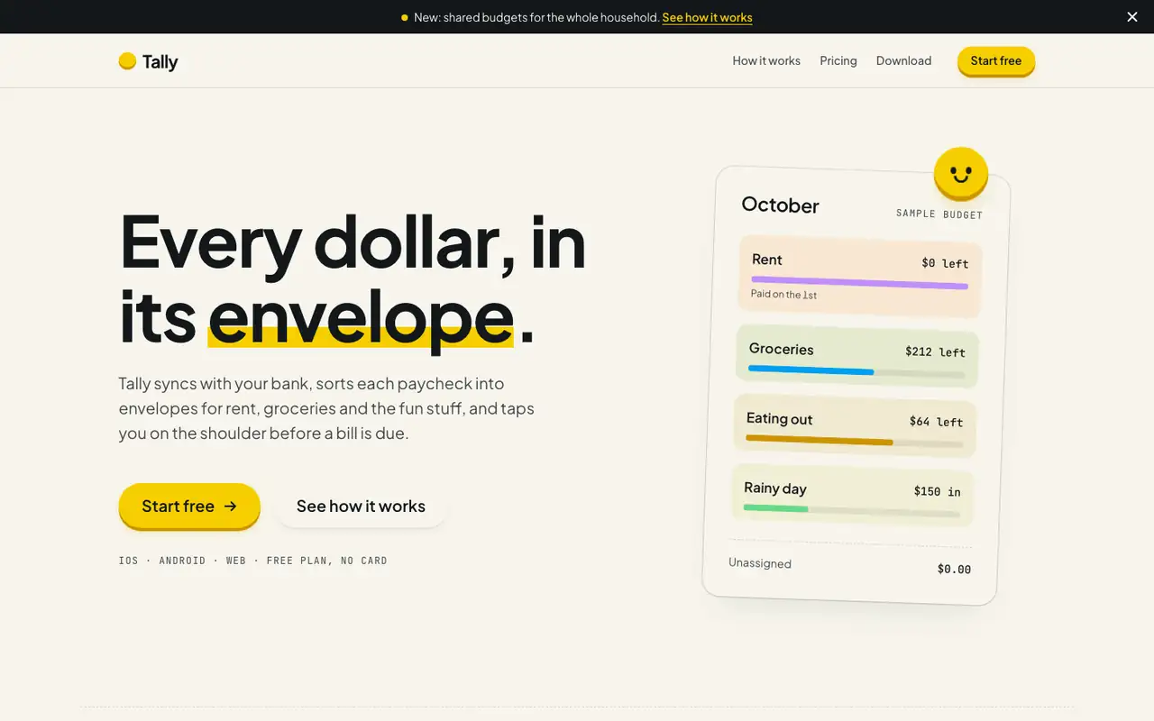
Hallmark turns Tally into a cheerful yellow-and-pastel brand in Plus Jakarta Sans with big ghost numerals, and the dashboard matches it. The most consistent result in the set, but it took about 12 minutes per brief.
Side by side
Field
Antislop UI
Hallmark
Fonts
Fraunces
Instrument Sans
Public Sans (dashboard)
Plus Jakarta Sans
JetBrains Mono
Colors
#F6F1E7 paper (same as baseline)
#1F3A2E ink green
#C8452F stamp red
dashboard #1F6B4F green
#A93F26 over budget
paper oklch(97% 0.012 95)
yellow accent oklch(86% 0.18 95)
blue oklch(66% 0.18 235)
pink, mint and lavender step bands
ink oklch(20% 0.012 250)
Good fit for
personal finance
small consumer SaaS
early-stage products that need honest copy
consumer budgeting apps
family and household tools
onboarding-heavy mobile apps
friendly B2C SaaS
Not great for
brands that need to look unlike other AI-made pages
dark-first apps
dense pro dashboards
serious banking or wealth
enterprise and pro tools
luxury brands
Flaws we saw
palette and headline match the baseline ("Give every dollar an envelope." on #F6F1E7 paper)
dashboard chart: the value labels above the first two bars crowd into each other
dashboard mobile: the tab row is cut at "Set" and needs a sideways swipe to reach Settings
landing and dashboard: the mono labels run very small and get hard to read
each brief took about 12 minutes (742 s and 722 s), about five times the baseline's 143 s and 125 s