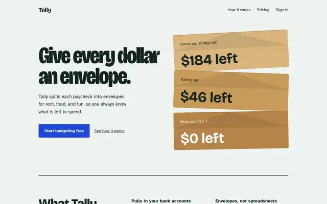
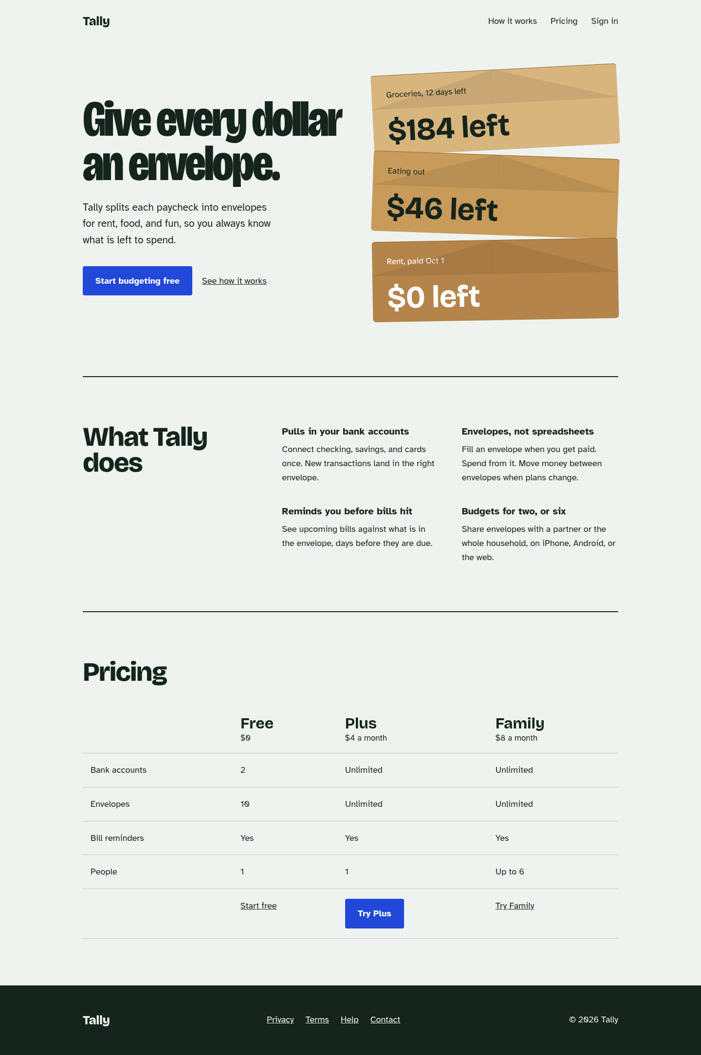
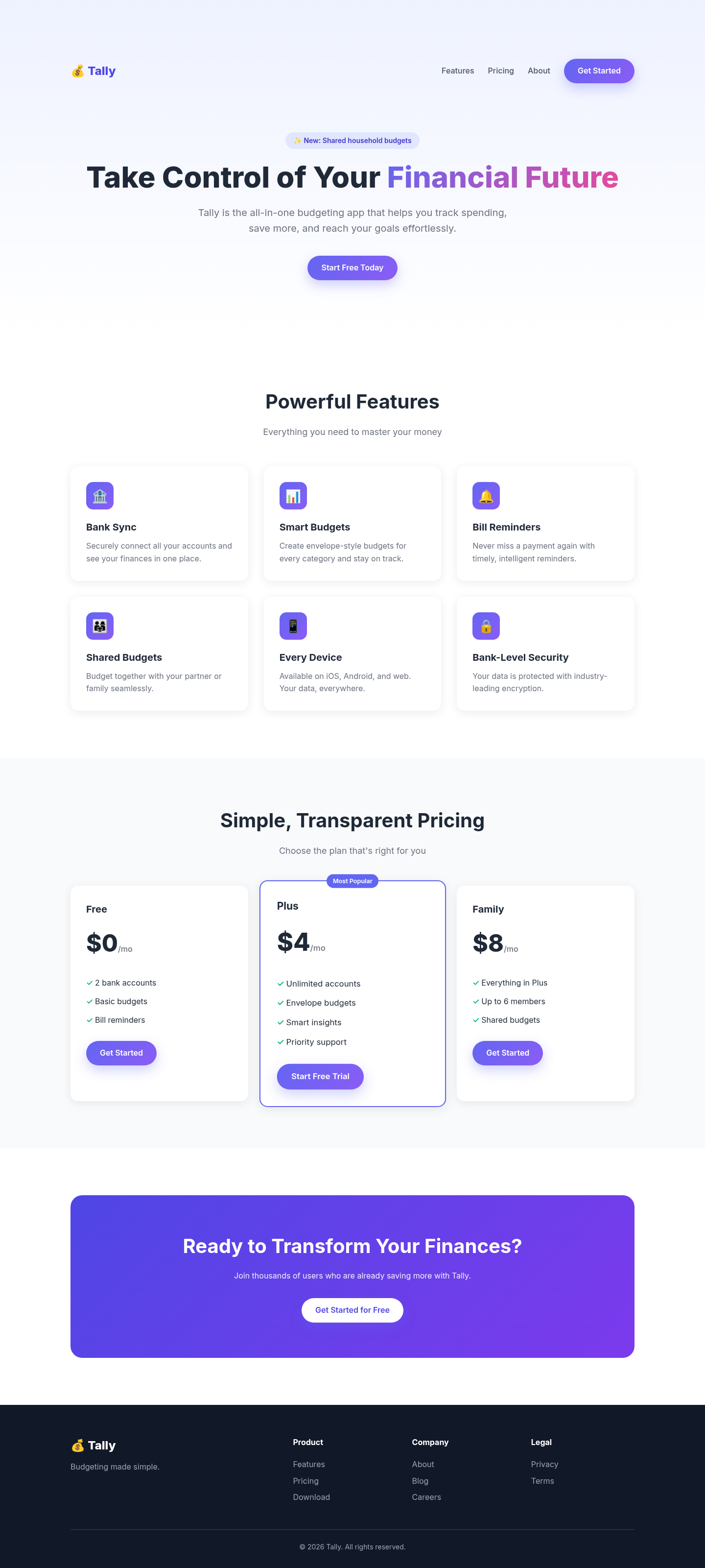
The biggest jump in the set: the generic purple SaaS template became a page built around one idea (a stack of kraft envelopes), with characterful type, a plain feature list and a comparison table instead of card grids. Its anti-default checklist visibly removed every gradient, emoji and 'Most Popular' tell from the baseline.
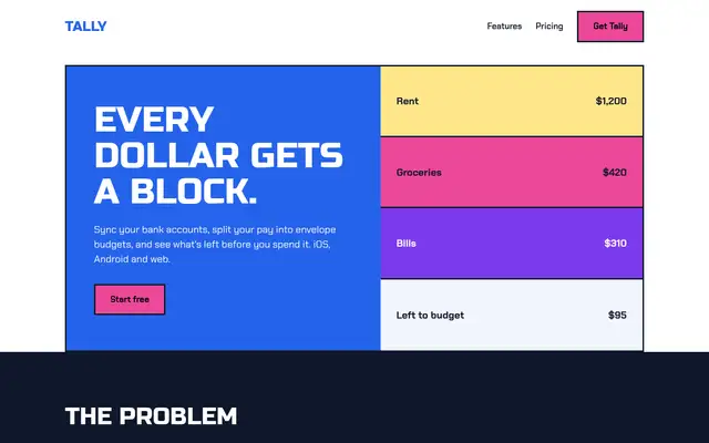
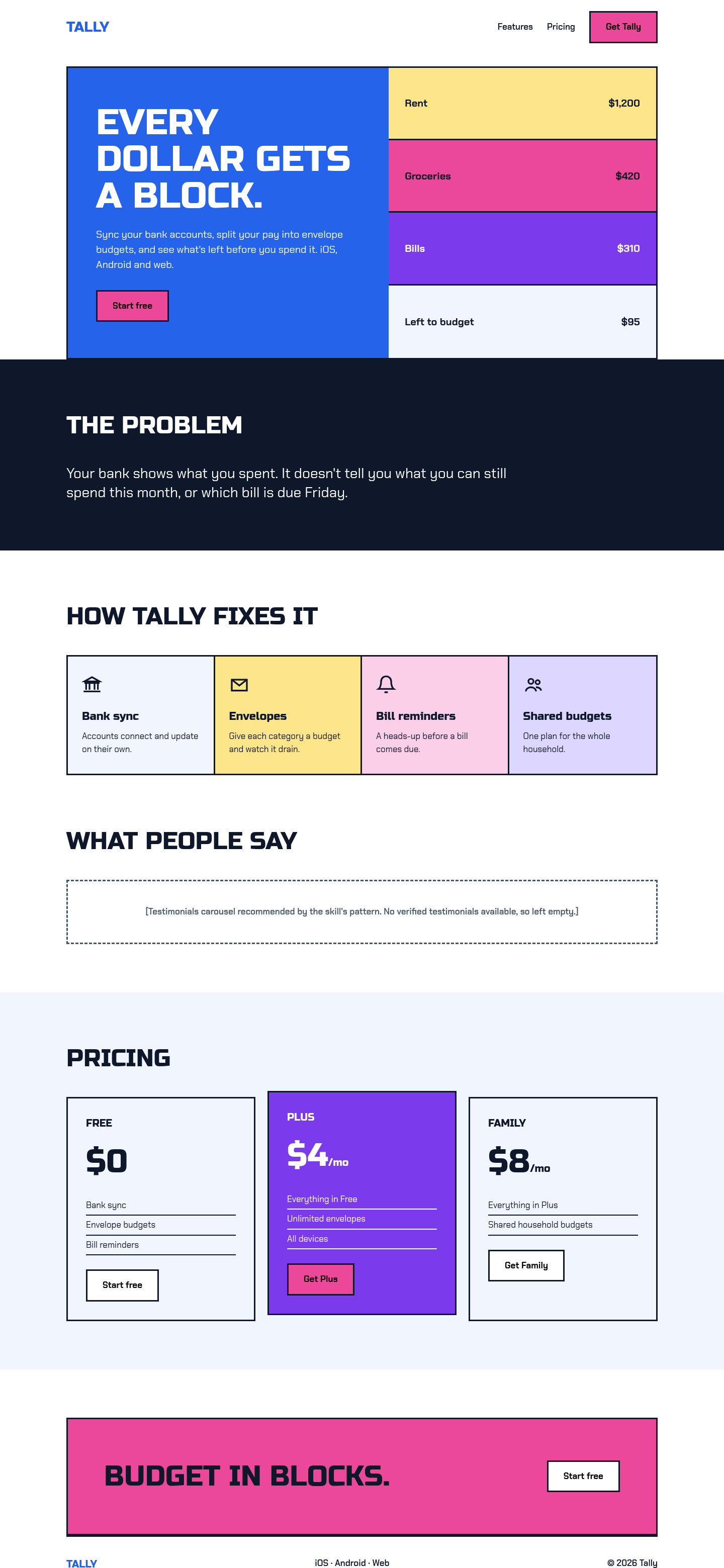
We ran its own design-system generator on the brief. It picked a 'Vibrant & Block-based' style, blue/purple/pink and Russo One with Chakra Petch, a pairing it tags for gaming and esports, and a testimonials-led layout we had no real quotes for. Following it gave a bold, accessible block layout with SVG icons and visible focus states, but the look doesn't fit a calm budgeting app. Good rules and checklists; the auto-picked direction needs a designer's veto.
 Skills for Design