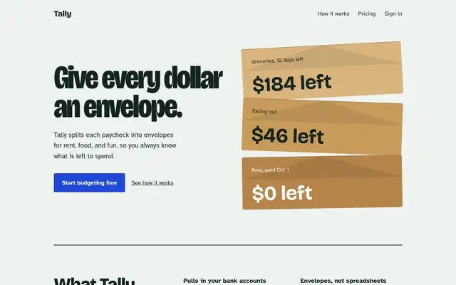
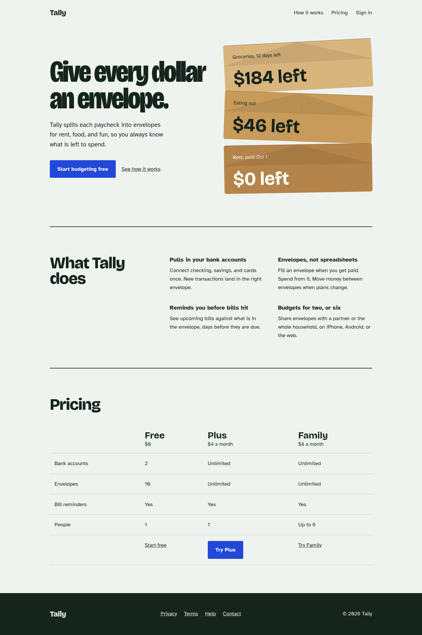
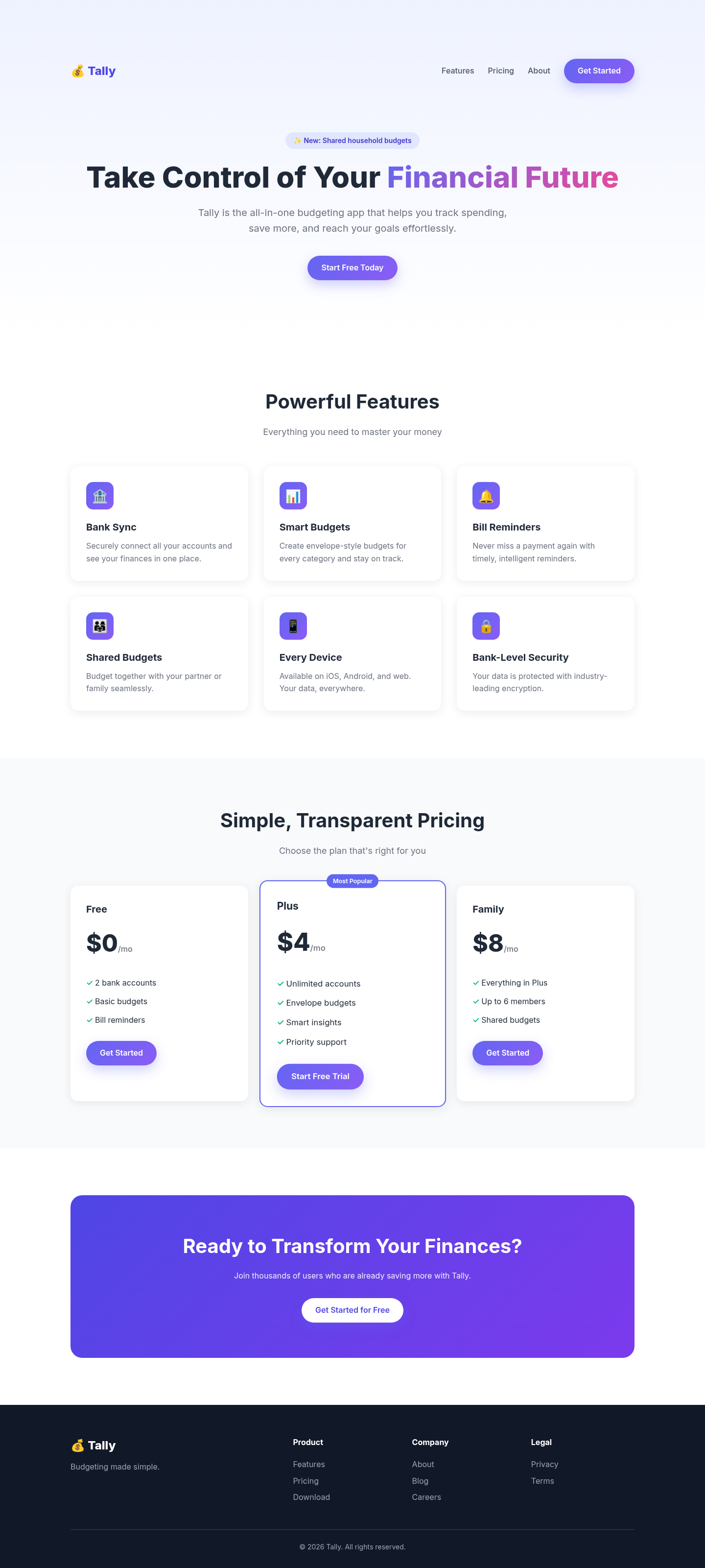
The biggest jump in the set: the generic purple SaaS template became a page built around one idea (a stack of kraft envelopes), with characterful type, a plain feature list and a comparison table instead of card grids. Its anti-default checklist visibly removed every gradient, emoji and 'Most Popular' tell from the baseline.
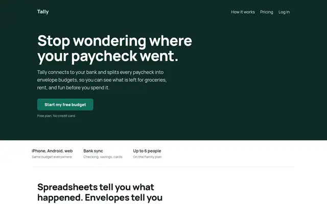
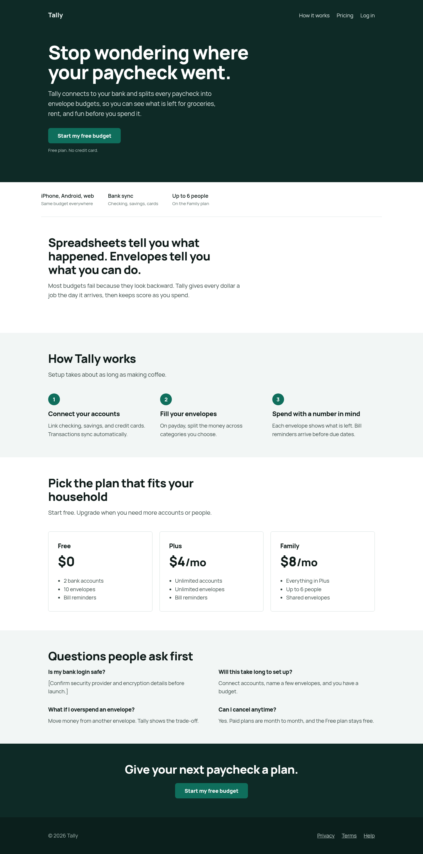
Its landing-page-copy and design-standards skills mostly improved the words and structure: an outcome headline, a problem section, a 3-step mechanism, an objection FAQ and a repeated single CTA. Visually it stays conventional, with a dark hero band and plain card pricing.
 Skills for Design