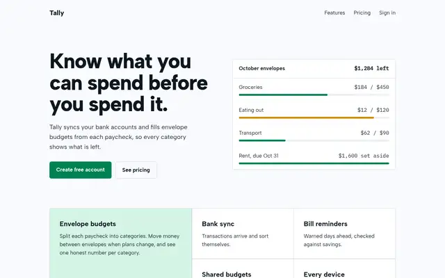
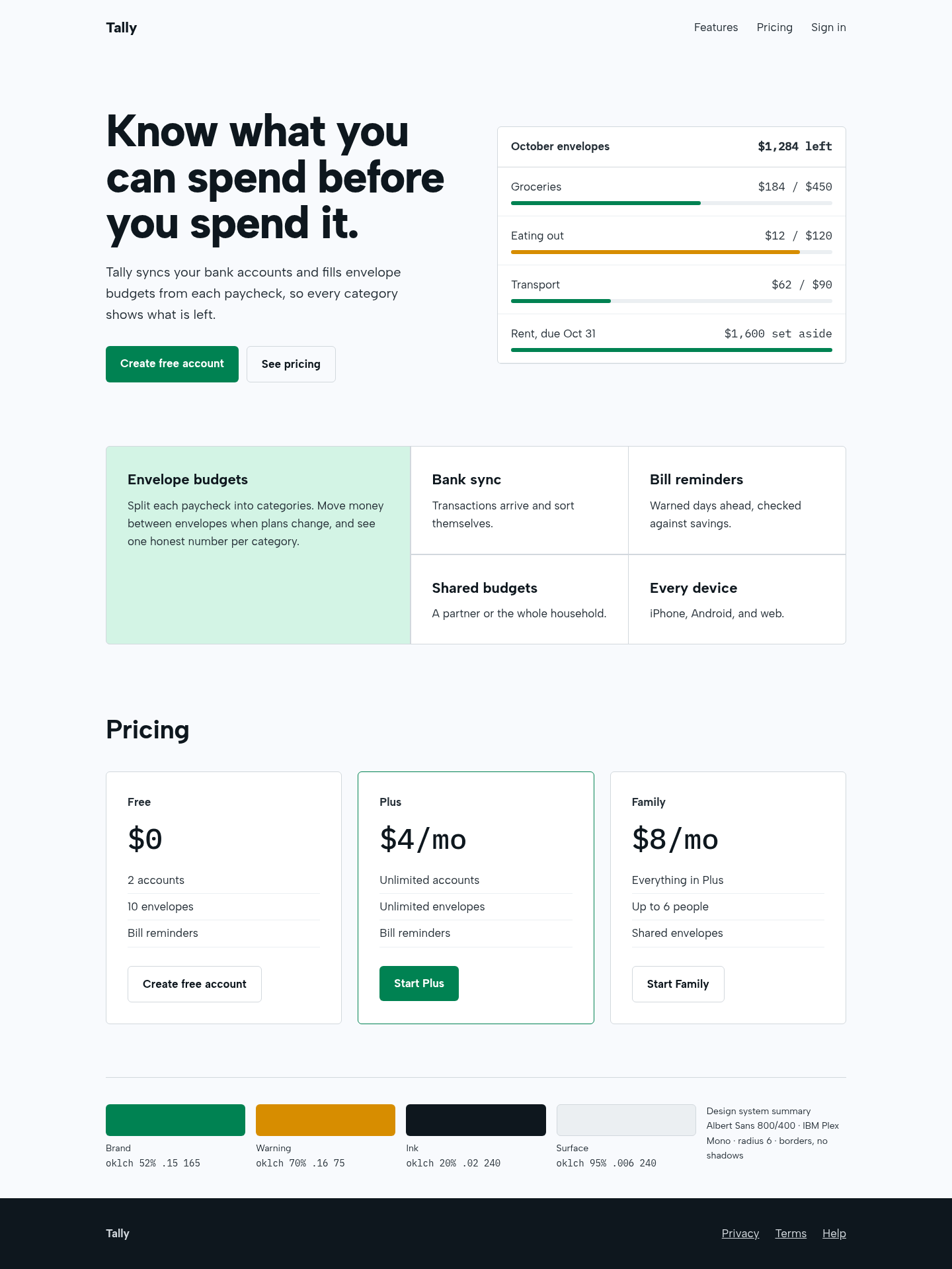
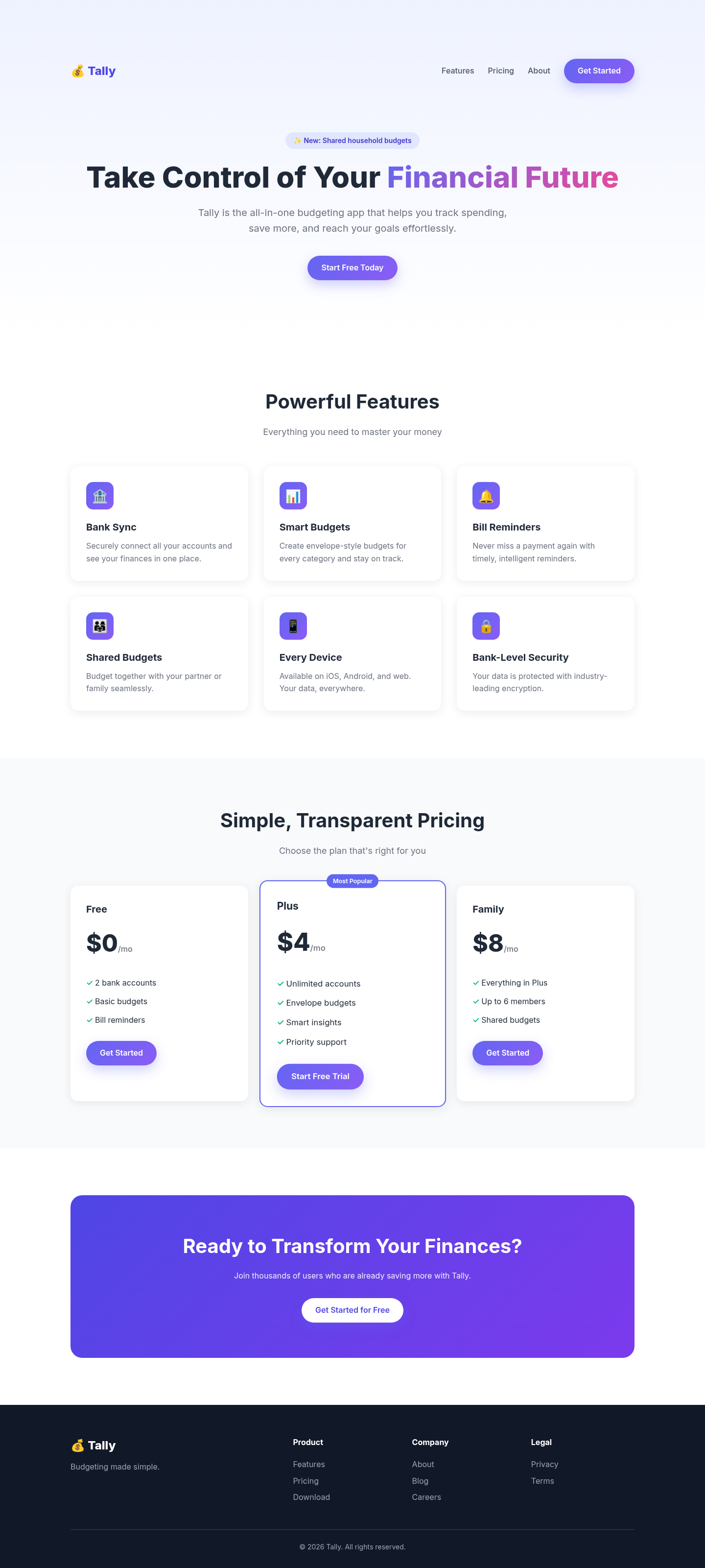
The aesthetic-direction and slop-check skills produced a calm, coherent fintech page: a real product panel in the hero, a bento feature block with one lead cell, and borders instead of shadows. It also renders a visible design-system summary, as the skill requires, which some will see as clutter.
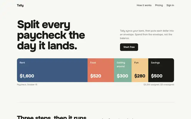
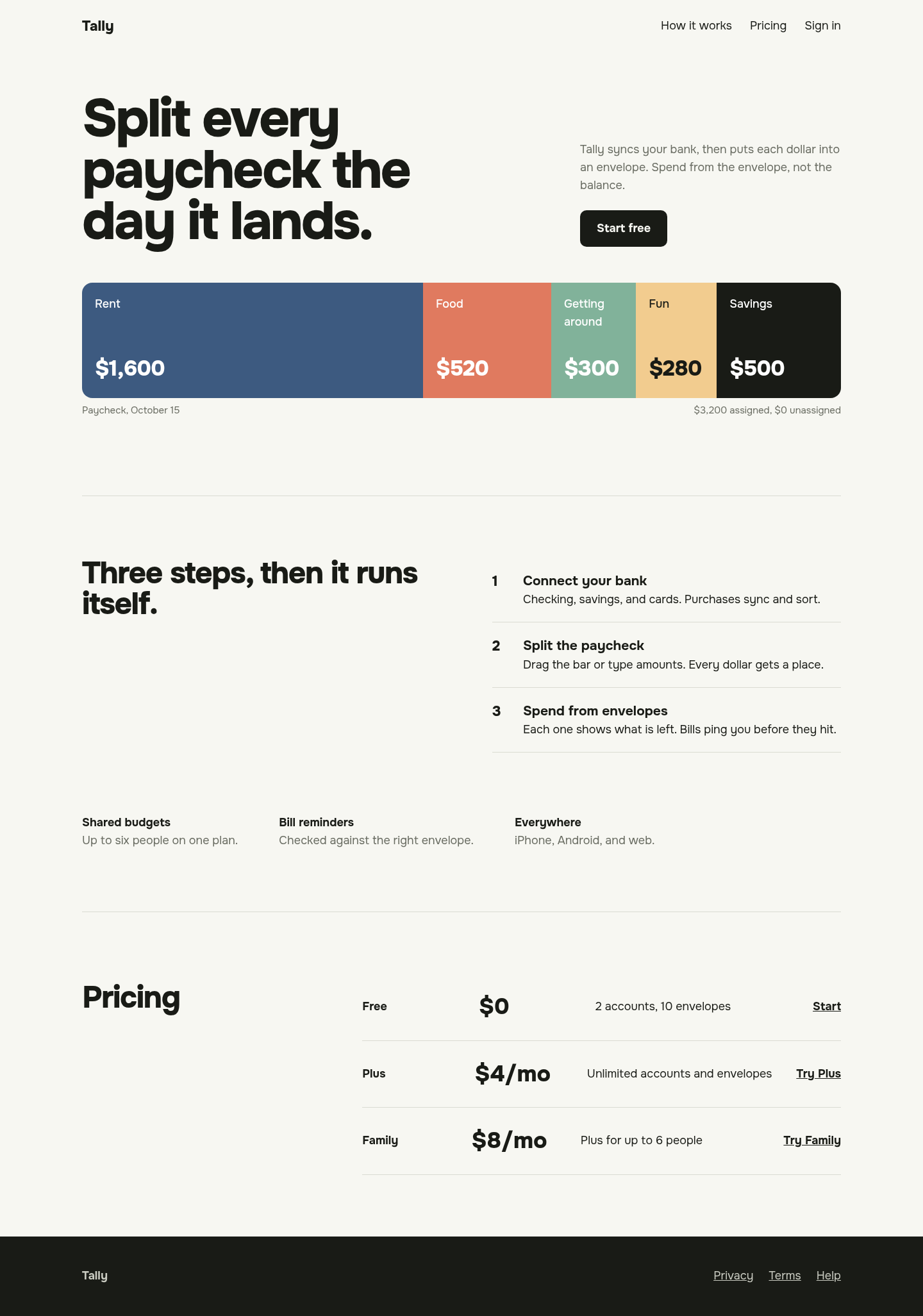
Its 'one protagonist per screen' rule gave the page a memorable hero: a full-width paycheck bar split into colour-coded envelopes, with the palette taken from it. The rest is restrained to the point of sparseness, and we skipped its usual three-direction user check.
 Skills for Design