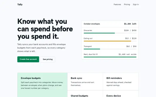
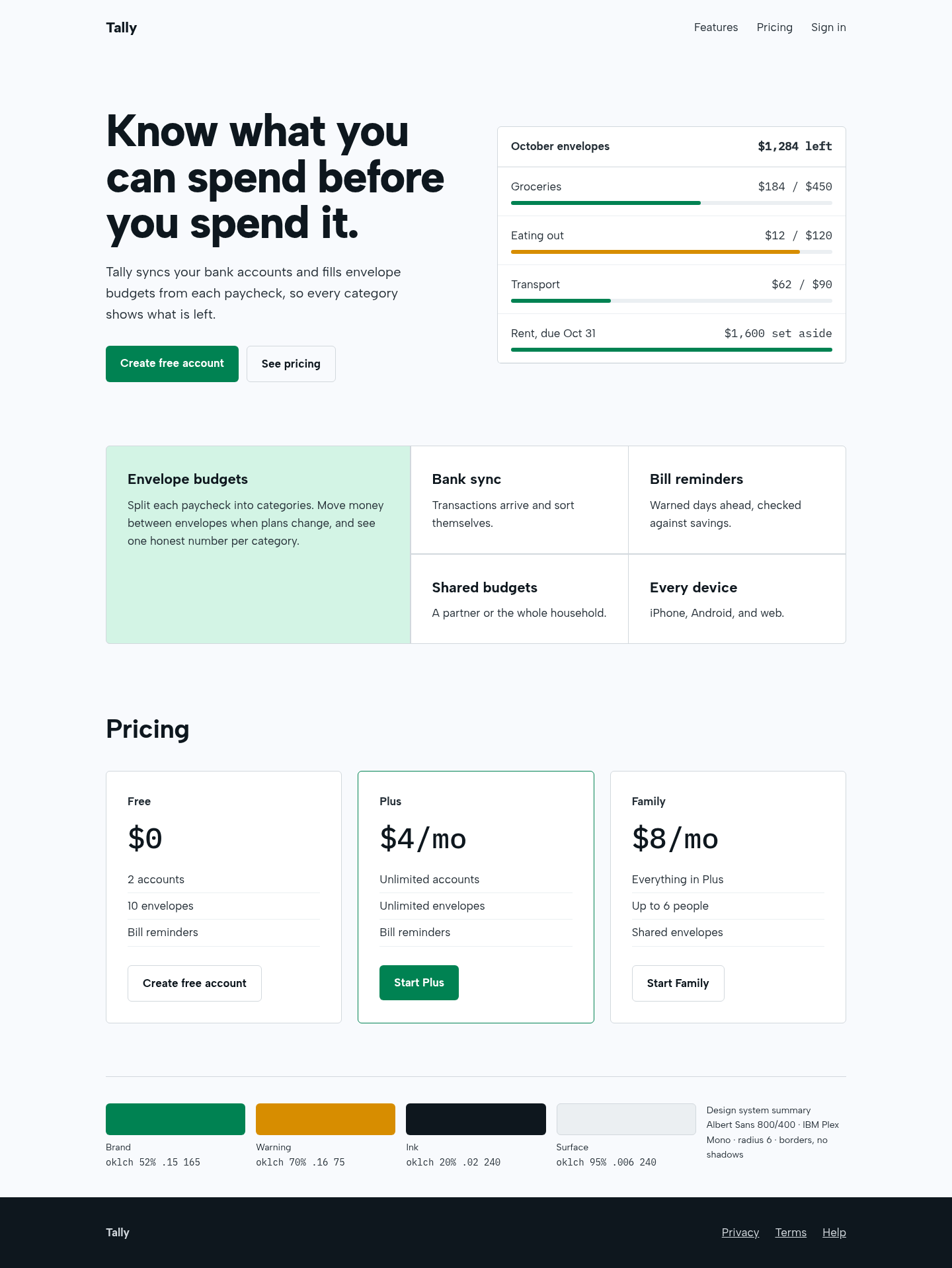
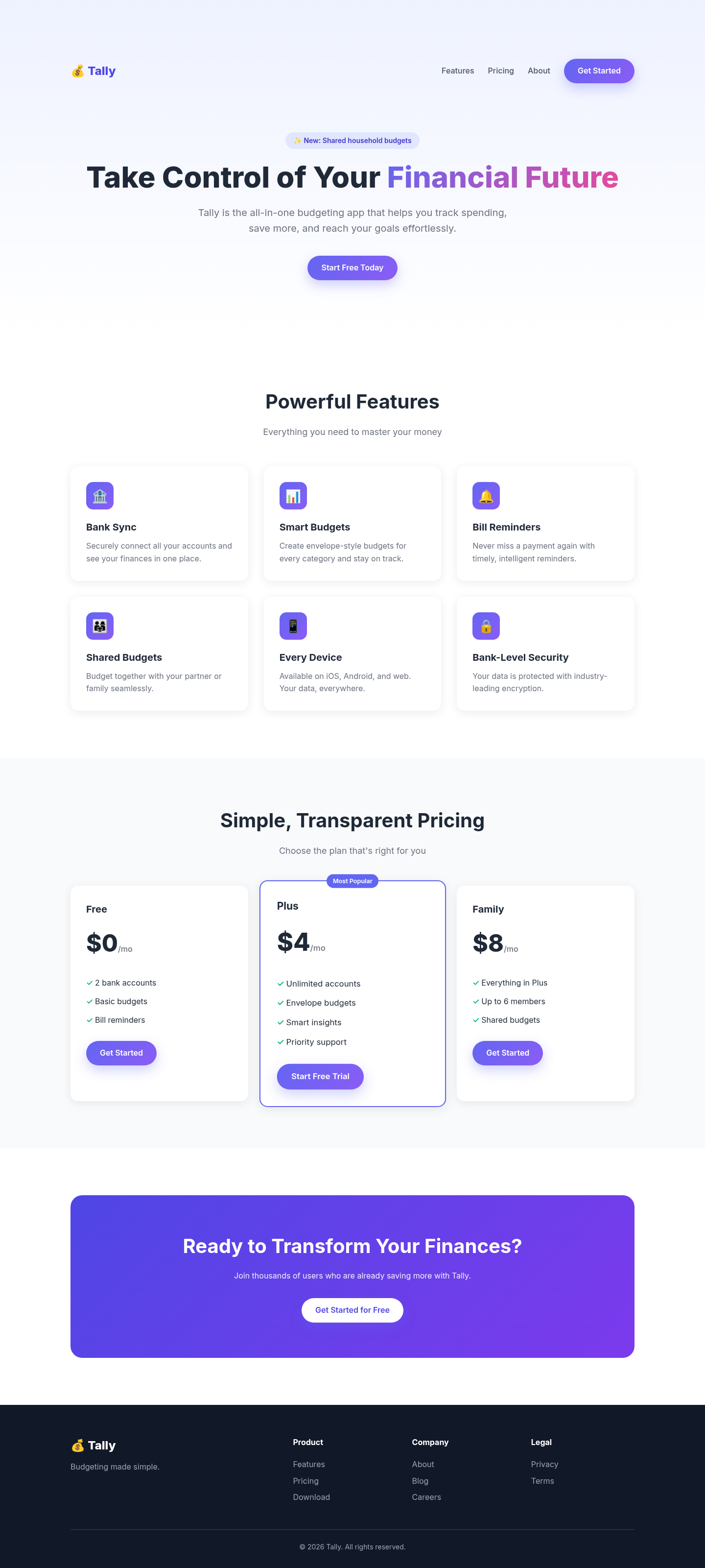
The aesthetic-direction and slop-check skills produced a calm, coherent fintech page: a real product panel in the hero, a bento feature block with one lead cell, and borders instead of shadows. It also renders a visible design-system summary, as the skill requires, which some will see as clutter.
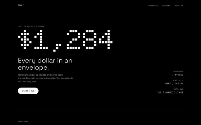
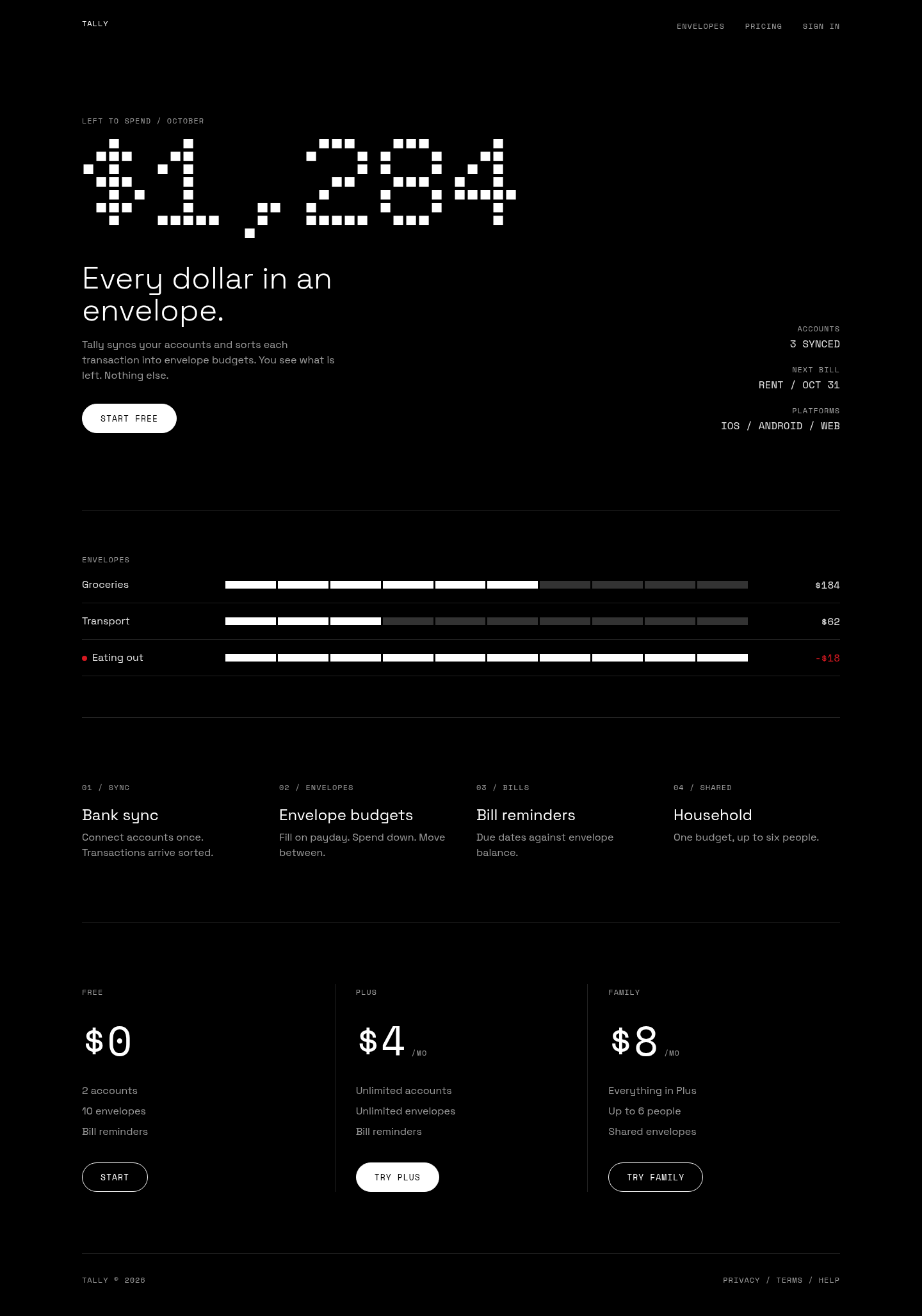
Produces a strongly recognisable result: OLED black, a dot-matrix hero number, mono caps labels and a single red over-budget dot. Faithful and striking, but the style is fixed, so every page made with it will look like a Nothing product regardless of brand.
 Skills for Design