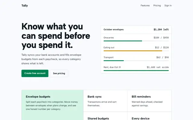
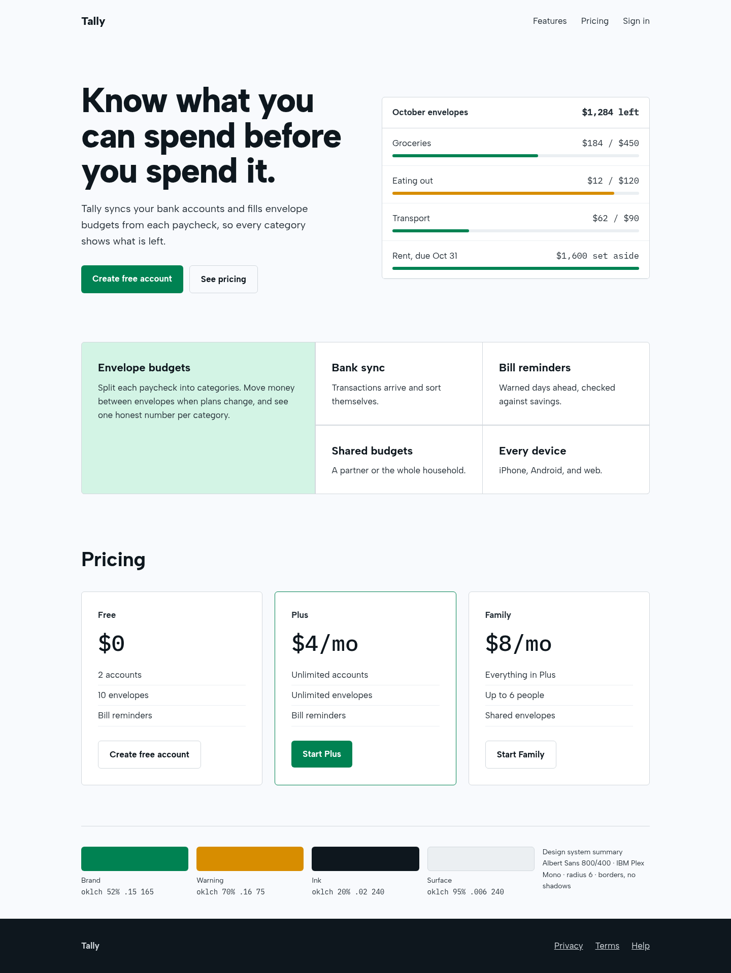
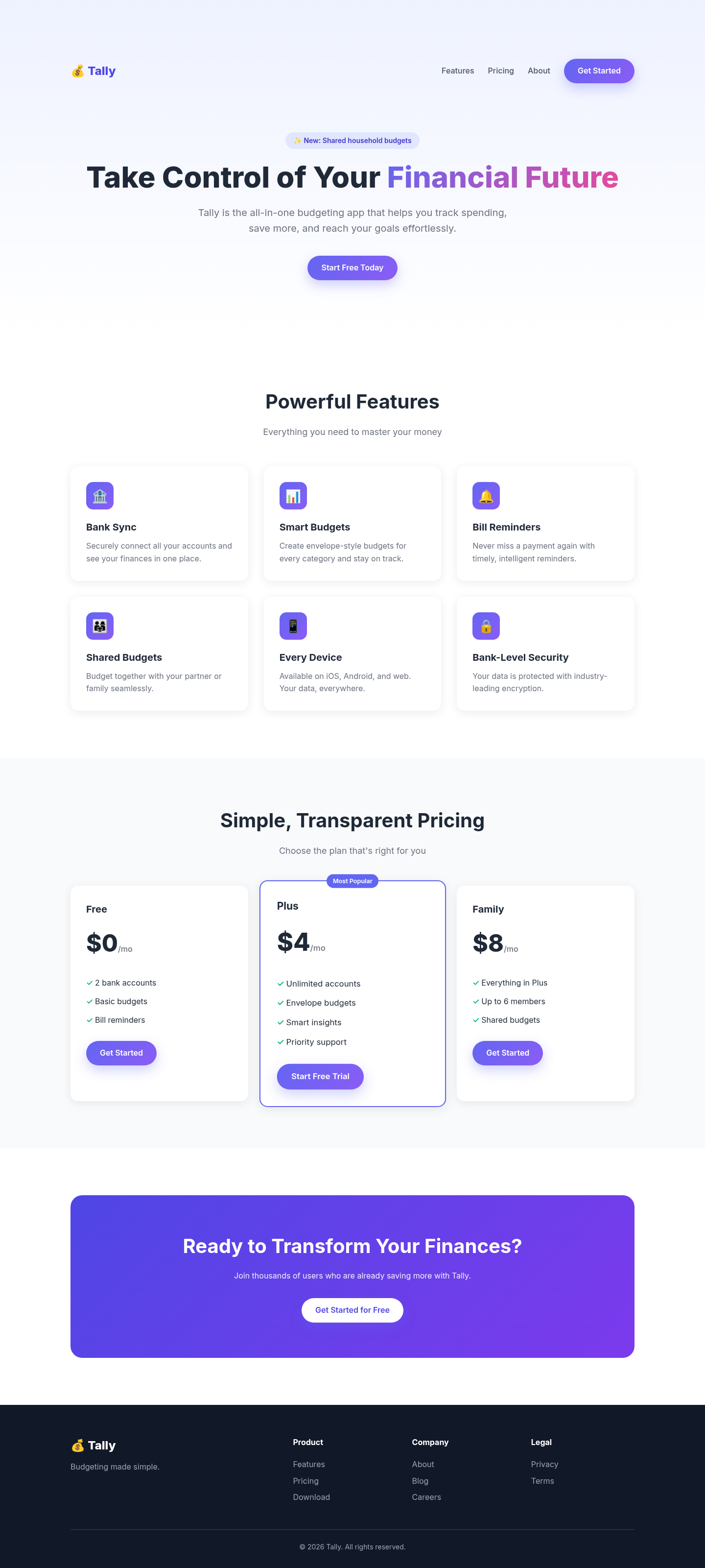
The aesthetic-direction and slop-check skills produced a calm, coherent fintech page: a real product panel in the hero, a bento feature block with one lead cell, and borders instead of shadows. It also renders a visible design-system summary, as the skill requires, which some will see as clutter.
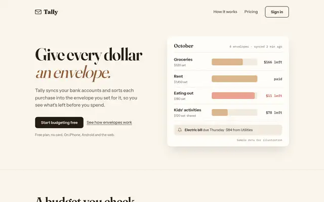
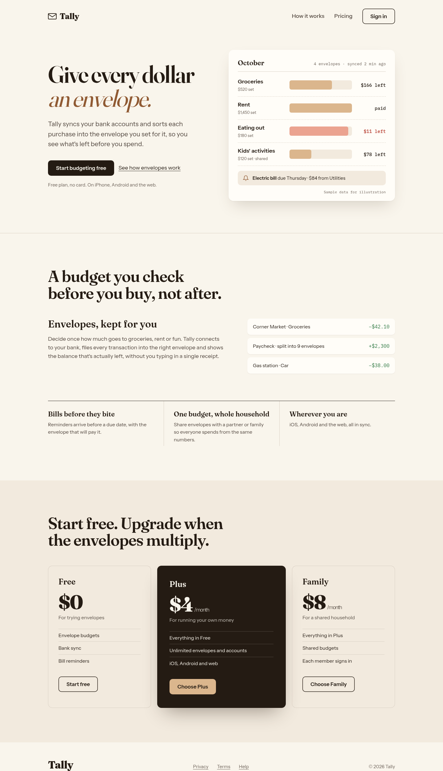
Threw out the gradient-and-emoji template for a warm paper 'ledger' world: the hero is a working envelope budget (labelled as sample data), features become one lead argument plus a ruled row, and pricing leads with a dark Plus plan. Distinctive and honest with copy. We followed its written rules but not its full workflow (launcher, question round, reviewer subagent), so a real run could differ.
 Skills for Design