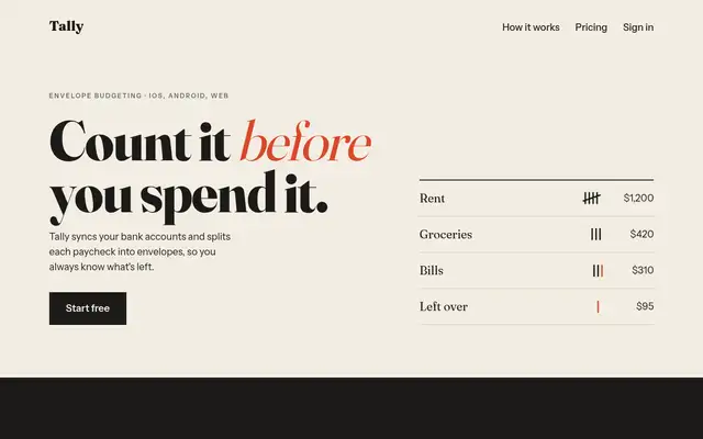
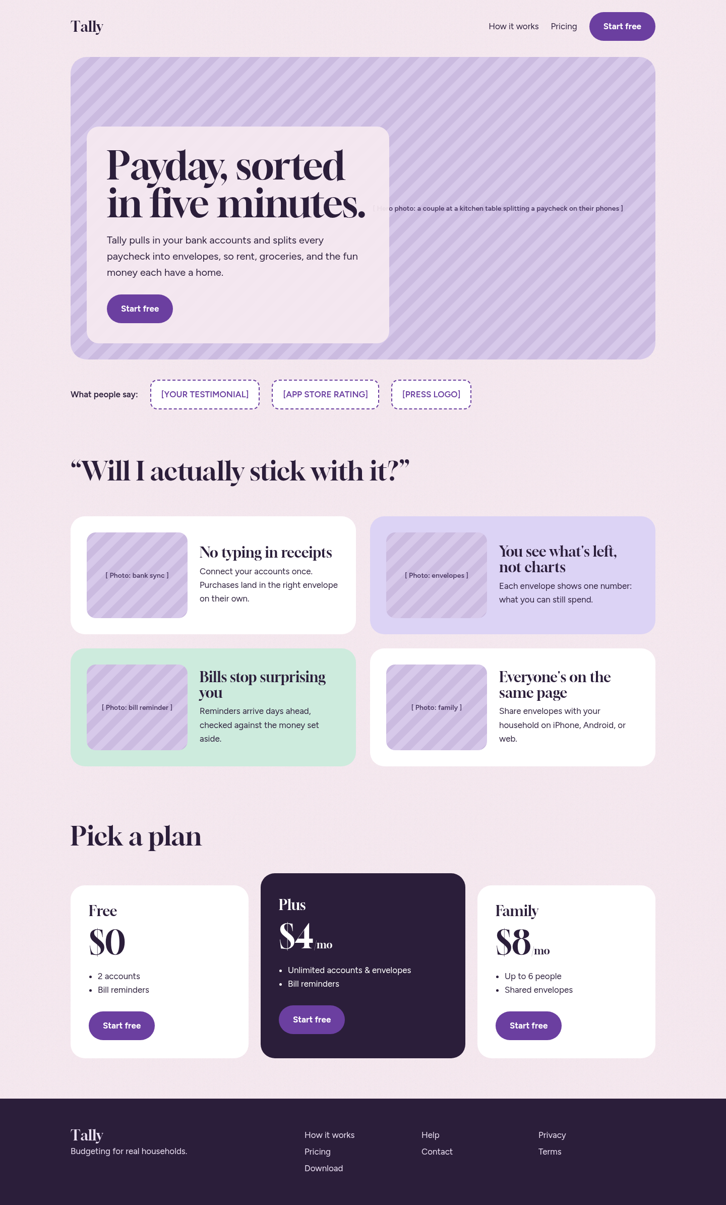
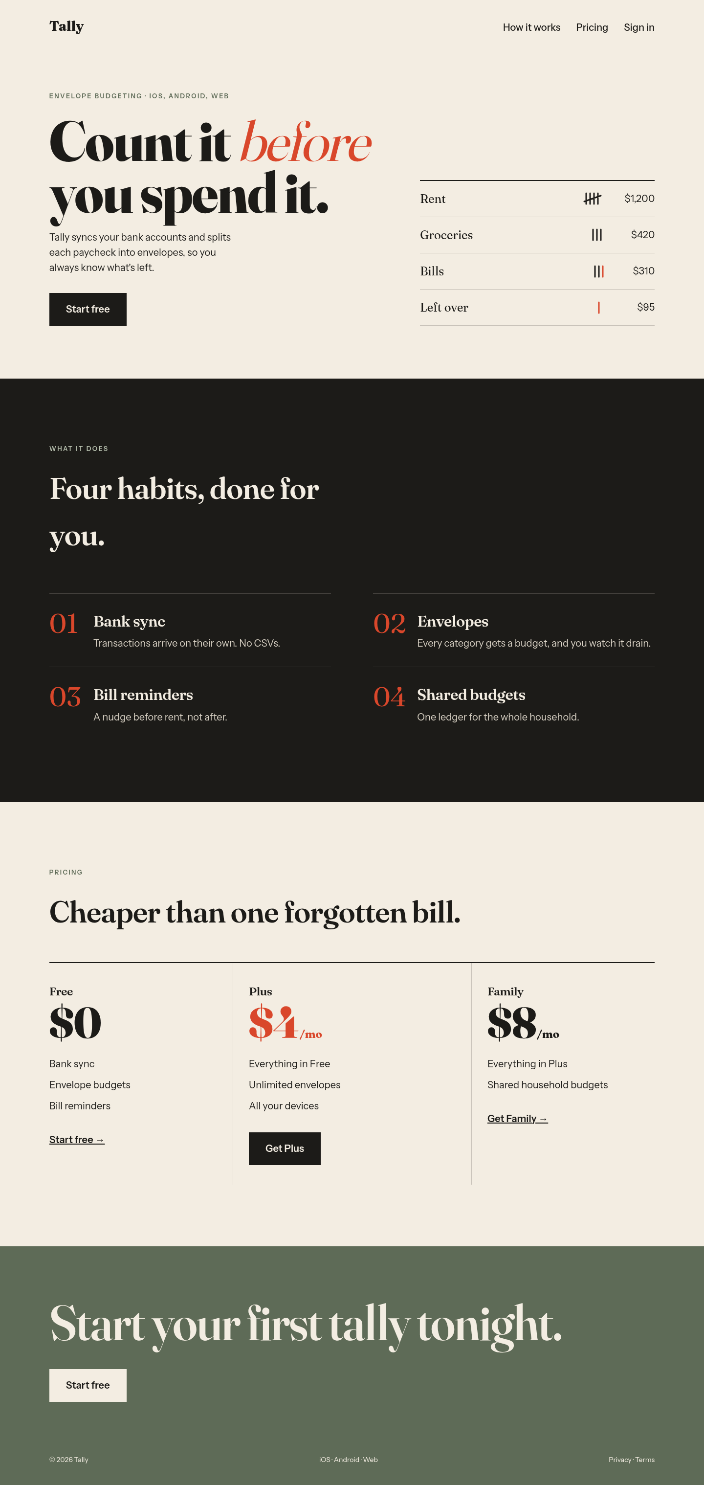
Both after shots are the Tally budgeting-app landing page, made by applying each skill's published instructions. Shared tags: Landing pages, Visual direction.
Following its landing-page rules gave the page a clear single CTA, objection-led sections and honest placeholders for photos and testimonials instead of invented proof. Structurally better than the baseline, but without real photography the screenshot is dominated by striped image slots.
Its mandatory six-line brief (direction, mood, palette, type, layout, signature) pushed the page into a warm editorial ledger: Fraunces on paper, one tomato accent, hand-drawn tally marks as the signature and alternating paper/ink sections. One of the most distinctive results in the set. The weak spot is its full-viewport section habit, which leaves big empty bands on a short page.
 Skills for Design