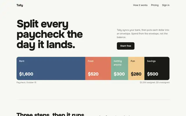
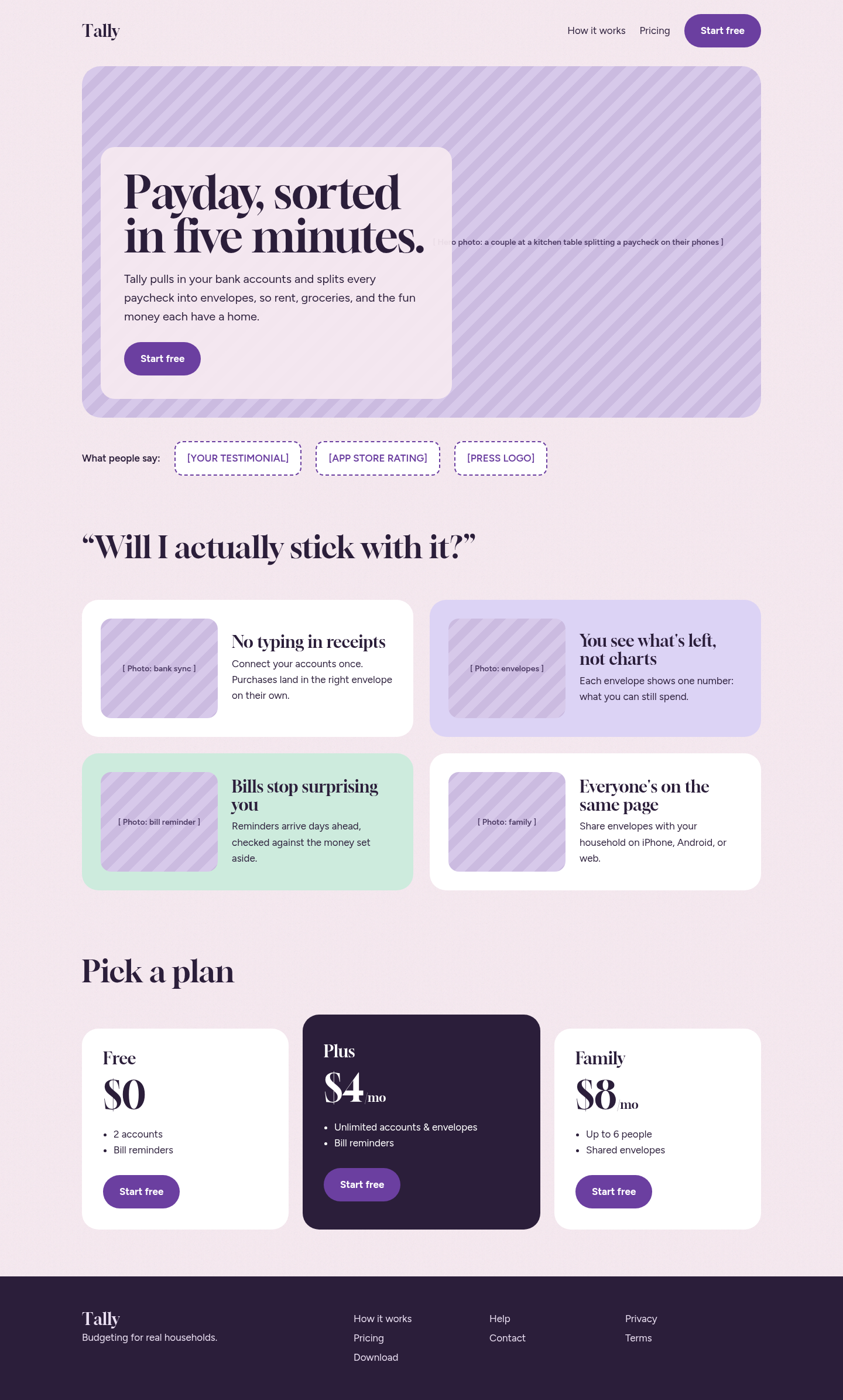
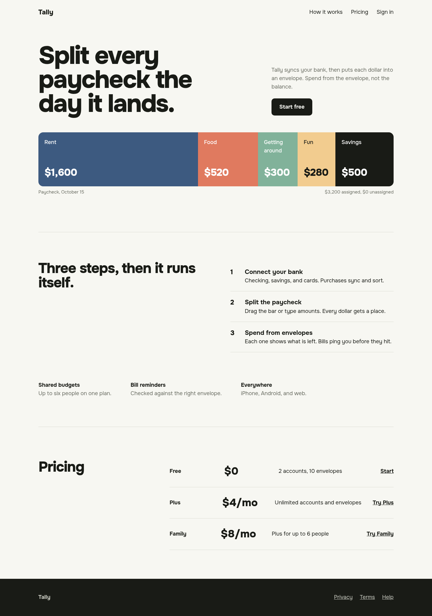
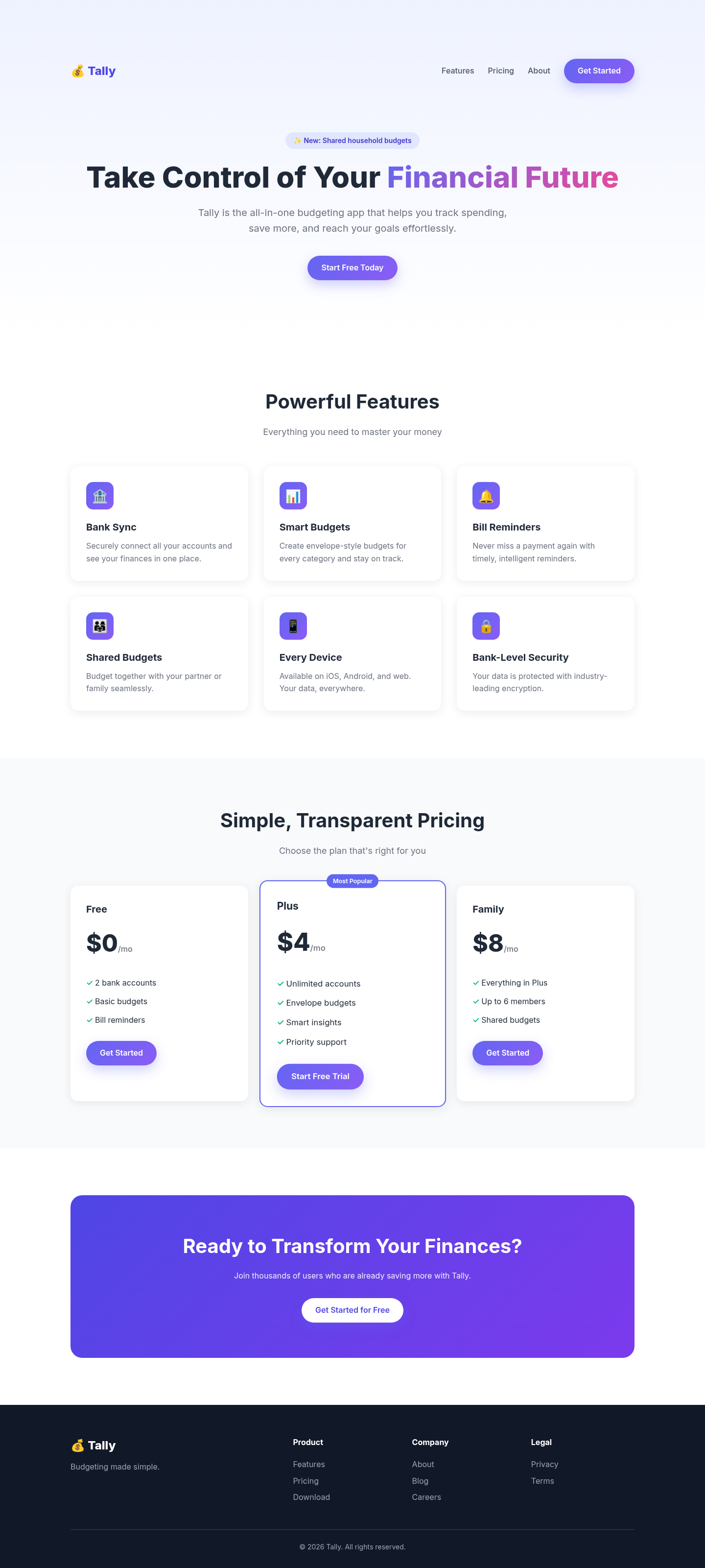
Both after shots are the Tally budgeting-app landing page, made by applying each skill's published instructions. Shared tags: Visual direction, Landing pages.
Following its landing-page rules gave the page a clear single CTA, objection-led sections and honest placeholders for photos and testimonials instead of invented proof. Structurally better than the baseline, but without real photography the screenshot is dominated by striped image slots.
Its 'one protagonist per screen' rule gave the page a memorable hero: a full-width paycheck bar split into colour-coded envelopes, with the palette taken from it. The rest is restrained to the point of sparseness, and we skipped its usual three-direction user check.
 Skills for Design