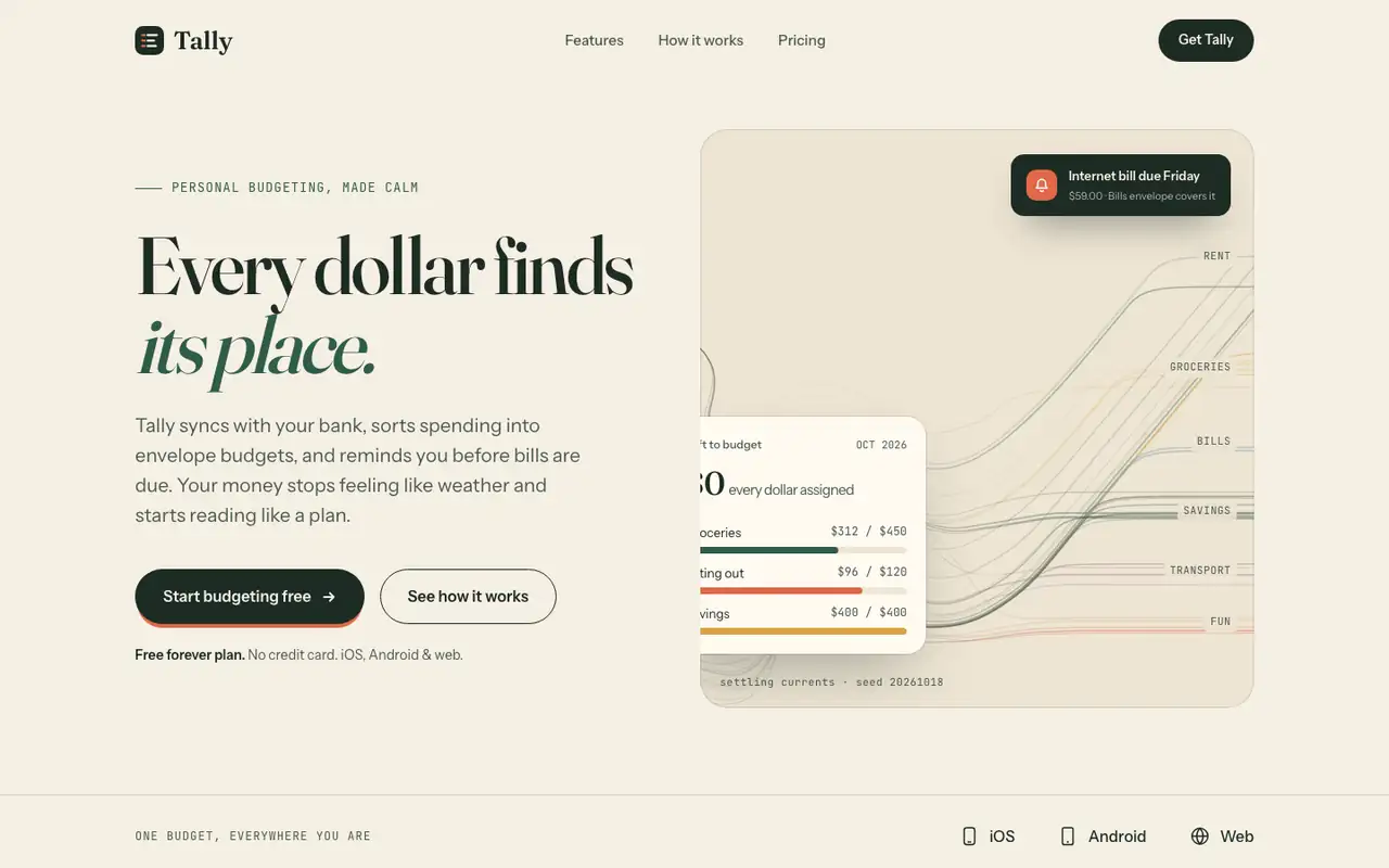
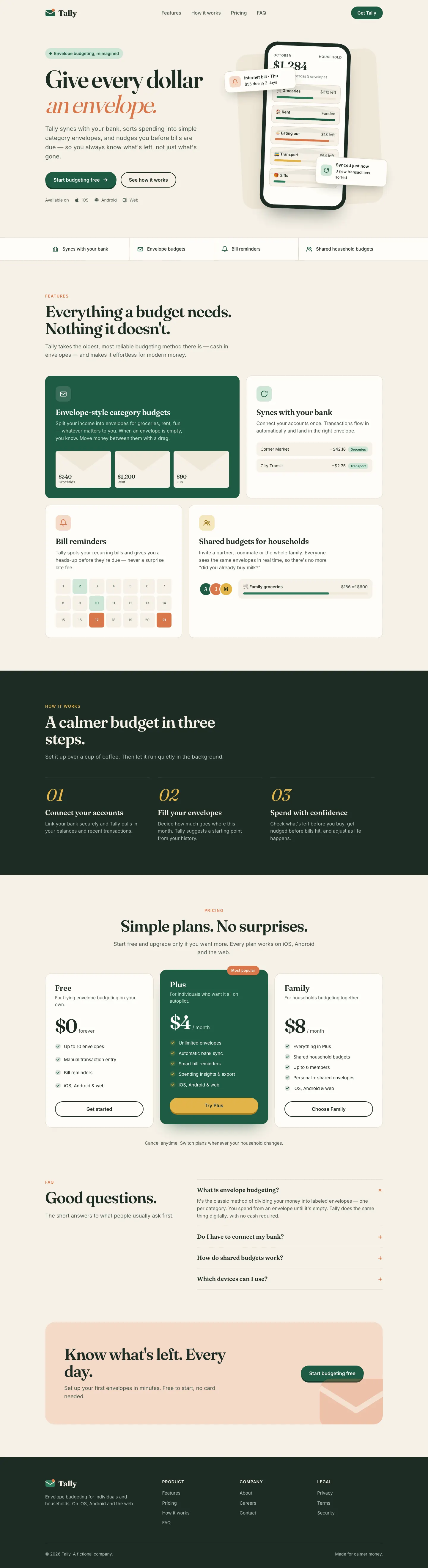
Algorithmic Art paints a seeded generative flow field across the hero, and even prints the seed, on cream with deep green, Fraunces and Instrument Sans. That art makes the landing page memorable, but the dashboard is close to the default. Pick it for a landing hero that nobody else has.
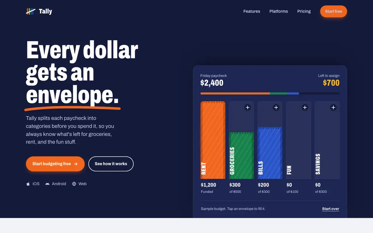
Impeccable drops the cream-and-serif default for a loud navy, orange and primary-color landing page set in heavy Archivo, then builds a calmer pine-and-lime dashboard. Pick it if you want a product page with real energy that still holds up on a dense screen.
Side by side
Field
Algorithmic Art (Anthropic)
Impeccable
Fonts
Fraunces
Instrument Sans (landing)
JetBrains Mono (landing)
IBM Plex Sans (dashboard)
IBM Plex Mono (dashboard)
Archivo (landing)
Schibsted Grotesk (dashboard)
Colors
#f5efe3 cream
#1d2b24 ink
#2f5d4a green
#e0694a coral
#d9a441 mustard
#6d93a8 sky
#151a33 navy
#f0661f orange
#17834b green
#2a55c9 blue
#f2b62d gold
pine rail oklch(0.29 0.045 168)
lime oklch(0.89 0.16 124)
Good fit for
creative tools
generative brand art
landing page heroes
portfolio sites
consumer fintech marketing
product launch pages
directories and marketplaces
sports or youth brands
B2C SaaS dashboards
Not great for
dashboards
data products
brands that avoid serif-and-cream
luxury or quiet editorial brands
wellness and calm-first apps
long-form reading sites
Flaws we saw
dashboard: close to the baseline in palette and layout
outside the hero art, the landing uses the default cream, Fraunces and green
dashboard: money figures print with a space before the comma ("$5 , 400")
dashboard desktop: an empty gap sits under the spending chart
landing: the page runs 6,836 px and the zigzag feature sections start to feel repetitive
the landing (navy and orange) and the dashboard (pine and lime) share little color